Hello,
I updated the Educon template and am now having issues with how the logo and menu are displayed.
The logo displays differently—or sometimes not at all—depending on the browser and device.
On mobile devices, the menu sometimes appears over everything else, even though there is a dedicated mobile menu.
How can I fix this?
Staff replied
Templates
Issues with logo and menu display
8 replies

Ziaul Kabir Staff
Hello,
Thanks for reaching out to us. Could you please share temporary administrator access to your Joomla backend? You can provide the credentials securely in the hidden content section. Also, please take a full backup of your site before we make any changes.
Once I have access, I’ll investigate further and see what’s causing the issue. Let me know once you’ve shared the details!
Best regards,
Knut Ingwersen Asked this
Hello,
thank you for your help!
Ziaul Kabir Staff
Hello,
From my end, I could not reproduce this issues.
To investigate this properly, could you please provide screenshots of the issue (showing the logo problem and the mobile menu behavior on different devices/browsers)? This will help us identify the cause more accurately.
Once you share the screenshots, I will check it and assist you with a fix.
Thanks,
Knut Ingwersen Asked this
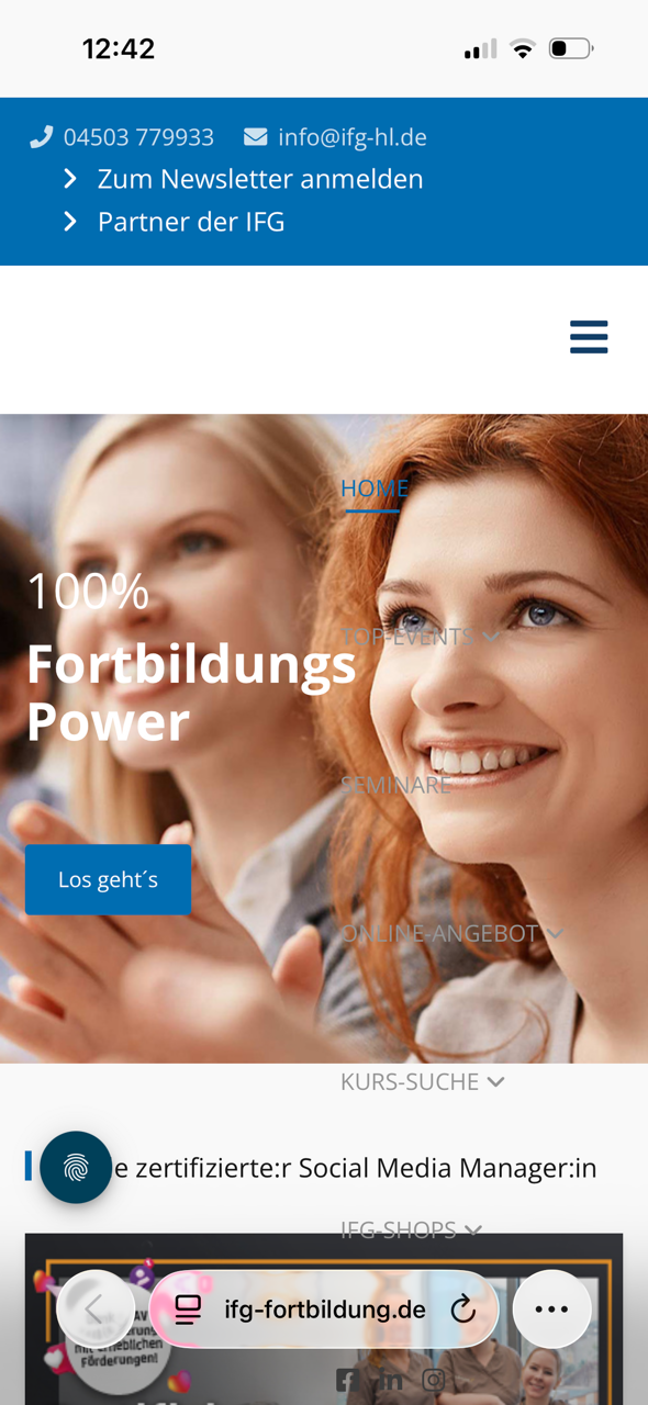
On mobile, the website displays without the logo and with an overlaying menu, preventing anything else from being clicked.

On the iPad, two logos are displayed—likely one standard version and one Retina version.
Knut Ingwersen Asked this

Ziaul Kabir Staff
But on my phone I see your site is ok:
Check: https://prnt.sc/wQQfQ-AbZ_KT
Thanks
Knut Ingwersen Asked this
On my iPhone 15 using the Safari browser, the menu overlaps the content, and I can't click any buttons. The logo isn't displaying either—just like in the photo I uploaded.
Ziaul Kabir Staff
Hello,
Please, check this: https://prnt.sc/dhgZyjt83ZV2 this screenshot is taken from iPhone 16 and there is no issues, Please, try from different phone.
Thanks
Log in to reply.