Off-canvas menu position changes on resize - Forum | JoomShaper
Solved Helix Framework

Off-canvas menu position changes on resize

Asked by clausjepsen 5 years ago Last activity 5 years ago

On this site: https://www.egedalweb.dk/dabyfo/

My menu is the off-canvas menu.
If I resize the browser window (smaller) or view on smartphone, the offcanvas menu moves into the body instead of staying in the header.

How can I force it to stay on resize?

Accepted answer

Marked as the solution
Pavel

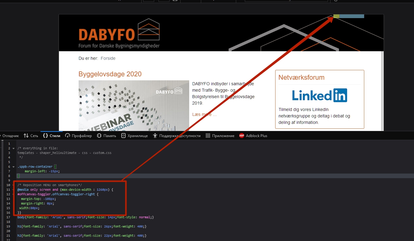
Hi. It looks like your not the right custom code.

9 more replies

clausjepsen Asked this

Hi, I did some googling and came up with the @media custom css to correct it as shown by Pavel.

Pavel: Please verify if it looks correct now.

Pavel
5 years ago · edited

Hi. It still looks wrong. You should completely remove your code.

/* Adjust Menu position on Smartphones*/
#offcanvas-toggler.offcanvas-toggler-right {
  margin-top: -108px;
  margin-right: 0px;
 width:80px;
}

And instead, adjust the column widths in the Helix Ultimate layout builder. Read the Helix documentation https://www.joomshaper.com/documentation/helix-framework/helixultimate/layout-builder, it is very helpful.
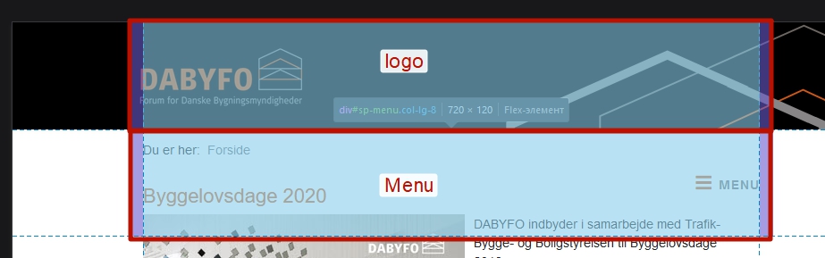
Your mobile columns now look like this.

You should set it up like this

clausjepsen Asked this
5 years ago · edited

... see new comment

clausjepsen Asked this
5 years ago · edited

Hi again,

I think I managed it now - at least part of it.

Using Column Options, I could set which bootstrap column to use on Smaller Phones. Had to set both "Logo" to col-1 and "Menu" to col-11 for "phones" in order to work (see image 1).

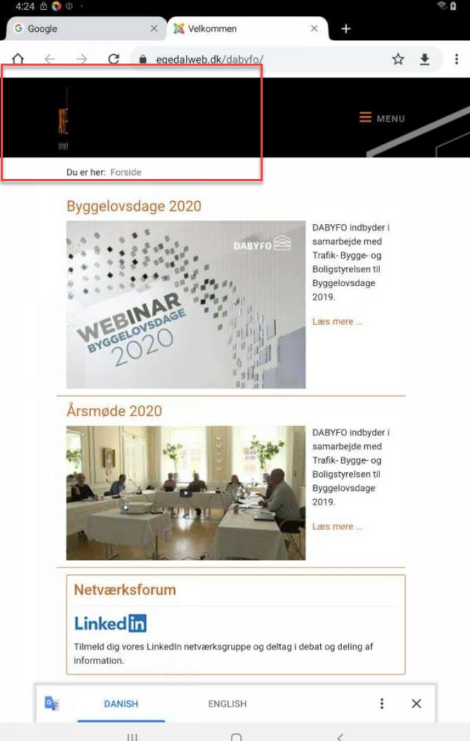
On tablets, I can do the same, but when fixing the logo at col-1 it squeezes to be within the col-1. How to overcome that? (image 2). I solved it on phone, by decreasing logo size for small screens. Is that the way to do it?

/* Decrease logo-size on Smartphones*/
.logo-image {
  display: block;
  max-width:200px;
  max-height:78px;
  width: auto;
  height: auto;
}

Image 1: Column options to set bootstrap column
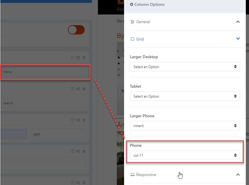
Image 2: On larger screens the logo squeezes
Pavel

Hi.

You don't need css code. Just set up the columns.

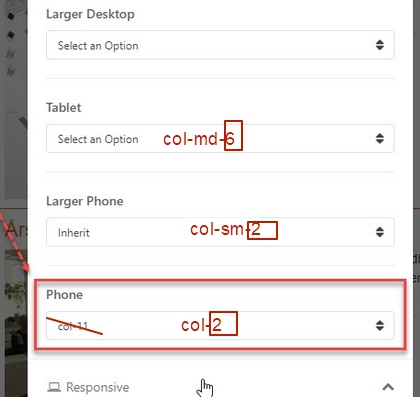
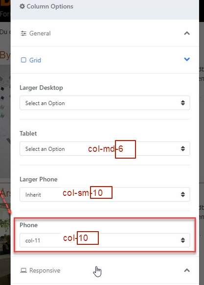
For exemple:

tablet - logo 6 menu 6

phone (and larger phone) - logo 10 menu 2

clausjepsen Asked this

@Pavel
Not sure I fully understand you.
On my "Logo" I can set column by device, but what do you mean by: "logo 6" and "logo 10" ?

Pavel

Hi. Yes, set column by device. I meant it.

Screen for Menu column

Screen for Logo column

clausjepsen Asked this

Thanks Phavel,
That made it for me.
I really think Joomshaper should inklude a link/explanation or illustration on how these columns are located on the different media. Also provide an option to upload or force scaling of images to ones preferences.
Best
Claus

Log in to reply.