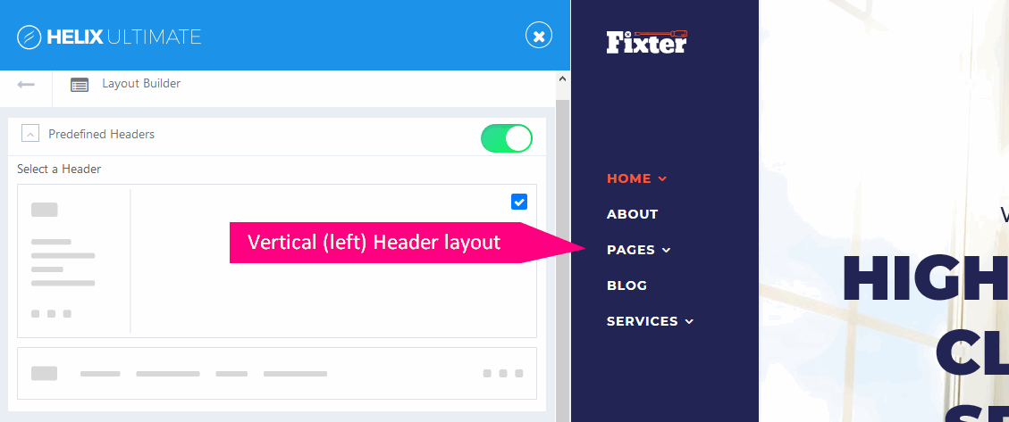
Header & Navigation (Top & Left)
This is our first template, which offers 2 types of headers: vertical (left) and horizontal (top) to choose from. In Template Settings > Layout Builder > Predefined Header, you can select the Header (logo & menu) position.
Logo width/size
Logo width depends on the width of the column where it is added. It means that if the logo column is short (default), the logo image is resized to a smaller size, no matter how wide the original logo image is. If you need to show a wider/bigger logo, in most cases, you have to:
- Increase "logo" column size, from Template Settings > Layout Builder > Predefined Header*
- Reduce left and right padding around "logo" column or whole header if we talk about Vertical Header. This option is easier, but it will increase the logo picture by +35px only. But it's worth trying, especially if you have Vertical Header. So you will be able to use a 190px wide logo, by default is only ~145px.
- You also have to reduce (remove) the right margin.
body.predefined-header1 #sp-header {padding: 30px 15px 100px 20px;}

#sp-header .logo {margin-right: 0;}
*Please read Helix Ultimate Manual tip: How to build a custom header.
Margin between Logo and Menu
In Vertical Header space between logo and Menu is 115px In some cases, it may be too big a value. To reduce it to 50px, please use code below:
body.predefined-header1 #sp-header .sp-megamenu-wrapper {margin-top: 50px; }Vertical sidebar width
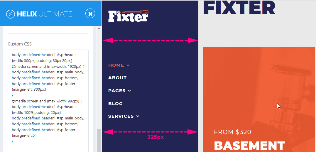
Yes, it's possible to change the width of the vertical sidebar by custom CSS only. By default, this section is only 210px wide. Below you have an example code how to increase the width to 325px and reduce the padding inside the left column.
body.predefined-header1 #sp-header {width: 300px; padding: 30px 20px;}
@media screen and (max-width: 1920px) {
body.predefined-header1 #sp-main-body,
body.predefined-header1 #sp-bottom,
body.predefined-header1 #sp-footer {margin-left: 30px;}
}

@media screen and (max-width: 1440px) {
body.predefined-header1 #sp-main-body,
body.predefined-header1 #sp-bottom,
body.predefined-header1 #sp-footer {margin-left: 10%;}
}

@media screen and (max-width: 992px) {
body.predefined-header1 #sp-header {width: 100%;padding: 20px;}
body.predefined-header1 #sp-main-body,
body.predefined-header1 #sp-bottom,
body.predefined-header1 #sp-footer {margin-left:0;}
}

body.predefined-header1 #sp-header .sp-megamenu-wrapper .sp-megamenu-parent > li > .sp-dropdown {
    padding-left: 20px;}
Note! Use above syntax inside Custom CSS code section or custom.css file.