

Template Customization
This section walks you through how to customize a template. You can configure the look of the template without having to edit core files or face problems when upgrading to a newer version in the future. For custom CSS code changes, we recommend using a custom.css file, which should be created in the/css/ folder of the template next to other CSS files. Read here for more information.
How to change the Header background color
You can use your own background color or gradient instead of the default style, but it requires custom CSS.
Example code to change header (not sticky) to red gradient:
#sp-header::before {
    background-image: linear-gradient(90deg, #A72B34 0%, #EF3E4A 100%);}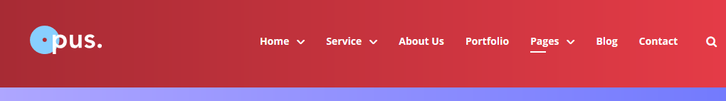
Example custom CSS code for sticky header with solid red color:
#sp-header.header-sticky {background: #EF3E4A;}
Example custom CSS code for sticky header with red gradient:
#sp-header.header-sticky {
    background-image: linear-gradient(90deg, #A72B34 0%, #EF3E4A 100%);}
How to change Header height
It request custom CSS, becuase you have to set header height and add centermenu section.
Example custom CSS code to increase height to 100px:
#sp-header.header-sticky {height: 100px;}
#sp-menu {margin-top: 15px;}
How to change Page Title Background colors
You can use your own background color or gradient instead of the default style, but it requires custom CSS.
Example custom CSS code for green gradient for Page Title section:
.sp-page-title {background-image: linear-gradient(90deg, #9DF5D1 0%, #1F9B62 100%);}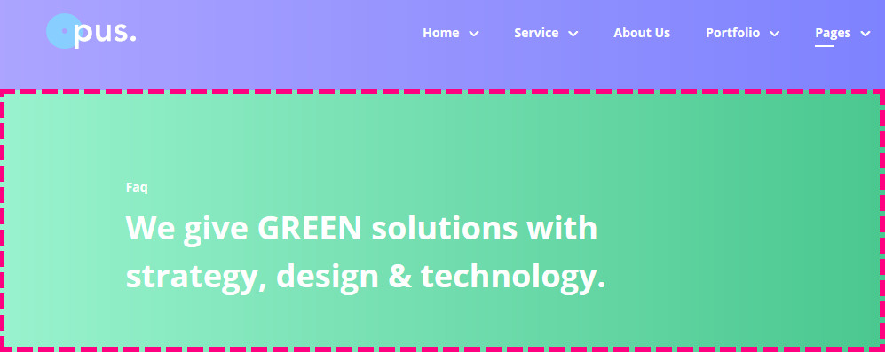
How to change the primary color used for buttons
The primary style gradient it's taken from template styles (template.css). To change the design of the button(s), you have two options:
- Head over to Button Style > Custom, and choose your own colors.
OR - Override default colors used for primary style, for example, a green gradient like below:
.sppb-btn.sppb-btn-primary {
    background-image: linear-gradient(224deg, #90C940 0%, #67932C 100%); }

.sppb-btn.sppb-btn-primary:hover,
.sppb-btn.sppb-btn-primary:focus {
    background-image: linear-gradient(-224deg, #67932C 0%, #90C940 100%); }

How CSS gradient works: https://developer.mozilla.org/en-US/docs/Web/CSS/linear-gradient
How to remove Grid from Home page Slider
You have to use simple CSS code to disable white grid from background of slider, becuase it was added by image.
.sppb-slide-item-bg::before {display: none; background-image: none;}
How to remove Box beyond Slider image
Box shape beyond image in slider was built using CSS border. It means that you can easily remove it, or customize it design. Here is example code how to remove it.
.sppb-slide-item-bg .slide-img-wrapper::before { border: 0; }