

Helix Ultimate

hv.digital
Hello, I am working with Helix ultimate and Joomla 4, and there is a lot of crazy stuff going on, from yesterday to today offcanvas hamburger icon appered on desktop and when its switched to mobile, menu is empty, and its only shown on some screen resolutions. Also from yesterday to today footer got completly broken.
Is there a lot of known bugs and issues with helix ultimate?
12 Answers
Order by
Oldest

Paul Frankowski
Accepted AnswerHi,
Before did you have Helix Ultimate 1.1.x and you made template update to 2.0.x ? If yes or not sure, please read tip #1: https://www.joomshaper.com/documentation/helix-framework/helix-ultimate-2/troubleshooting-faq
Paul Frankowski
Accepted AnswerAlso from yesterday to today footer got completly broken.
And what you did yesterday on your website?
Remember to clear Joomla cache and disable CSS compression - for testing purposes.
Anytime you can also share site URL
hv.digital
Accepted AnswerAbsolutly nothing, that is the issue, I cleared cache but mobile menu is crazy Im sending you two links for dev enviroment
- mobile menu is normal
- mobile menu is crazy
I am using v2.0 on both sites
Paul Frankowski
Accepted AnswerMaybe I am blind, but all seems be OK on 2nd link. tested on: Firefox / Brave / Opera
Please try from 2nd browser as well.
hv.digital
Accepted AnswerAnd also check the the first link, yesterday menu was looking like that and now looks broken
Paul Frankowski
Accepted AnswerIt wil be easier & faster if you tell me on which I should test. Like in the doctor/dentics office, when they ask you where do you feel pain.
Paul Frankowski
Accepted AnswerI have idea
Inside Template options > Custom Code > Custom CSS add this
.offcanvas-menu .offcanvas-inner ul.menu,
.offcanvas-menu .offcanvas-inner ul.menu ul { border: 1px solid;}
It should help for table view and Mobile Menu problem.
Paul Frankowski
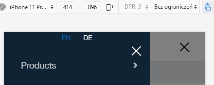
Accepted AnswerMenu item: "Products" - works fine. From desktop and mobile view.
Do you need video evidence?
But I would add also this:
.offcanvas-menu .offcanvas-inner .sp-module { margin-top: 20px;}
To get more space for (x) close icon
hv.digital
Accepted AnswerHello, so the problem is that menu items disapire on some screen resolutions (957px), that is for the second link, and on the first link on same resolution works fine