Hi Team,
what is the best way to give styles to mega menu when we use helix framework. Or is it possible to insert a module extension instead?
Helix is great but menu looks always the same
Solved
Helix Framework
transform mega menu
Accepted answer
Marked as the solution
Paul Frankowski Senior Staff
4 years ago
· edited
BTW
Have you used "menu" position name? If yes, WRONG. Few days ago I told you to use different name (!)
That's why you may have two menus. Oh...
15 more replies
Paul Frankowski Senior Staff
4 years ago
· edited
Hi Martin,
- By using existing settings and custom CSS you can make big design changes.
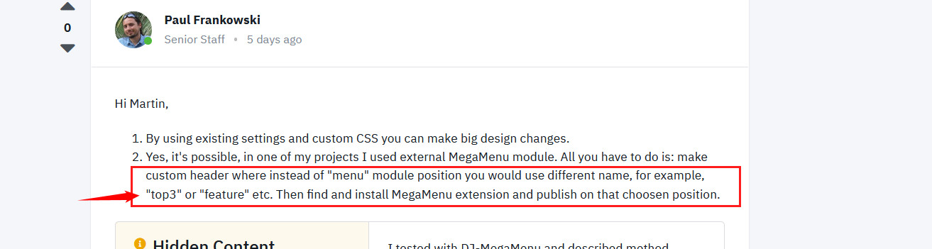
- Yes, it's possible, in one of my projects I used external MegaMenu module. All you have to do is: make custom header where instead of "menu" module position you would use different name, for example, "top3" or "feature" etc. Then find and install MegaMenu extension and publish on that choosen position.
Martin Seidl Asked this
Hi Paul,
thnx a lot!
2. How to make custom header? In helix template settings I couldnt find a way ....
Paul Frankowski Senior Staff
More info inside Helix documenation >> https://www.joomshaper.com/documentation/helix-framework/helix-ultimate-2/custom-header
Martin Seidl Asked this
Hi Paul thnx, I got it!
But still one prob: menu is doubled in the menu bar on top. see https://2022.agentur-texte.de/
I disabled predefined header, but still previous menu is displayed....
Martin Seidl Asked this
would be nice to get answer....
Paul Frankowski Senior Staff
4 years ago
· edited
Sorry for small delay, Let me check.
Paul Frankowski Senior Staff
4 years ago
· edited
Warning
Login denied! Your account has either been blocked or you have not activated it yet.
Give me working access to admin area. Now I cannot login to check setting.
Paul Frankowski Senior Staff
Und?
Martin Seidl Asked this
sorry, wait a moment
Martin Seidl Asked this
see hidden section
Martin Seidl Asked this
I got it, thnx a lot!!!!
Martin Seidl Asked this
om mobile view still it looks horrible. It seems I need to enable the mobile button of the module somehow and have correct module position somehow.....
Paul Frankowski Senior Staff
4 years ago
· edited
Ok, Danke.
I cannot help with mobile button from DJ Menu if problem is from its software directly.
Still "Login denied! Your account has either been blocked or you have not activated it yet." Oh Martin ;)
Paul Frankowski Senior Staff
4 years ago
· edited
As I see on front-end you have Helix Mobile Menu and it works.
About column positions in mobile view (header). Please check settings - you can control width of logo and "new-menu" position on tablet and mobile view from Grid tab.
Example from my demo site
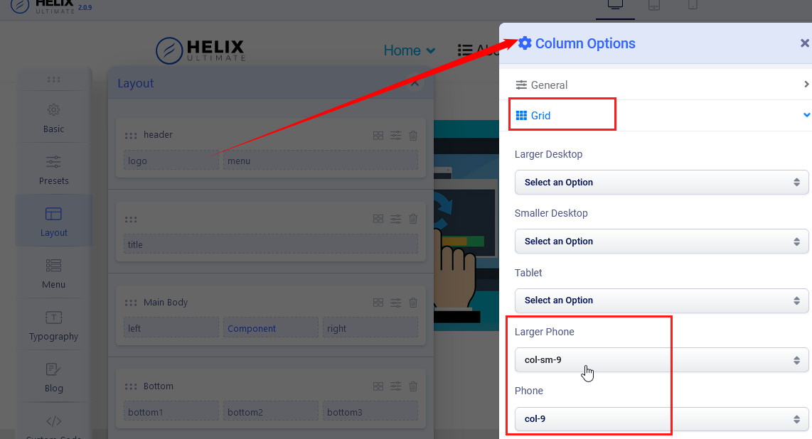
9 is for "logo" so for mobile menu should be "3" - why? becuase in bootstrap columns summary should be 12 to keep them on this same row level. Alles klar?
Paul Frankowski Senior Staff
I hope everything is OK now. Have a nice weekend.
Log in to reply.