

Website is Not Responsive On Ipad (1024x768px) - Menu Breaks In 2nd Line
Dirk Bungenstock
Hi,
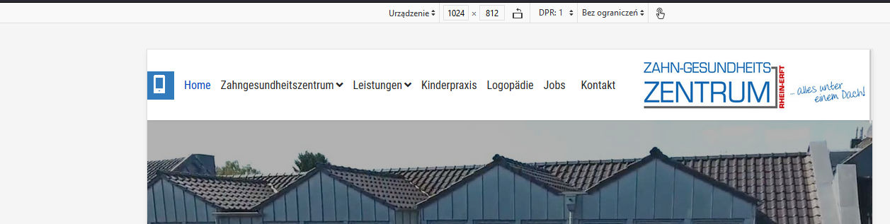
on our projekt site https://zgzprojekt.smartwebseite.de/ the menu braks in a 2nd line if you look it on an ipad with 1024x768px. After the menu iteam "Jobs" ist the iteam "Kontakt" not in the same line, it is in a second line on the image. But it should be not like this.
Please help.
Best regards Dirk

Paul Frankowski
Accepted AnswerJa, Dirk.
Webmaster should create or upload that file if decided to use it.
Paul Frankowski
Accepted AnswerHi Dirk,
it's simple math, not a bug. If the available space is too low (smaller screen) there is no place for the last menu item, and the menu collapses into two rows, natural behavior. It's like people in the car, if you add extra person it has to sit on somebody knees or you have to choose only slim persons ;)
Yes, can be fixed by using custom CSS
Paul Frankowski
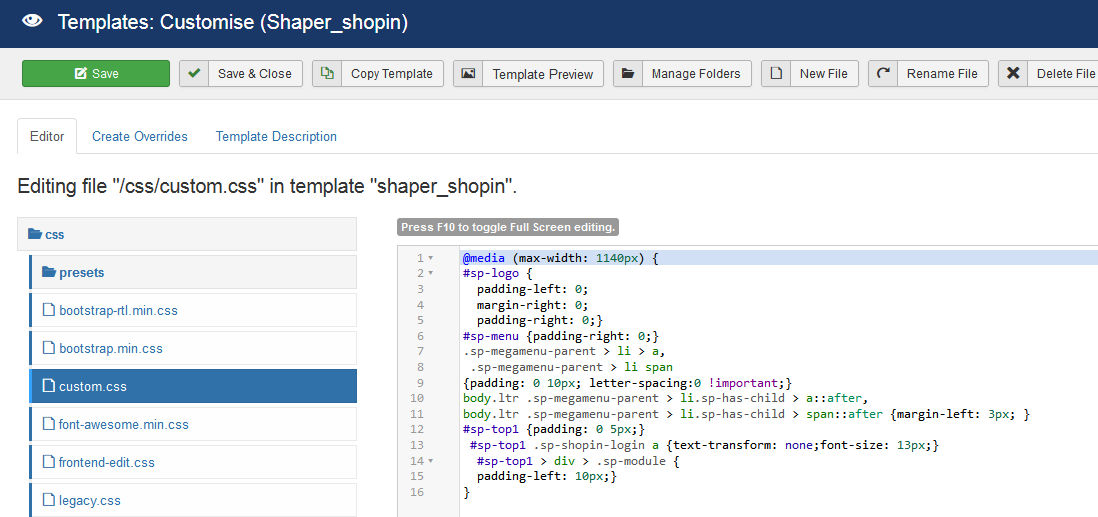
Accepted AnswerMy suggestion is (added already inside custom.css file)
@media (max-width: 1080px) {
#sp-logo {padding-left: 5px;}
#sp-menu {padding-right: 0;}
.sp-megamenu-parent > li > a,
 .sp-megamenu-parent > li span
{padding: 0 7px;}
body.ltr .sp-megamenu-parent > li.sp-has-child > a::after,
body.ltr .sp-megamenu-parent > li.sp-has-child > span::after {margin-left: 3px; }
.sp-megamenu-parent > li > a {font-size:15px}
}
Paul Frankowski
Accepted AnswerIf you're German webmaster please read that "law info" >> https://www.joomshaper.com/documentation/sp-page-builder/sp-page-builder-3/google-fonts-and-dsgvo
Bryan
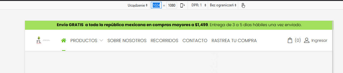
Accepted AnswerHi, I am in the same situation with my website. When opened in a popup or smaller window, the menu gives a line break and the text scrolls down.
Paul, can you help me to solve it?
I asked a question about this 3 weeks ago, but have not gotten any solution. https://www.joomshaper.com/forum/question/14105#qa-answer-68076
Paul Frankowski
Accepted AnswerHola Bryan.
in your case my custom CSS may help as well, but you have to add more "reduction styles" inside custom.css
and 2nd step you have to change column size in header, section with shop card and login takes too much space. Now you have 1+7+4 and you should have 1+9+2
I saw that you shared access to your site, I put my changes already. FIXED
My fix starts from screen size 1140px but you can set it sooner... 1160px etc.
Dirk Bungenstock
Accepted AnswerHi Paul,
thanks a lot for your help and the custom CSS which solve the problem.
Yes I am German. And thanks for the notice of Google Fonts.
Best regards Dirk
Dirk Bungenstock
Accepted AnswerHi Paul, please an other question:
It now works perfect on our project site. So I looked to the template you added your code in a file: "custom.css".
On the real site www.zgz-rheinerft.de there is no custom.css - that means I have to create a custom.css file with your (the same) code to put in it and load this new custom.css to our server manually at this folder: /templates/shaper_helixultimate/css/custom.css
Is this right?
Best regards Dirk