

Custom Header In Helix Ultimate Not Displaying Correctly On Tablet Or Mobile
Sheryl Prucka
I have built a website with a simple header. It has 3 elements: A hamburger menu on the left, a logo in the center, and a link to a ContactUs form on the right (which is disabled on mobile and tablet)
The logo is centered in the middle of the header bar.
When I switch to tablet view, the logo drops to the next line (so it's not in the header any more.)
I have tried many things to see if I could get this to work on tablet and mobile, but nothing seems to work.
Can you please advise me?

Paul Frankowski
Accepted AnswerI changed settings in Column Options
Now is OK (or at least should be)

Mehtaz Afsana Borsha
Accepted AnswerHi
Thanks for contacting us. Could you please give me a screenshot of your issue?
-Regards.
Sheryl Prucka
Accepted AnswerThe way it looks in full screen: https://dl.airtable.com/.attachments/d45c40c9324cdf57968b25db566bd856/2d92a61a/WL-full-screen.png
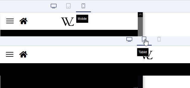
The way it looks in tablet:
https://dl.airtable.com/.attachments/087a59216467d2e6196d41a53aaef11b/0bfbb620/WL-tablet.png
Note that on a tablet the WL logo is present but it's on the next line.
Thanks!
Paul Frankowski
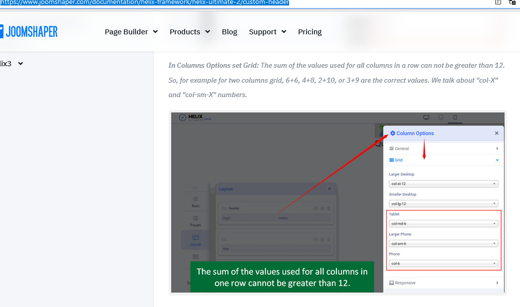
Accepted AnswerHI Sheryl,
in Template Options > Layout > Column Options > you can set size of column displayed on each device. Use that setting it may help. More in Helix documenation here >> https://www.joomshaper.com/documentation/helix-framework/helix-ultimate-2/custom-header
Sheryl Prucka
Accepted AnswerThanks so much, but this actually does not help. The column options affect the column position, but not the width.
I have debugged this a bit more and have important details, but I still need help to fix the problem. When using the full screen width, the column for the logo only takes up 4 (of the 12) spaces; however, which I switch to Tablet, the column for the logo takes up the entire row, even though it should not. These pictures completely demonstrate the problem.
Full screen: https://dl.airtable.com/.attachments/31ed60d8facca2bf465658cccd6c30ea/4441d2ae/Fullscreen-sl-logo.png
Tablet: https://dl.airtable.com/.attachments/104dfd40291ca8c482a2ca03839fcf52/a9b5e3d6/Tablet-sp-logo.png
Can you please look into this? I'm pretty sure it's a bug, not a user error. (I'd prefer a user error...) The 4+4+4 custom columns should apply to all responsive layouts, the center column should not be pushed to the next row when we go to Tablet mode.
Thanks so much for your help.
Paul Frankowski
Accepted Answerwhy did you ignore my advice :( anyway, I'll set you how it should be...
Sheryl Prucka
Accepted AnswerThank you so much for fixing the problem, I really appreciate it.
Now I really should tell you that I didn't ignore your advice at all, I read the instructions and spent quite a bit of time with the column options. The instructions say nothing about the "width" of the columns, only the "position", so I kept making changes to column 2, which did nothing.
Now that I see the changes that you made, I can understand what is going on and won't have this problem again, but I think the instructions could be more clear about what "col-md-4" does, for example.
Again, thank you so much!