

Problem Whith Hamburger Menu
SowieSo GmbH & Co. KG
Hello,
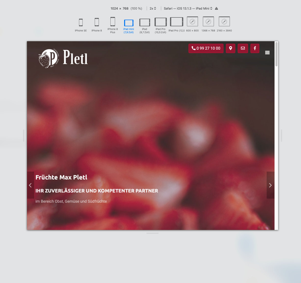
I use the Organic template on the www.fruechte-pletl.de website - on a tablet of 1024 px or more, the Hamburg menu is no longer visible when scrolling. In addition, the menu cannot be opened at all.
This is already the case with the template, who can help me?
Everything works fine on the smartphone and desktop.
Thank you
Torsten.S
Accepted AnswerI can't see any "Hamburg Menue at all if i visit your site, or did i miss something ?
SowieSo GmbH & Co. KG
Accepted AnswerHey Thorsten,
it's only about the display on the tablet from 1024px - the hamburger menu is at the top right next to your contact icons. When scrolling, the hamburger is no longer visible because it is probably fixed somewhere, but I can't find anything about this.
In addition, the menu does not appear when you click on the hamburger.
On the smartphone or tablet horizontally, everything is correct.
I've been searching for days and can't find a solution.
Regards Paula

Anne
Accepted AnswerHello there,
Thanks for contacting with us. I can't see the Hamburger menu icon while visiting your site at desktop. Can you give me a screenshot about it?
-Regards
SowieSo GmbH & Co. KG
Accepted AnswerHello,
There is no hamburger menu on the desktop, only on the tablet and smartphone.
how can I send a screenshot?
REgards Paula
Anne
Accepted AnswerHello there,
You can attach a screenshot by using any online screenshot taking tool like lightshot.
-RegardsSowieSo GmbH & Co. KG
Accepted Answerhello,
the tool does not work for me, I have saved the screen here. https://fruechte-pletl.de/images/screen.png
The hamburger menu is visible here, but when I click, no submenu appears.
To understand the error, please switch to the tablet view.
When I scroll, the hamburger disappears because it doesn't seem to be fixed. But I can't find where it is.
Anne
Accepted AnswerHello there,
I am sorry for the inconvenience.Please share your administrator access here to check the issue. Use the Hidden Content box to share the credentials.
Best regards
SowieSo GmbH & Co. KG
Accepted AnswerHello Anna,
can you solve my problem? Please let me know, otherwise I will have to look for other help. Thank you
Regards Paula
Anne
Accepted AnswerHello there,
I am extremely sorry for the delay. I can't login to your site.
Please, have a look and check the user id and password.
-Regards
Rein
Accepted AnswerHi Paula,
Just a simple fix, please change in your custom.css file:
@media (max-width: 1024px)
.responsive .sp-main-menu-toggler {
    padding: 0 !important;
    font-size: 15px !important;
    position: fixed;
}
The position:fixed; must be added to make the hamburger menu fixed in place.
To make your opened mobile menu fixed on top I would also recommend to change your code in custom.css to this:
@media (max-width: 1024px)
.responsive .sp-mobile-menu {
    position: fixed !important;
}
Regards,
Rein
SowieSo GmbH & Co. KG
Accepted AnswerHello Anna,
the account I sent you is working. Please try again. I was able to fix the icon for the hamburger menu now, but clicking on the icon does not open the menu, that would still need to be fixed.
SowieSo GmbH & Co. KG
Accepted AnswerHello Rein,
Thanks for the info. I was able to fix the icon for the hamburger menu now, but clicking on the icon does not open the menu. Regards Paula
Rein
Accepted AnswerHi Paula,
On my side I can click the hamburger-menu and it opens fine, in mobile simulation on chrome and firefox as well as on android mobile.
Is it intentional that your menu-bar now scrolls up when the page is scrolled? The first time I looked at your site it was fixed when scrolling.
FYI I am just another helpful user of Joomshaper products .
Regards,
Rein.