- TemplatesTemplates
- Page BuilderPage Builder
- OverviewOverview
- FeaturesFeatures
- Dynamic ContentDynamic Content
- Popup BuilderPopup Builder
- InteractionsInteractions
- Layout BundlesLayout Bundles
- Pre-made BlocksPre-made Blocks
- DocumentationDocumentation
- EasyStoreEasyStore
- ResourcesResources
- DocumentationDocumentation
- ForumsForums
- Live ChatLive Chat
- Ask a QuestionAsk a QuestionGet fast & extensive assistance from our expert support engineers. Ask a question on our Forums, and we will get back to you.
- BlogBlog
- PricingPricing
Define Breakpoints Global In SP Page Builder
MK
Mario Kaufmann
Hi
I try it this way, because I try now over a week to solve this issue in a private Post wiht Joomshaper support, but till now nobody can help:
Does somebody in this Forum know, where I can define global the breakpoints, that I can define in SP Page Builder when it change from Desktop view, to Tab view and then to Smartphone view?
Till now I get from Support here only this Link (But this is only for old SP Page Builder and is not working in current Version of SP Page Builder): https://www.joomshaper.com/blog/how-to-make-a-website-perfectly-responsive-with-sp-page-builder
3 Answers
Order by
Oldest
Paul Frankowski
Accepted AnswerHI Mario,
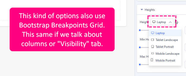
breakpoints (based on resolution) that are used in SPPB are from Bootstrap, this is no secret.
If you want to override used values to use custom ones, you have to use extra Custom CSS. So you cannot change them from settings. For example Desktop/Laptop uses @media (min-width: 1200px) { }
Link that you shared is from 2018, and probably it was based on SPPB 3.x.
If you need current info use SPPB 5 documenation & bootstrap 5 gudies.
MK
Mario Kaufmann
Accepted AnswerHi Paul
Thank you very much for your help, with your answer in less then 1 hour we have already come much further then after 1 Week in the other private ticket (the private ticket was really frustrating..). BTW: The Link above is from your support team, and I already told them, that it is not for current Version (but they ignored my message..). In SPP5 Documentation I can't find information about Breaktpoints, or am I overlooking them?
As I understand you, we need to define in custom CSS like this:
- Desktop: @media (min-width: 1200px) { }
- Tablet: Could you please help me how to define this?
- Smartphone: Could you please help me how to define this?
Thanks for sharing the screenshot: But this is only for a single module, right? I want to define it global for all SSP5 Pages.


