

Adaptability Control In SPPB 5

Dmitry Goncharov
https://disk.yandex.ru/i/pazKfoTF1cHfog
https://disk.yandex.ru/i/fO6qEO6ocnifDA
Implement layout control tools in SPPB for intermediate breakpoints. Let the parameters change in the main ones, but with a slider to watch how the content adapts. Because now there is a breakpoint 320 and 576 and that's it, and most phones have a resolution of 425px and how to be? What is adapted on 320 looks very bad on 425. And when using div blocks and Flex it is not controlled in any way. You have to constantly look through F12 in the browser, which is very inconvenient.
Make such a tool inside the editor to be able to look adaptability in intermediate values.
8 Answers
Order by
Oldest

Paul Frankowski
Accepted AnswerHi Dmitry,
We use those same as Bootstrap 5.
But I agree that iPhone 12/13 (and few others) has 428px - I will ask our developer to consider adding one more, or maybe defined by webmaster (I saw that feature in WP).
Let's wait for the developers' decisions
Dmitry Goncharov
Accepted AnswerYou misunderstand. I don't need to add a new breakpoint (although it wouldn't hurt )). I'm talking about a tool to control adaptability, so that you can move the window in the editor and see how the content adapts with the existing settings. Similar to F12 in Google Chrome when viewing adaptive content. With the mouse you take the edge and move it.
Dmitry Goncharov
Accepted Answerhttps://disk.yandex.ru/i/4bUZacDN3oytzA
https://disk.yandex.ru/i/Vwd0V9oGMNt5Hw
https://disk.yandex.ru/i/CwnwKeSX8bkCGg
Here's an example. 2 breakpoints in SPPB and what the page looks like on the phone. I can't control the behaviour of elements in the editor. I need some mechanism that would allow me to smoothly change the size of the editor window, at least to control the behaviour of elements. And change parameters at breakpoints.

Pavel
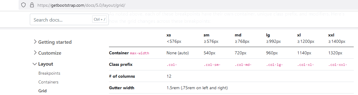
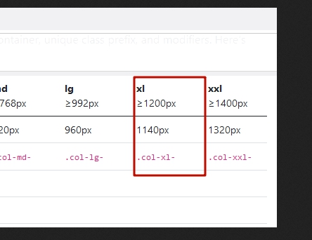
Accepted AnswerWe use those same as Bootstrap 5.
Hi Paul.
This range is absent in SPPB 5 editors.
I'm tired of waiting for an adequate answer about this.
https://www.joomshaper.com/forum/question/29019
It was in SPPB 4, but Joomshaper devs for some unknown reason broke it in SPPB 5. I think, first of all, it should be restore order with standard breakpoints, before considering additional opportunities.
Dmitry Goncharov
Accepted AnswerMobile version in SPPB https://disk.yandex.ru/i/DoWDh2WCdgSFlw
Mobile version in Helix Ultimate https://disk.yandex.ru/i/oXfpa8XghC6Puw
Are there plans to make adaptability settings humanly possible? How to control the layout?
Paul Frankowski
Accepted AnswerIt depends what logo size you have on the mobile view, from what I see it's too wide now.
If you would decide to use Custom Header then you have more possibilites about layout grid.