

Fixter Template Left Header/menu does Not Drop Down Under Logo When Viewing On Tablet/mobile Device.

Alan
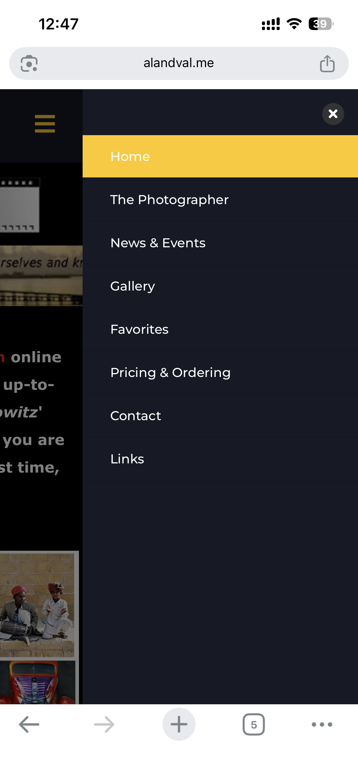
I chose the Fixter template as my client wanted a vertical menu on the left side of his website. When collapsing the site to show on tablets or mobile devices, the vertical header remains on the left and the body is cut off or partially hidden on the right side. (see screenshot). When using the horizontal header/menu everything works as it should, but I cannot use that for the client site.

8 Answers
Order by
Oldest

Ofi Khan
Accepted AnswerHello Alan,
Thank you for reaching out to our technical support forum. I’m sorry to hear about the trouble you’re experiencing.
I could not get your issue properly. This is what I see on the mobile version of your site.
Best regards

Rashida Rahman
Accepted AnswerHi there!
Thanks for reaching out.
It is looking fine at my phone. And I have checked by resizing the window as well. Both looks good!

Would you please clear your browser caches or check with new fresh browser or with the incognito mode?
Best regards,
Alan
Accepted AnswerI am sorry about the bother here. There was some custom CSS added to something else on the site that was interfering with the proper operation of the header.
However, I am unable to adjust the HEADER WIDTH without causing the same issue as seen in my original post. The menu items on the left are too large for the header width unless I reduce the font size and spacing to make them small enough to fit, and that is too small. Is there a particular setting or CSS that can be changed to widen up the header in a vertical position that will not cause it to quit operating properly?
Rashida Rahman
Accepted AnswerHi Alan,
No worries, we are happy to help you!
Did you check and try the documentation, please?
Best regards,
Rashida Rahman
Accepted AnswerHello Alan,
Hope you are doing well. Didn't hear anything back from you since then.
Alan
Accepted AnswerSorry about not responding. I've managed to work out all the issues with some custom CSS. The menu us responding as it should now, and while I couldn't really enlarge the menu width without running into issues (it seems to be related to DROPDOWN widths rather than the header width) I reduced the font size a little and managed to make that work for me. The client is happy in any case, so I've been moving on to other work on their site. I really DO APPRECIATE your CUSTOMER SERVICE experience as always. Probably the best in the business. Thanks again, and you may close this ticket and consider it resolved to my satisfaction.
Rashida Rahman
Accepted AnswerNo issues:) Glad that we could help!
You may accept the most useful answer in order to close the post.
Have a nice day!
Ofi Khan
Accepted AnswerJust checking in to see if you have feedback on the provided solution. If the answer resolved your query, you can mark it as accepted to close the post and guide others with similar questions. You’ll find a button to accept answers below each comment.
If you need further assistance, feel free to let us know!