

Background Color On Menu In Unfold Template
Jeanette
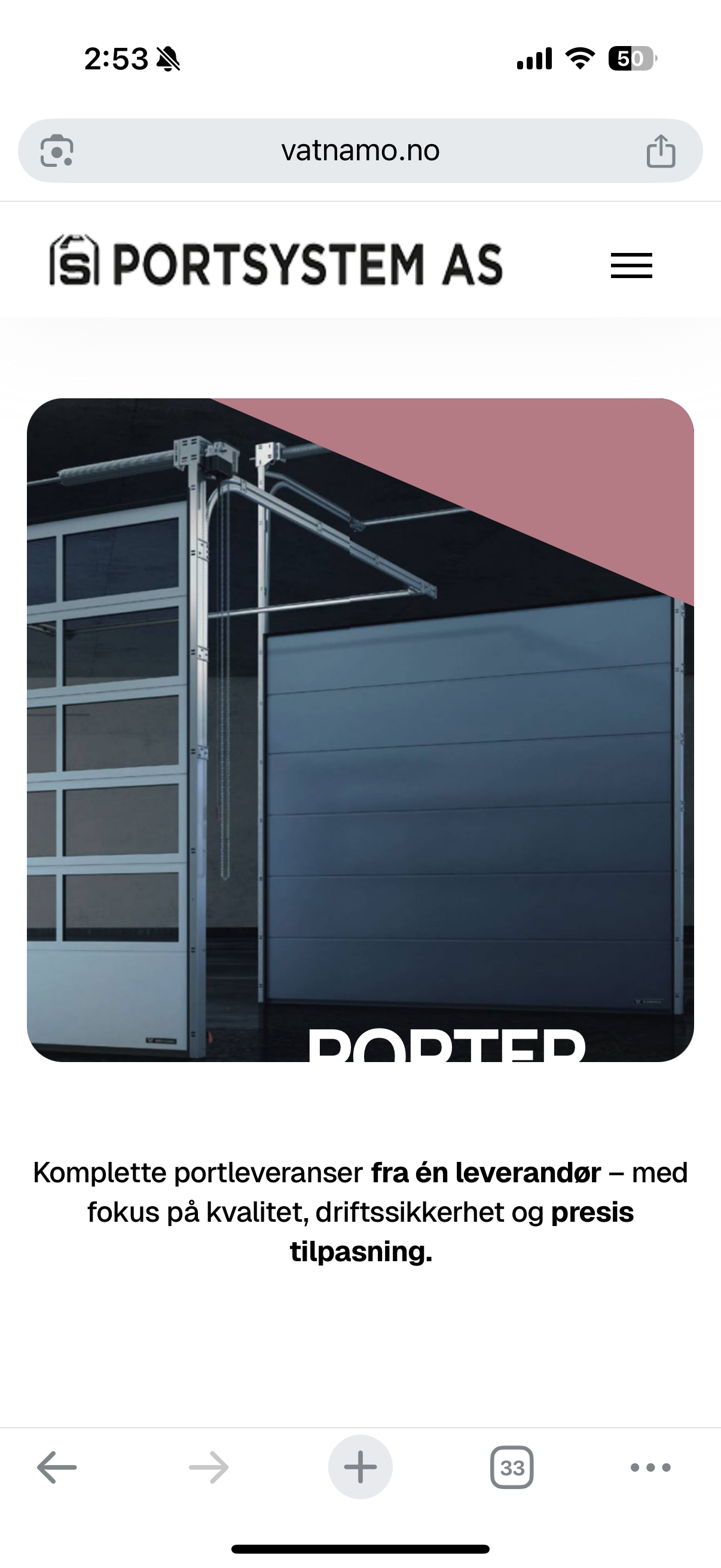
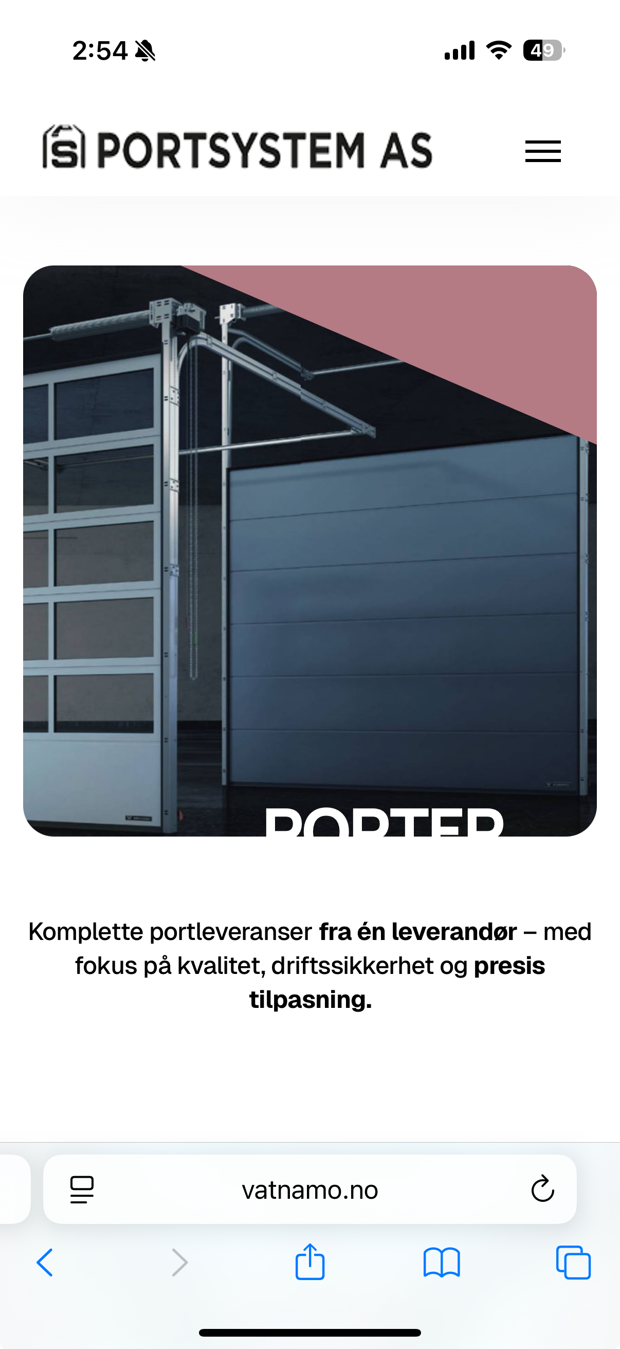
I have selected the alternative menu display for this template and are also using sticky menu. But when scrolling down the menu items kind of dissapears cause they are displayed on top of all images and colors in the template. Can you help me so that the menu background always have a set color so that the menu are easyer to see?
Site is her: https://www.vatnamo.no/porter/
I have put the login in hidden content if you need.

Toufiq
Accepted AnswerHi there,
Thank you for reaching out, and I apologize for any inconvenience caused by this oversight. Please check now and let me know.
Best regards,
Toufiqur Rahman (Team Lead, Support)
Toufiq
Accepted AnswerAdded custom css code inside the custom.css file.
Here is the file location that i have created a custom.css file.
templates/your_templates/css/custom.css
Jeanette
Accepted AnswerPerfect, thank you so much :)
Can i ask where you changed this in case i want another background color?
Also i would like the menu fonts bigger, but cannot figure out where to change this?
Toufiq
Accepted AnswerWe are glad to know that your issue has been resolved successfully. If you are comfortable, we would truly appreciate a short 15–20 second selfie video sharing your experience with our support team.
The video may be published publicly on our official social media platforms to help other users understand the quality of our support services. This is completely optional, and we will proceed only with your consent.
Thank you
Jeanette
Accepted AnswerHi Toufiq,
Seems i have a follow up on this one.
My logo is now on top, but on MOBILE screen it displays only "half".
I have put this code in custom.css:
@media screen and (max-width: 767px) {
  #sp-header {bottom: auto;top: 0px;}
}
If i change the top to f.ex 30px the logo will show better when opening the page, but when scrolling it will "show half" again.
Also as you can see of the enclosed image, the text on the topimage are not showing when on mobile. Can you check this at the same time please?
Can you help?

Jeanette
Accepted AnswerSomething happened with the menus now, they are all wrapped to the right. The mobile looks good now, but the desktop menus are weird.
Jeanette
Accepted AnswerPlease can you check this quickly cause i am in the process of showing the site to my customer. Sorry for the inconvenience.
Jeanette
Accepted AnswerHellooooo - This is urgent! I dont know where you did a change so i cant fix it myselves.
Jeanette
Accepted AnswerHi again,
I want to say it was not good that this was not checked before telling me its done. I had a client meeting to show the website and i could not show it like this. So meeting was delayed cause i needed to fix this.
Ihave tried to fix this myselves and entered the following in my custom.css:
/* trying to let the menu bar not wrap */
.col-10 {
    width: auto;
}
This made the menu be ok again on the desktop but now its bad on the mobile again. Please fix this and also check that it is working on all resolutions.
I suppose this is not to be set in custom.css so please do the needed changes.
Toufiq
Accepted AnswerNow the Pre-defind header is disabled. You can controll it your end by settings.
Jeanette
Accepted AnswerHi again,
I dont need to control the menu. I just need the menu to work properly at both desktop. As in your other templates this works fine, but not in this unfold template.
The mobile version is still the same, the logo is to high and the text on the frontpage image are not showing. Will you please check again.
Jeanette
Accepted AnswerNothing is working fine now. The menu and logo on the desktop version is fcked up and the menu on the mobile version is gone.
Dont you do any testing before you ask me to check? This is really not good - my client are checking this site atm and it cannot be like this. Please fix this immediately.


Jeanette
Accepted AnswerI have disabled the insert you did in the css but it did not help to fix anything.
I am so frustrated right now, the site top menus, button and logo cannot look like this while my client is testing.
I have no idea what you changed but i need you to reset so the site looks ok at least on desktop for now!
Jeanette
Accepted AnswerI have done nothing. It was like this when i came back from the meeting with my client and we started to check the site. I removed the line you put in custom.css, but that did not do anything.
I have cleared the cache but nothing is changing.
Jeanette
Accepted AnswerHang on, it looks ok now! But the button to the right is a bit down. It should be on the same heigh/level/row as the menus. Can you check this?
Maybe the cache cleaning took some time to show.

Ziaul Kabir
Accepted AnswerJeanette
Accepted AnswerHi again, If i can ask one more thing, that is for the big letters on the main picture to display on mobile (text: Porter for industri og bolig). These are so big that they dont show when on mobile. I checked your demo template and the letters/text are not fully visible there either. Seems like they are not scaling. Could you fix?
Please remember my client is still going through the site so want you to be aware of this so that we dont get the same situation as yesterday. Thank you.
Check screenshot here:

Ziaul Kabir
Accepted AnswerPlease, check now: https://prnt.sc/5MicM7O_agoD
Thanks
Jeanette
Accepted AnswerI can see when using "browser inspect" option and viewing the mobile version it looks ok. But on the actual mobile it dont.
It still looks like this, but it has maybe changed a bit displaying a smaller text but still not fully visible on the image.

Jeanette
Accepted AnswerI dont understand what you mean with the browsers work fine.
On my phone the text "Porter for industri og bolig" are not displayed on mobile. The images you included is also showing that the text is not fully displayed.
The text "Porter for industri...." is placed down on the image and the full text is not visible on your images also.