
Educon Template Detected An Anomaly In Its Usage.
U
Unchana
The Educon Template is displaying incorrect button colors when changing the Default Style, Primary Style, Success Style, Warning Style, Info Style, Danger Style, or Link Style. Please check and fix this problem.
5 Answers
Order by
Oldest

Rashida Rahman
Accepted AnswerHi Unchana,
Thanks for reporting this, and sorry for the trouble.
Educon applies its own button styling on top of Bootstrap's default classes, so the Primary / Success / Warning / Info / Danger / Link variations may not render the colors you'd expect. Before we confirm whether this is a bug or the template's intended styling, could you share a few details?
The front-end URL of the page where the buttons appear. Where exactly you're changing the style — the SP Page Builder Button addon, a module, or a Joomla article. Your version numbers: Joomla, Educon template, SP Page Builder, and PHP. A screenshot showing what you're getting vs. what you expect. A temporary Super User login in the Hidden Content field below, so we can inspect the setup directly.
Once we have those, we'll reproduce it on our end and either send you a custom CSS fix or forward it to our development team for the next template update.
Best regards,
U
Unchana
Accepted AnswerURL : https://educondemo.fiet.kmutt.ac.th/demo/addons-buttons-educon-template.html
The environment used to create web pages.
- SP Page Builder Button addon : Addons Buttons - EDUCON Template
- Joomla Version : 6.1.3
- EDUCON Template Version : 4.0.3
- SP Page Builder 6 Pro Version : 6.9.0
- PHP Version : 8.3.6
Received screenshot :
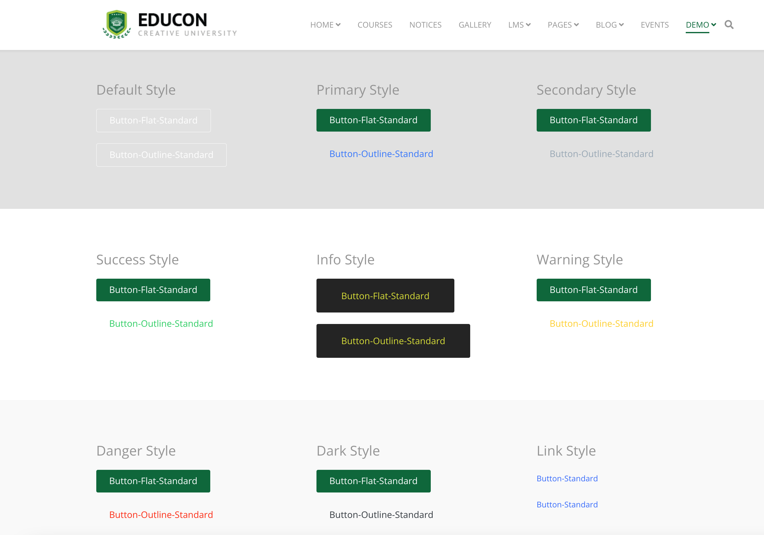 URL : https://educondemo.fiet.kmutt.ac.th/demo/addons-buttons-educon-template.html
Expected screenshot :
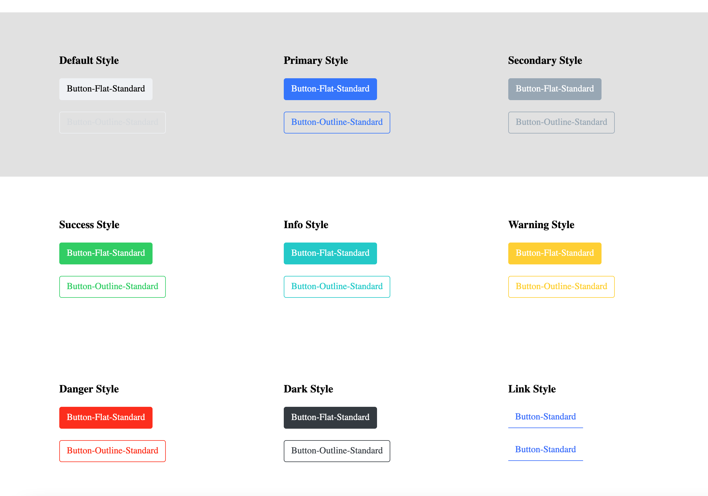 URL : https://educondemo.fiet.kmutt.ac.th/demo/addons-buttons-cassiopeia-template.html
Rashida Rahman
Accepted AnswerHi Unchana,
Thanks for the details, and sorry for the trouble.
We reproduced this on a clean install, and it's expected template behavior rather than a bug. Educon intentionally restyles buttons in its own palette: the template only defines colors for Default, Link, and Info, and the preset adds Primary — Success/Warning/Danger aren't styled, so they fall back to white text with no background. That's why they differ from Cassiopeia, which keeps Bootstrap's standard colors.
To bring the standard colors back, please add this to Template Options → Custom Code (so it survives updates):
body .btn.btn-success, body .sppb-btn.sppb-btn-success { background-color:#28a745; border-color:#28a745; color:#fff; }
body .btn.btn-warning, body .sppb-btn.sppb-btn-warning { background-color:#ffc107; border-color:#ffc107; color:#212529; }
body .btn.btn-danger, body .sppb-btn.sppb-btn-danger { background-color:#dc3545; border-color:#dc3545; color:#fff; }
body .btn.btn-info, body .sppb-btn.sppb-btn-info { background-color:#17a2b8; border-color:#17a2b8; color:#fff; }
body .btn.btn-default, body .sppb-btn.sppb-btn-default { background-color:#f8f9fa; border:1px solid #ced4da; color:#212529; }
Let us know if you'd like the buttons matched to Educon's theme colors instead.
Best regards,
Rashida Rahman
Accepted AnswerHi Unchana,
Happy to help with that. Educon's colors come from the active preset (Preset 1 in your setup), whose palette is Major/primary #3f51b5 and accent/hover #ffc94e. To make all the button variants use Educon's theme colors instead of Bootstrap's defaults, add the CSS below to Template Options -> Custom Code -> Custom CSS (that keeps it update-safe), then clear your site cache.
/* Educon theme button colors (Preset 1 palette) */
/* Base: primary/major #3f51b5, accent/hover #ffc94e */

body .btn, body .sppb-btn { border-radius: 4px; transition: all .3s ease; }

/* Primary / Default -> Educon major color */
body .btn.btn-primary, body .sppb-btn.sppb-btn-primary,
body .btn.btn-default, body .sppb-btn.sppb-btn-default {
  background-color: #3f51b5; border-color: #3f51b5; color: #fff;
    }
    body .btn.btn-primary:hover, body .sppb-btn.sppb-btn-primary:hover,
    body .btn.btn-default:hover, body .sppb-btn.sppb-btn-default:hover {
      background-color: #ffc94e; border-color: #ffc94e; color: #212529;
        }

        /* Info / Link -> lighter tint of the major color */
        body .btn.btn-info, body .sppb-btn.sppb-btn-info,
        body .btn.btn-link, body .sppb-btn.sppb-btn-link {
          background-color: #5c6bc0; border-color: #5c6bc0; color: #fff;
            }
            body .btn.btn-info:hover, body .sppb-btn.sppb-btn-info:hover,
            body .btn.btn-link:hover, body .sppb-btn.sppb-btn-link:hover {
              background-color: #3f51b5; border-color: #3f51b5; color: #fff;
                }

                /* Success -> theme-consistent green */
                body .btn.btn-success, body .sppb-btn.sppb-btn-success {
                  background-color: #2e7d5b; border-color: #2e7d5b; color: #fff;
                    }
                    body .btn.btn-success:hover, body .sppb-btn.sppb-btn-success:hover {
                      background-color: #256b4d; border-color: #256b4d; color: #fff;
                        }

                        /* Warning -> Educon accent color */
                        body .btn.btn-warning, body .sppb-btn.sppb-btn-warning {
                          background-color: #ffc94e; border-color: #ffc94e; color: #212529;
                            }
                            body .btn.btn-warning:hover, body .sppb-btn.sppb-btn-warning:hover {
                              background-color: #f0b62f; border-color: #f0b62f; color: #212529;
                                }

                                /* Danger -> theme-consistent red */
                                body .btn.btn-danger, body .sppb-btn.sppb-btn-danger {
                                  background-color: #d64541; border-color: #d64541; color: #fff;
                                    }
                                    body .btn.btn-danger:hover, body .sppb-btn.sppb-btn-danger:hover {
                                      background-color: #bf3a37; border-color: #bf3a37; color: #fff;
                                        }
A few notes: I mapped Primary and Default to the Major color (#3f51b5) with the accent (#ffc94e) on hover, Warning to the accent color, and gave Success/Danger/Info theme-consistent shades so everything reads cleanly against Educon's palette. If you'd prefer different shades for Success/Danger, just let me know your preferred hex values and I'll adjust. Also, if you switch presets later (Preset 2/3/4), tell me and I'll send matching values.
Best regards,