

Dynamic Content In Columns
S
Sandra
Hi,
I would like to make a custom portfolio that would look like this :
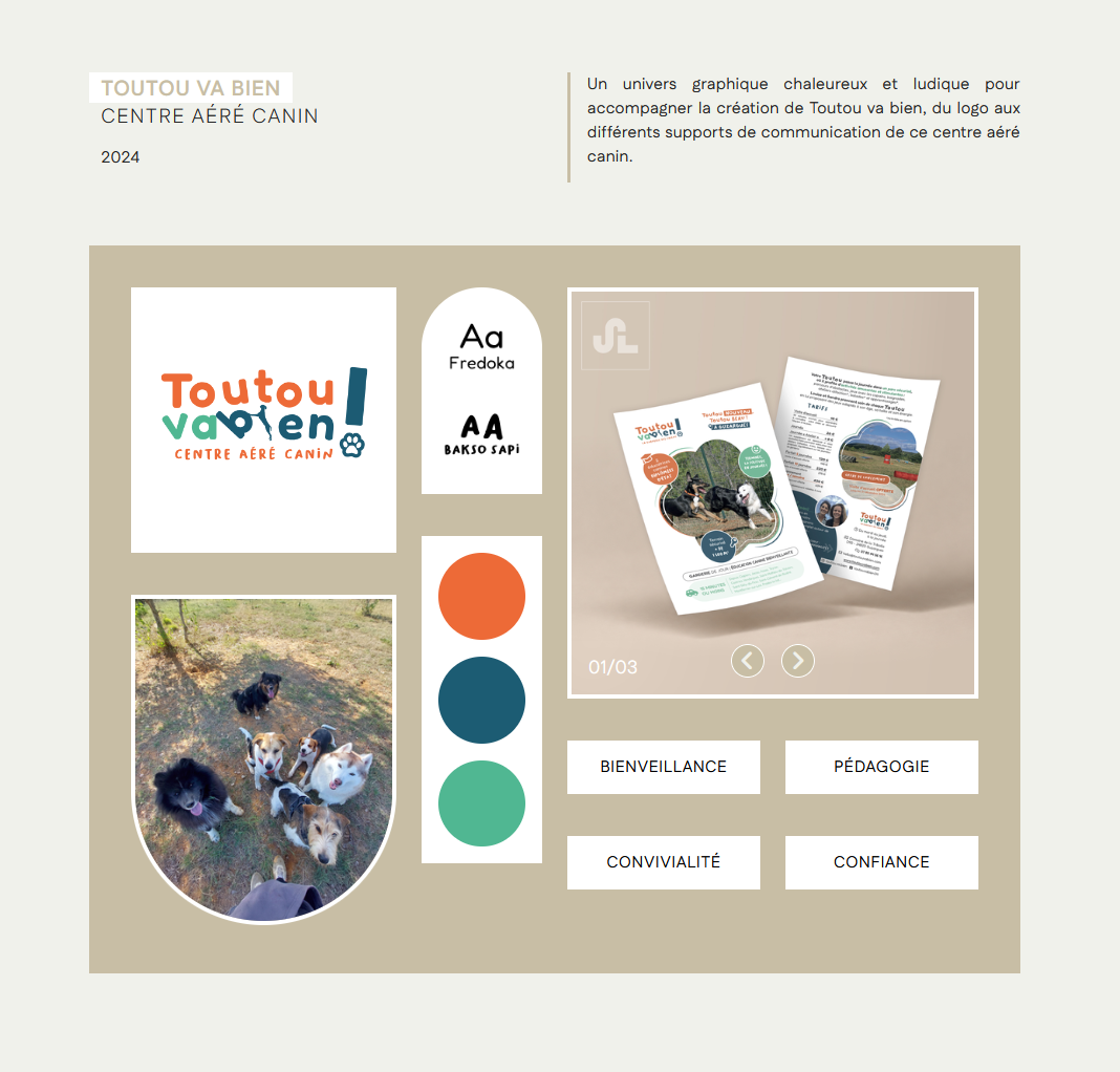
I won't have many projects to present, but I will probably have to make a template for laptop and another for mobile/tablet so I would like to use dynamic content if possible to avoid adding manually twice the same contents.
But when I'm on my page, I add a collection, and then I can't add columns in it, so I can't display the content the way I would like to do it. Is there a way to do so ?
3 Answers
Order by
Oldest
S
Sandra
Accepted AnswerAnd since I'm at it, is there an easy way to add an hex code in the dynamic content item and then use it in the css to change the colors "patches" in the project ? 😇 For the slideshow, I guess it's not possible to use dynamic media ?

Rashida Rahman
Accepted AnswerHi Sandra,
Thanks for reaching out.
Columns inside a Collection — Row and Columns can't go inside the Collection addon, but the Div addon can. Drop a Div in, set Display to Flex or Grid (Div → General → Display), and nest more Divs inside it holding your Dynamic Text / Dynamic Media addons. That gives you the grid from your screenshot, repeated per item.
The Collection addon also has its own: General → Layout → Type (Grid or Stack), Columns, Column Gap, Row Gap, each with a per-device setting.
For one project across a full page, use a Detail Page: Pages → + Add → New Dynamic Content Page → your collection → Detail Page. There you build with normal Rows and Columns and the dynamic addons map straight to your fields — no Collection addon needed. Keep the Collection addon on your listing page for the project cards.
Laptop vs mobile/tablet — one template is enough. Rows, columns, Divs and addons all have per-device settings, plus Advanced → Responsive → Hidden on Laptop / Tablet Landscape / Tablet Portrait / Mobile Landscape / Mobile Portrait. Content is entered once in the collection item either way.
Slideshow — yes, this works. Add a Gallery field to your collection, then use the Dynamic Media addon and turn on Enable Slider (General → Options). You get width, height, gap and radius controls, and the images stay per-project.
Colour patches — there's no Color field type yet, so a hex value can't drive the CSS. Use an Image field with a small solid-colour image per shade and output it with Dynamic Media.
Hope this helps!

Toufiq
Accepted AnswerHi there,
Thank you for reaching out. Please watch the video. I hope this video will help you.
https://drive.google.com/file/d/1_2uEWJwBaNx1U7IjUrvAcAzCuWcA7Hw4/view
Best regards,
Toufiqur Rahman (Team Lead, Support)