Black Friday 2026 50% off every plan Our biggest deal of the year on #1 Joomla products.
Ends in 13d 05h 53m 51s
Claim 50% off
Staff replied Templates Joomla 6 easy store 3.1.1

Problem with products and filter after updating to EasyStore v3.1.1 (Selixo Template)

Asked by Luciana Marina Machuca 3 days ago Last activity 5 hours ago

Hello, my template has undergone several changes after updating to Easy Store 3.1.1 on the Selixo template.

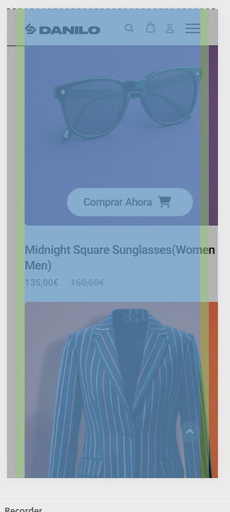
  1. Product overflow on desktop and mobile views: The products don't seem to fit within the row container.
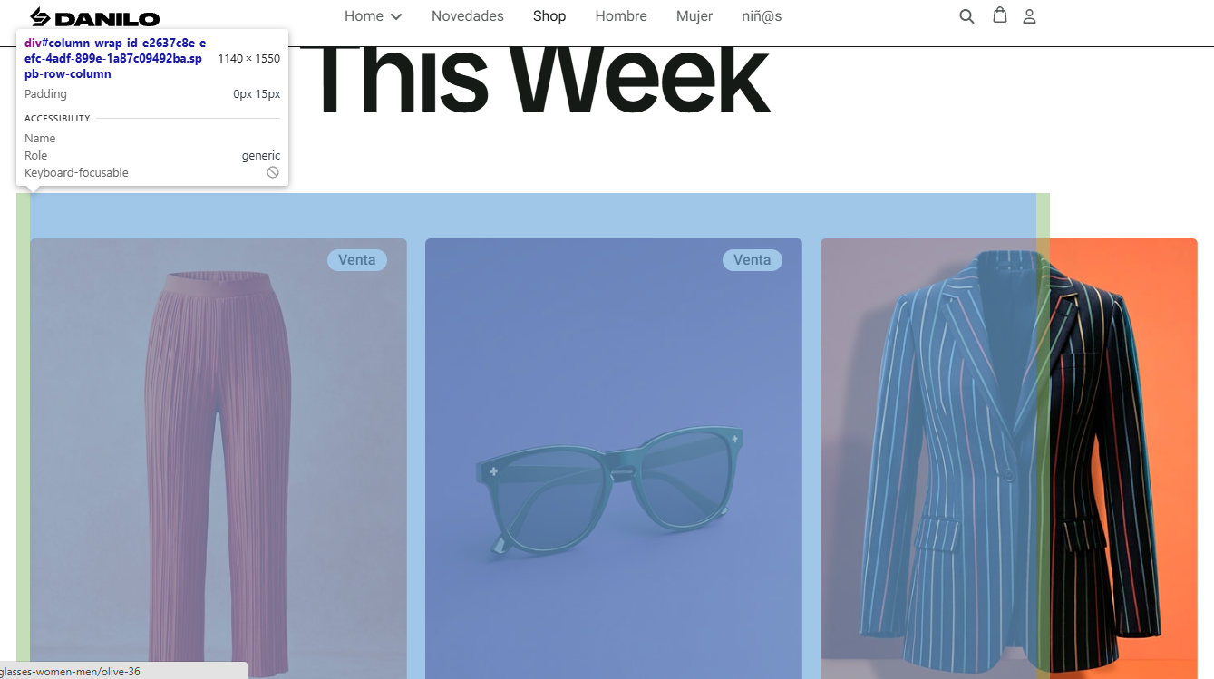
    description

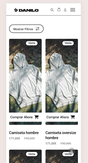
It also happens on mobile phones:
description

I checked the addon settings but I can't find a solution. I did a second installation of the quickstart and the problem started right after updating.

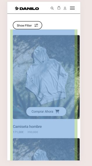
  1. Product filter in mobile view: Right after updating, the top part of the filter panel is also hidden by the menu, making it impossible to close it once it has been expanded.
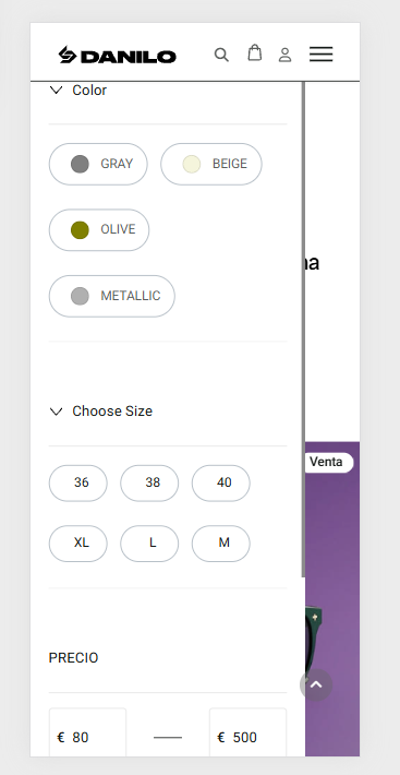
    description

9 replies

Ziaul Kabir Staff
3 days ago · edited

Hello,

Thanks for reaching out to us.

Could you please check it now? I've added a small piece of CSS to the Custom CSS section:

@media (min-width: 991px){
#sppb-addon-09531436-22c1-4520-a260-39a0a3a5c975 .sppb-collection-addon,
#sppb-addon-a299d462-e64b-47d0-b5f1-79ca216eabf3 .sppb-collection-addon{
    grid-template-columns: repeat(3, minmax(0, 1fr));
}

}
.easystore-list-filter-custom .addon-root-easystore-list-filter {
        top: 60px !important;
    }

Please let me know if everything is working as expected.

Thanks!

Luciana Marina Machuca Asked this

Thank you so much for your quick response. This has resolved the issue in the add-on on this page, but it's also happening on the storefront (https://www.bydanilowear.com/shop). How can I configure your code so that it defaults to the way you've set it everywhere?

Thanks!

Ziaul Kabir Staff

I'm now using a common CSS class, so this styling will apply across your entire site wherever you use the Product List Addon with a three-column grid layout.

@media (min-width: 991px) {
    .sp-page-builder .sppb-collection-addon {
        grid-template-columns: repeat(3, minmax(0, 1fr)) !important;
    }
}

This way, you won't need to add the CSS separately for each Product List Addon.

Thanks!

Luciana Marina Machuca Asked this
2 days ago · edited

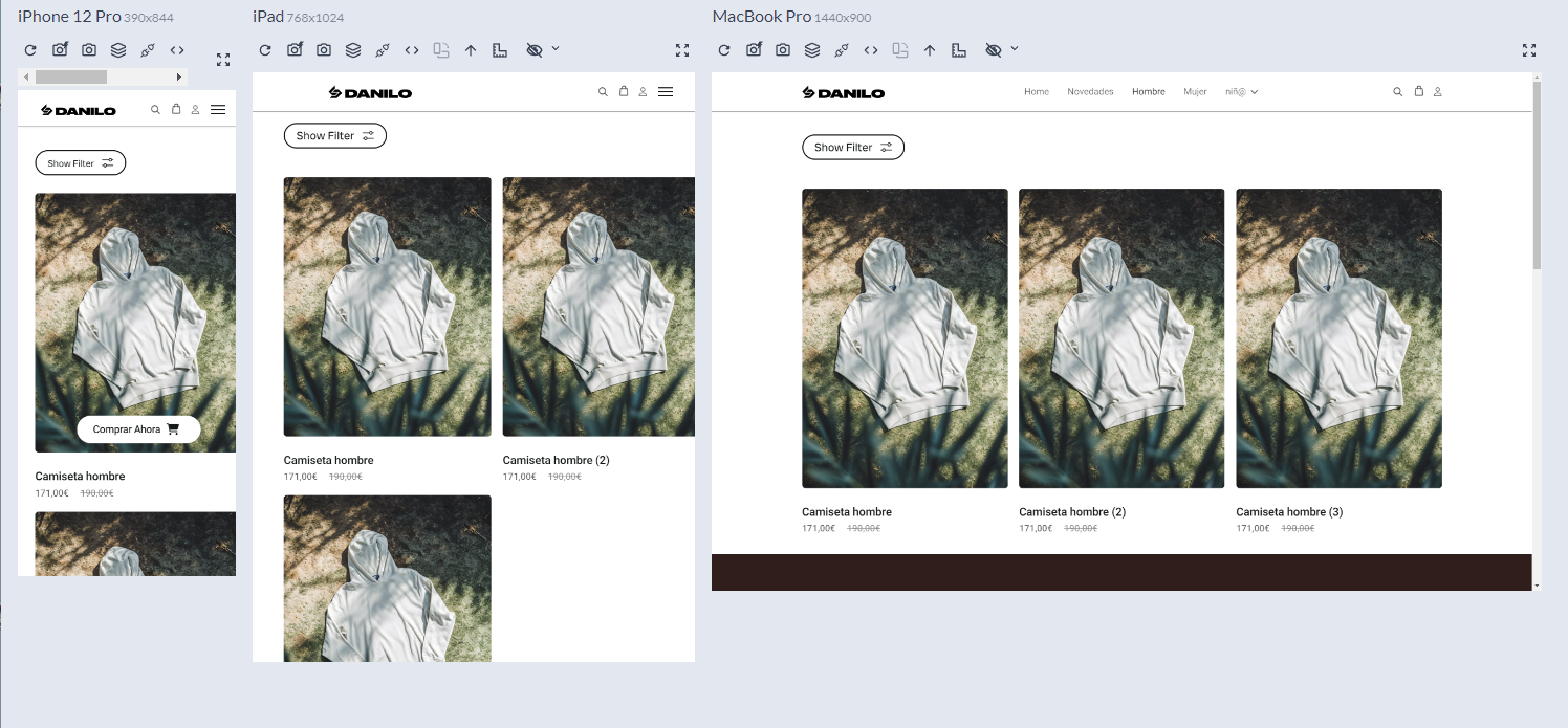
Hello, the problem was resolved in the addon only in desktop, but not in mobile and tablet, and the storefront page. The products are overflowed to the right on mobile and tablet screens. Nothing I do in the columns or rows (padding or margin) works.

I understand that the classes of the addon are different from those of the storefront page. Please look at these screenshots:

please check: https://www.bydanilowear.com/hombre/camisetas (storefront easystore page)
description
description

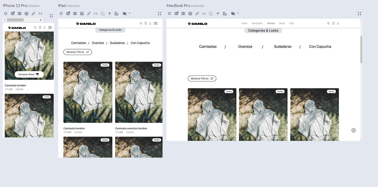
And check addon page:
please check: https://www.bydanilowear.com/hombre
description

It looks like the template needs to be polished after upgrading to easystore 3.1.1

Ziaul Kabir Staff

Please, check now from incognito mode. Here is the revised css:

@media (min-width: 991px){
.sp-page-builder .sppb-collection-addon{
    grid-template-columns: repeat(3, minmax(0, 1fr)) !important;
}
}
@media (max-width: 991.98px) {
 .sp-page-builder .sppb-collection-addon {
        grid-template-columns: repeat(2, minmax(0, 1fr)) !important;
    }
}
@media (max-width: 767.98px) {
    #sppb-addon-a299d462-e64b-47d0-b5f1-79ca216eabf3 .sppb-collection-addon {
        grid-template-columns: repeat(1, minmax(0, 1fr)) !important;
    }
}

.easystore-list-filter-custom .addon-root-easystore-list-filter {
        top: 60px !important;
    }

Thanks

Luciana Marina Machuca Asked this

Thank you very much for your quick response, everything is OK except for the mobile view on the page where the add-on is inserted (https://www.bydanilowear.com/hombre), which now looks like this:
description

Ziaul Kabir Staff

Hello,

Could you please try accessing it using a different browser or a mobile device?

I've checked it on both my phone and Mac, and everything looks good on my side. Each row contains only one item, as expected.

Screenshot for reference:
https://prnt.sc/0-AZf56YFsF5

Thank you!

Luciana Marina Machuca Asked this

Hi!, yes, I finally solved it with a little AI, but I'm having trouble adjusting the template to my needs. Now, with this CSS applied (I've copied all your CSS to custom.css along with all my additional settings), the add-on controls aren't working (for example, at the bottom of the product page I want 4 columns, and although it's configured in the add-on there are only 3, which I understand is due to the CSS we've added). My question is: Isn't there a global solution for the entire template that adjusts the container that got messed up when EasyStore updated to the latest version? Is there a solution that allows me to configure the add-ons freely without having to adjust each thing with CSS? I'm thinking not only about the present, but also about the near future when I implement more products of different types and find that I can't quickly adjust my store to my needs.

Thanks!

Ziaul Kabir Staff

Hello,

We are currently working on SP Page Builder version 7.0. In the meantime, please follow the workaround below.

If you want to display products in 4 columns, simply replace 3 with 4 in the following CSS:

grid-template-columns: repeat(4, minmax(0, 1fr)) !important;

We have also forwarded this issue to our development team. They will work on a permanent fix after the release of version 7.0.

Thank you for your understanding.

Best regards,

Log in to reply.