
Hello!
the sticky menu (canvas) on mobile does not work consistently,
In some situations it is not shown at all, sometimes the menu display is flickering.
Maybe a layer problem?
Is it possible to turn off the fade in? If yes/ where???
Please test on a mobile device! Testing with the browser on mobile works. See my screenshot here:
https://prntscr.com/21dog53
Staff replied
SP Page Builder
Sticky on mobile does not work consistently on portfolio & other pages
Asked by Klaus Fuchs
4 years ago
Last activity 4 years ago
34 replies

Toufiq Senior Staff
Hi there,
Thanks for contacting us. Sorry for the inconvenience. I have checked my end and no problem found.
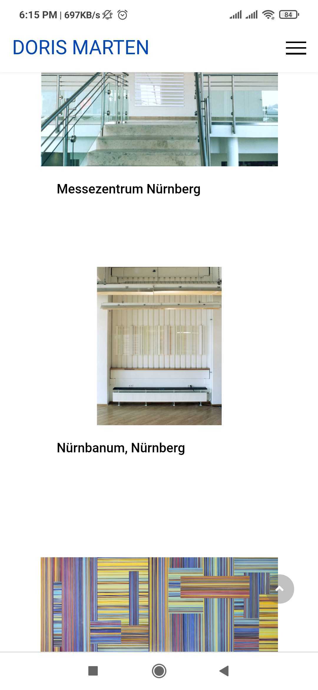
-Thanks
Klaus Fuchs Asked this
Hi,
as mentioned. it is not consistently.
see:
https://prntscr.com/21klj99
What I figured out on mobile:
if you scroll to the very end of a page, then start to scroll up slowly, no sticky menu anymore. Yoiozu can see it here:
http://dev.dorismarten.com/images/sticky.MP4
Maybe switch off the fade in of the sticky menu?
Regards
Klaus

Pavel
Hi. Try this code
#sp-header {
animation: none !important;
}
Klaus Fuchs Asked this
4 years ago
· edited
hi,
no change:-(
I tried:
Iphone 8:
safari, opera, FF
all the same issue:
browse to the end of a page, then swipe to go up, no sticky menu, swipe done, sticky menu ok.
If I try desktop with responsive viewer it works.
I need to have that fixed.
I found that:
https://github.com/JoomShaper/helix-ultimate/issues/149
Thanks Klaus
Toufiq Senior Staff
Please check & let me know. Thanks
Klaus Fuchs Asked this
Hi,
no. this Link shows that the issue still exists.
I urgently need a solution on that, my client is not amused. And because of the other issue--> https://www.joomshaper.com/forum/question/8941 It is getting critical.
I build a fast copy of the website with joomlashine and with yootheme pro, it works as expected without any bugfixes or individual coding.
Please take this issue as a urgent & serious issue with priority.
I hope we find a solution in the next two days.
Klaus
Pavel
4 years ago
· edited
Hi. Delete this one
#sp-header.header-sticky {
    animation: initial;
}
Replace
#sp-header {
    animation: initial;
}
to
#sp-header {
    animation: none !important;
}
Set Header offset to 0 in template settings (Basic tab).
This is the maximum what can be done without editing core template files.
Unfortunately, Header is still a headache in Helix Ultimate throughout its existence.
Klaus Fuchs Asked this
hi thanks for the answer.
But still the same issue.
Browse on a mobile device until the bottom of a page. Then browse to the top - no header, browse bit down header is shown, but then browse up - no more header.
This is a crucial error, I hope I can explain this to my customer, if not I have to use another framework :-) Especially that the other error, sorting in portfolio, is still not fixed.
Klaus
Pavel
Did you make a cache cleaning on your device? I checked on my Samsung - Firefox, Chrome - works great without any problems
Pavel
4 years ago
· edited
UPD. I checked your site until full loading. At this moment, the browser toolbar panel is static. After page full loading, I saw the problem - it is associated with a floating browser toolbar. When it appears Header disappears. Nevertheless, there was no such problem in Helix Ultimate 1.
For the developers team, you can reproduce the problem on the desktop. To do this, you need to cause a shock effect on the page. If you click F 12 To invoke Dev Tools Header disappears, just like on mobile device. After closing the Dev Tools Header begins to work not correctly until page refresh.
Klaus Fuchs Asked this
ok,
thanks again for your answer,
what is there to do to make it working?
Is there a workaround, any idea?
Klaus
Toufiq Senior Staff
@Klaus Fuchs can you share a screencast video?
Klaus Fuchs Asked this
Hi, here it is:
Toufiq Senior Staff
Can you please provide me the FTP access?
Klaus Fuchs Asked this
4 years ago
· edited
here it is:
Thanks!
Pls. confirm if u can access.
Toufiq Senior Staff
Sorry it doesn't work. Please don't make it public. Share your FTP access via hidden content area. Thanks
Klaus Fuchs Asked this
see hidden content
Toufiq Senior Staff
I have also found the issue in our demo Helix. I need to discuss with our developer team. I will get back to you soon. Thanks
Klaus Fuchs Asked this
cool! That would be great!
Thanks, Danke, Merci.
Toufiq Senior Staff
Added in our to do list. I hope it will fix as soon as possible. Thanks
Klaus Fuchs Asked this
hi,
any news?
regards Klaus
Toufiq Senior Staff
Hold on for the next update. We are working for update. We need more time. Thanks
Klaus Fuchs Asked this
Hi, any news about that topic?
...
Let the navbar stick at the top of the viewport while scrolling OR only when scrolling up.
I want to have it stick on the top and not sticky ONLY when scrolling up.
The issue is only on mobile, Desktop = ok.
Do you need another screen recording to fix the issue, or if you know already, when it will be fixed, I need to tell my client when it will work.
Thank you
Toufiq Senior Staff
Hi there, We are working Page Builder 4 and Today or tomorrow you will get an update about the page builder 4. Helix Ultimate update will as soon as possible. Please allow more time. Thanks
Schwyzer
Hi, I also have the same problem with a complet new website, made with Joomla 4 and the newest Page Builder and Helix Ultimate............the sticky header on mobile is horrible...
It would be good to update soon.....
Thanks a lot.
Kind regards,
Maggie
Deleted user
Issue solved. Here is the updated file.
Schwyzer
4 years ago
· edited
Hi,
Thanks for your Update, but it doesn't work, my header is still shacking/flickering on iphone.....hmmmm..
Deleted user
@Schwyzer can you please share your site url.
Thanks
Schwyzer
Toufiq Senior Staff
@Schwyzer I have checked your site & it works fine. Thanks
Schwyzer
Hi Toufiq....it works fine on desktop....but on mobile the header is shacking and flattering.....if I move up and down....its not realy sticky....
Deleted user
Can you tell me your browser and device name. We checked on iphone and others devices also. please check on broswer incognito mode. Maybe your facing cache issue.
Schwyzer
Well, thats it, I cleaned the cache on my iphone....and it works!!!!!!!
Thank you sooo much for your help.
Kind regards,
Maggie
Toufiq Senior Staff
Glad to heard that your problem has been solved. Thanks
Log in to reply.