In order to have a fluid with menu on https://clef-des-champs.ch/ I had to create a custom header instead of the predefined header.
But since then the offcanvas menu on https://clef-des-champs.ch/ appears beneath the Menu.
If I set margin-top to -105px in body.ltr #offcanvas-toggler.offcanvas-toggler-right the offcanvas menu doesn't work anymore.
Any ideas how I can solve this problem?
Thanks and Happy New Year
Solved
Helix Framework
Offcanvas: Position beneath Menu
Accepted answer
Marked as the solution
Pavel
Hi.
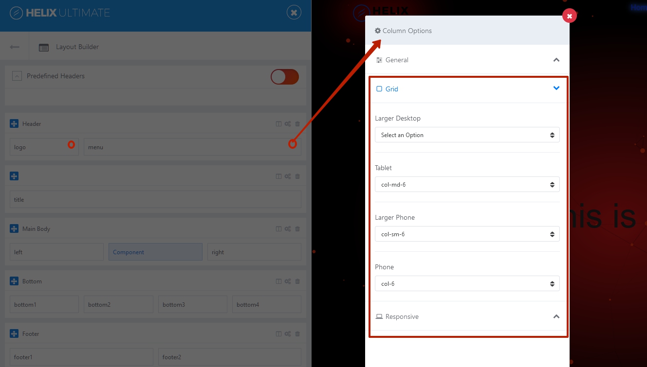
You should adjust the column width in the template settings for different devices. (Column Grid settings)
9 more replies
jpberry Asked this
Thanks, that did the job!
jpberry Asked this
Thanks, that did the job.

Rashida Rahman Staff
Thanks Pavel, for your valuable contribution to the forum!
Pavel
You are wellcome :)
jpberry Asked this
Sorry to bother you again.
I just realised that the menu on https://clef-des-champs.ch/ doesn't change in to offcanvas mode in tablet view ... Do I have to change the breakpoint or can I adapt the settings in the layout builder of my helix ultimate template?
Pavel
Hi. In bootstrap, Tablet breakpoint starts at 991 px. Everything is working correctly on your site. If you need to do it on a wider screen size, you need to write custom css code for this

jpberry Asked this
Yes, but I want to set the breakpoint for canvas menu at 1024px already. How can I do that?
Pavel
@media (max-width: 1023px) {
    .sp-megamenu-parent {
        display: none !important;
    }
    #offcanvas-toggler {
        display: block !important;
    }
}
jpberry Asked this
Great, thanx!
Log in to reply.