
Hi,
How can I close the gap between the mobile header and the first row with the H1 page title in it without destroying the desktop version or having to create one version for desktop and one for mobile please?
Kind regards
Claire :-)
Hi,
How can I close the gap between the mobile header and the first row with the H1 page title in it without destroying the desktop version or having to create one version for desktop and one for mobile please?
Kind regards
Claire :-)
Thanks Claire,
in that case, the custom CSS fix to reduce -50px from the top would be:
  @media (max-width: 980px) {
.sp-page-builder .page-content #top_row {padding-top: 0 !important; }
    }
To reduce even more (-70px) I would use longer version:
  @media (max-width: 980px) {
.sp-page-builder .page-content #top_row {padding-top: 0 !important; }
.sp-page-builder #column-wrap-id-1675272505251 {margin-top: 50px !important;}
}Hi Claire,
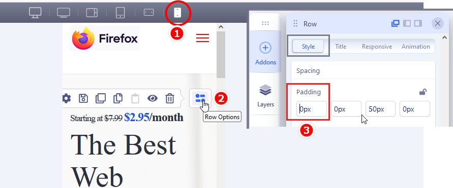
easy, all you have to do is use Row settings and change padding-top value for mobile view only, from 50px to 0px.
OR do this same in Column settings, but this time for margin-top from 70px to 0px
Useful guide screenshot for you
BTW
Great activity for kids :)
BTW
I would only change order of menu items and replace places "Our Gym" (2) with "About Us" (5)
and put info about parking possibilites and how to get using Bus? in Contact Page (as parent this info is important, at least here in Europe)
Hi Paul,
Thank you for your reply, the 2nd lot of tips were great thank you!
I know how to do row, column and addon padding & margins. I cant remove the top 50px as this also affects the desktop version. Is there some bottom padding/margin on the mobile header that can be removed instead? I can't find it.
kind regards
Claire :-)
...forgot to say... I am trying not to use a desktop plus a mobile version of any of the addons to keep it as simple as possible for my clients to edit.
(I don't like the new SPPage Builder layout very much).
😀
Good news in that that we already working to build back-end editor for SPPB 4.0.x
Have you clicked (1) mobile icon to switch mode ?
Aweswome! :-)
Yes, I tried that, but I couldn't see the top addon to edit it. It had disappeared upwards. This is when I ditched that idea and reverted to just one version of the addon for all devices.
In case of ... I can give you CSS solution as well, but first rename Row ID name.
Ok, yes please. I have renamed it to top_row
Many thanks :-)
Thank you very much :-)
as you can see, everything is fixable as McGyver used to say :)
