Hello,
last days I see that my logo is streched on mobile devices, but not on all pages. On desktop it looks fine.
How to correct this again?
Hello,
last days I see that my logo is streched on mobile devices, but not on all pages. On desktop it looks fine.
How to correct this again?
For tablet you have to change value from 680px to 990px (probably) - remeber to refresh browser cache 2x.
Besides, change logo image used on Mobile view, as you know, iPhone/IPad needs better quality of images, so maybe use the same image as you used for Desktop.
Hi
Thanks for contacting us and sorry for your issue. You can use this CSS in your custom.css file
@media (max-width: 576px) {
    .logo-image-phone {
        height: 46px !important;
    }
}
-Regards.
OR try that alternative // ODER probieren Sie diese Alternative aus
@media screen and (max-width: 680px) {
#sp-logo {padding-right: 0;}
 .logo-image-phone {height: auto;max-height: 55px;}
}
I saw that you're using CSS optimization, so clear/reload JCH cache after using above CSS (one of them)
BTW
Correct that, Language switcher (from gptranslate module) shouldn't cover the [=] menu icon in mobile view.
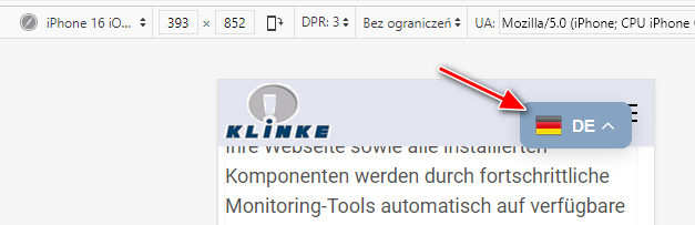
done, thank you!
well, thank you very much, Paul.
I'll try.
But I am wondering why I have to do this and not the template.
the logo is still shown in correct size on startpage, but not on most subpages, tested on tablet first.
I have added your code.
Regards
Peter
Glad to know that its solved and thanks Paul for helping him.

