

Celestia Mobile Version Logo And Offcanva Icon

Massimiliano
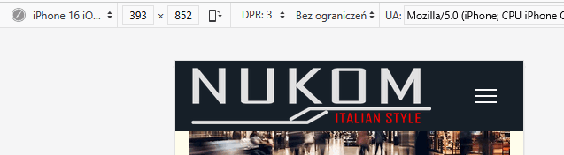
Good evening, in the mobile version the logo appears large leaving no space for the offcanva menu that moves below.
How can I put the logo as large as possible making the offcanva menu appear on the same line?
See image: https://gyazo.com/51183e896e26a738e77eb1529476fee6
thnx for your help
17 Answers
Order by
Oldest

Mehtaz Afsana Borsha
Accepted AnswerHi Massimiliano,
You can now close this post by accepting the answer.
Mehtaz Afsana Borsha
Accepted AnswerHi
Thanks for contacting us and sorry for your issue. You can use this CSS in your custom.css file
.logo-image-phone {
    height: 55px !important;
}
-Regards.
Mehtaz Afsana Borsha
Accepted AnswerHi
It seems ok in my end, please clear your Joomla and Browser cache then check again.

Paul Frankowski
Accepted AnswerI noticed a small problem with [=] on bigger phone, I will correct that in next 3min
Mehtaz Afsana Borsha
Accepted AnswerHi Massimiliano,
Your issue is fixed now and thanks Paul for helping him. Massimiliano you can now close this post by accepting the answer.
Massimiliano
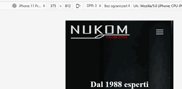
Accepted Answeri'm sorry Paul and Mehtaz
Iphone: with safari and crhome i continue to have the same problem
Android: firefox and chrome same problem
as u see in the picture https://gyazo.com/1e435f276caf4e8715f95c505ad088fc
Paul Frankowski
Accepted Answerwhat phone do you have , what screen size?
Ok, I will check again one thing... but you have to clear browser cache after (!)
Paul Frankowski
Accepted AnswerRefresh browser cache (2x) and check again.
on my Android phone & browser was OK, Logo and [=] Menu is on the same row.
Massimiliano
Accepted Answerdid it but nothing changes, i alsto installed opera borwser on my android phone and i see as before
Paul Frankowski
Accepted AnswerNo changes at all ?? impossible.
What phone do you have ?
@Mehtaz - can you check on your phone please.
Massimiliano
Accepted AnswerI found the solution using your code. probably Paul you have a phone with a higher resolution.. I have an iphone15
Changing your css from
sp-logo {max-width: 220px !important;}
to
sp-logo {max-width: 200px !important;}
it looks good.. thanks for your help