

Menu Settings, Colors & Type
In current template in "Top" Menu section we used:
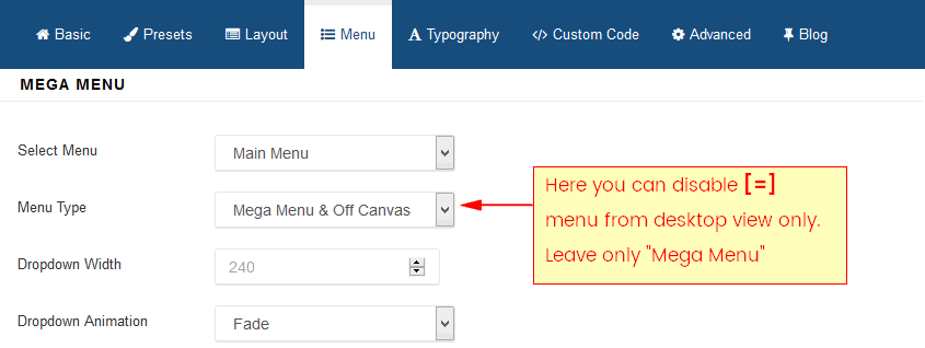
- Main Menu (type: Mega Menu only)
- search icon.
Of course you don't have to use all demo items/elements.
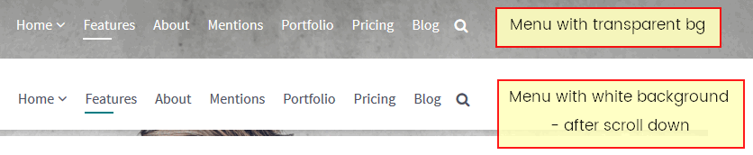
For example pretty easily you can disable Off Canvas [=] menu from desktop view only.
Color of menu items is controlled by template.css but you have to use custom css code inside custom.css file (more info here) to change/override used colors:
.sp-megamenu-parent > li > a { color: green;}
.sp-menu-item > a:hover, .sp-megamenu-parent > li > a:hover {
    color: yellow;
}
.sp-megamenu-parent .sp-dropdown li.sp-menu-item > a {color: grey;}
.sp-megamenu-parent .sp-dropdown li.sp-menu-item > a:hover {color: purple;}
.menu-fixed .sp-megamenu-parent > li > a {color: blue;}
.menu-fixed .sp-megamenu-parent > li > a:hover {color: red;}
In Agency template variation there is a fancy [=] [x] Menu
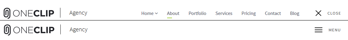
You can easily switch to classic MegaMenu (with all menu items visible) and hide fancy menu using only 2 lines of custom CSS code:
body.variation-agency #sp-menu .sp-megamenu-parent {display:block}

body.variation-agency #sp-menu .show-menu {display:none;}
Note! Do not use "no-scroll" class name for Home menu item.
Please read where to put css code: https://www.joomshaper.com/documentation/helix3/custom-code-settings