
I am using the Helix Ultimate Template.
My Mega-Menu is too large for screens below 1199px.
Is ist possible to force the mobiule menu for screens up to 1199px instead of 990px, other than using custom CSS?
I am using the Helix Ultimate Template.
My Mega-Menu is too large for screens below 1199px.
Is ist possible to force the mobiule menu for screens up to 1199px instead of 990px, other than using custom CSS?
Hi
You have to done this via CSS. There is no default option to do that.
Hi
Thanks for contacting us. I need to try it. Give me a screenshot of your issue.
-Regards.
With Helix Ultimate on screens 990px and below it shows the burger button:
above 990 it shows the full menu. I want it to show the burger button at 1199px and below, not at 991.
Tha's what it is:
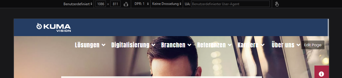
This is what I want:

Therefore I needed to add this to thew custom CSS:
/*** Tablet menu FIX ***/
@media (max-width: 1199px) {
.sp-megamenu-parent > li > a,
.sp-megamenu-parent > li > span,
.sp-megamenu-parent .sp-dropdown li.sp-menu-item > a {
    font-size: 16px;
}
.d-none {
    display: none!important;
}
#sp-header nav.sp-megamenu-wrapper #offcanvas-toggler {
    display: block!important;
margin-top:1rem;
}
}
My question is: CAN I DO THIS WITH TEMPLATE STYLE SETTINGS OR NOT?
I need also this for Helix Ultimate. How to do it? My menu also does not show up correctly on smaller screens.
You can use my CSS Fix above and modify it, if necessary
Unfortenly this code doesn't work properly on Helix Ultimate. It would be awsome if we can easily configure break-points for each device.
I have made it:
@media (max-width: 1400px) {
.sp-megamenu-parent > li > a,
.sp-megamenu-parent > li > span,
.sp-megamenu-parent .sp-dropdown li.sp-menu-item > a {
    display: none!important;;
}
}
This works for my needs.
Glad to know that.
