Hello support, I have tried to place these letters (see the attachment) to the side of the logo, but I have not been able to, even though in the page builder it is on the side, in the mobile version it appears at the bottom, not on the side; However, in the PC version it appears on the right side, can you help me? Is there any CSS I need to add to make it appear on the side?
Solved
Templates
You cannot put letters on the side of the logo.
Accepted answer
Marked as the solution
Paul Frankowski Senior Staff
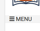
You need only that one very simple, but universal CSS line:
#offcanvas-toggler::after {content: " MENU";}
12 more replies
John Mendivel Asked this
I wanted to put attached images, but it doesn't allow me, so you can see and understand better, help me, thank you.
Paul Frankowski Senior Staff
2 years ago
· edited
But you can add link to image. For example, use your own server to store those screenshots.

Paul Frankowski Senior Staff
2 years ago
· edited
Hola John.
I guess you fogot that your site is in Offline mode, so I can see only login screen and nothing more :p
Is there any CSS I need to add to make it appear on the side?
Probably yes. But I have to see to tell more.
John Mendivel Asked this
2 years ago
· edited
hi support,
Hello support, I sent my access credentials, in desktop mode it looks normal, but in mobile mode, the letters are placed at the bottom, but I want the letters to be on the right side, I have tried to configure with the sp page builder but I have not been able to .
John Mendivel Asked this
Also, how can I change the color of the login module, I used a custom CSS, but it hasn't worked for me, the login module looks a little dark, it is at the top right.
I wanted to put a white on it #ffffff
Paul Frankowski Senior Staff
- Done, I used only columns settings from "Logo" SPPB Module
Paul Frankowski Senior Staff
- Done. I used Custom CSS to override template styles.
John Mendivel Asked this
2 years ago
· edited
Hi, Paul I have noticed that the language switcher module no longer works, I cannot change the language, perhaps something has moved.
what was the configuration you did with the columns of the logo module, I have tried to search, thank you.
John Mendivel Asked this
Another question is how do I make the menu as seen on desktop also be seen on mobile, I don't want to use off canvas because people don't know how to use it, thank you.
Paul Frankowski Senior Staff
We have 2024, and most people know they have to click [=] to see Mobile Menu.
Of course it's quite easy to add word "Menu" after [=] icon.
But keeping classic menu on mobile, looks like in 90's are you really want that?
John Mendivel Asked this
hi paul,
Hi Paul, I noticed that the change language module is no longer working, I can't change the language, I can't click, maybe something has moved.
What was the configuration you did with the columns of the logo module, I have tried to search, it has already been solved, but if you can tell me so I know, thank you.
Paul Frankowski Senior Staff
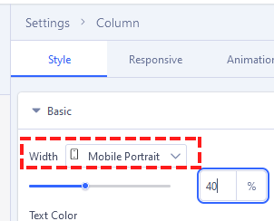
As you know (or not) using columns settings you can change Grid also for Mobile view. Becuase by default each column use 100% of width on Mobile view.
As I remember I set 40% and 50% , example
Paul Frankowski Senior Staff
BTW
I put language switcher module also inside Mobile Menu, it also may help improve UX
John Mendivel Asked this
hi Paul,
It is true, you are right, it is better to have the off canvas, please, how can I put the word MENU to the right of the off canvas icon so that visitors know that it is a menu, thank you.
Log in to reply.