

Mobile Browser Menu Bars Showing Up On Desktop Browser After Upgrading To SPPB 6 Pro
Chris Austin
Hello,
I just upgraded our dev site to SPPB Pro 6 and the top left mobile menu bars now show up in a desktop browser as well as on mobile devices. (Joomla 5.42, Helix 2.23.)
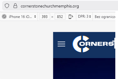
Dev site: https://dev.cornerstonechurchmemphis.org
SPPB Pro in Prod is still on 5.72 and it works as expected. Prod site: https://cornerstonechurchmemphis.org
Can you please help me figure out why the mobile menu bars are showing up on dev in a browser now that its been upgraded?
Thanks,
Chris

Atick Eashrak Shuvo
Accepted AnswerHello Chris,
Apologies for the inconvenience. Please ensure that the Menu Type is set to Mega Menu in Template Options → Menu → Mega Menu settings. You can see an example here: https://prnt.sc/0oV8YiDosqt5.
For more details on configuring the Mega Menu, you can refer to the documentation here: https://www.joomshaper.com/documentation/helix-framework/menu-navigation#mega-menu.
Once this is set correctly, the mobile menu bars should only appear on mobile devices as expected.
Best regards

Paul Frankowski
Accepted AnswerHi Chris,
[=] Menu is from Template, not SPPB Pro, so no relation with used version of component.
If above tip (shared by @Atick) will not help, please use this Custom CSS:
@media screen and (min-width: 1200px) {
body.ltr #offcanvas-toggler.offcanvas-toggler-left {visibility: hidden;}
}
and all will be OK, today and in the future days.
Chris Austin
Accepted AnswerOk. So I should probably clarify that I had a developer create these sites. According to him, he used a lot of custom CSS. I am an IT infrastructure guy by trade not a developer but I'm sure I can easily learn. ;)
It's just strange to me that after upgrading from SPPB 5.72 to 6 these bars are now showing up when they weren't there before...
Nevertheless, the Mega Menu setting is 'Mega Menu & Off-Canvas.' Can you please tell me where I should check for this 'custom CSS' or where I need to add it?
Thanks!
Paul Frankowski
Accepted AnswerRead Helix Documenation (easy lecture) >> https://www.joomshaper.com/documentation/helix-framework/custom-code-css-js-meta
About Mega Menu setting is 'Mega Menu & Off-Canvas' it should be "Mega Menu" only (!) Then Menu will be displayed on Dekstop, and Off-Canvas on Mobile view only. Also described in Helix Documenation.
Chris Austin
Accepted AnswerThanks Paul. Changing that worked on dev.
Oddly enough, that mega menu & off canvas setting is configured that same way on prod but the hamburger menu does not display on a desktop browser in prod. Any idea why?
Paul Frankowski
Accepted AnswerAbout which domain we are talking about?
Becuase also here seems to be OK (your production, Mobile Emulator)
Cyf
Accepted AnswerHi, I've just updated Helix Template and Framework to the last release 2.2.3 in Joomla 5.4.1 but now the mobile menu bar are showing up in desktop, despite the fact that the Menu Type is set to Mega Menu only. I've tried adding the solution described above (shared by @Atick) in custom.css: @media screen and (min-width: 1200px) { body.ltr #offcanvas-toggler.offcanvas-toggler-left {visibility: hidden;} }
But the mobile menu bars are still visible in desktop.
How can I fix this? Any help would be very appreciated.
Paul Frankowski
Accepted AnswerI will repeat my question on what domain you see it ?
Remember to reload browser cache (!) or check on different browser.
Chris Austin
Accepted AnswerHi Paul,
CYF was adding his new query to this thread...
Yes, prod: cornerstonechurchmemphis.org. The bars do not display on a desktop browser (which obviously I don't want them displayed on the desktop) even though the mega menu & off-canvas setting is present. IE, why did I have to change the setting on dev but not prod?
Thanks,
Chris
Paul Frankowski
Accepted AnswerOk, but for what purpose you need [=] on dekstop view? I don't get it.
Chris Austin
Accepted AnswerI guess I'm not communicating well. ;)
I am only asking why on Prod the hamburger menu still does NOT show up on a desktop browser when the 'Mega Menu & Off-Canvas' is enabled but on Dev it DID show up. I had to change the Dev site to 'Mega Menu' only for the hamburger to go away on a desktop browser.
I don't want it to show up on either site; I'm just trying to understand why it was showing up on dev but not prod especially since prod is still set to 'Mega Menu & Off-Canvas'.
Paul Frankowski
Accepted AnswerYou have enabled CSS compression, so I cannot tell why.
But if you really need [=] also on Desktop view use that
#offcanvas-toggler .burger-icon {display: block !important;}
.burger-icon > span {background-color: #eee !important;}Paul Frankowski
Accepted Answer403: Access Forbidden Your location (PL) has been disallowed. RsFirewall :/
Cyf
Accepted AnswerHi, can you give me your IP address so I can add it to the whitelist?
Thank you!
Paul Frankowski
Accepted AnswerWithout access to settings, I can suggest only that solution
@media screen and (min-width:1020px) {
#sp-header.lg-header #offcanvas-toggler {display: none !important;visibility: hidden;}
}
It will hide [=] menu icon on laptop & desktop view.
Cyf
Accepted AnswerThank you Paul! the bars are now hidden in desktop. But I have another problem, before the update, the bars were displayed at the right of the screen in mobile and now it is displayed in the center of the header. How can I fix that? I haven't made any changes to the template.
Thank you again for your help.
Paul Frankowski
Accepted AnswerInside your custom.css file in line 125 , where you have that part of code add "order: 3;"
@media (max-width: 450px) {
  #sp-header.lg-header #offcanvas-toggler {
    margin-right: 0;
    order: 3;
  }
}
and I suggest to change from 450px to 680px in first line of that code.
order 3 means that it must be the last 3rd element.