

Sp-page-title – Responsive Behavior - Nectar Template
R
RicoKir
Hello experts,
I’ve been trying for quite a while but can’t find the CSS needed to adjust it.
On all pages created with SP Page Builder, a responsive behavior is already defined, which works well for me. However, when I open a single article from the blog view (the blog view itself works fine), I get some differences.
With normal-sized viewports everything still looks identical. But the smaller the viewport becomes, the more the responsive layout differs from the other pages.
I have included example links in the hidden content.
Where exactly do I need to adjust the CSS?
9 Answers
Order by
Oldest

Toufiq
Accepted AnswerHi there,
Thank you for reaching out, and I apologize for any inconvenience caused by this oversight. Add this css code inside the custom.css file.
@media screen and (min-width: 320px) and (max-width: 768px) {
.view-article .sp-page-title > .container {
    max-width: 525px !important;
    margin: 0 !important;
    padding: 50px 30px 60px;
    border-top-right-radius: 12px !important;
    background-color: var(--bg-color2) !important;
    z-index: 2 !important;
    position: absolute !important;
    bottom: 0 !important;
    left: 0;
    right: 0;
    max-width: 320px !important;
}
}
Best regards,
Toufiqur Rahman (Team Lead, Support)
R
RicoKir
Accepted AnswerHello Toufiq,
And thank you for the first step. I do have an approximation, but as you can see in the image, the background image of the menu link is zoomed in much more, and the container around “sp-page-title-heading” is also taller.
Toufiq
Accepted AnswerCould you kindly grant me access to your Joomla administrator area so that I can investigate the issue you're experiencing? Prior to providing access, please ensure that you have backed up your site. Additionally, it's important to note that providing login credentials is entirely voluntary on your part; we respect your decision either way. However, if you do choose to share the login details, it would greatly expedite the resolution process. Thank you for your cooperation
R
RicoKir
Accepted AnswerHello Toufiq, thank you for help. Access is in the hidden content. This is just a test installation; you can use it however you need.
R
RicoKir
Accepted AnswerHello Toufiq, After deleting all CSS and using the code from above, I have no background image at 'section id="sp-page-title"' and the container '.sp-page-title > .container' with the text from the menu link is also missing. The initial rendering with the background image comes from an override.php file. This can't be the cause, since the rendering was perfectly correct in a large video report. Currently, the original default.php file is being rendered.
Toufiq
Accepted AnswerAdd this css code inside the custom.css file.
.view-article #sp-page-title, .view-article #sp-position1 {
    display: block !important;
}
@media screen and (min-width: 320px) and (max-width: 768px) {
.sp-page-title {
    background: #2f5d37;
    padding-top: 180px;
    padding-bottom: 180px;
}
}
R
RicoKir
Accepted AnswerHello Toufiq,
many thanks!
It now works without padding.
Toufiq
Accepted AnswerYou are most welcome! We appreciate your feedback and are delighted to hear that you're satisfied with our service.
To officially close this forum post, mark it as accepted. If you have any more questions or need further assistance in the future, please don't hesitate to reach out to us.
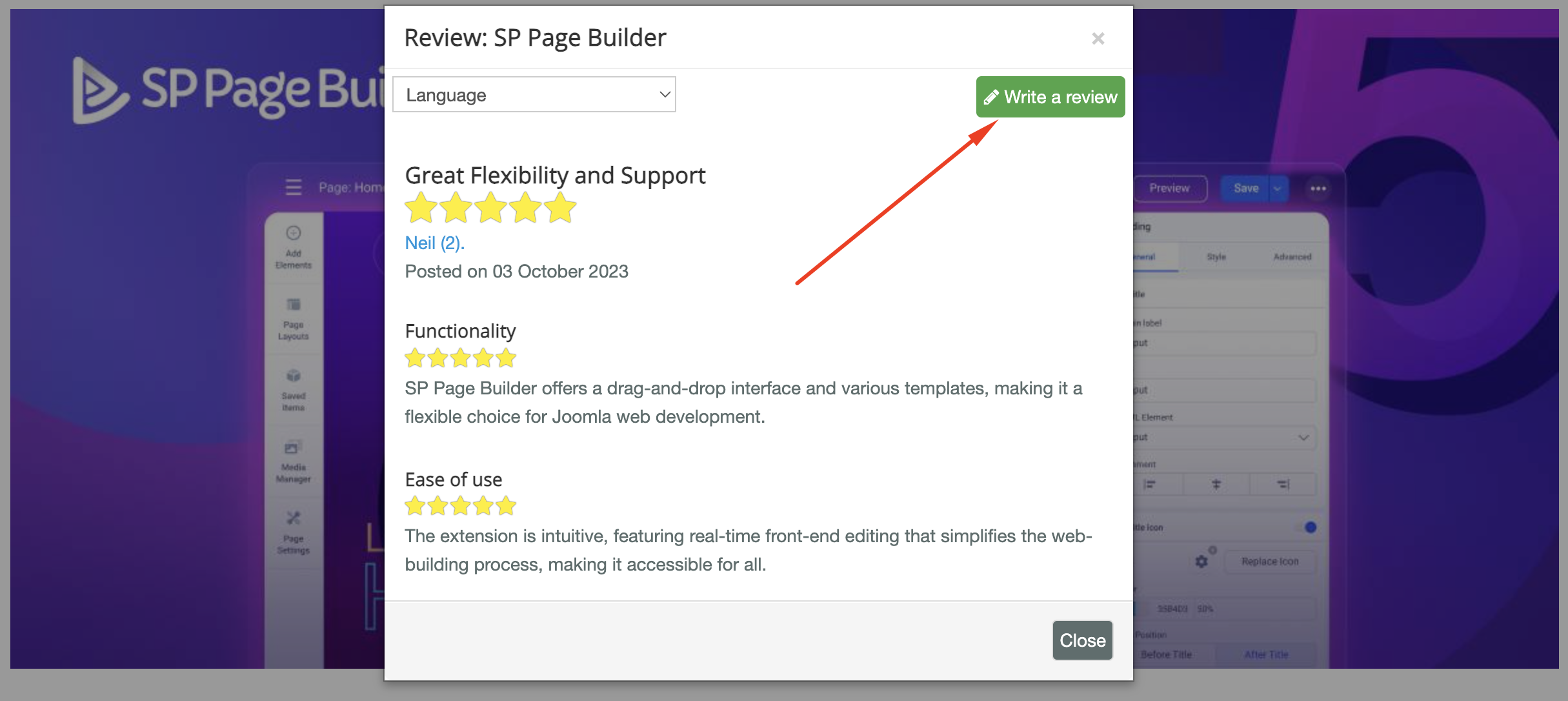
As for writing a review about our product and support quality, we would greatly appreciate it! Your feedback helps us improve and serves as a valuable reference for others. Please take a moment to share your thoughts about your experience with our product and the support you received. Your input is valuable to us and the community. Thank you in advance for your time and support.
We're here to assist you with any further questions or requests you may have. Once again, thank you for choosing our product and for being a part of our community.
Best regards,
Toufiqur Rahman
Team Lead, Tech Support (JoomShaper)s