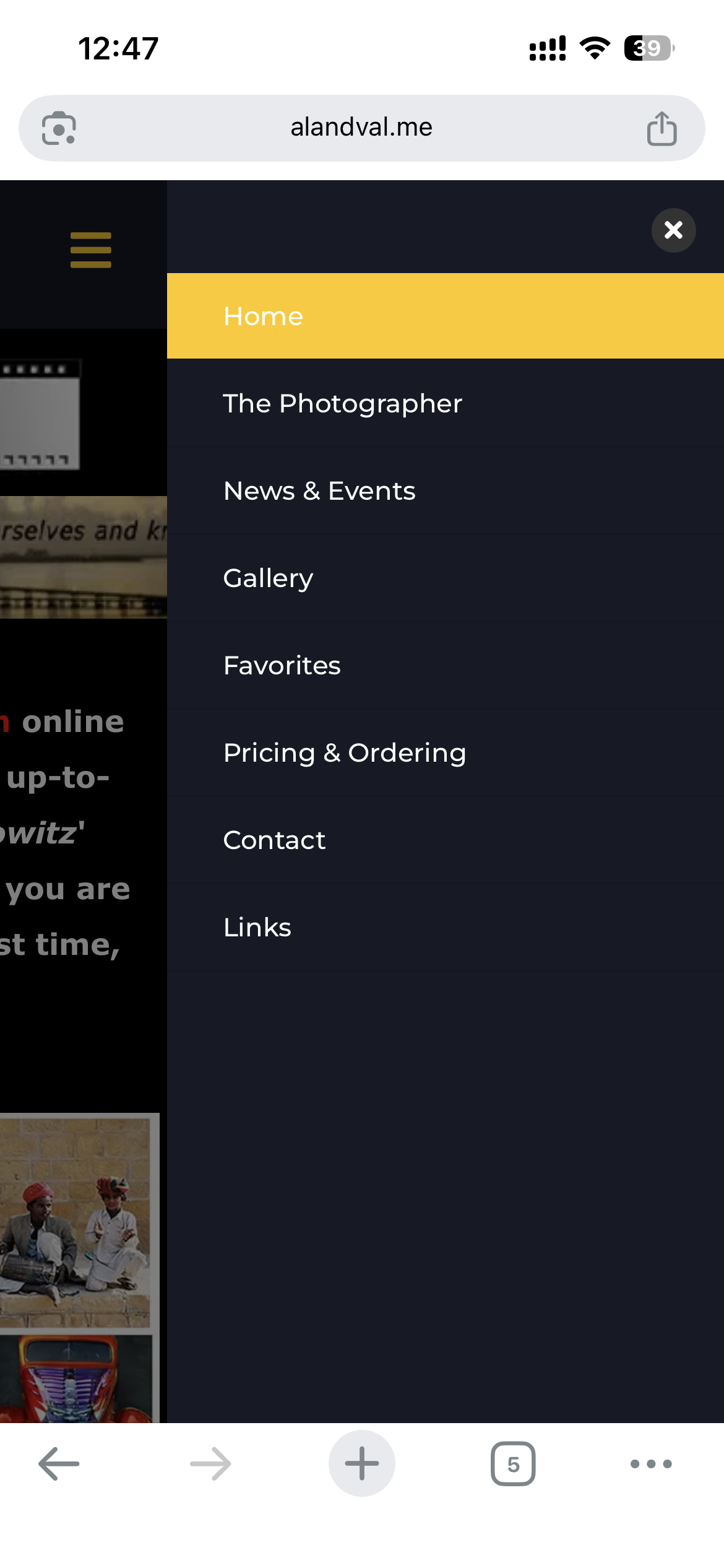
I chose the Fixter template as my client wanted a vertical menu on the left side of his website. When collapsing the site to show on tablets or mobile devices, the vertical header remains on the left and the body is cut off or partially hidden on the right side. (see screenshot). When using the horizontal header/menu everything works as it should, but I cannot use that for the client site.