Hi,
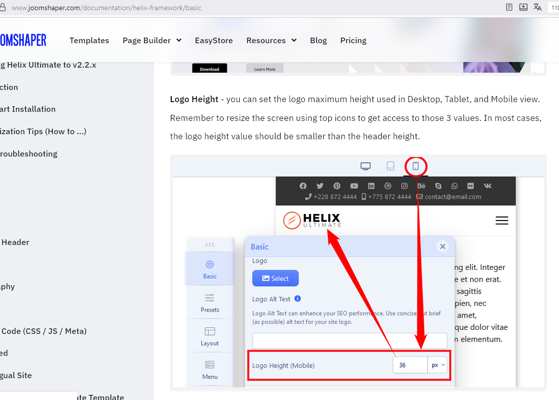
My header is set at 100px high and logo at 85px and looks fine for laptop ot large tablet.
When on smaller screen/mobile the header seems to go to 50px high but logo remains at 85px. I can use CSS to keep the header at 100px I think but the logo remains in a postition that is above the header, this then hides a top part of the logo.
How can I make this suit show the full logo on mobile device nicely?
See attached screenshot and login details if needed.
https://prnt.sc/oOseIkzS3f9C
Thanks
CT