

Template Design Customization & FAQ
Feature Boxes - Home page
If you want to customize 3 Feature Boxes from Educonn homepage, follow the instructions.
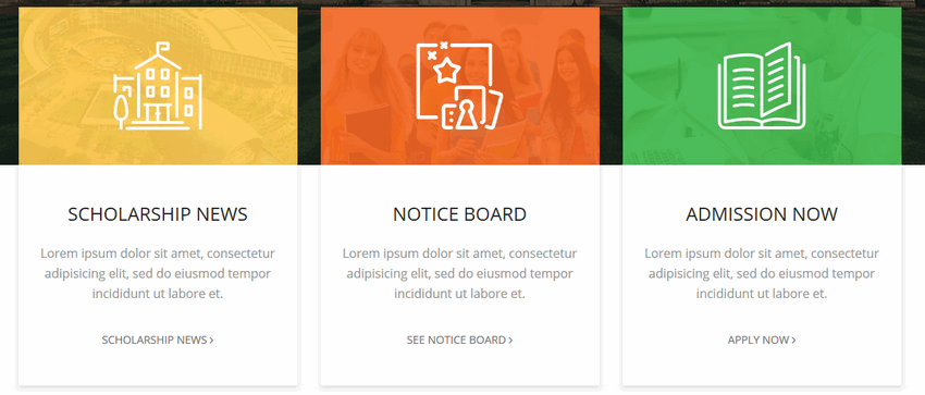
First, you must know that those are Feature Box addons from SP Page Builder Pro component, designed for this template only.
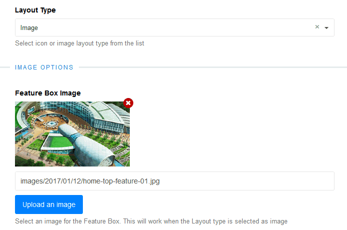
Background image
Background image used under bg color layer you can change from Feature Box addon settings : Feature Box Image
Background color
To change the background color you have to use custom CSS to override the default bg color. Below is the default CSS code used in the template.
- Gold/Yellow
.home-feature .sppb-addon-feature .sppb-img-container::before { background: rgba(255,201,78,0.9);} - Orange
.home-feature .sppb-col-md-4:nth-child(2) .sppb-addon-feature .sppb-img-container::before { background: rgba(242,101,34,0.9);} - Green
.home-feature .sppb-col-md-4:nth-child(3) .sppb-addon-feature .sppb-img-container::before { background: rgba(57,181,74,0.9);}
Notice! By default background colors were set for 3 columns layouts only. If you want to add 4 columns (with 4 addons) it requests extra custom CSS code - to use BG color for 2nd, 3th and 4th box. Below is an example CSS syntax:
.home-feature .sppb-col-md-3:nth-child(2) .sppb-addon-feature .sppb-img-container::before {
    background: rgba(242,101,34,0.9);}

.home-feature .sppb-col-md-3:nth-child(3) .sppb-addon-feature .sppb-img-container::before {
    background: rgba(76,187,89,0.9);}

.home-feature .sppb-col-md-3:nth-child(4) .sppb-addon-feature .sppb-img-container::before {
    background: rgba(255,49,77,0.9);}
Icons (building, board, book)
In this addon we used SVG files as background, not typical graphic icons.
- Building graphic
.home-feature .sppb-addon-feature .sppb-img-container::after { background: rgba(0,0,0,0) url('/templates/shaper_educon/images/top-feature/scolar.svg') no-repeat scroll center center / cover;} - Notice board graphic
.home-feature .sppb-col-md-4:nth-child(2) .sppb-addon-feature .sppb-img-container::after { background: rgba(0,0,0,0) url('/templates/shaper_educon/images/top-feature/notice.svg') no-repeat scroll center center / cover;} - Book graphic
.home-feature .sppb-col-md-4:nth-child(3) .sppb-addon-feature .sppb-img-container::after { background: rgba(0,0,0,0) url('/templates/shaper_educon/images/top-feature/book.svg') no-repeat scroll center center / cover;}
So you have two options to replace icon graphic. You can replace the file with yours (.svg) but with exact name and location
OR override the background image by custom CSS.
Read the Helix3 manual to get know how to use custom CSS. In most cases, we suggest using a new custom.css file.
How to increase article view area
To increase the article width area and reduce paddings inside please use below custom CSS:
.view-article #sp-main-body,
.view-category #sp-main-body { padding: 50px 0; }

.view-article article.item {width: 100%;}
.view-article article.item {padding: 25px 25px 10px 15px;}
And to reduce top & left space even more inside the article you can also use that:
article.item .content-wrap {
  margin-top: 30px; padding-left: 25px;}