Vertical Video Issues - Forum | JoomShaper
Solved SP Page Builder

Vertical Video Issues

Asked by Douglas B 4 years ago Last activity 1 year ago

Hello,

There seems to be an increasing need for vertical video support across different platforms. We have created vertical videos and uploaded them (to vimeo in this case) for the purpose of how they will be viewed on a mobile device. (as an example think of how you watch youtube shorts or instagram videos on a mobile device).

I cannot use joomshapers video addon as it doesnt allow for a button such as 'Preview' to click to watch the video preview. So I have tried modal popup addon which is more in line with that.

However, even though vimeo respects the flipped aspect ratio of 9:16, the joomshaper modal popup does not and forces it into a standard 16:9 video box. Maybe i am missing a 'switch', i have certainly been known to do that, but if not, can you please instruct me on how to place a vertical video without forcing it into a standard 16:9 box.

Thank you very much for your help.
Accepted answer

Marked as the solution
Douglas B Asked this

Hello Paul,

Thank you for this update, i was actually wondering if it could be scaled up. That is very helpful.
Thank you sir, I will try and tweak the placement a bit as it pops up low and on the left, but this is really heading in the right direction. I appreciate your help.

@media (max-width: 580px) {
.mfp-iframe-scaler iframe {height: 300%;}
}
.mfp-iframe-scaler iframe {width: auto !important; box-shadow: none; background: transparent; }
.mfp-close-btn-in .mfp-content .mfp-close { font-size: 44px; right: 50%; }

19 more replies

Toufiq Senior Staff

Hi there,

Thanks for contacting us. Sorry for the inconvenience. Tired to find out the "preview" button. But, There is no "preview" button found. Can you help me find out the "preview" button?

-Thanks

Douglas B Asked this

yes, sorry, please take a look again. Thank you sir.

Paul Frankowski Senior Staff

Douglas, If I may....

  1. YouTube Shorts (Vertical) videos will be supported in one of the upcoming updates for Video addon.
  2. But indeed we forgot about Modal addon, maybe becuase so far all users used horizontal/classic videos.

So I guess, right now it request using custom CSS to fix it.

On which subpage you have that video or where I should click to see it?

Douglas B Asked this
4 years ago · edited

Hello Paul,

I like and use the video addon, and as you have mentioned, normal horizontal videos are what we predominately use. Also, how the video addon functions showing the video thumbnail prior to playing it is great, love it.

But I have been asked to create some vertical videos for the front page especially for mobile visitors. For desktop users, there is less of a point to using a vertical video in my opinion.

In my case, it makes sense to use a button to activate the video as showing the video thumbnail would take up too much space (especially if it was a proper vertical video). That is why i chose the modal addon, as it allows you to choose other options instead of the standard thumbnail.

I am glad to hear this feature is coming in upcoming updates, thank you. Hopefully you can implement it into modal addon at the same time.

Thank you for your help, and have a great day.

Paul Frankowski Senior Staff

On that page, use extra Custom CSS line

.mfp-iframe-scaler iframe {width: auto !important; }
.mfp-close-btn-in .mfp-content .mfp-close { font-size: 44px; right: 50%; }

Should be better by now.

Douglas B Asked this

Hello Paul,

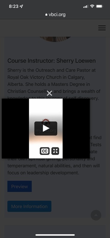
Thank you for your reply. With the iframe scaler code it looks like this on a mobile device:

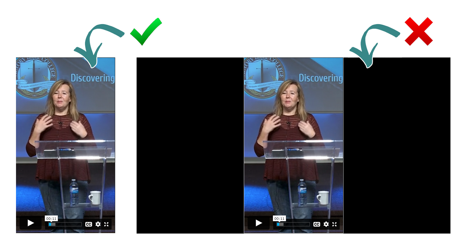
Is there a further tweak that i can make to remove the black bars as mobile is where I would use a vertical video?

Thank you again for helping me out with this issue. I greatly appreciate it.

Paul Frankowski Senior Staff
4 years ago · edited

About 2nd question

update my code 1st line to:

  .mfp-iframe-scaler iframe { width: auto !important;
  box-shadow: none;   background: transparent; }
Paul Frankowski Senior Staff

About 1st question, this CSS Zoom hack my help for Mobile devices

@media (max-width: 580px) {
.mfp-iframe-scaler iframe {height: 200%;}
}

You can play with % value, as well.

foto_8961_2022.jpg

Paul Frankowski Senior Staff

After all those "simple" 4 lines made a big improvment in video view.

I am glad that I could help also this time. I know ... McGyver style ;)

Douglas B Asked this

Well i certainly could not have done that myself, and i'm sure it was not as simple as it looked. Thank you Paul, have a great day today.

Log in to reply.