Website - Forum | JoomShaper
Staff replied General

Website

Asked by fabrice 2 months ago Last activity 2 months ago

Hello,
I'm having display issues with the responsive layout on the following website:
https://www.bordescudoscharpente.fr/
When I view the site on my phone:

  • The menu doesn't appear.
  • The entire bottom section isn't responsive: the footer, etc.
    Can you help me?
    Thank you.

25 replies

Paul Frankowski Senior Staff
2 months ago · edited

Yes, please unlock some coutries from RSFirewall. It looks that you locked too many of them. And all we see is error 403, and we cannot help, doors are closed!

It also may slown down your site, becuase Joomla has to check each IP in huge database. I recommend to lock only 4-5 countries, to be honest. Yes, I talked with RSJoomla team about that too.

fabrice Asked this

I've done it : both countries are unlocked.

Paul Frankowski Senior Staff

Merci.

Mobile menu - the problem was with color of [=] icon, white color on white background.

Please in Template Options > Custom Code > Custom CSS add that line:

.burger-icon > span, #offcanvas-toggler span {background-color: black;}

Paul Frankowski Senior Staff

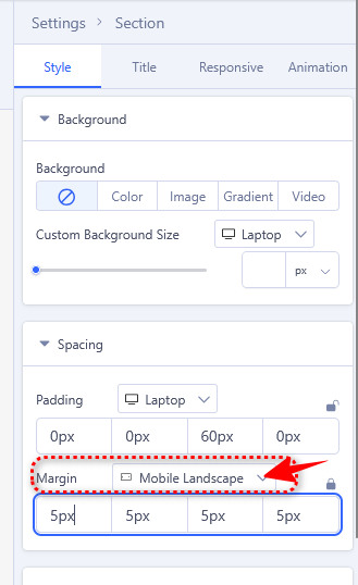
About Footer Menu , it can be corrected by settings, using size of columns. Can you share access to admin area, or you need CSS that may solve it as Duct Tape?

fabrice Asked this
2 months ago · edited

It works, thank you so much Paul !
My only problem still remaining : a filter on the logo (it appears in black)

fabrice Asked this

If possible, i'd like the CSS to solve the problem. thanks.

Paul Frankowski Senior Staff

About Footer I would prefer to have access, CSS would be complicated.

fabrice Asked this

OK. So can you explain me where i'll find the settings access for using size of columns ?

Paul Frankowski Senior Staff

a filter on the logo

I see green. No CSS filters over the logo.

info__401.png

fabrice Asked this

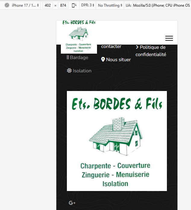
There's a black filter when i view the menus on a mobile phone

Paul Frankowski Senior Staff

Do you talk about Logo color filter or logo height?

If 2nd, you should be able to change that from Template Options, or force by Custom CSS.

@media  (max-width: 680px) {
#sp-logo .logo-image {height: 100px;}
}

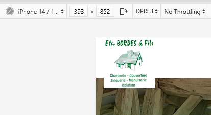
I see green logo also on Mobile view (iPhone)

info__405.png

fabrice Asked this

I agree with you : but the filter is visible once you click on the menu, on the right side

Log in to reply.