

Customization Tips (How to ...)
How to use Custom CSS
In all Helix Ultimate-based templates in Template Options > Custom Code > Custom CSS (field) you can enter any custom CSS to customize your site. For extensive CSS modifications, we recommend using a custom.css file. For more information, see our dedicated guide (Custom Code, CSS, JS, and Meta). Here is an example of Custom CSS with ID and Classes.
 If you're a beginner, we recommend also reading the blog post Which line do I have to edit...". All popular browsers (Firefox, Chrome, Opera, Safari) has the Inspector tool, which is part of the Developer Tools, is an essential resource for webmasters. It lets you examine and modify the HTML and CSS of any webpage directly within your browser. This is incredibly useful for debugging styling issues and experimenting with design changes in real time, without altering the source files. Using the Inspector is a fast and efficient way to prototype design changes, troubleshoot layout issues, and learn how various CSS properties affect your website's appearance. Changed in preview CSS styles you can copy and paste into the Custom CSS field.
How to use the new "X" Twitter icon
The social media network formerly known as Twitter was rebranded simply to X (since July 2023), a change from bird logo has been replaced with a letter X. Because this is new, it wasn't included in FontAwesome 5.x that you may have inside Helix Ultimate and Helix3-based templates. It was added only inside the new Helix Ultimate update (Nov 2023) and FontAwesome 6.4.2+.
If your Joomla 5.x site loads that file: media/system/css/joomla-fontawesome.min.css (preview in HTML view in <head> area) it means that Font Awesome 6 is already used, and you can easily use the new icon. Use Custom CSS method (copy-paste) to replace old icon with a new one, without touching template php file.:
.fa-twitter::before {content: "\e61b"; font-family: "Font Awesome 6 Brands"; }OR use a more robust version if you have more extensions that use/load FA.
.fa-twitter::before {content: "\e61b" !important; font-family: "Font Awesome 6 Brands"; }Use it in Template Options > Custom Code > Custom. After adding it clear the Joomla cache.
An alternative method for older Joomla and Helix-based templates:
- Start by visiting: https://fontawesome.com/icons/x-twitter?f=brands&s=solid
- Choose the primary color (by default is dark navy). You can choose any color you need from a color palette, for example, a light color, then click OK.
- Click the "Download SVG file" button, and save the file (x-twitter.svg) on your local drive.
- If you want to have a different color, open the icon file with an HTML editor, add
fillan attribute with the HEX color you need, and save the changes. It's needed to check at least, because in some cases FA generator may not add that color value. - Using the FTP tool, File Manager (cPanel), or any other working method to upload it to your server to /images folder.
- Inside Template Options > Custom Code > Custom CSS, paste the below CSS code:
.fa-twitter::before { content: url("/images/x-twitter.svg"); width: 14px;
  display: inline-block; height: 14px; vertical-align: -0.125em;}
It will replace all Twitter icons with a new design (X). If you want to use it inside the custom.css file - it's better to add an absolute URL path to the .svg file. Remember to use matching color for all previously used icons, try to use the most universal one.
Extra tip! In Joomla 4+ by default, you cannot upload .svg files, it requests changing settings in Joomla Media > Options. But you can also install & use the Phoca Commander component, to upload a zipped (.svg) file and then unzip using the toolbar.
If you want to have a different color for the hover effect remember that .svg is not a font, and color cannot be changed using color style. You can get it only by using a second image with a different color code inside (x-twitter.svg) file. It means that you have to edit the file, then add/change fill the attribute with the HEX color that you need - then save a file with a different name, and use the extra CSS line. Here is an example CSS code:
.fa-twitter:hover::before { content: url("/images/x-twitter-hover.svg"); width: 14px;
  display: inline-block; height: 14px; vertical-align: -0.125em;}
How to hide "Featured" badge in Articles
In the Helix Ultimate 2.1 update we added a "Featured" badge that is displayed in a list of articles and a single article view if the article was marked as featured. Until we don't add the option On/Off, you have to use Custom CSS to hide it - if you don't want to display that red badge.
To hide from the list of articles (blog view), use the Custom CSS:
.article-list .article .featured-article-badge { display: none; visibility: hidden;}
To hide it from a single article view, use the Custom CSS:
.article-details .featured-article-badge { display: none; visibility: hidden;}
How to hide Icon from Breadcrumbs
If you're using Helix Ultimate 2.0.x you may notice that in the first position of breadcrumb, there is an icon (map marker). Yes, it can be hidden by using custom CSS:
.breadcrumb .divider.fas.fa-map-marker-alt {display: none;}How to reduce space between Header and Article(s) area
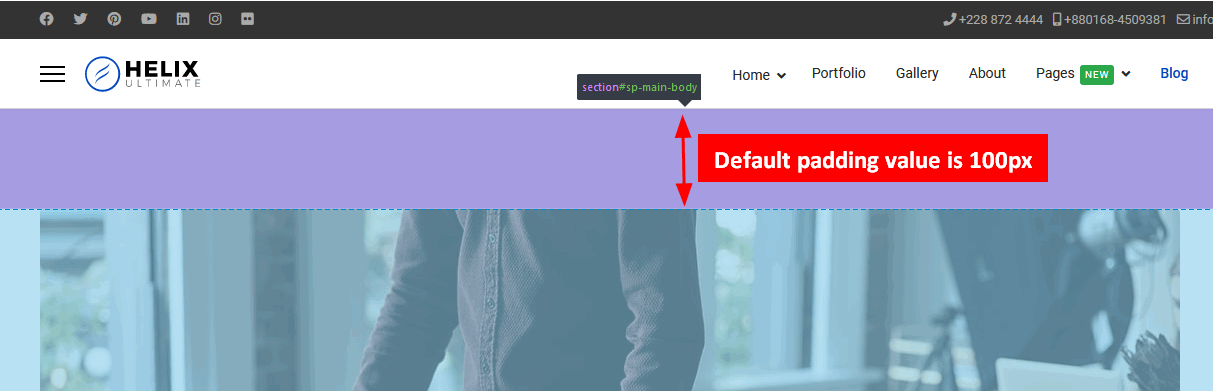
If the space (padding) between the header and article and blog view is too big for you (by default is 100px), you can reduce it.
It's pretty easy, but request using custom CSS code:
.com-content #sp-main-body { padding: 10px 0; }Of course, you can use a different value, a custom one for the top and bottom padding. It depends on your design goals.
If you want to reduce only for the top padding and keep the default bottom padding (100px) use the below custom CSS code instead of the code mentioned above:
.com-content #sp-main-body {padding-top: 0px; }If you want to reduce to 0px paddings only in a single (detailed) article view - please use the below line:
.view-article #sp-main-body {padding: 0px; }Notice! By default in SP Page Builder view from Page, the top and bottom padding doesn't exist at all, the value is set to 0.
How to reduce space between Header and Component area
If you want to reduce the top space (padding) between the header and the main body, please use the following Custom CSS:
#sp-main-body {padding-top: 0px; }Notice! The default value from template styles was set at 100px. You can use any value you want, but it will be used for all components (articles, sp page builder, sp simple portfolio etc.) and everywhere on all subpages.
How to disable the whole Header (with Logo & Menu)
Go to Template Options > Header > Predefined Header: Off > Save & Close
It will remove the entire default header from HTML code in all views, and you will be able to build your own, also by using Row and Addons (SPPB).
If you have a Custom Header already (made in Layout), just remove the logo and/or menu module position from the Row/Section.
How to customize Page Title & Page subtitle
For that task, use Custom CSS. Example syntax:
.sp-page-title .sp-page-title-heading  { font-size: 40px; color: yellow; }
.sp-page-title .sp-page-title-sub-heading {font-size: 18px; color: white; opacity: 1;}
It will use yellow and white colors and increase the font size slightly. Now that you know the class name, and you should be able to customize the displayed text even more.
How to show Offcanvas Menu sooner
You can hide the MegaMenu and display the Offcanvas Menu also of your chosen by you resolution, but it requires using extra Custom CSS. Here is an example for 1024px; you can change to 1280px as well. First line force to show [=] icon, and second to hide the mega menu.
@media screen and (max-width: 1024px) {
#sp-header #offcanvas-toggler.offcanvas, #sp-header #offcanvas-toggler.mega
{display: block !important;}
 .sp-megamenu-parent.d-none.d-lg-block
 { display: none !important; }
}
OR
@media screen and (max-width: 1280px) {
    .sp-megamenu-parent {display: none !important;}
    #offcanvas-toggler {display: flex !important;}
}
How to change the color of Offcanvas (=) Menu icon used in Header
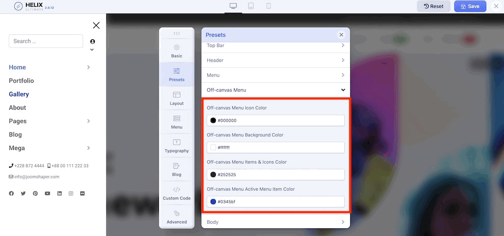
Since the Helix Ultimate 2.0.12 update, you can change colors using Template Options > Presets > Edit > Off-canvas Menu settings
Notice! Remember to disable SCSS > CSS in the Advanced tab first, also during that change, also CSS Compression must be Off. Later, after changes, you can turn it On and then save the changes.
For templates that do not have that feature yet, you can also do that using a custom CSS method:
.burger-icon > span {background-color: white;}It should change the color of stripes [=] to white. If the above style does not work, please use that variant:
#offcanvas-toggler .burger-icon > span {background-color: orange;}You can use any color you need (red, blue, yellow, green, orange). In the first example, I used white (#fff) color, in the second, orange. It's useful when your header has a dark background color.

To see changes, remember to disable CSS compression and clear the Joomla cache, especially if you use JCH Optimize or a similar tool after using the above code. You may need to refresh/clear the browser cache as well.
How to increase the size of Offcanvas (=) Menu
It's also easy, please use the below custom CSS:
.burger-icon { width: 35px; }

 .burger-icon > span {height: 4px; }
The final effect after using the above CSS code should be similar to that:

Notice! The default value for [=] width is 25px, and height is 2px.
Offcanvas: How to add the word "MENU" after [=] icon
If you are going to use it for one common language used on the front-end is an easy task, please use below custom CSS:
#offcanvas-toggler::after {
  content: "MENU"; padding-left: 5px; color: #111; margin-top: -3px;}
If your site uses more than one language where the "Menu" word has a different spelling, the above CSS code needs to be customized.
How to change background color of Offcanvas Menu
As the first method, try to change it using Template Options > Presets > Edit > Off-canvas Menu > Background color > Choose color > Save settings.
As the second method, you can use Custom CSS to control the background color. Here is an example code (to use solid black):
@media screen and (max-width: 992px) {
  .offcanvas-menu {background-color: black; background: black;}
}
You can use also haft transparent background color using the RGBA color code:
@media screen and (max-width: 992px) {
  .offcanvas-menu {background-color:rgba(0,0,0,0.55); }
}
Remember to make sure that the background color is contrasted with the font color used for all of the mobile menu items.
Offcanvas Menu: How to change the color of the closing (x)
To change the color of closing (X) icon from black to red, please use below custom CSS:
.offcanvas-active .burger-icon > span,
#modal-menu-toggler.active .burger-icon > span
{ background-color: red;}
Before and after the change. In the below example, we used red color for "X" icon, but you can change to different colors (yellow, green, pink, blue).
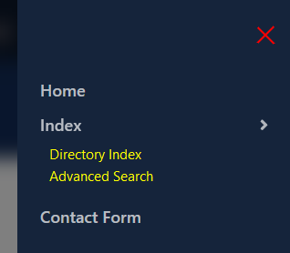
Offcanvas Menu: How to display all submenu items (expand all)
If you want to display all submenu items from the mobile menu that users don't have to click (+) to see them all. It's possible, but requests using custom CSS code:
.menu-parent .menu-child {display: block !important;}
.menu-parent .menu-toggler {display: none !important;
}
In some cases, to be able to scroll down through the mobile menu you have to add/use also this CSS line:
.offcanvas-menu {overflow: scroll;}The above code should be used inside Template Options -> Custom Code -> Custom CSS OR inside the custom.css file.
Offcanvas Menu: How to display all submenu items from one main menu item only
The method for that is very similar to the one presented above, the only difference is that you have to add/use a class name from the Main Menu item. Add extra: .item-123 - where 123 is the ID number from Menus: Items (Main Menu) > last column. I used 123 as an example, in your case that number will be probably different. Each Menu item has its unique ID number.
Example CSS code:
.item-123.menu-parent > .menu-child {display: block !important;}
.item-123.menu-parent > .menu-toggler {display: none !important;}
The above code should be used inside Template Options -> Custom Code -> Custom CSS OR inside the custom.css file. Remember to change the ID number twice, in both lines.
After using it, on the Mobile Menu you will see all menu items from the selected Menu item displayed, and the "toggler" is hidden, and for the whole rest of the menu items will remain closed until the ">" icon is not clicked.

Offcanvas Menu: How to change ">" open icon and submenu item's color
In the off-canvas menu, submenu items can be opened using a ">" icon, by default it has a black color. To change its color it requests using custom CSS code. Below is an example using a WhiteSmoke color (you can use classic white, green, or yellow instead, as you wish):
.offcanvas-menu .offcanvas-inner ul.menu > li.menu-parent > a > .menu-toggler,
.offcanvas-menu .offcanvas-inner ul.menu > li.menu-parent > .menu-separator > .menu-toggler {
  color: whitesmoke;}
To change submenu items the in off-canvas (mobile) menu you have to use custom CSS as well. Here is an example with yellow color, but you can use white or another color.
.offcanvas-menu .offcanvas-inner ul.menu > li li a {
  color: yellow;
}
The above code should be used inside Template Options -> Custom Code -> Custom CSS or inside the custom.css file.
How to Customize Offcanvas Menu
As the first step, check the settings in Presets, where in the "Custom Style" tab, you should be able to find the Offcanvas Menu section. From it, you can change basic colors.
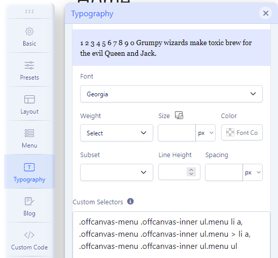
About Font-Family and Font-Size go to Template Options > Typography > Custom > Custom Selectors - paste:
.offcanvas-menu .offcanvas-inner ul.menu > li a,
.offcanvas-menu .offcanvas-inner ul.menu > li span
Then set font settings > Save settings.
Alternatively, you can use Custom CSS to change the design of displayed menu items in the Mobile Menu. Basic knowledge of CSS is required. Here are the class names used there:
.offcanvas-menu .offcanvas-inner ul.menu > li a  { ... }

.offcanvas-menu .offcanvas-inner ul.menu li.active a  { ... }

.offcanvas-menu .offcanvas-inner ul.menu > li a:hover  { ... }

.offcanvas-menu .offcanvas-inner ul.menu > li li a { ... }
Knowing it, you can use (inside "{}"), for example, color: green; font-size: 1.1rem; - to change the color and font size used for Mobile Menu items. Easy, right.
BTW "hover" does not work in mobile devices because this is only for mouse behavior, not finger touch.
How to increase space between menu items in Offcanvas Menu
You have to use Custom CSS to increase the space between menu items in the Mobile Menu. Here is an example code:
.offcanvas-menu .offcanvas-inner ul.menu > li > a,
.offcanvas-menu .offcanvas-inner ul.menu > li > span {padding: 15px 0px;}
And to increase space for submenu items, use below CSS line instead of the above one:
.offcanvas-menu .offcanvas-inner ul.menu ul li {margin: 4px 0;}
Of course, you can use different values, smaller or bigger than 4px. In that example, 4px will be added at the top and bottom.
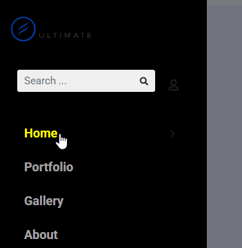
How to make a menu item name active in Offcanvas Menu
By default, you have to click the arrow icon ">" to open the submenu items. However, a CSS hack allows you to have the whole menu item name active, not only the arrow. It helps users browse your Mobile site faster. It's CSS for LTR (Left-to-Right) sites only, where text is read and written starting from the left side (English, Spanish, Italian, Greek, and most other Western alphabets).
body.ltr .offcanvas-menu .offcanvas-inner ul.menu > li.menu-parent > a > .menu-toggler,
body.ltr .offcanvas-menu .offcanvas-inner ul.menu > li.menu-parent > .menu-separator > .menu-toggler,
.offcanvas-menu .offcanvas-inner ul.menu > li.menu-parent li.menu-parent .menu-toggler {
  right: auto;width: 99%;}

.offcanvas-menu .offcanvas-inner ul.menu > li.menu-parent li.menu-parent .menu-toggler::after,
.offcanvas-menu .offcanvas-inner ul.menu > li.menu-parent > a > .menu-toggler::after,
.offcanvas-menu .offcanvas-inner ul.menu > li.menu-parent > .menu-separator > .menu-toggler::after {
  float: right;}
How to choose a font for Offcanvas Menu
It's possible to change the font used for the mobile menu. For example, you can set it directly from Template Options > Typography > Custom: On
- In the Custom Selectors area, paste below class names:
.offcanvas-menu .offcanvas-inner ul.menu li a,
.offcanvas-menu .offcanvas-inner ul.menu > li a,
.offcanvas-menu .offcanvas-inner ul.menu ul- Choose the font-family from the list
- If you need, change also the Font Weight value and/or Font-Size
- Then, Save Template settings
- Clear Joomla & browser cache to see changes
Using the same class names and Custom CSS, you can do the same.
How to hide all images from Offcanvas Menu
Sometimes, when you use images (banners) in the MegaMenu, they are not needed in the Mobile Menu. Here is an example of CSS on how to hide them in the Offcanvas Menu:
.offcanvas-menu .offcanvas-inner .sp-module ul > li a > img {display:none; visibility: hidden;}
How to resize Text Logo
If you decide to use the Text logo, not the Image file, you must use Custom CSS code to resize the logo phrase (word).
Example syntax that you can use:
#sp-logo .logo a { font-size: 24px; }To change (customize) also color & weight of the logo text, add also CSS color & font-weight property inside Custom CSS code. Here is basic example:
#sp-logo .logo a {font-size: 24px; color: red;font-weight: bold;}How to change font-size in top-bar
You can do that by using Custom CSS or by Typography > Custom settings.
/* Left side top-bar */
#sp-top1, #sp-top1 span, #sp-top1 a   { font-size: 16px;}
/* Right side top-bar */
#sp-top2, #sp-top2 span, #sp-top2 a  { font-size: 16px;}
And by using Typography > Custom, just put below IDs and Classes, and then choose Font settings > Save & Close.
#top-bar, #sp-top1, #sp-top1 span, #sp-top1 a , #sp-top2, #sp-top2 span, #sp-top2 a
How to make the bottom menu vertical instead of horizontal
If we talk about the Menu module, you have to use Bootstrap 5 class in that module in the Advanced (tab) > Menu Class (field): navbar
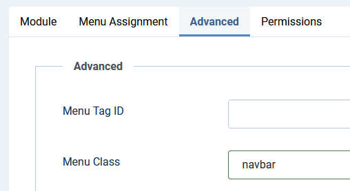
Remember to add extra space before the word "navbar" (!), otherwise it will not work.
If that Menu module was published in the bottom position, please also add that in the Custom CSS area to make all positions equal:
#sp-bottom .sp-module ul > li:last-child {margin-bottom: 15px;}In some cases, you also need to add extra Custom CSS to add space between menu items. Example code:
#sp-bottom .sp-module ul {list-style: none;}
#sp-bottom .sp-module ul li {margin-right: 10px;}
For the footer position that is below the bottom, just change the name from "bottom" to "footer".
-
How to change 'Sign In' Link Color
It's pretty easy, but request using custom CSS code. Below is an example using a white color:
a.sp-sign-in { color: white; }To add hover color effect (yellow) add and use also this line:
a.sp-sign-in:hover, a.sp-sign-in:focus { color: yellow; }How to Translate the Sign-in Link
It's a template language phrase. Please go to System -> Language Overrides, choose your language (Site), and create a new override for this language string:
HELIX_ULTIMATE_SIGN_IN_MENUHow to Translate Profile and Logout links
It's a template language phrase. Please go to System -> Language Overrides, choose your language (Site), and create a new override for those language strings:
HELIX_ULTIMATE_USER_PROFILE
HELIX_ULTIMATE_USER_LOGOUT
General tip: All phrases used by the Helix template (in front and admin area) are inside that file: languages/en-GB/en-GB.tpl_shaper_helixultimate.ini
How to add a Custom Menu inside the Profile menu
To get extra menu items inside the Profile menu visible after user login - You have to publish a menu module in module position:
Logged In Usermenu [logged-in-usermenu]
That menu with all menu items inside will be displayed above the "Profile and Logout" menu items. This is a new module position added in the Helix Ultimate 2.1x+ template update, older templates may not have that feature.

To make that Profile menu a little bit wider than default 100px please use below Custom CSS:
.sp-profile-wrapper .sp-profile-dropdown {min-width: 150px;}How to translate the Reading Time phrase
Translate and override them using Joomla Admin - Language Override component.
HELIX_ULTIMATE_BLOG_MINUTES_READ
HELIX_ULTIMATE_BLOG_MINUTE_READ
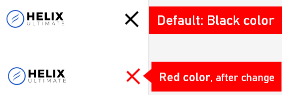
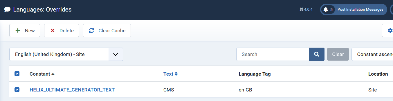
How to rename Meta generator with Helix Ultimate name
Since Helix Ultimate 2.0.9 update in Joomla! administrator, you can override the generator phrase by using: Languages: Overrides.
<meta name="generator" content="Helix Ultimate - The Most Popular Joomla! ...."> In the field: Language Constant use: HELIX_ULTIMATE_GENERATOR_TEXT
In the text field: put your custom name, it can be "CMS" or your company name, as you wish. Remember to use this language override for all installed languages (ES, DE, FR, etc.).
If you have an older Helix-based template version (2.0.6 and older), you can still hide it by using small code customization - edit that file: plugins\system\helixultimate\src\Core\HelixUltimate.php - where you have to edit line 312:
$this->doc->setGenerator('Helix Ultimate - The Most Popular Joomla! Template Framework.');Then replace the default text with a custom one, you can use any word, for example, "CMS" or your company business name. To edit php files you can use File Manager from cPanel or Phoca Commander component or FTP tool.
How to fit the menu to the header row
If you have several menu items and they do not all fit in one row, collapsing into two rows, you can do 3 basic steps to prevent that:
1st step: Use the below Custom CSS to reduce the default space around the menu, and it should give you an extra 3,6rem:
#sp-menu {padding: 0;}
2nd step: reduce menu font size. For example, if you have 19px, use 17px (2px less)
3rd step: consider if you can use shorter words used in MainMenu, for example, instead of "Home page" use "Home" and "Contact Us" use "Contact" etc.
4th step: reduce the default space between menu items (2px less), read the tip below.
How to reduce space between menu items
If you have several menu items and they do not all fit in one row - you have a few solutions on how to improve that. Start by reducing the default space between menu items. See the example below:
.sp-megamenu-parent > li > a,
.sp-megamenu-parent > li > span {padding: 0 10px;}
By default, there is 15px of left and right padding between menu items. The value of 10px seems to be reasonable. Use that CSS code inside Helix Ultimate > Template Options > Custom Code > Custom CSS section or the custom.css file. Of course, you can reduce this value only for smaller selected screen sizes (laptops, tablets) using the @media query. Perhaps the most common media queries in the world are those that target particular viewport ranges. Example CSS syntax:
 @media screen and (max-width: 1199px)  { .sp-megamenu-parent > li > a,
.sp-megamenu-parent > li > span {padding: 0 10px;}
}

There are lots of other things we can target besides viewport width. That might be screen resolution or device orientation, such as tall (portrait) or wide (landscape) based on how the device is rotated.
In some cases, to fit all the menu items, you should reduce the space between the MegaMenu items, but also reduce the font size a bit. Even 2 pixels less can make a big difference. For example, for smaller screens, you can reduce the font-size value from 17px to 15px to keep (fit) all menu items in one row on iPad Landscape view.
Here is an example of Custom CSS (using two methods):
@media screen and (max-width: 1190px)  {
.sp-megamenu-parent > li > a {padding: 0 10px; font-size: 13px;}
}
If you used Menu items written in BIG LETTERS remember that they take up more space than Small Letters, so you may need this style as well (after "font-size: 13px;"):
text-transform: none;How to change the color of submenu items?
You should be able to do that from Template Options > Preset > Customization. But if somehow it doesn't work in MegaMenu please use below Custom CSS:
.sp-megamenu-parent .sp-mega-group > li > a {color: black; }
.sp-megamenu-parent .sp-dropdown li.sp-menu-item > a:hover,
.sp-megamenu-parent .sp-mega-group > li > a:hover {color: red;}
How to change the font size of submenu items?
By default, if you change font size in the Typography tab > Navigation those changes affect the main menu, as well as submenu items.
To change font size only for submenu items you have two options, by Settings or Custom CSS:
- Also in the Typography tab enable (On) Custom Tab. Then add changes (Font and Size) and inside "Custom selectors" past that class name:
.sp-megamenu-parent .sp-mega-group > li > a - Or by Custom CSS use (one of those):
.sp-megamenu-parent .sp-mega-group > li > a {font-size: 16px; }
.sp-megamenu-parent .sp-dropdown li.sp-menu-item > a {
  font-size: 18px !important; }
Save changes in Template Options. And clear the browser cache and Joomla cache to see changes.
How to change the position of the menu?
By default, in most cases, the menu is aligned to the left side, close to the logo picture. In the old Helix-based template, you could have a menu aligned to the right side or most to the center. To center the menu, you have to use custom CSS with a new justify-content property value (center, flex-end, or flex-start):
#sp-menu > .sp-column,
 #sp-menu  .sp-megamenu-wrapper { justify-content: center !important;}
If you have a Custom Header, you can also use that:
#sp-menu>.sp-column.justify-content-end {
    justify-content: center !important;}
To move the menu to the right side, use below custom CSS code:
#sp-menu > .sp-column,
 #sp-menu .sp-megamenu-wrapper { justify-content: flex-end !important;}
To move the menu to the left side use flex-start value in a similar way (Custom CSS) as it was presented above, then Menu Items will positioned at the beginning of the container:
#sp-menu > .sp-column,
 #sp-menu .sp-megamenu-wrapper { justify-content: flex-start !important;}
How to hide the 3rd level of a menu in MegaMenu
From Navigation and MegaMenu settings it's not possible, but by using custom CSS you can hide from viewers' 3rd submenu. It's mostly for Desktop and Laptop users:
@media (min-width: 840px) {
.sp-megamenu-parent .sp-dropdown.sp-dropdown-sub .sp-dropdown-inner,
body.ltr .sp-megamenu-parent .sp-dropdown .sp-dropdown-items .sp-has-child > a::after
{display: none; visibility: hidden;}
}
How to add a button in Menu
- Create a module that will contain that button, it can be SP Page Builder (with Button addon) or Custom Module with a Bootstrap button class name.
- Then that module must be published in the "menu" module position.
- Remember to remove unnecessary margin or padding values.
- Sometimes small CSS corrections may be needed.
Please watch a video tutorial (step by step) >> https://youtu.be/PO9PQhEOeYE
How to remove background for active lang flag
By default under the active language flag, there is a grey background, you can remove it by using Custom CSS:
div.mod-languages ul li.lang-active {
  background-color: transparent;}
How to change background of body area in Boxed-Layout
By default is has solid white background color (#fff) but by using Custom CSS you can:
- add color transparency,
- set different background color or even gradients,
- or remove current color completely.
For that task you have to use Custom CSS to modify background color. Here is example CSS code that will add 50% of transparency for white color:
.layout-boxed .body-innerwrapper {
  background: rgba(255,255,255,0.5);
}
RGBA - contain color value (Red,Green,Blue) and transparency (alpha) value. The alpha parameter is a number between 0.0 (fully transparent) and 1.0 (not transparent at all).
To set the 100% transparent background color, you can also use:
.layout-boxed .body-innerwrapper {
background: transparent; }
It can be used for whole site, like in above example, for for selected subpages, but then it request extra class name.
How to change the order of elements in the Article view
If your projects request changing the position (order) of Article Title and Image you have two options to do this.
- By template article view customization: plugins\system\helixultimate\overrides\com_content\article\default.php
- Or by custom CSS code
/* for single article */
.view-article .article-details {
    display: flex;
    flex-direction: column;
}
.view-article .article-header {
    order: -1;
    margin-bottom: 20px;
}
If you want to change it for the Article list in Blog view as well then use below Custom CSS:
/* for articles list */
.article-list .articleBody, .article-list .article-body {
    display: contents;
}
.article-list .article {
    display: flex;
    flex-direction: column;
}
.article-list .article-header {
    order: -1;
    margin-bottom: 20px;
}
How to use Dark Mode
Until we didn't introduce dark mode in Helix to get a dark color template layout you have to use Custom CSS. Here is an example black & white code from which you can start. Use custom.css file, and below CSS lines:
body, .sp-preloader, .list-group-item {background-color: black; color: white;}
h1, h2, h3, h4, h5, h6, p, #sp-component a, h1 > a, h2 > a, h3 > a,
.article-info, .article-info a, #sp-right li a {color: white;}
(more tips soon)
How to add Smooth Scrolling
There are many ways to add this nice-looking feature to Helix based template, you can:
- Install an extra Smooth Scrolling type plugin from JED.
- Download and use smooth-scrolling javascript code inside the custom.js file.
But by default, Helix Ultimate 2.0 template use Bootstrap 5.x where scroll-behavior: smooth property is already used. It specifies whether to smoothly animate the scroll position, instead of a straight jump for the whole page. The scrolling box scrolls in a smooth fashion using a user-agent-defined timing function over a user-agent-defined period of time. Note: it is also possible to add it to a specific element/scroll container.
Browser support: Chrome, Edge (new), Firefox, Safari, Opera. For browsers that do not support the scroll-behavior property or you want a more advanced (configurable) solution, you should use JavaScript / jQuery or a ready plugin.
How to disable the link for the Logo
First, you have to know that since Helix Ultimate 2.0.12 update in the raw template you can put your custom URL for the logo link, it can be with a domain or just a subpage alias as well as just #. But if somehow you don't link at all, you have to use a custom CSS method:
#sp-header .logo a, .logo a, #sp-header .logo a {
cursor: default !important;
pointer-events: none; text-decoration: none; color: currentColor;
user-select: none; -webkit-touch-callout: none;}
The above disabling a link CSS method should work for all Helix-based templates, based on Helix Ultimate and Helix3 even with a custom header name.
How to use Rumble Video in an Article Blog Media tab
By default is not possible to use the "Video" tab to paste a link, but you can still use Rubmle.com video. Just from the selected video clip, copy the Embed code (Embeddable Player > iframe type) and then paste it inside the "Audio" tab > "Audio Embed Code" (area). The video will work & play. You can change the width and height values if you need.
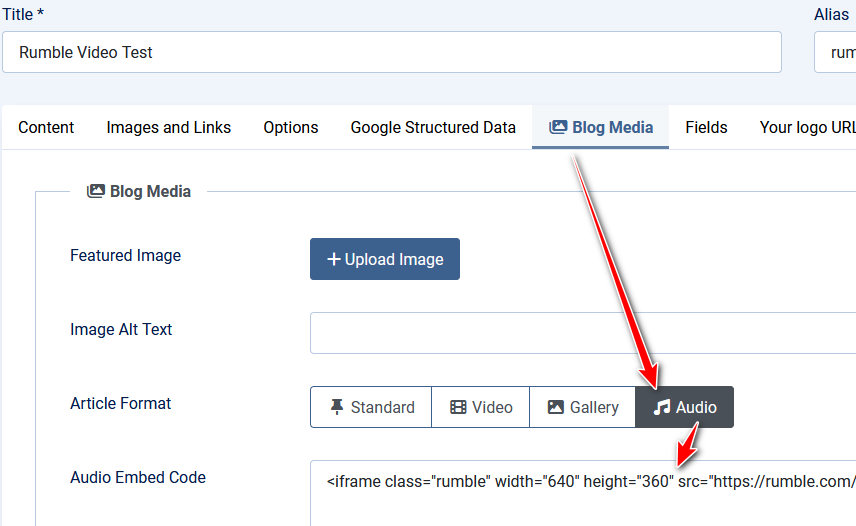
You can rename the phrase "Audio" to "Others" or "Custom" using Language Override to help site Editors. The first phrase is for "Audio" and the second for "Audio Embed Code".
HELIX_ULTIMATE_BLOG_POST_FORMAT_AUDIO

HELIX_ULTIMATE_BLOG_POST_FORMAT_AUDIO_LABEL
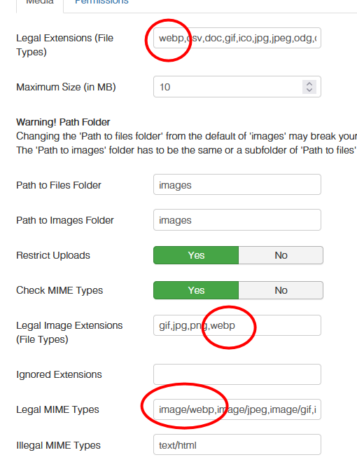
How to add .webp image type support
By default, Joomla 3.10 or Joomla 4 may not use this image extension format, so you have to add it manually. In Joomla Admin go to Media - click "Options" then please add mentioned phrases. Screenshot from Joomla 3.10 with correct settings. In Joomla 4 it's very similar.
How to make the footer sticky or fixed
Here's a complete CSS setup to make the #sp-footer sticky at the bottom of the page. If the page content is short, the footer will stay at the bottom; if it's long, it will follow the content and still appear at the bottom naturally. Sticks to its position only when scrolling past it, but only within its containing block. The footer can also be set to position: fixed, meaning it will always stay visible at the bottom of the screen (fixed position), no matter how much the page is scrolled & and it's completely removed from the normal page flow.
Example 1 (sticky behavior):
#sp-footer {
  position: sticky;
  bottom: 0;
  width: 100%;
  background-color: #555; /* Example background color or remove that line */
  z-index: 111;
}
html, body {height: 100%;}
Example 2: If the footer must always be visible
#sp-footer {
  position: fixed;
  bottom: 0;  left: 0;
  width: 100%;
  background-color: #555; /* Example background color or remove that line */
  z-index: 911;
}
Use it inside Template Options > Custom Code > Custom CSS or inside the custom.css file.
How to add Google Fonts manually
If somehow needed a font is not on the Helix Ultimate Google Font you have to add it manually in a few basic steps:
- Go to: https://fonts.google.com/
- Find the Font name using the Search field.
- Click the "Get Font" button (blue).
- Click the "Get Embed Code" button.
- In Helix Template Options > Custom Code (tab):
- In the area "Before < / head>" paste code from the Google Font section "Embed code in the <head> of your html"
- In the area "Custom CSS" paste the CSS code, here is an example of how it may look like for "Reddit Sans" font. (yes, you can use a custom.css file instead)
body, p, h1, h2, h3, h4, h5, h6, li, a, span
{  font-family: "Reddit Sans", sans-serif;
  font-optical-sizing: auto;
 font-weight: <weight>;
  font-style: normal;
}

strong, b  {font-family: "Reddit Sans", sans-serif;  font-weight: 700;}
If you want to use on whole site use all HTML tags (as I did), or just select one HTML tag only (for example H1 or H2).
- Remember to disable the Typography tabs (!) in Template Options.
- Now save the Helix settings (Save button) to see a difference.
How to use a custom font(s)
In this guide, you will learn the basics of how to use self-hosted fonts in the Helix Ultimate template. Useful for custom fonts (that are not part of the Google font family) for text elements.
According to browser stats, the WOFF (.woff) and the WOFF 2.0 format is supported by all major browsers. Only old IE, Opera Mini, and older browsers don’t support it. Every browser (including Edge) can use woff, ttf, and otf fonts. In most cases, you need two font formats per font. In the following example, I used the font AMATIC. To generate web font formats and CSS code use Webfont generator, for example:
- https://transfonter.org/
- https://www.fontspace.com/web-font-generator
- http://webfonts.gidix.net/
- https://webfont.codevision.io/
- https://www.whatfontis.com/Webfont-Generator.html
- or download Web Fonts from MyFonts.com.
Follow these steps:
- Disable selected fonts in the Typography section (Template Options)
- Copy all font files here: templates\shaper_helixultimate\fonts
- Create a new file "custom.css" to input the generated/custom CSS code.
- Then change paths for font files adding "../fonts/" at the beginning.
- In the custom.css file, for example, define what HTML tags (H1...h6, p, li) or classes your custom font should be used for.
VIDEO guide: https://www.youtube.com/watch?v=MfAIT8cMuv4
If the above steps are too complicated for you, install & use component OD Local Fonts > https://extensions.joomla.org/extension/od-local-fonts/
How to add Adobe fonts to your website
You can integrate them only by using custom HTML and custom CSS. It means that you won't see them in Helix Template Options.
- Read the official Adobe guide: https://helpx.adobe.com/fonts/using/add-fonts-website.html
- After choosing and generating the Adobe Font code, the first HTML part
<link rel="stylesheet"....paste in Helix Template Options > Custom Code > Before < / Head > - And then by using Custom CSS you have to define for what HTML tags (for example
h1, h2or wholebody) Adobe fonts should be used. For example:
h1, h2, h3 {font-family:"FONT_NAME"; font-weight:700; font-style:normal;}

p {font-family:"FONT_NAME"; font-weight:300;}
If Adobe Font would be your main font(s) you can disable other fonts in Template Options > Typography and from all addons that you used so far.