

Layout
Layout Manager allows you to build a flexible layout based on module positions. Layout Builder is one of the unique features of Helix Ultimate 2.2, which allows webmasters to customize the existing template in almost any shape without code customization.
Layout Grid
Helix Ultimate Layout is based on a 12-column layout from Bootstrap 5.x. It includes a powerful mobile-first flexbox grid system for building layouts of all shapes and sizes. The Helix grid system uses a series of containers (they can be switched off), rows, and columns to layout and align content.
You can choose a preset column or set your own grid. The grid system is responsive, and the columns will rearrange depending on the screen size.
- You can use Predefined Headers. We’ve added 9 built-in header variations to a template that will enrich the scope and versatility of your sites created with the framework. Or build your own (read more).
- Rows are wrappers for columns. Each Row can have its own column structure and unique settings.
- An icon with 6 dots allows you to change the positions of rows by moving them up or down.
- Use the plus icon to add a new Row, then choose column structure and select the module position(s) used there. We also suggest inserting a short ID name for the new Row.
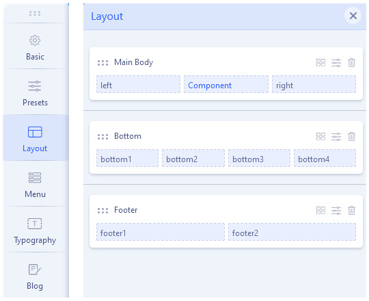
Available features (with related icons):
- [6 dots] - it's a drag-and-drop area, put a mouse cursor over it and move the row below or above others.
- [4 blocks] - it's a column layout selector, where you can change column structure inside the row based on the 12-column system.
Only one row is available in a single section. Choose one from the predefined or set your own grid. When using a Custom Layout, remember that the sum of columns must always be 12. For example, you can insert 6+6, 3+3+6, or 4+4+4. - [basket/bin] - it allows you to delete the current row with all elements inside.
- [sliders] -
Tip! Using proper Grid settings inside all columns in the row, you can define different column structures for each device (desktop/tablet/mobile) separately. More details in tips below.

You can set the whole column (right or left) with all modules inside a sticky (fixed) position. A fixed position element is positioned relative to the browser window itself. This means that when the window is scrolled, the viewport remains unchanged, keeping the module in its original position on the right or left side of the page. It's used for the Desktop view only. Useful for extra navigation and banner modules.
Click on the three dots of your left or right module and go to the Column Settings. Locate the Position Sticky option. Enable it to make your whole column remain sticky on either the left or right side of the page.
Notice! This feature was introduced in the Helix Ultimate 2.1 update. Older Helix-based templates may not have this new feature (option).
Template Positions
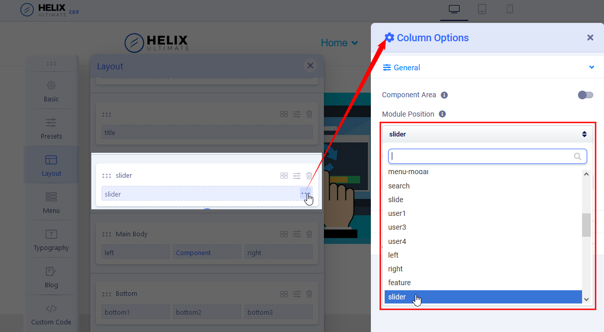
Except for the default one which you can see and use. The Helix template has two additional module positions (Content Top & Content Bottom), although they are not visible in Layout Builder, they can be used to display any modules above and below the component area.
If you want to use a position name that is not on the default list, you can do it even without an edition of the template XML file. Just create a new module or edit an old one, put a unique module position name and click Enter, then save that module. Then you should be able to use that position in Template Layout.
You have a custom module position named “Off-canvas Modules” which removes the restriction of using only one menu in the Off-canvas. Now, you have the freedom to use multiple menu modules in the Off-canvas position and craft your off-canvas however you like.
Custom Header! Using Layout features, you can build a custom header. But remember to use the "header" name for the "logo + menu" row to still have a sticky header. And of course, disable the Predesigned header (from the Basic - Header section). Read the "Custom Header" guide about that topic.
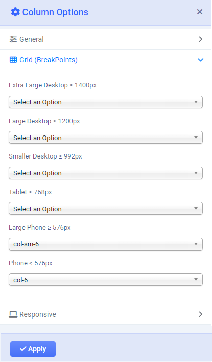
Grid (Breakpoints)
Column Options > Grid (Breakpoints) tab - a feature that allows the layout to adapt to different screen sizes. They define when the layout should change. Breakpoints are preset screen-width ranges where the template applies different layout rules.
Helix Ultimate is based on the Bootstrap 5 grid concept, which allows you to choose different breakpoints used for columns inside the Rows. For example, you can use different column sizes for each view. Remember to change the settings for each column in the row. If you want to keep all columns in one row, their summary must be 12 or smaller. For example, the "6" value must be set for two columns in the row.
Responsive
Column Options > Responsive tab - from where you can hide a column on chosen devices.
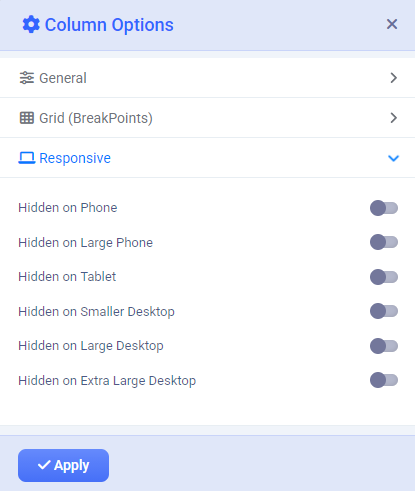
Those breakpoints are based on screen dimensions:
- Phone (max-width: 575px, what means less than 576px)
- Larger Phone (min-width: 576px, what means between 576px and 767px)
- Tablet (min-width: 768px, what means between 768px and 991px)
- Smaller Desktop/Laptop (min-width: 992px, what means between 992px and 1200px )
- Desktop (min-width: 1200px, what means 1200px and up)
Notice! That feature hides columns or rows using CSS; it will not be removed from the HTML code. So the hiding happens simply by overriding the display property at and above the chosen breakpoint.
In summary
Helix Ultimate template (and Bootstrap) hides elements by applying display: none !important within breakpoint-specific media queries. This provides full control over which resolutions show or hide an element, without requiring you to write custom media-query CSS.