

Menu
Inside the Menu (Navigation) tab, you will find the following tabs:
- Menu Builder - to manage menu structure, menu items content, and enable MegaMenu.
- Mega Menu - basic settings for Mega Menu display (Type, Width, Animation).
- Off-canvas - to manage the appearance and content of the Mobile Menu [=].
Menu Builder
Is an advanced system that allows you to manage menu structure (all menus) with all items used there. By default, it displays MainMenu with all submenu items. Using a mouse, you can change the order of menu items, just grab and move up or down. You can also add a new menu item.
- Pen Icon - opens the window to edit the options of the chosen Menu Item.
- Basket Icon - allows you to delete the chosen menu item.
- Grear Icon - extra settings for chosen menu item (Show Menu Title, Dropdown position, Icon, Custom Class, and Badge).
- Boxes Icon - access to extra settings and Mega Menu options if enabled there. You can add and use badge, icon, and row and column-based menus, and also drag and drop the modules to the menu positions from the modules list.
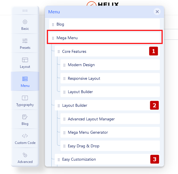
How to build advanced Submenu
If you want to have 2-3-4 columns in the menu as the first step you should start with building menu structure - add submenu items to the main menu item, it's similar to the root structure. Here is an example of three columns submenu.
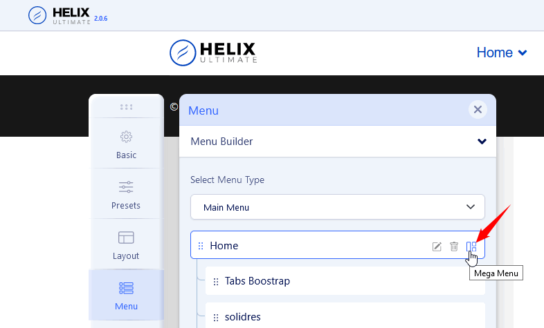
As 2nd step in the first main item please click the "Mega Menu" icon, then enable the "Mega Menu" option.
Now you should click the "Add New Row" button. Now you can choose the column structure (it's based on Boostrap columns grid) - you can use a predefined layout or create your own (Custom).
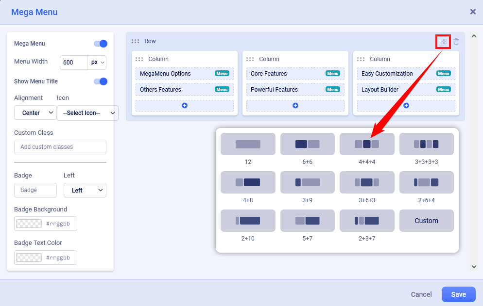
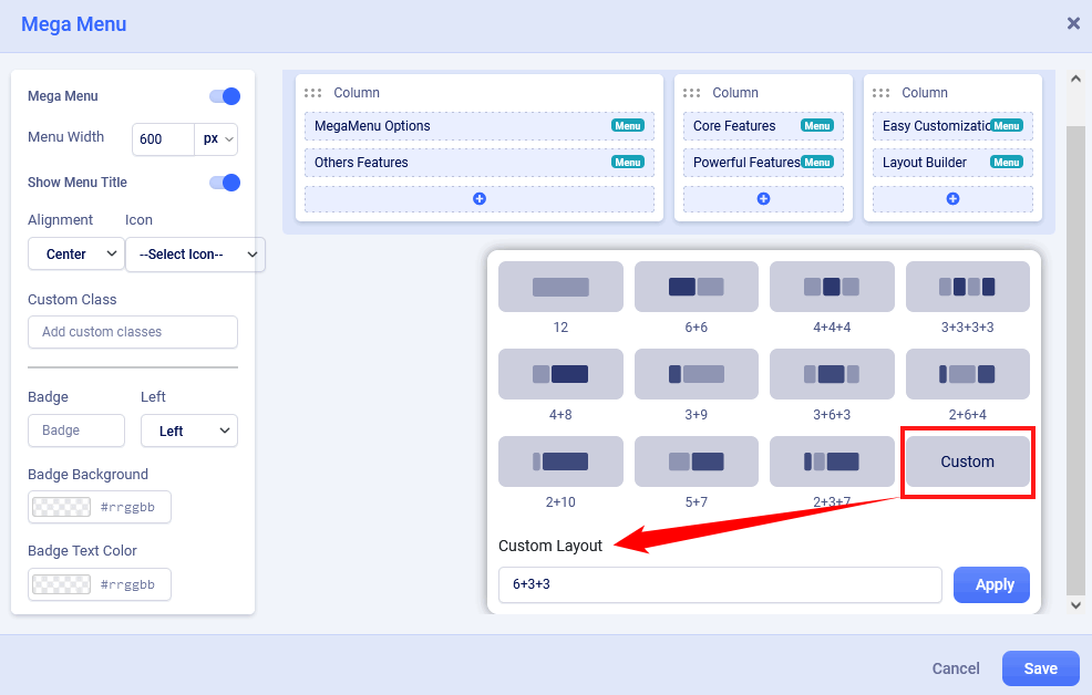
Custom Submenu structure is quite elastic so you can have many different grid layouts - for this purpose we created a "Custom" button. In theory summary of all columns should be equal to 12. For example: 6+3+3 or 5+5+2.
Anytime you would be able to delete or redesign layout structure by using icons on the top right position.
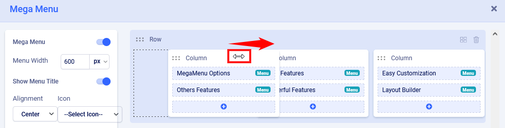
You can also change the order of columns content - hover on the column name until you would see a two-direction arrow icon then you can move the column to the left or ride side, later save settings to see changes.
How to add a Module or Menu Item to the Submenu
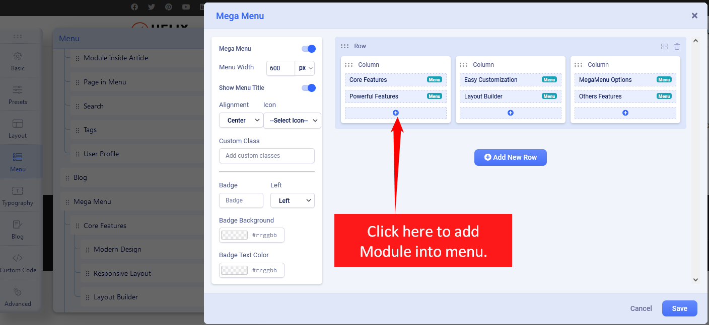
If you enabled Mega Menu and you have a row with a single column or columns, you can now add any module or menu item from the list of installed modules or available menu items. For example, you can display a banner, the latest articles, or a login module.
When you click on the plus (+) icon inside the column where the module should be, you will be presented with two tabs. Using the Modules Tab, you can insert any of the site modules. If you click on the Menu Items tab, you can choose from your site's existing menu items.

How to add icons in menu items
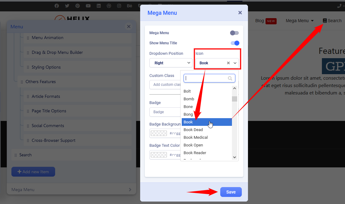
Using the Mega Menu options allows you to insert an icon next to a menu item and/or use an icon instead of a menu item. As the first step choose an icon from Font Awesome Free 5.15.x collection (around 1600 icons to choose from). You can search by name and preview them inside the map. You can also in the meantime open the FA website: https://fontawesome.com/v5.15/icons?d=gallery&p=2&m=free - and find an icon that fits you the most. Save settings to see the new or changed icon.
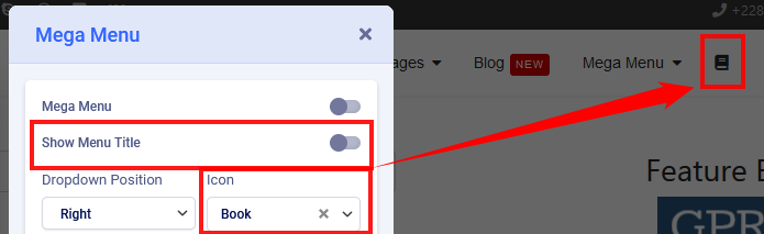
And to have an icon only without a text menu item turn off "Show Menu Title" and then click Save to keep settings.
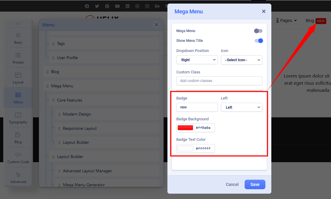
How to add badges in menu items
The badge is extra information displayed next to a menu item, it's a helpful feature to highlight a menu item. You can use any word there. Then choose the position of the badge (left, right). Next select background color and text color, if you would not choose any color options, by default dark red with white text would be used.
Mega Menu
Menu type - by default, there are enabled two separate menus: Mega Menu and Off-Canvas Menu [=] - sometimes called Hamburger Menu, because of the used shape. In desktop view, you can use both or only MegaMenu. It is pretty easy to disable the Off-Canvas menu from desktop view only. Just select "Mega Menu" and Save settings.
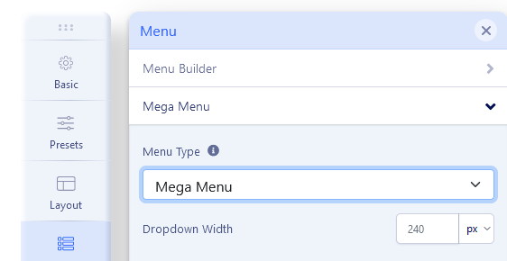
Dropdown Width - Width value is used to declare submenu width content area. By default is 240px. You can choose not only value itself but also different units for expressing width (px, em, rem, %).
Dropdown Animation - Mega Menu offers several transition options for your dropdown submenus:
- No Animation
- Fade In
- Fade In Up
- Fade In Down
- Rotate In
- Zoom In
- Pulse
This is the transition that occurs when the submenu is opened. To have the sub-menu appear with no fancy effect, just set it to None (No Animation).
Off-Canvas / Mobile Menu
Off-Canvas [=] is a mobile menu based on a menu module but customized by the Helix Ultimate framework. It's used in Mobile and Tablets view mostly. Yes, can be displayed on desktop view as well, in that case, just check Mega Menu tab settings.
Available settings:
- Off-canvas Position - select a position for the off-canvas menu, it can be on the left or right side.
- Select Offcanvas - select premade design for displaying the off-canvas menu (left align, left bordered or center align). Yes, you can create your own design. Just create a new style here: templates\shaper_helixultimate\offcanvas - using one of the existing styles as source code inspiration.
- Select Offcanvas Menu - select which menu should be used for the off-canvas (mobile) menu. Compare to old helix framework versions now by default, you don't have to publish any menu module to get the mobile menu.
- Maximum Level - select what deep of menu structure should be displayed in the Off-Canvas (Mobile) Menu. If you choose 'All', all levels will be shown.
- Show Logo - you have control of the display of your website logo in the off-canvas menu in top area.
- Enable Search - display the search (classic search in J3.x) field in the off-canvas box.
- Enable Login - display login icon that allows users to be redirected to login view.
- Enable Social Links - display social links at the bottom of the Off-Canvas Menu.
- Show Contact - display contact information, for example, phone number and e-mail.
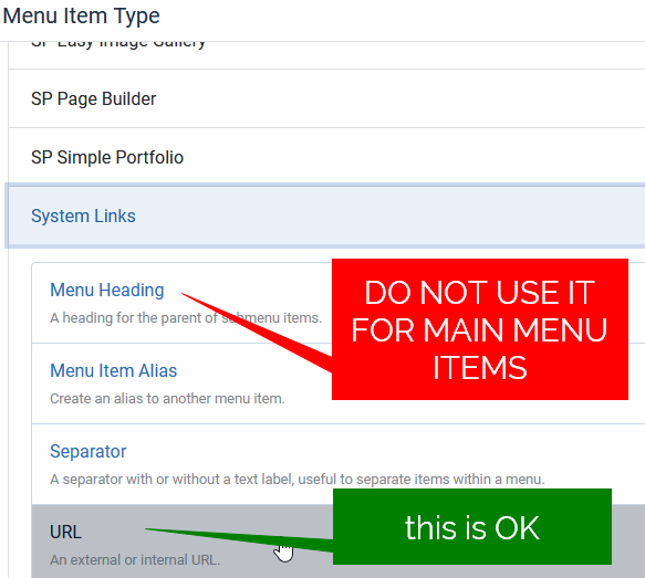
Important note! Please do not use the "Menu Heading" nor "Separator" menu type for the Main Menu items, otherwise in the Mobile (Off-canvas) menu, you will not see the ">" icon that allows you to expand the menu to see the submenu items. You can use an Article, Blog, or any component view or URL with "#" used as a link.
Notice! Remember to add and publish a Menu module on "offcanvas" position. If your site has more than one language, use two or more menu modules for each language separately.
Off-canvas arrow position:

Helix Ultimate allows you to set the off-canvas menu arrow position to either left or right.
This provides more flexibility in customizing the navigation experience by ensuring the off-canvas menu matches your site design and layout preferences.
Example:
- Selecting Left will display the arrow on the left side of the off-canvas menu.
- Selecting Right will display the arrow on the right side.
Note: This setting only affects the off-canvas menu arrows and does not change the menu content or structure.
How to show/hide logo inside off-canvas menu
In Template Options > Menu > Off-Canvas (tab) > Show Logo: On/Off
How to add an image to the off-canvas menu
If you want to display a selected image (for example ads banner) in the off-canvas menu area, below the menu please follow the steps:
- Create a new module "Custom" in Joomla > Modules.
- Put your logo image inside. Remember that the used image must have contrasting colors compared to the background color.
- Publish that module position "offcanvas" or "offcanvas-modules" - just choose from the list of positions.
- Assign the module to all pages (menu items).
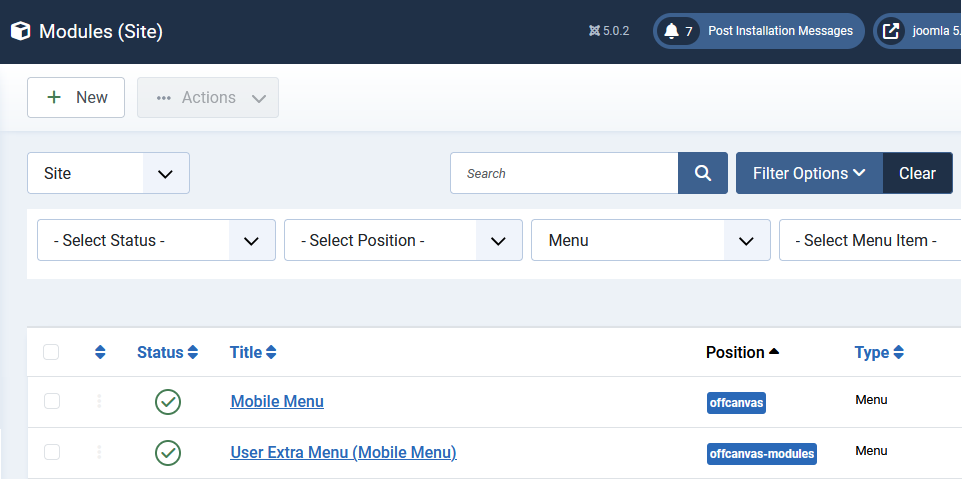
How to get more than one Mobile Menu
You can use more than one [=] mobile menu published in "offcanvas" position:
- In Module Manager, add a new "Menu" module.
- Select a different Menu from the list.
- Set Position "offcanvas" or "offcanvas-modules" (look at the screenshot above)
- Select the order of the module, probably need the below added before.
- Disable Module Title.
- Select the specific Menu assignments - probably you want to set it to all Menu Items.
- Select a module language if you have more than one active on your site.
- Then publish the module.
Module positions inside the Mobile Menu
In Helix Ultimate, you have two module positions that you can use in the Mobile (Offcanvas) menu area:
- offcanvas
- offcanvas-modules (is placed below)
By using one or both positions, you can publish almost any module under the Offcanvas menu items. This can include a Custom module with your own HTML code.
By using Custom CSS and order property you can make some basic changes and change the order of displayed blocks.