Configuration Changes
Charlotte Munch
Hi I am working with the Terrae template and would like help with the following:
-
How do I change the typography and colors of the wavy banner on the front page - see screenshot1
-
I want to reduce the distance from the menu down to the header - see screenshot2. How do I do that?
best regards Charlotte
27 Answers
Order by
Oldest

Paul Frankowski
Accepted AnswerSuper. Mark topic as solved. I updated also Template documenation adding those tips.
Paul Frankowski
Accepted AnswerHi Charoltte,
Your screenshot links are not correct, I see only error 404.
Anyway. I will try to guess.
ad 1) Use Custom CSS to change default code
.clip-style1 textPath {
  font-family: Bagel Fat One;
  font-weight: 400;
  font-size: 130px;
  line-height: 1.1;
}
Now your turn, change font name and font-size (!)
Then color, from green to white use
.clip-style1 textPath {
  color: #FFF;
  fill: #FFF;
}Paul Frankowski
Accepted Answerad 2) Padding (purple) in Article view
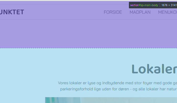
You can reduce top-padding by using that Custom CSS
.view-article #sp-main-body {
  padding-top: 80px;
}
default value was around 185px
Charlotte Munch
Accepted AnswerThanks for the answer!
I managed to change the style - but not to the font "Baloo Thambi 2" which I wanted!
I did not manage to change the color as the page crashed when I tried!
I can't find the ccs file where I need to reduce the top-padding. I have tried template.css in the CSS folder theme.scss / responsive.scss in the SCSS folder
Paul Frankowski
Accepted AnswerTouching template.css is bad idea, we informed about that in Helix documenation (!). Please use custom.css file >> https://www.joomshaper.com/documentation/helix-framework/custom-code-css-js-meta
do everything using Custom CSS, in case of "I gave up..." please let me know what font settings you need and share access in "Hidden Content" area.
Charlotte Munch
Accepted AnswerI would like to use the font "Baloo Thambi 2" (as in the main headline) And the background of the banner should have the color #389433
And thanks for the good advice - the spacing is perfect now 👍
Paul Frankowski
Accepted AnswerNew Font
.clip-style1 text, .clip-style1 textPath {
  font-family: 'Baloo Thambi 2', sans-serif;}
Background color (not green anymore, for example, transparent black)
.clip-style1 .waveClip {
stroke: #000000b2; }Charlotte Munch
Accepted AnswerThe typography is correct now - but the background color should not be black - but green. It can be transparent, however.
Paul Frankowski
Accepted AnswerAre you sure that you used , I don't see sign of using it
.clip-style1 .waveClip {
  stroke: #224A1ED1;
}Charlotte Munch
Accepted AnswerSorry - I have to reopen! Because now I have problems configuring my off canvas menu - it doesn't work if I change the configurations under template styles
The background should be #FFFFFF Text Color should be #252525 Hover Text Color should be Blue: #2C79A8 Active Text Color should be Red: e24417
And the whole menu should be left aligned!
And one more thing - I would really like to make a larger margin on the left and right on the mobile pages. The headline can end up going over the edges!
Can you help with that too?
Paul Frankowski
Accepted AnswerThose colors are taken from SPPB Settings. Edit here
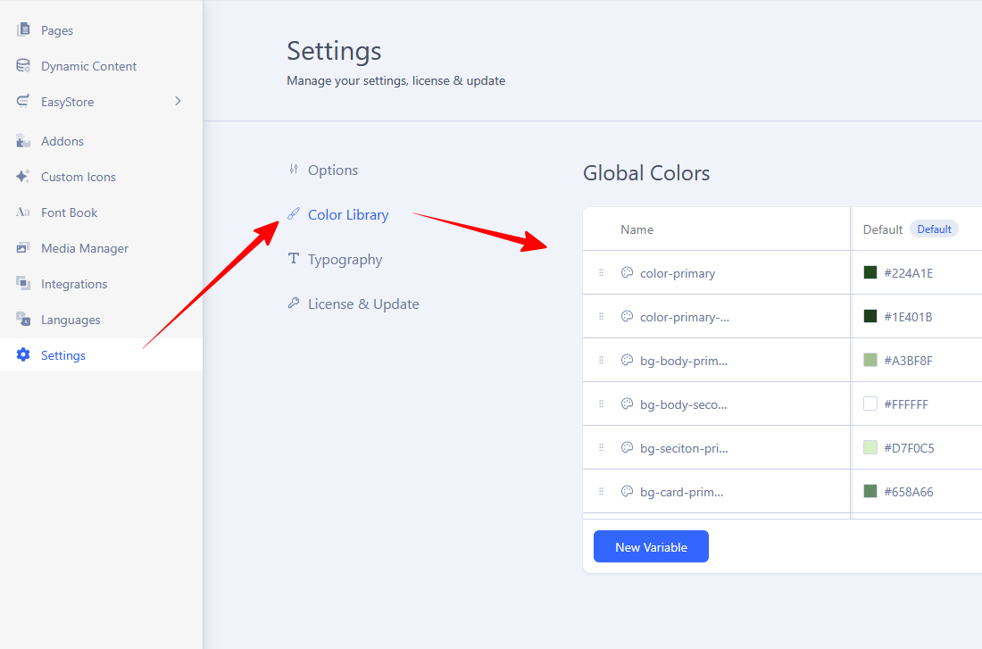
For example:
- Mobile Menu BG is bg-body-primary
- Mobile Menu items: text-variation-1
- Active Menu item (now yellow): text-variation-5
Charlotte Munch
Accepted AnswerThanks - The colors match now! But the typography and centering of the menu don't - where do I change it?
And again one more thing - I would really like to make a larger margin on the left and right on the mobile pages. The headline can end up going over the edges!
Paul Frankowski
Accepted AnswerAbout Typography, if you used Custom CSS already for that , just change one small thing, add "#sp-header" before class name:
#sp-header .sp-megamenu-parent > li.active > a,
#sp-header .sp-megamenu-parent > li.active > span,
#sp-header .sp-megamenu-parent > li  > a,
#sp-header .sp-megamenu-parent > li > span { .... }Paul Frankowski
Accepted AnswerCustom CSS should help
@media screen and (max-width: 768px) {
.com-sppagebuilder #sp-main-body,
.view-article #sp-main-body {margin: 0 10px; }
}
it will add extra 10px on both sides on mobile view
Charlotte Munch
Accepted AnswerI can't code - unfortunately. So I only use Custom CSS when you send me something !!! Can you send the whole code?
Paul Frankowski
Accepted Answerthis is default style used for menu items, change what you need/want
#sp-header .sp-megamenu-parent > li > a,
#sp-header .sp-megamenu-parent > li > span,
#sp-header .sp-megamenu-parent > li > a,
#sp-header .sp-megamenu-parent > li > span {
  font-weight: 400;
  font-size: 18px;
  letter-spacing: -0.2px;
  opacity: .6;
  color: 080808;
}Charlotte Munch
Accepted AnswerThere are only 2 things I'm not so happy about:
The footer doesn't go all the way to the edge. And that's maybe because we've made a right and left margin. But only the mobile version needs a margin in the body - because the text can end up going over the edge - not the footer!
I want the wave not to be transparent (sorry I changed my mind)
Paul Frankowski
Accepted AnswerThan just change color hex code (here), or totally remove that line
.clip-style1 .waveClip {
stroke: #000000b2; }Paul Frankowski
Accepted AnswerFooter changes to override template default style
@media screen and (max-width: 768px) {
  #sp-footer {padding: 10px 0; margin: 30px 10px 0 10px;}
}Charlotte Munch
Accepted AnswerWould you please check this -> https://midtpunktet.dextime.dk/index.php/madplan on your mobile (I have an iphone14) and see that the header goes over the edge on the right side.
On the PC the footer still has a white margin on the same page
Paul Frankowski
Accepted Answer@media screen and (max-width: 768px) {
h1, .article-details h1 {font-size: 60px;}
}Smaller font-size should help , by default was 87px
Paul Frankowski
Accepted AnswerAbout the footer, update the previous code to that one
@media screen and (max-width: 768px) {
  #sp-footer {padding: 10px; margin: 30px 0px 0px 0px;}
}
I changed margins > padding