

Basic Settings (Helix3)
With Helix3 you get unlimited possibilities to customize the look of your website. All these things you can easily customize with just few clicks. Basic settings include many useful customization settings, which allows you to adapt Helix3 to your project goals and your customer expectations.
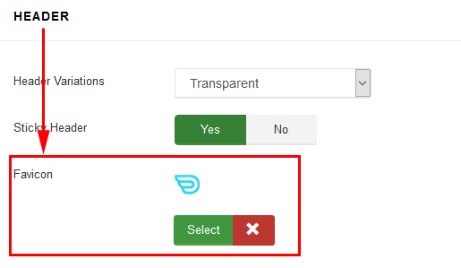
Header
Use a Sticky Header for better usability. With Helix3 sticky header your main menu and logo will always be at the top of the screen, automatically following when you scroll. This makes it much easier for your viewers to quickly navigate through your site. And you can easily turn the sticky header on or off in our advanced theme options panel.
Favicon - upload ico, gif or png graphic file to replace default Joomla favicon. That icon associated with a website intended to be used when you bookmark the web page. Web browsers use them in the URL bar, on tabs, and elsewhere to help identify a website visually. A favicon is typically a graphic 16 x 16 pixels square, also can use transparency inside. All modern browsers (tested with Chrome, Firefox, IE8, Opera and Safari) will always request a favicon.ico so it's best to always have a favicon.ico file, to avoid a "404 not found" error.
Boxed Layout
You can use Helix3 in wide (default) or boxed layout variants.
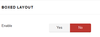
Wide layout (if No) is perfect for you, if you like airy websites, with no visible borders or page edges. A boxed layout (if Yes) is a form of layout where the boundary of the main body is clearly defined and you can choose to have the background be a custom image.
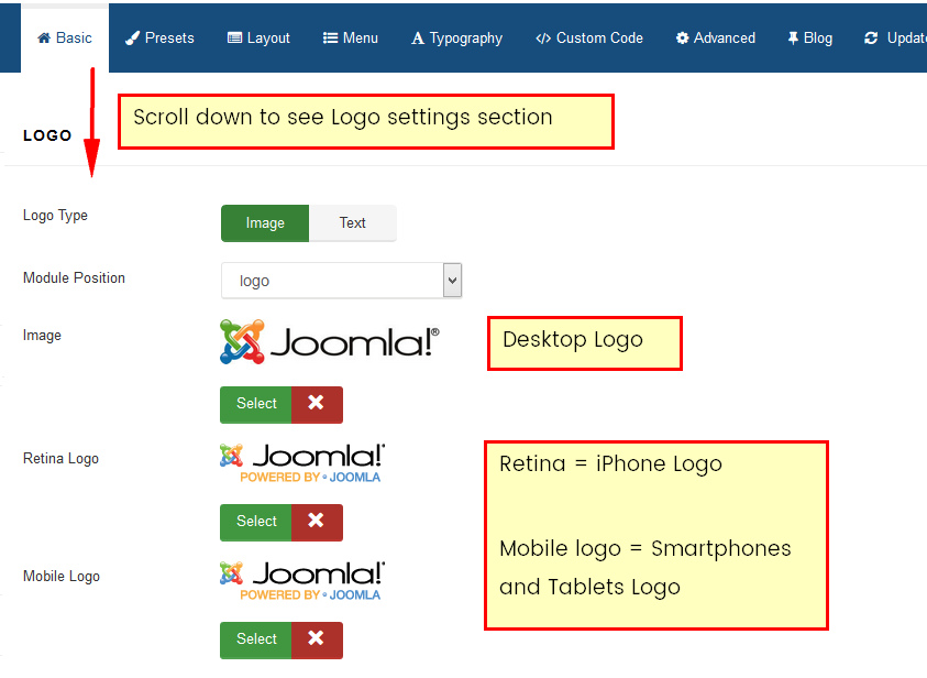
Logo Image
The Logo feature controls the output of the template's main logo in top-header section.
- Logo Type - you can set the logo type as image or text type.
- Logo position - logo can be placed on every available module position. Not only on default "logo" position.
- Image - if you chosen Image logo type, you can upload & use your own logo image (PNG, animated GIF or JPG). We suggest to not use logo image wider than 400px. In most cases doesn't make sense to use wider.
If your logo after change on front-end still look too small please change column sizes which Logo and Menu in Layout tab setting section. - Retina Logo - upload & use a double size of your original logo dimension to keep look great of higher resolution devices like retina or 5k display. It will work on any retina device but only on safari (iPhone/iPad) and chrome browser.
- Mobile logo - use this logo image for mobile devices only, use smaller version of default logo (with height less than 80px) , which will be suitable screens in all popular smartphones.
Note: If none of those image will be chosen - template will use default logos from template design like helix3 logo or template name logo.
Tip: PNG with transparency level is the best choice for logo image.
Logo and Sticky Header
If you're using sticky header and your main logo is big you may have small problem with it size after page would be scrolled down. But following customization css code may help to improve it. Of course you can change value of max-height according to your needs.
div.is-sticky .sp-default-logo { max-height: 60px;}
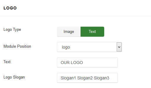
Text Logo
Text logo may be used when you do not have graphic logo. Also it may help a little bit in SEO purposes.
In that case you can also use text slogan.
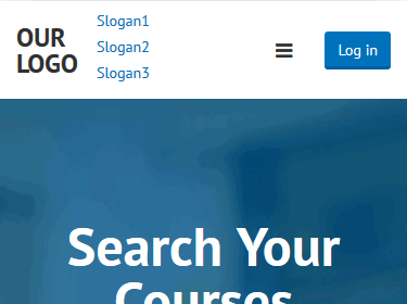
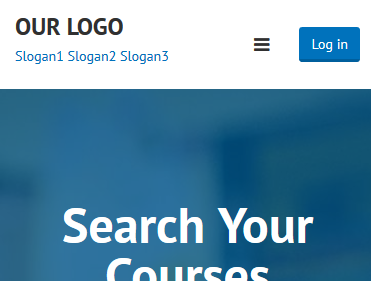
Note! Site opened in smartphones and some tablets may have vertical slogan not horizontal. To fix it, you can reduce font-size of slogan or use following code:
@media (max-width: 767px){
 #sp-header .logo p,
 #sp-header .logo h1 { display: block !important;}
 #sp-header .logo h1 {margin: 15px 0 0;}
 }
It will help to reduce partition / separation of longer slogan and text logo.
|
BEFORE
|
AFTER
|
Of course if you do not have login button there (which takes some space) there is a hope that you do not have to customize code.
Use following code to remove slogan on smartphones only:
@media (max-width: 480px) {
 #sp-header .logo p  { display: none !important;}
 }
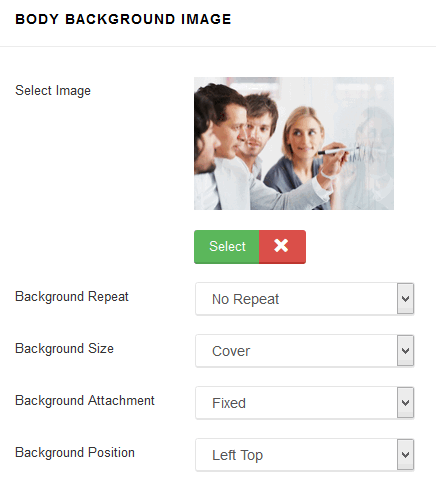
Body Background Image
If you chosen Boxed Layout (before) you can use that option which allows you to set background image for <body> without editing or adding custom CSS code.
- Select Image - select image (JPG, PNG, GIF) which will be used as the background. To remove a background image, simply delete the URL from the settings field.
- Background Repeat - sets how a background image will be repeated. By default, a background-image is no repeated, and the image is placed at the top left corner. Available options: No Repeat, Repeat All, Repeat Horizontally, Repeat Vertically, Inherit from default settings. These values allow you to tile images across either axis of an element (or both axes) but don’t allow for any finer control than that.
- Background Size - sets the size of the background image. Default value is cover - is means scale the background image to be as large as possible so that the background area is completely covered by the background image. The contain keyword sets the image should to scale (proportionately) as large as possible, without exceeding either the height or width of the containing element. Available options are: Cover, Contain or Inherit from default settings.
- Background Attachment - sets whether a background image attachment is fixed or scrolls. Available options: Fixed, Scroll or Inherit from default settings.
- Background Position - sets the starting/initial position of a background image.
Footer
Template settings allows you also to add custom footer copyright note also with html tags linke <a href="/"> to use link inside. You can select the position where footer section will be published. By default is using "footer1" module position created from Layout Manager. Of course instead using this feature you can publish there alternative module, also Custom HTML. But that solution is much quicker.

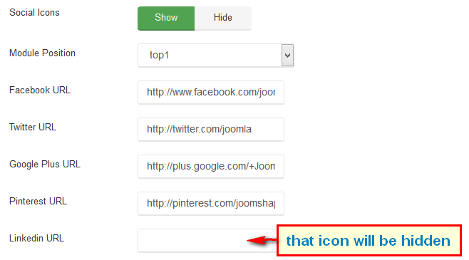
Social Icons
Those social icons are localized in top left corner of template, in that row there can be 11 icons with links to popular social networks serves: Facebook, Twitter, Google Plus, Pinterest, Linkedin, Dribbble, Behance, YouTube, Flickr, VK (VKontakte) and Skype communicator. By default this object is using a "top1" module position.
You can easily disable/enable this feature and choose which social icons must be shown. Remove "#" in input fields to hide icon on front-end.
Contact Information
Instead using a Custom HTML module you can use this feature to show small contact info in top right corner, which include phone number and e-mail address.
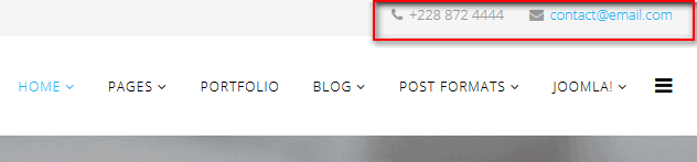
Phone icon and e-mail icon are added automatically and they are based on Font Awesome. By default this object is using a "top2" module position.
Coming Soon
This mode can be used to replace default off-line mode. It creates a Coming Soon page for your Joomla 3 website while it's under construction and shows countdown timer & short message from your visitors, instead "boring" login module.
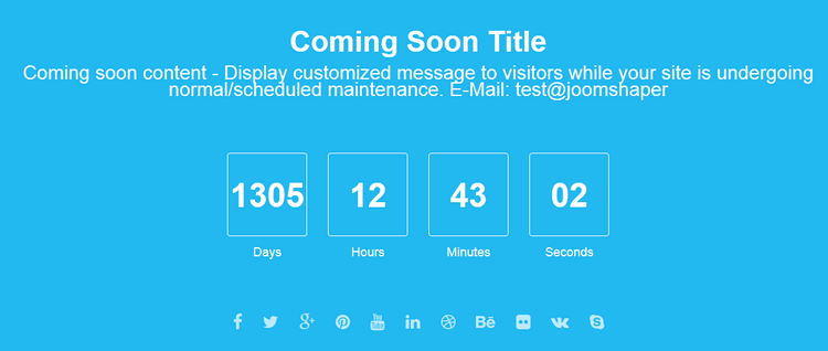
Is the important key for business company or organization after they purchased a domain, but they have not started the development website yet, so coming soon page very primary option for temporary use. It is very useful if you intend to launch a new project because it inform your potential readers that you are working on something.
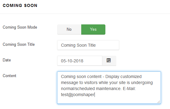
Note! The only valid date format in "Date" field is DD-MM-YYYY, please use it.