

Menu Settings & Customization
Mega Menu is an easy to use menu tool for creating beautiful, customized menus for your site, also with modules inside. That also boosts SEO and user engagement. Here in template settings you have access to 4 options only, more advanced settings are "hidden" in Menu Manager inside each menu item - so please check also there.
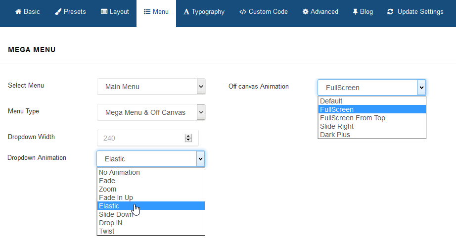
Select Menu
It allows you to choose menu from available in your system.
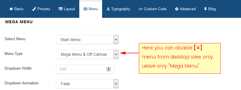
Menu Type
By default there are enabled two separate menus: Mega Menu and Off Canvas Menu [=] - sometimes called Hamburger Menu, because of used shape. You can use both or only of them - as you want or need.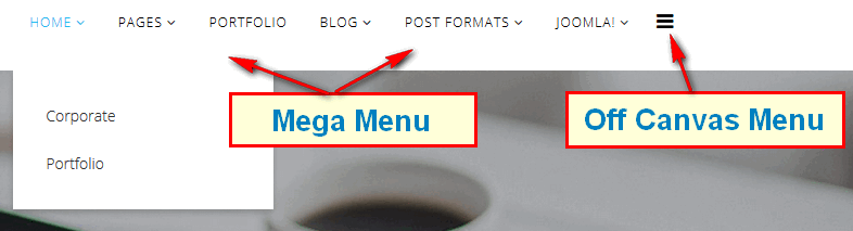
How to use Mobile Menu / Off Canvas
Off Canvas [=] is indeed a external menu module, built-in in Helix3 framework. It's used in Mobile view for Smartphones and Tablets mostly.
Follow those basic steps to use it:
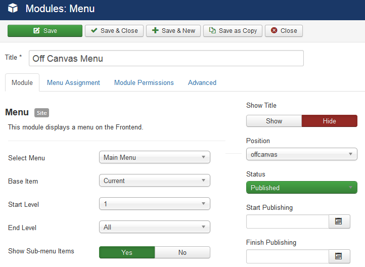
- In Module Manager add new "MENU" module.
- Select Menu from list which should be used.
It doesn't have to be "Main Menu" every time, you can use different menu for mobile/tablet purpose only. - Select "offcanvas" module position for it.
- Set Menu Assignment > Module Assignment : On all pages (suggested)
- Set Status: Published
How to get more than one Mobile Menu
You can use more than one [=] mobile menu published in OffCanvas position:
- Just add new "Menu" module.
- Select different Menu from the list.
- Set Position "offcanvas"
- Select order of module, probably you need below added before.
- Disable Title
- Select the specific Menu assignments - probably to all Menu items.
- Then publish module.

How to disable OffCanvas Menu in desktop
It pretty easily to disable Off Canvas [=] menu from desktop view only (!). Just select "Mega Menu" only here:
Menu Dropdown Width
Dropdown Menu Width value would be to set it to the width of your submenu size content area. By default 240px.
Menu Dropdown Animation
MegaMenu offer four transition options for your dropdown submenus:
- No Animation
- Fade
- Zoom
- Fade In Up
- Elastic
- Slide Down
- Drop In
- Twist
This is the transition that occurs when the sub-menu is opened. To have the sub-menu appear with no fancy effect, set this to None (No Animation).
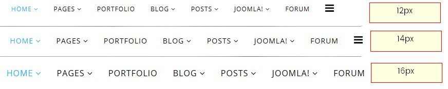
How to change Menu items font size
In Helix3 template or template based on Helix3 you can do this using custom CSS code:
.sp-megamenu-parent > li > a {font-size:14px;}
by default we used font-size :12px, so 2px more means bigger letters and so on.
How to change Menu items font weight
In Helix3 template or template based on Helix3 you can do this using custom CSS code:
#sp-header .sp-megamenu-parent > li > a { font-weight: bold;}
The font-weight property sets how thick or thin characters in text should be displayed. The font-weight property accepts either a keyword value or predefined numeric value. Font weight is dependent either on available font faces within a font family or weights defined by the browser.
How to change Menu items font color
In Helix3 template or template based on Helix3 you can do this using custom CSS code:
#sp-header .sp-megamenu-parent > li > a { color: red;}
The color CSS property sets the foreground color value of an element's text. You can use named color (blue, green, blue), hex (#46A546) and rgb color values inside { }.
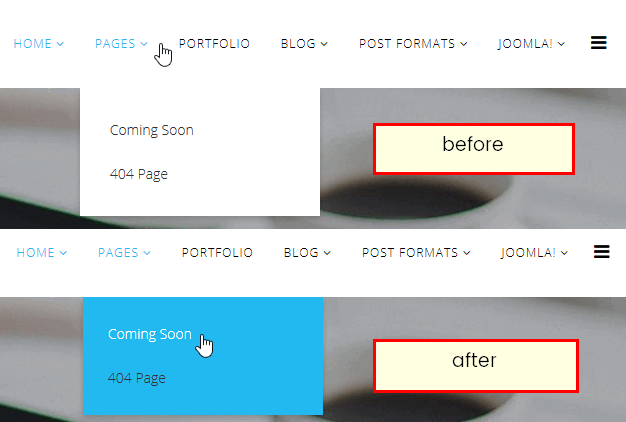
How to reduce space in submenu
To reduce space (padding) in all sub-menus, also between sub-menu items please use following custom CSS code:
 .sp-megamenu-parent .sp-dropdown .sp-dropdown-inner {padding:10px;}
.sp-megamenu-parent .sp-dropdown li.sp-menu-item > a
{padding: 4px 7px; }
How to change color of active link
One of popular question is: how to change/make a visited menu link color remain highlighted, so a visitor knows which page they are on. By default we implement this feature, but it has this same color as hover. With custom CSS, links can be styled in different ways.
All visted menu item(s) use the :active CSS pseudo-class that is being activated by the user. It is generally triggered when the user clicks on an element or selects it with the keyboard's tab key. Check below simple custom CSS code:
 .sp-megamenu-parent > li.active > a,
.sp-megamenu-parent .sp-dropdown li.sp-menu-item.active > a { color: red; }
Note: :active MUST come after :hover (if needed) in the CSS definition in order to be effective!
Off Canvas Menu [=] Customization
To change color & size of Off Canvas (mobile) Menu icon [=] (which may be white or black by default) you have to use following custom CSS code :
#offcanvas-toggler > i { color: red !important; font-size: 32px; }
In this example we chosen red, but of course try with other name or hex colors.
If you want to change color of [=] menu on subpages with header or slidershow only use:
.has-sub-image #sp-header.menu-fixed #offcanvas-toggler > i,
.has-slideshow #sp-header.menu-fixed #offcanvas-toggler > i { color: blue; }
To change color of mobile menu icon [=] after hover on it, please use basic custom CSS code as well:
#offcanvas-toggler > i:hover { color: yellow; } Color of menu items inside Mobile Menu
To change color of Off Canvas menu items, please try example custom CSS code:
.offcanvas-inner .sp-module ul > li > a { color: red;  }
.offcanvas-inner .sp-module ul > li > a:hover { color: yellow; }
In this example we chosen red for links and blue for links with :hover selector - when you mouse over them, try with other name or hex colors as well.
Background color of Mobile Menu
You have use custom CSS, here is example code to make it green (two shades):
.offcanvas-menu { background-color: #31794D; color: white;}
Here is example code to make it blue (two shades):
.offcanvas-menu { background-color: #147DE5; color: #fff; }
(!) How to use custom CSS code in templates based on Helix3? Read in Custom CSS and Header code section below.
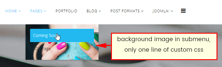
How to add background color / image to Dropdown Menu area
First you have to know that it request a custom CSS code. But besides it's pretty easy.
Please use following CSS code:
 .sp-megamenu-parent .sp-dropdown .sp-dropdown-inner {
    background: #22b8f0;
    padding: 15px;
}
To add background image as well, you have to add more parameters to background property. The background and background-image property in CSS applies a graphic (PNG, JPG, GIF, SVG and data URI) or gradient to the background of an element. The url() value allows you to provide a file path to any image, and it will show up as the background for submenu area.
Image background example code:
.sp-megamenu-parent .sp-dropdown .sp-dropdown-inner {
    background: #22b8f0 url(http://domain.com/images/menu_bg.png) no-repeat scroll 0 0 / cover;
}
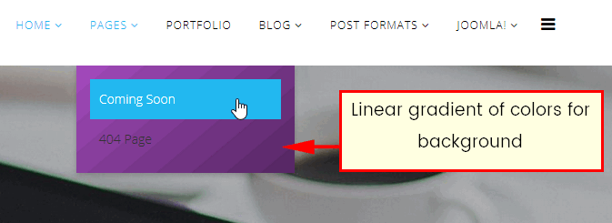
You can declare the background of an element to be a solid color in CSS or image, but you can also declare that background to be a gradient. Using gradients declared in CSS3, rather using an actual image file, is better for site performance.
Gradient sub menu background example code:
 .sp-megamenu-parent .sp-dropdown .sp-dropdown-inner {
    background: #a048b9 linear-gradient(140deg, #a048b9 0%, #a048b9 10%, #9845b0 10%, #9845b0 20%, #8c40a3 19%, #9041a6 21%, #9041a6 20%, #9041a6 30%, #853c99 29%, #883e9d 31%, #883e9d 30%, #883e9d 40%, #7d3990 39%, #803a94 41%, #803a94 40%, #803a94 50%, #753587 49%, #78368b 51%, #78368b 50%, #78368b 60%, #6d317e 59%, #703381 61%, #703381 60%, #703381 70%, #652e74 69%, #682f78 71%, #682f78 70%, #682f78 80%, #5d2a6b 79%, #602b6f 81%, #602b6f 80%, #602b6f 90%, #552662 89%, #582866 91%, #582866 90%, #582866 100%) repeat scroll 0 0;
    padding: 15px;
}
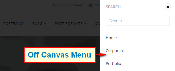
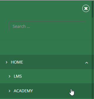
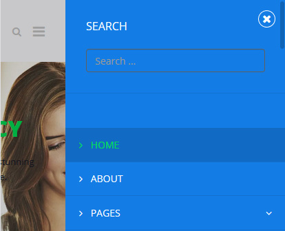
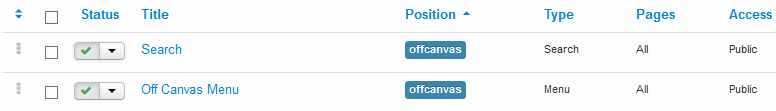
Search in Off Canvas Menu
Probably you're wondering how to add search module inside Off Canvas Menu. It's quite easy. All you have to do is:
- Create New or Edit current search module (in Module Manager)
- Disable Module Title (probably you do not need it there)
- Change/Choose its position to "offcanvas"
- Assign to all or selected subpages (menu items)
- Publish module
Using this same steps you can also publish there any other module(s). But please remember that Menu should be the most important part there, so put it as a first or second position in the module order.