
Product Comparison
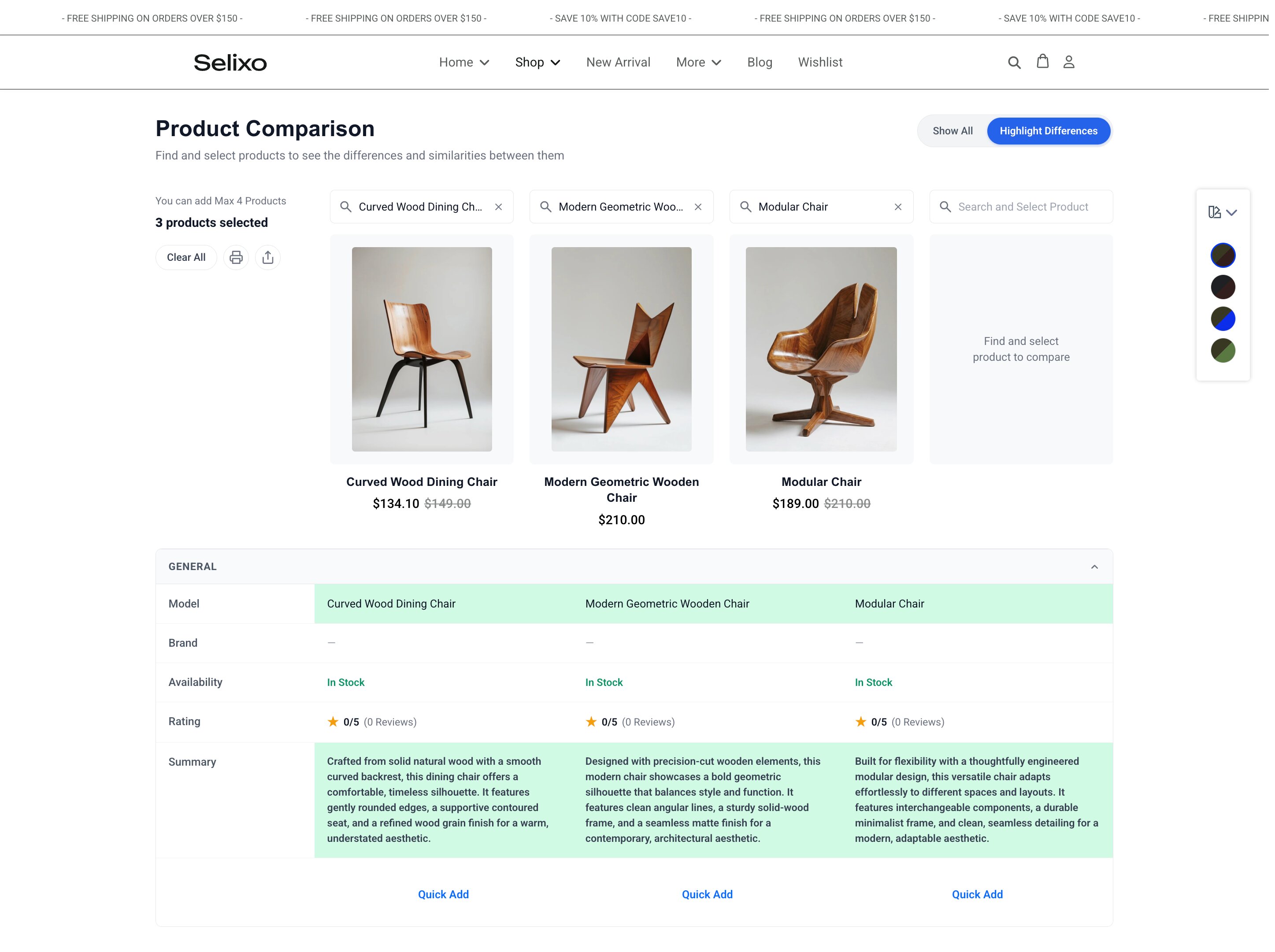
Product Comparison allows customers to compare products side-by-side in your store. When browsing your product list, users can select up to four products to compare. This feature can be implemented using the Add to Compare addon.
The addon can only be used after product comparison has been enabled. To enable this setting, go to Components > EasyStore > Settings > Products.
You will get the following customization options:
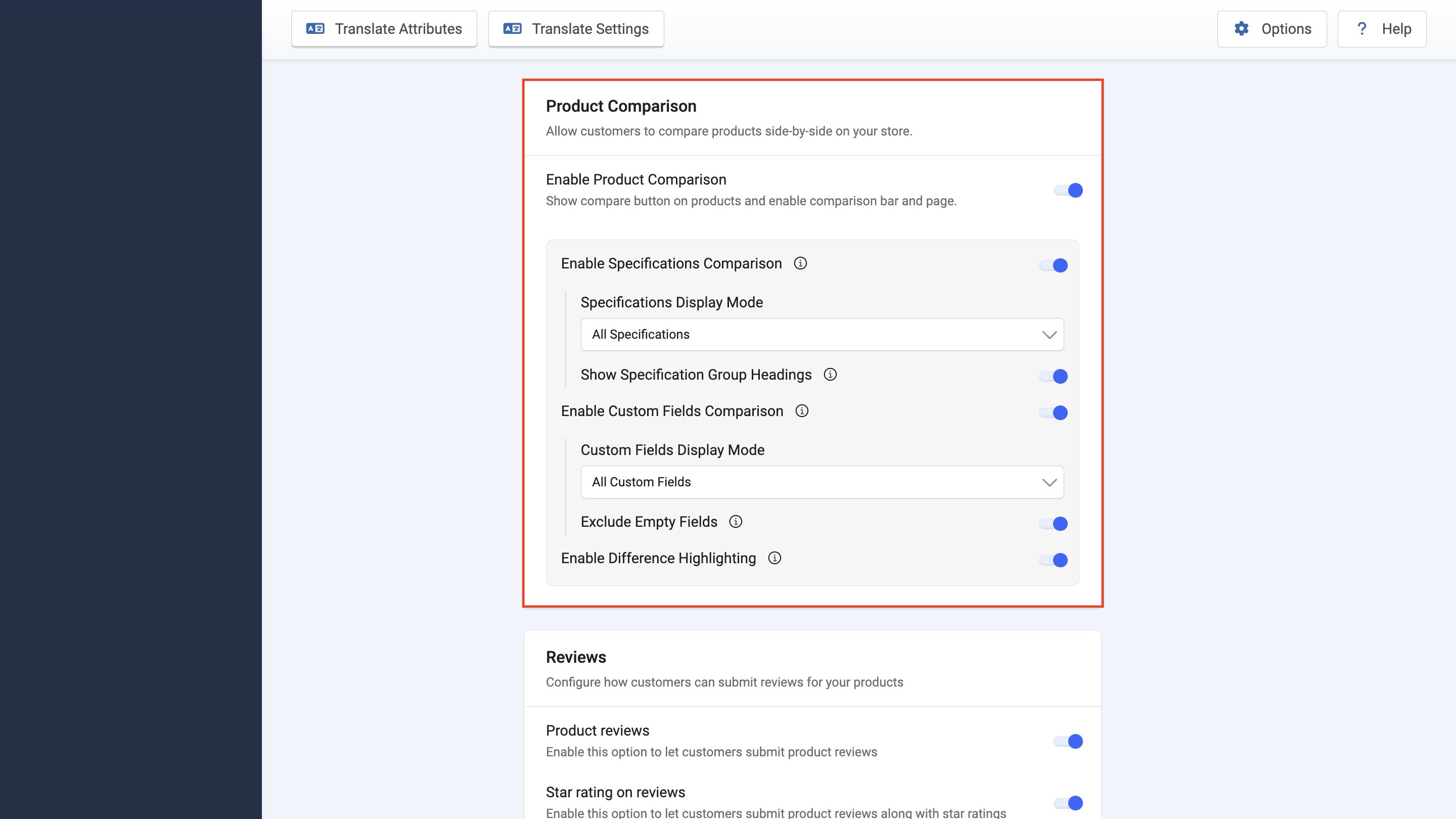
Enable Product Comparison: This is the primary setting to enable the compare button on products and enable the comparison bar and page.
Enable Specifications Comparison: This setting enables the products’ additional data or specifications in the comparison table. Underneath this setting you get additional options:
- Specifications Display Mode: Choose between “All Specifications”, “Selected Groups” or “Selected Keys”.
- Show Specification Group Headings: Use this option to display subheaders for each specification group.
Enable Custom Fields Comparison: Use this setting to include custom fields in the comparison table. It includes additional options such as:
- Custom Fields Display Mode: Use the dropdown to select between “All Custom Fields”, “Selected Fields” or “Selected Field Groups”.
- Exclude Empty Fields: Enable this to hide rows for custom fields that have no values across any compared product.
Enable Difference Highlighting: Enable this to highlight differing elements within the comparison table.
Add to Compare Addon
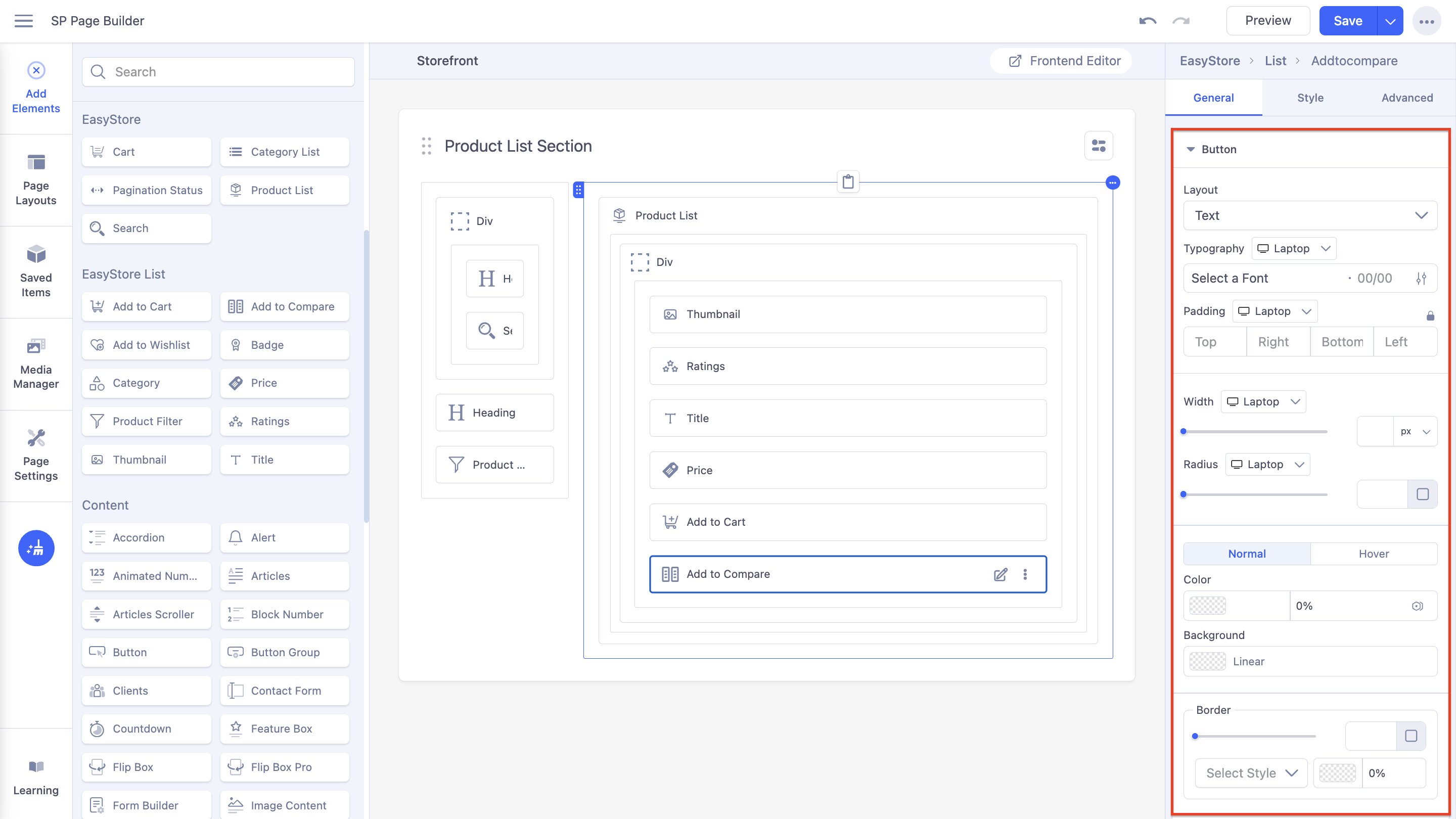
The Add to Compare addon allows customers to seamlessly compare between up to 4 products. It provides extensive customization options including adjustments to the button’s icon, layout, style, border radius, border style, background, and more, to align with your store’s design.
Note: Product comparison needs to be enabled first in Components > EasyStore > Settings > Products for the addon to be displayed and usable in the storefront.
Button
Layout: You can select whether the button will consist of only text, only an icon, or a combination of both.
Typography: You can customize the font type, font size, Line Height, Letter Space, Style, and Weight of the text. You can choose the screen type, and set different font settings for each screen type (Laptop, Tablet Landscape, Tablet Portrait, Mobile Landscape, and Mobile Portrait). SP Page Builder automatically adjusts these values for responsive design by default.
Padding: You can adjust the padding dimensions for the button. You can choose the screen type, and set different padding dimensions for each screen type.
Width: Using a slider, you can adjust the width of the button. You can choose the screen type, and set different widths for each screen. You can use the input field to adjust the width as well (in px, rem, em, and %).
Radius: Similarly, you can adjust the radius of the button using a slider and input field. You can choose the screen type, and set different radii for each screen. By expanding the input field by clicking the radius icon, you can input measurements for all sides of the radius or select one uniform value for all sides.
Color: You can adjust the color of the button using this option. You can control whether there will be a hover animation or not.
Background: You can adjust the background color of the button using this option.
Border: Similar to the radius, you can adjust the border radius of the button via a slider or input field. You have the option to adjust the border type (solid, double, dotted, dashed, groove, ridge, inset, outset) as well as the opacity of the border.
Icon
Size: Using a slider, you can adjust the size of the icon. You can use the input field to adjust the size in pixels.
Gap: Similarly, using a slider and an adjacent field, you can adjust the gap between the icon and the text. You can choose the screen type (Laptop, Tablet Landscape, Tablet Portrait, Mobile Landscape, and Mobile Portrait), and set different gaps for each screen.
Color: You can adjust the color of the icon using this option. You can choose whether the color will remain static or change once the user hovers over the button.