

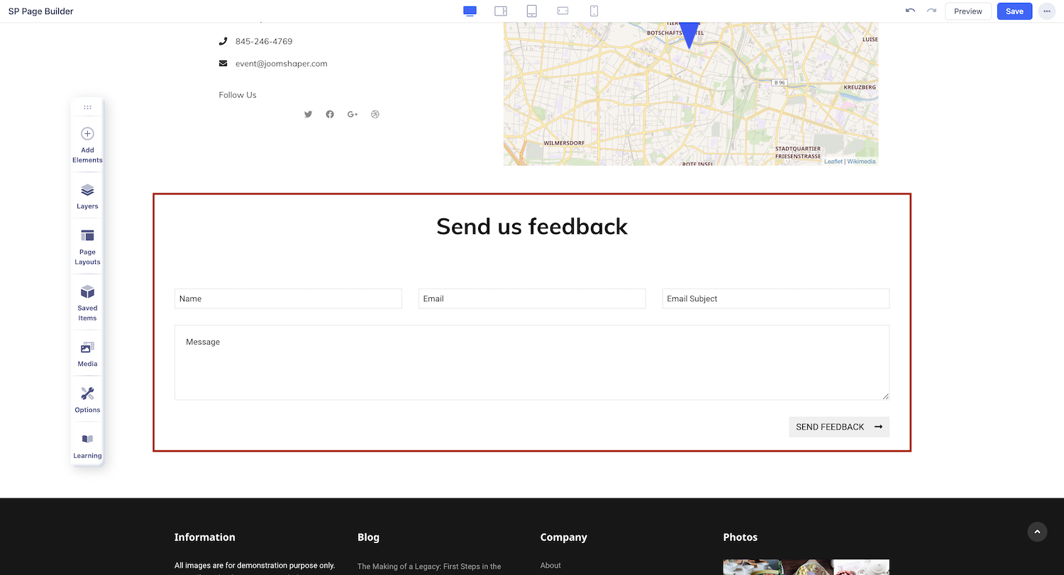
Contact Form
A Contact form, simply put is a form that visitors fill out to contact you. It can be a question set that asks for necessary information like name, email, and issues, that visitor needs to fill in to contact the site administrator. SP Page Builder’s Contact Form addon lets you create a contact form easily and without any hassle with all the necessary form fields.
Notice! Contact Form does not store submitted messages anywhere. Therefore, you may lose important messages forever if your mail server has issues or you make a mistake in mail configuration.
How to Add a Contact Form
You can add the Contact Form addon to your page from the SP Page Builder sidebar. Simply drag the addon from the Addons panel and drop it on the section of the page where you want to add a contact form.
Contact Form Settings
Click on the Contact Form addon you’ve added to your page to open the addon inline editor. You can access the addon settings from there and customize the contact form to fit your needs.
Content Settings
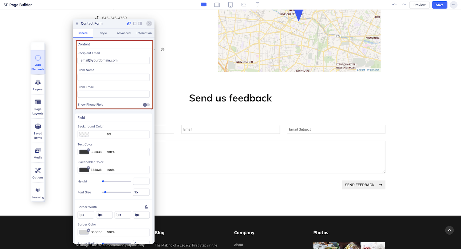
Recipient Email: Use this field to enter the recipient's email address. The recipient email holder will receive the inputted contact form information and queries.
From Name: Use this field to enter the name or label of the sender of the email.
From Email: Use this field to enter the email of the sender.
Show Phone Field: Enable to show the phone input field on the contact form.
Field Settings
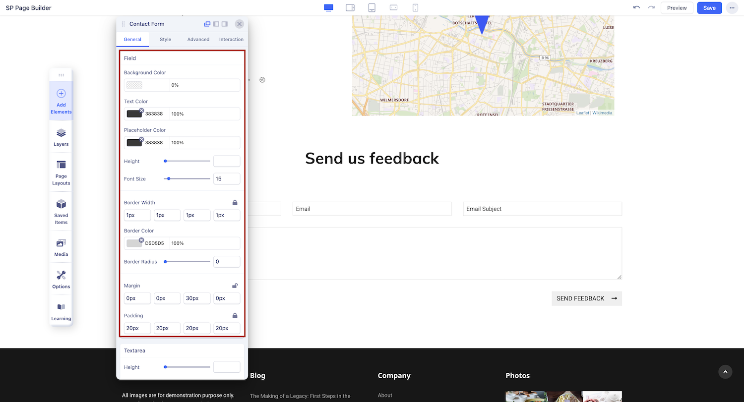
Background Color: Set the background color of the input fields.
Text Color: Set the color of the text when a user fills in the input fields.
Placeholder Color: Set the color of the placeholder texts in the input fields.
Text Area
Height: Set the height of the text area using the slider to up and down the number according to your preference.
Hover Background Color: Set the background color when a user hovers over the input field.
Hover Color: Set the color of the placeholder text when a user hovers over the input field.
Focused Border Color: Set the color of the input field border when a users hover over the input field.
Captcha
Enable Captcha: The contact form can lead your site to lots of security vulnerabilities. That's why SP Page Builder introduced a captcha with its contact form addon. Enable this option to enable captcha.
Captcha Type: Set the Captcha type to be Default, Google reCaptcha, or Google Invisible reCaptcha.
Captcha Question: In this field, you will add a smart question for your captcha as per the security priorities and this captcha question will be displayed on the contact form.
Captcha Answer: Use this field to enter the answer to the captcha question you have just entered in the captcha question field.
Checkbox
According to EU-GDPR requirements, users need to give explicit consent for the website to collect their information (also by contact form). That's why we added this checkbox field with the required status, this way users will not be able to submit the form without explicitly offering consent.
Show Checkbox: Enable to show Checkbox on the contact form.
Checkbox Label: Add a label to your checkbox so that users can understand what they are consenting to.
Form Button
Use Custom Button: It allows you to change text, color, and button appearance.
Button Text: Enter the button text here. Leave it blank if you don’t want any button.
Button Font Style: There is numerous button font style you can choose from uppercase, lowercase, etc.
Button Letter Spacing: Set the button letter spacing using this option.
Button Style: You can choose a desired button style from the given list.
Button Appearance: You can choose a suitable button appearance from the list.
Button Size: There are numerous options you can choose from to define your button size.
Button Shape: Choose your button shape from the list using this option.
Full-Width Button: Set this option to ‘Yes’ if you want a full-width button. Leave that to ‘No’ if you don't.
Button Icon: You can add a button icon using this option. Select the button icon from the list.
Button Icon Position: Where do you want the icon left or right? Select your desired position.
Enable Rate Limit
- Max Requests: Define the maximum number of form submissions allowed per user within the specified time window. For example, setting this to "5" means a user can submit the form up to 5 times before the limit is applied.
- Time Window: Specify the duration for the rate limit in seconds. For example, a value of "10 seconds" means that the user can only submit the form up to the defined Max Requests within that 10-seconds period.