- TemplatesTemplates
- Page BuilderPage Builder
- OverviewOverview
- FeaturesFeatures
- Dynamic ContentDynamic Content
- Popup BuilderPopup Builder
- InteractionsInteractions
- Layout BundlesLayout Bundles
- Pre-made BlocksPre-made Blocks
- DocumentationDocumentation
- EasyStoreEasyStore
- ResourcesResources
- DocumentationDocumentation
- ForumsForums
- Live ChatLive Chat
- Ask a QuestionAsk a QuestionGet fast & extensive assistance from our expert support engineers. Ask a question on our Forums, and we will get back to you.
- BlogBlog
- PricingPricing
Image Layouts
The Image Layouts addon presents six astonishing layouts for creating attractive visual content. This addon groups an Image, Text Content, and a Button together into a single block. You can even control the grid allocation and add a video modal to this addon. All in all, this is a very advanced tool to have at your fingertips.
How to Add Image Layouts
To add this addon, open the Addons Panel by clicking on the Addons button on the Sidebar or using the plus icon found within a Row. Scroll to the Media section and drag & drop the Image Layouts addon where you want to place it on your canvas.
Content
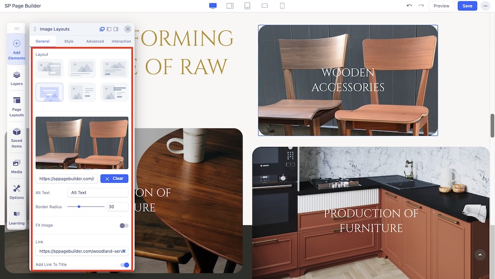
In the Content section under the General tab, you will also be presented with the following options:
Layout: Choose any one of the six available Image Layouts from here.
Choose Image: Opens the Media Manager from where you can select the image you want to use. After adding the Image, an Image Thumbnail will replace the Choose Image button. Initially, you will get the following additional options:
- Replace: Hover over the Thumbnail to find the Replace button which will open the Media Manager
- Clear: Click on this button to remove this image and add another one.
Image URL: If the image you want is online, you can simply paste its URL into the text field beside the Upload button.
Upload: Also opens Media Manager and from here you can click on the Upload Files option to upload your Image.
Alt Text: A brief description of an image that is used for conveying the image's meaning when it cannot be viewed for various reasons.
Border Radius: You can adjust the border radius of the image.
Image Order Options: Select the device you want to adjust the Image Order for.
- Image Desktop Order: Select the Image Order (position) of the Image in the Desktop view.
- Image Tablet Order: Select the Image Order (position) of the Image in the Tablet view.
- Image Mobile Order: Select the Image Order (position) of the Image in the Mobile view.
Link: Add a link to your image layout using the Link tab.
- For URL, simply paste the web address you want to link to into the first field.
- For Menu, select the option you want to link to from the dropdown list. Note that the options on this list are all Menu Items that exist on your website.
- For Pages, select the option you want from the dropdown list. Like Menu, these options are all existing Pages available on this website.
- Lastly, you can enable the option Open in New Tab to open this link in a new tab, Add nofollow to tell search engines to ignore this link, Add Noreferrer to prevent any referrer information from being sent to the target resource, and Noopener to stop a third-party website you connect to from using the window object to take over the browser tab.
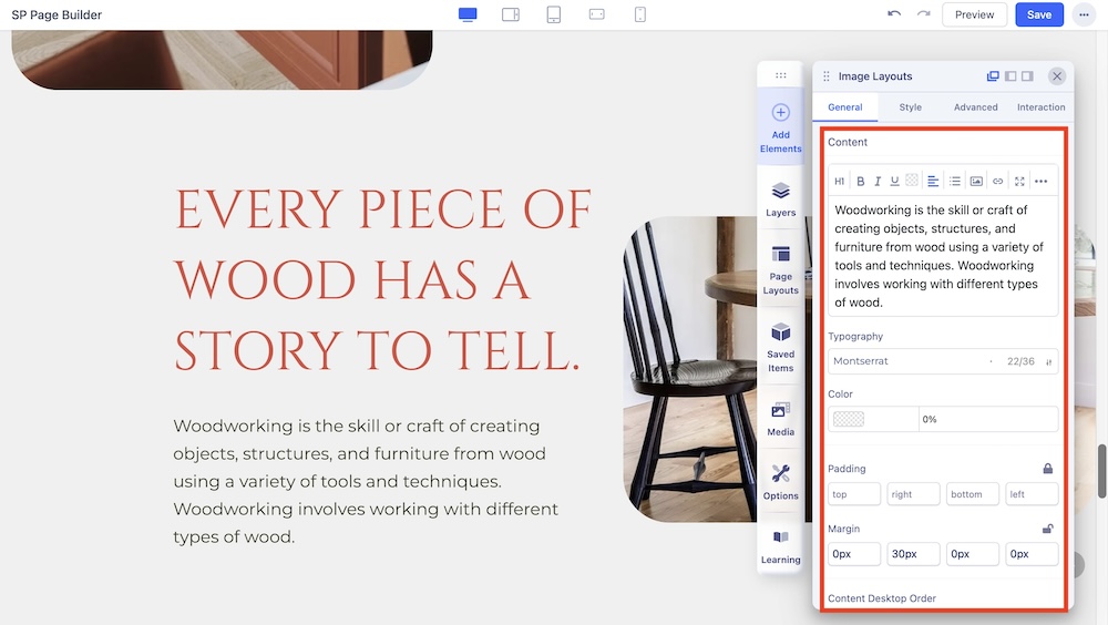
Content: Enter your content within the large text field or simply click on the existing content and edit it directly.
You’ll find a dropdown at the top-left corner with several options like Headings, Inline, etc. From here, you’ll also be able to select the HTML elements you want your content to consist of.
The three-dot icon on the top-right gives you even more options to customize your content like font size, alignment, list, image upload, and more.
Typography: Adjust your font types, Size, Line Height, Letter Space, Style, and Weight for your Feature box button texts.
Color: Use this option to select the Color of the content.
Margin: Set the Margin space of the content.
Padding: Set the Padding space of the content.
Content Desktop Order: Select the Image Order (position) of the Image in the Desktop view.
Content Tablet Landscape Order: Select the Content Order (position) of the Image in the Tablet Landscape view.
Content Tablet Portrait Order: Select the Content Order (position) of the Image in the Tablet Portrait view.
Content Mobile Landscape Order: Select the Content Order (position) of the Image in the Mobile Landscape view.
Content Mobile Portrait Order: Select the Content Order (position) of the Image in the Mobile Portrait view.
Text Alignment: Set the Horizontal Alignment of the Text Content. Options include Left, Center, and Right.
Vertical Alignment: Set the Vertical Alignment of the content. Options include Top, Bottom, and Center.
Title
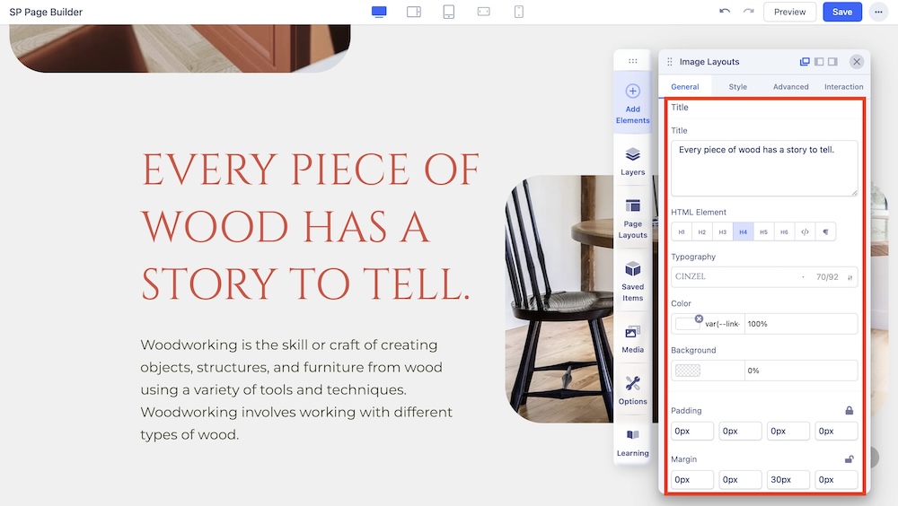
You can also give Image Layouts a Title. Scroll down to the Title section on the Image Layouts General Settings to do this.
Title: Enter the text for the Title
HTML Element: Set the HTML element hierarchy as H1, H2, H3, etc.
Typography: From here, you can adjust the Title’s Font, Font Size, Line Height, etc.
Color: Select the Title’s Text Color.
Background Color: Select the Title’s Background Color.
Margin: Set the Margins of your Title.
Padding: Set the Paddings of your Title.
Button
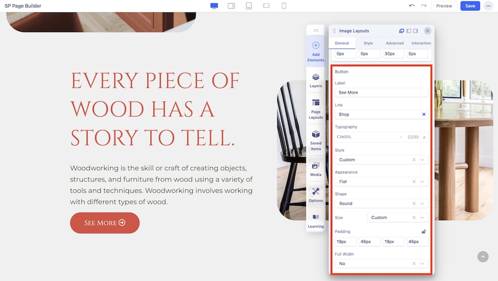
Some Image Layouts have a Call-To-Action Button, which comes in handy if you want to easily redirect your prospective customers to a page. To start customizing this button to suit your purposes scroll down to the Button section in the inline editor. This comes with the following customization options:
Label: Enter the label for your button.
Link: Add a link to your button using the Link option.
- For URL, simply paste the web address you want to link to into the first field.
- For Menu, select the option you want to link to from the dropdown list. Note that the options on this list are all Menu Items that exist on your website.
- For Pages, select the option you want from the dropdown list. Like Menu, these options are all existing Pages available on this website.
- Lastly, you can enable the option Open in New Tab to open this link in a new tab, Add nofollow to tell search engines to ignore this link, Add Noreferrer to prevent any referrer information from being sent to the target resource, and Noopener to stop a third-party website you connect to from using the window object to take over the browser tab.
Typography: Select the typography of the button.
Style: Select from a list of pre-made styles for your layout or choose a custom style which you can edit from the Styles Settings tab.
Appearance: Select from a list of pre-made appearances for your layout such as Flat, Gradient, and Outline.
Shape: Select a shape for your layout from Rounded, Square, and Round.
Size: Set the size of your layout from a variety of options.
Full Width: Choose whether your layout will encompass the full width of the page or not.
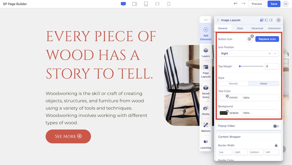
Button Icon: You can click on Choose Icon to select icons from the icon library or upload your own icon.
Icon Position: Select the position of the Button Icon.
Top Margin: Adjust the top margin of the Button Icon.
Style: Choose whether the Button Icon will remain static or have a hover animation.
Text Color: Change the text color for the Button Icon.
Background: Choose the background color of the Button Icon.
Popup Video
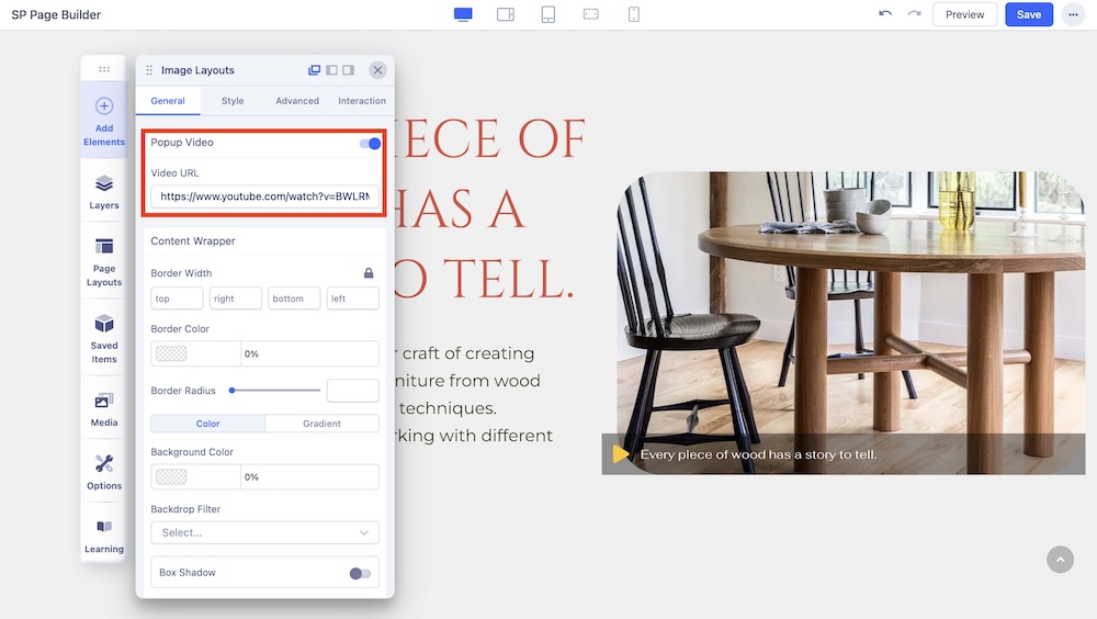
By enabling the Popup Video option, you can add a URL to the image in your Image Layout which will redirect to an external video upon click.
Content Wrapper
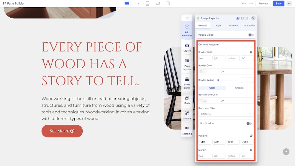
You can edit the Content Wrapper of your Image Layout through this setting. This comes with the following customization options:
Border Width: Set the Content Wrapper’s Border Width.
Border Color: Set the Content Wrapper’s Border Color.
Border Radius: Define the border radius of the content.
Background Color: Use the Color Picker to select the background color of the Content Wrapper.
Backdrop Filter: Choose to give the Content Wrapper a filtered background from several filter options.
Box Shadow: Enable a Box Shadow Effect. When enabled, you will get to access options to customize it.
Padding: Set the Content Wrapper’s Padding.
Margin: Set the Content Wrapper’s Margins.

