- TemplatesTemplates
- Page BuilderPage Builder
- OverviewOverview
- FeaturesFeatures
- Dynamic ContentDynamic Content
- Popup BuilderPopup Builder
- InteractionsInteractions
- Layout BundlesLayout Bundles
- Pre-made BlocksPre-made Blocks
- DocumentationDocumentation
- EasyStoreEasyStore
- ResourcesResources
- DocumentationDocumentation
- ForumsForums
- Live ChatLive Chat
- Ask a QuestionAsk a QuestionGet fast & extensive assistance from our expert support engineers. Ask a question on our Forums, and we will get back to you.
- BlogBlog
- PricingPricing
Typography Settings
Global Typography settings give you more control over the typography of your website. You can define global font styles that can be used across the site.
Define and save your typography and access it anytime from any addon’s typography settings.
Accessing Global Typography Option
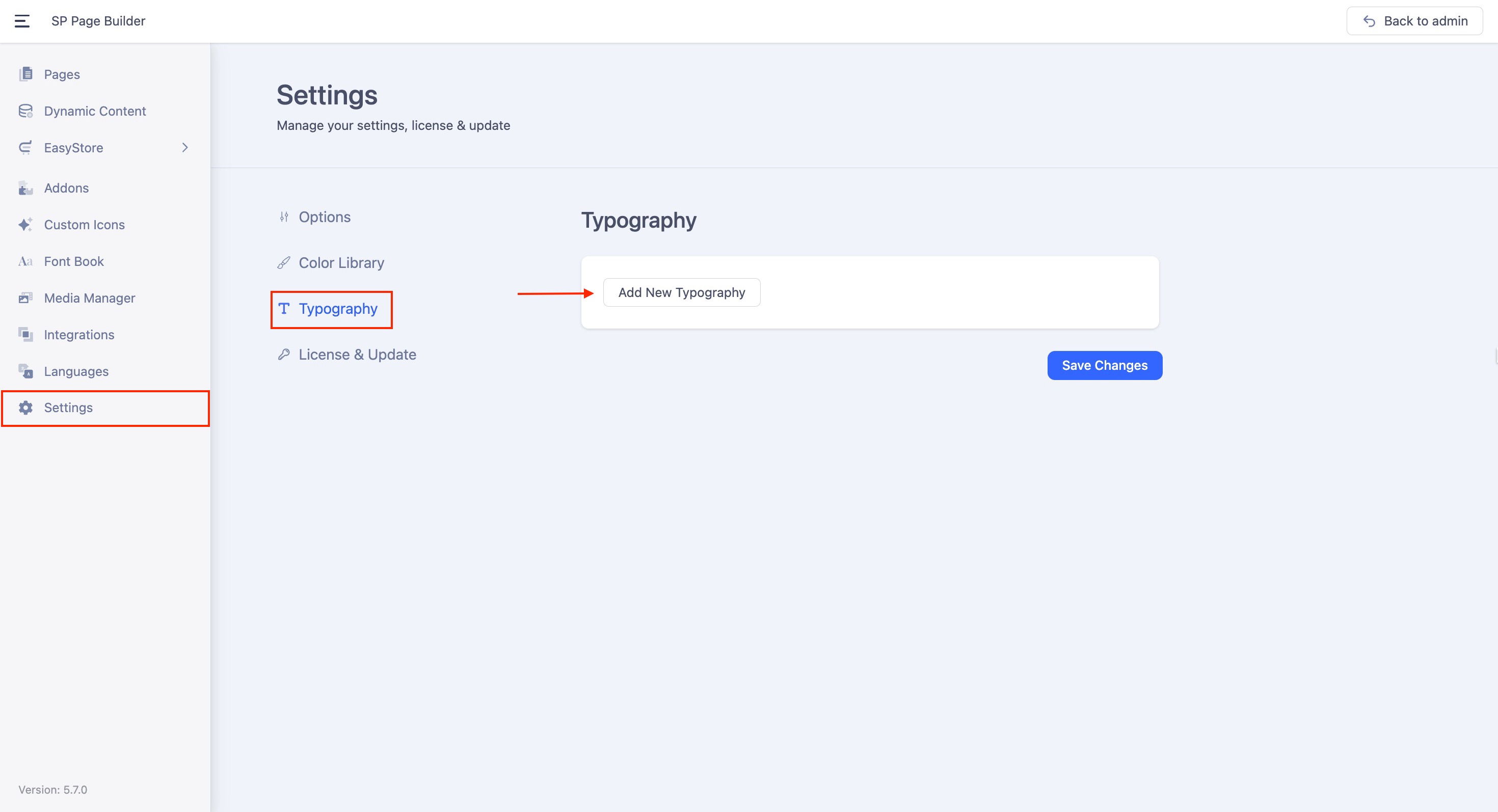
The Typography can be accessed from SP Page Builder’s Settings. From the side top bar, go to Settings > Typography.
Creating a Typography Preset
Add a New Typography Style
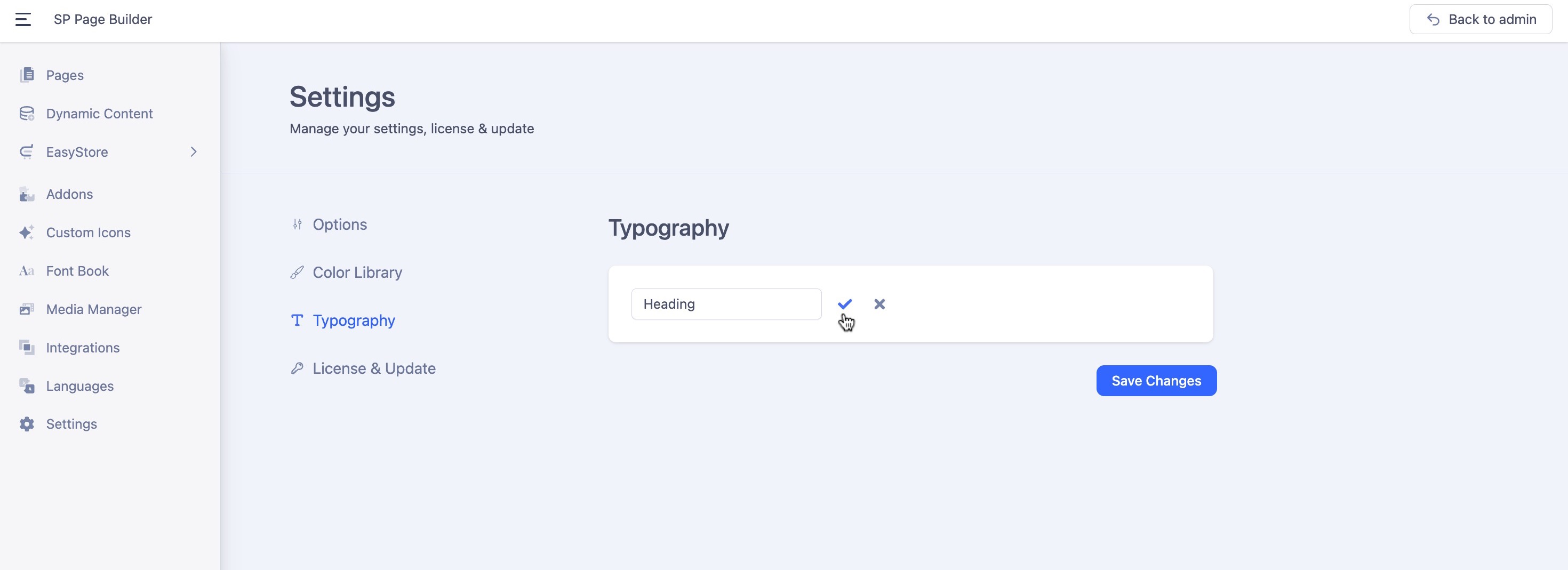
Click on the “Add New Typography” button. A prompt will appear asking you to name your new typography style. For example, if you're setting fonts for headings, you might name it “Heading”.
Save the Typography Name
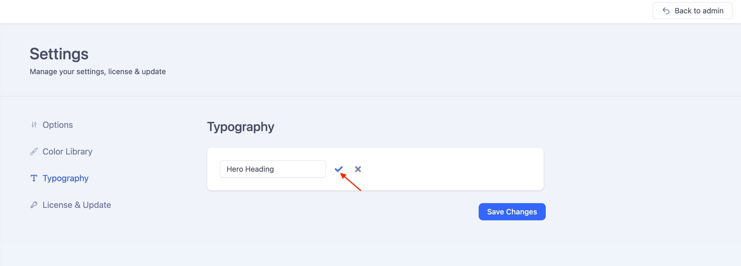
After entering the name, click the “tick” icon to save it.
Add Fonts to Your Typography
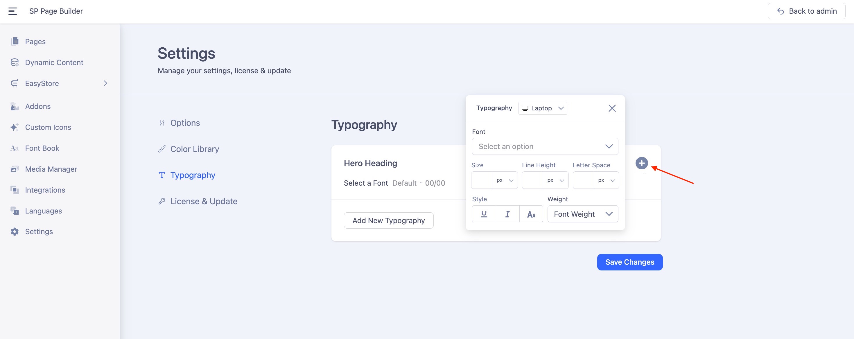
Next, click the “+” icon to add font settings to your typography style.
You’ll see a list of fonts categorized into Google Fonts and System Fonts. Choose your preferred fonts based on your design needs.
Learn more about adding Google Fonts.
In addition to selecting fonts, you can also predefine various settings such as size, line height, letter spacing, style, and weight to customize the typography exactly the way you want.
- Size: The size field defines the size of a font. You can adjust it using units such as px, rem, em, or %.
- Line Height: The line height defines the spacing between lines of text. You can adjust it using units such as px, rem, em, %, or set it to None for no specific unit. When you select the None option, a unitless value is inherited directly and adjusts based on the element's font size.
- Letter Space: The letter space sets the horizontal spacing between text characters. You can adjust it using units such as px, rem, em, or %.
- Style: From the Style, you can underline the texts, make them italic, or all capitals.
- Weight: Font weight determines how bold or light your text will appear. You can select the font weight from the drop-down list.
Configure Responsive Typography Settings
Responsive typography lets you tailor text styles for different devices, so you get a polished look on every screen.
Select a Typography Item
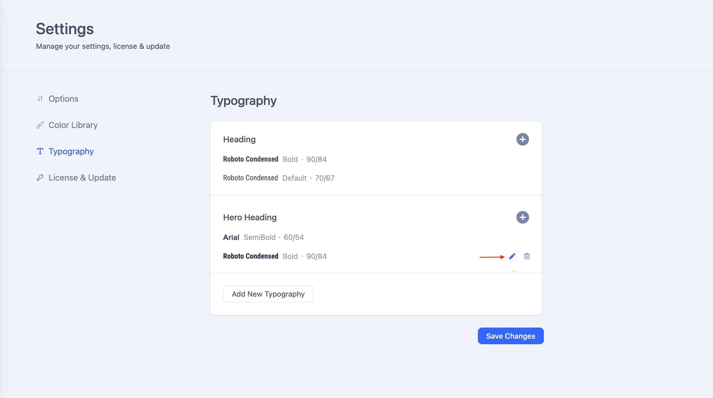
Choose a Typography item you'd like to adjust. Click on the edit icon adjacent to your chosen item.
Pick a Device
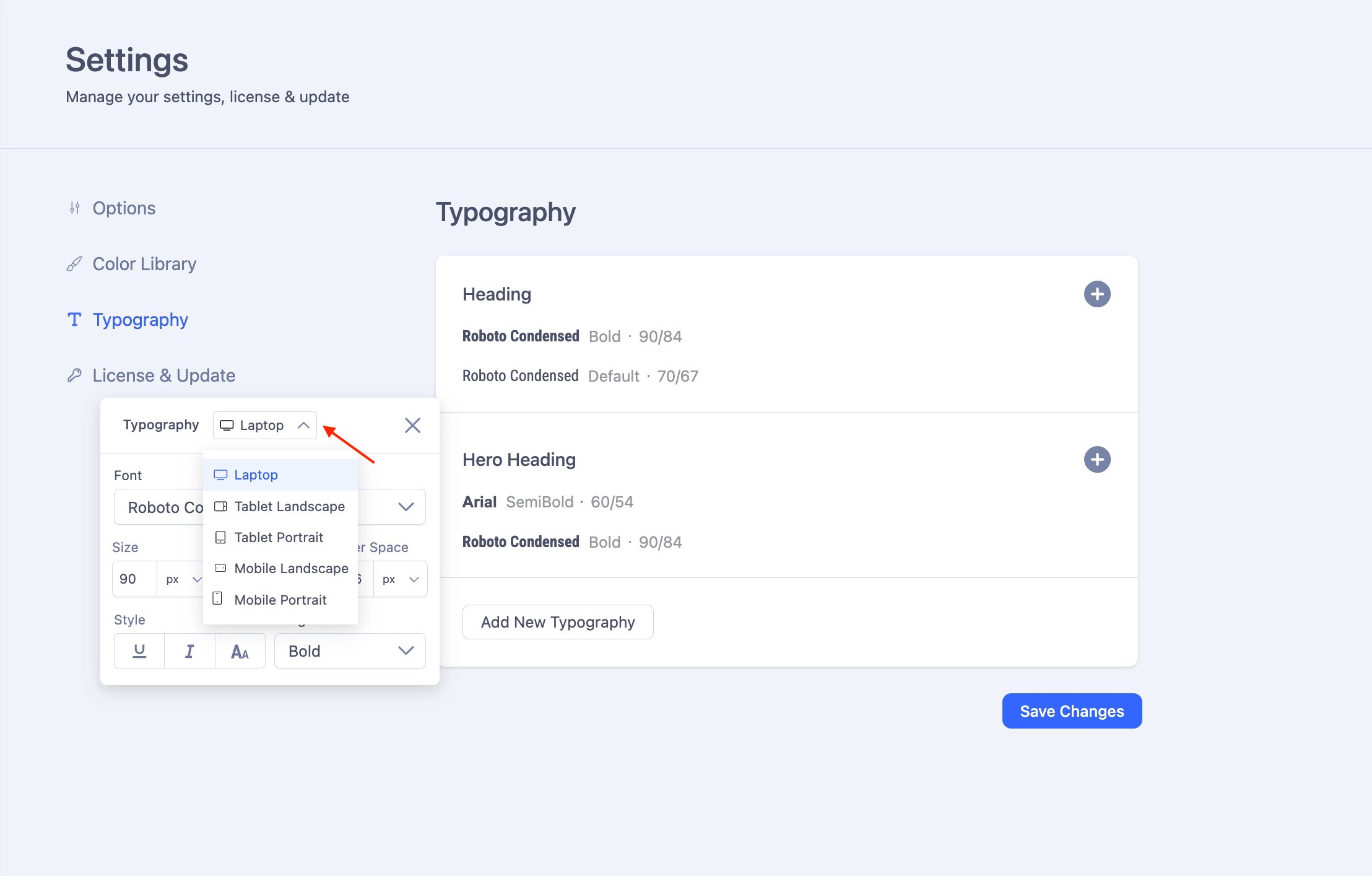
Use the dropdown menu to select a device. For example, choose Tablet Landscape.
Customize the Settings
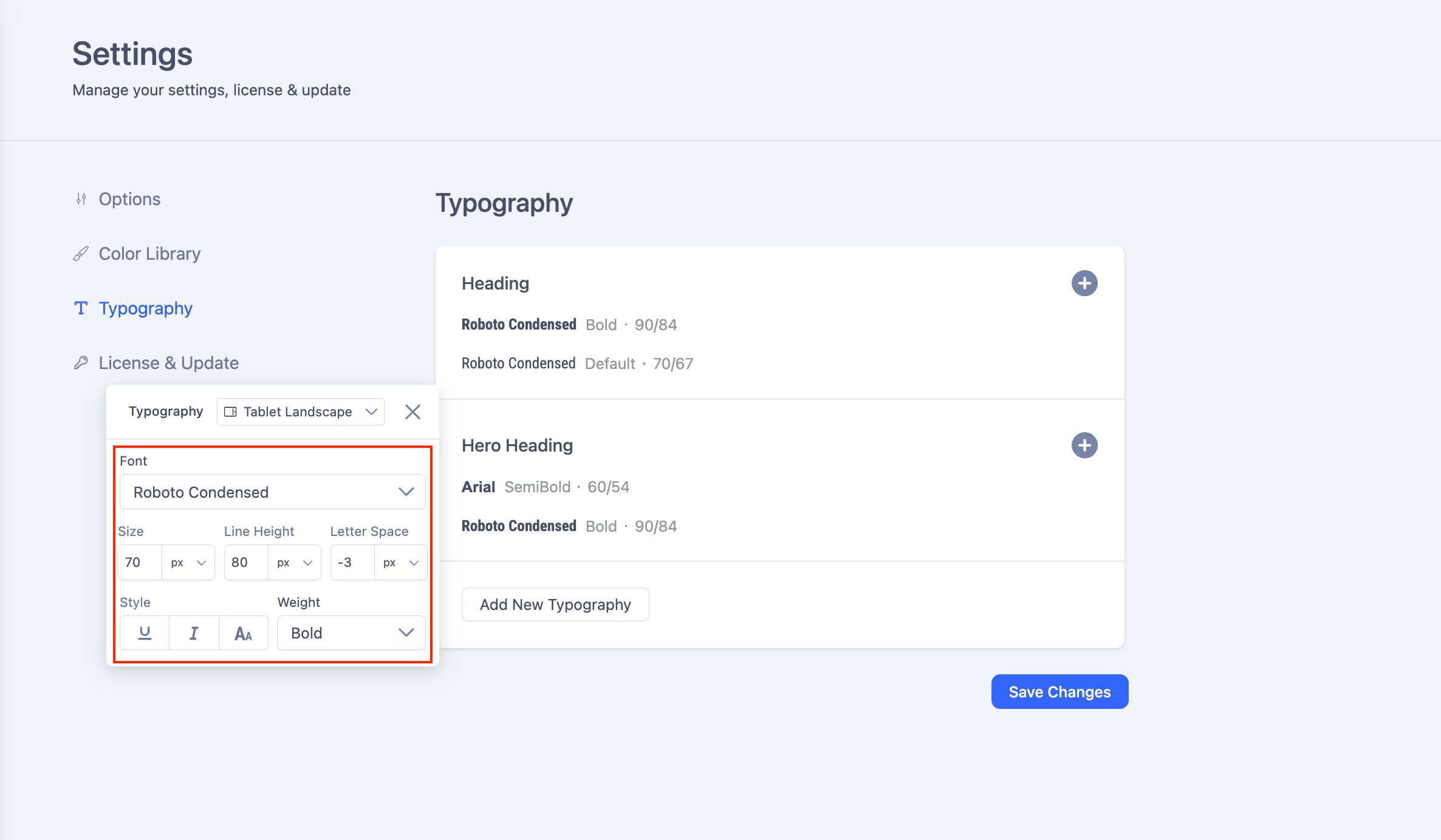
Adjust values such as font size, line height, letter spacing, style, and weight specifically for that device. These changes will only apply to the selected screen size.
Repeat for Other Devices
Switch between Desktop, Tablet, and Mobile to fine-tune your typography for each. Hit "Save Changes" once you are done.
Implement Your Saved Typography Styles Across All Devices
When you assign a typography item to a text element, the responsive typography settings you've previously configured for each device (desktop, tablet, and mobile) will be automatically applied. This allows your text to adapt seamlessly to different screen sizes, without requiring manual adjustments for each device.

