

Popover
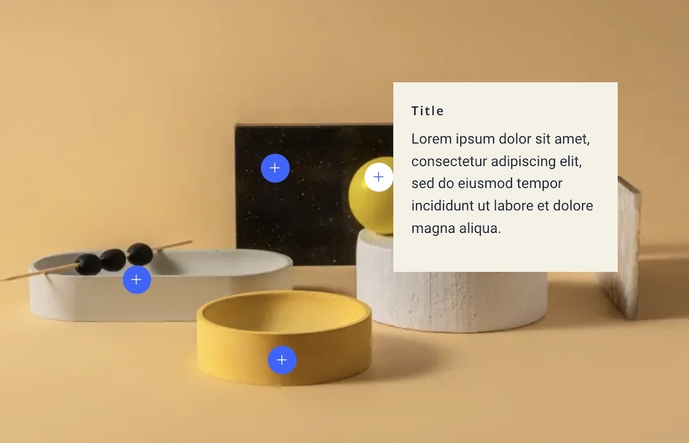
The Popover Addon in SP Page Builder empowers you to create sleek and customizable image popovers that enhance user engagement. When visitors hover over or click on an image, a popover appears, providing additional information, descriptions, or context.
Content Settings
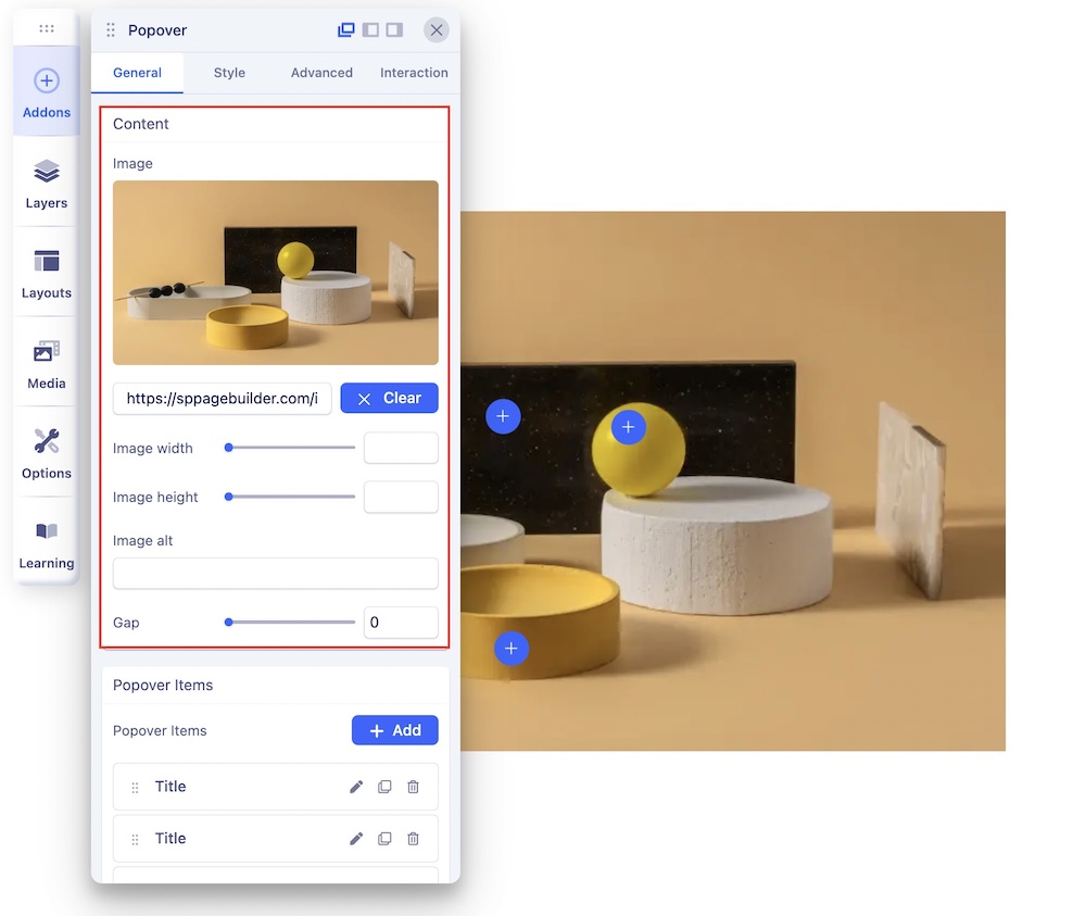
Upload Image: This serves as the base image for the popover. You can upload the image that forms the foundation of the popover.
Image Alt Text: Add alt text to your image for accessibility purposes.
Gap: Set the gap between the uploaded image and other popover items for precise spacing control.
Popover Items
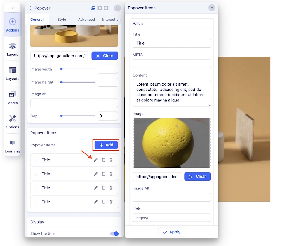
Click on the + Add button to create a new popover item. A popover item has the following settings:
Title: Enter the title for the popover item.
META: Add meta information for the popover item.
Content: Provide content for the popover.
Image: Set an image for the popover item.
Link: Define a hyperlink for the popover item.
Link Text: Specify the text for the hyperlink.
Marker: Customize the marker (indicator) for the popover.
Popover Position: Select the position of the popover item, ensuring it aligns perfectly with your content.
Display Options
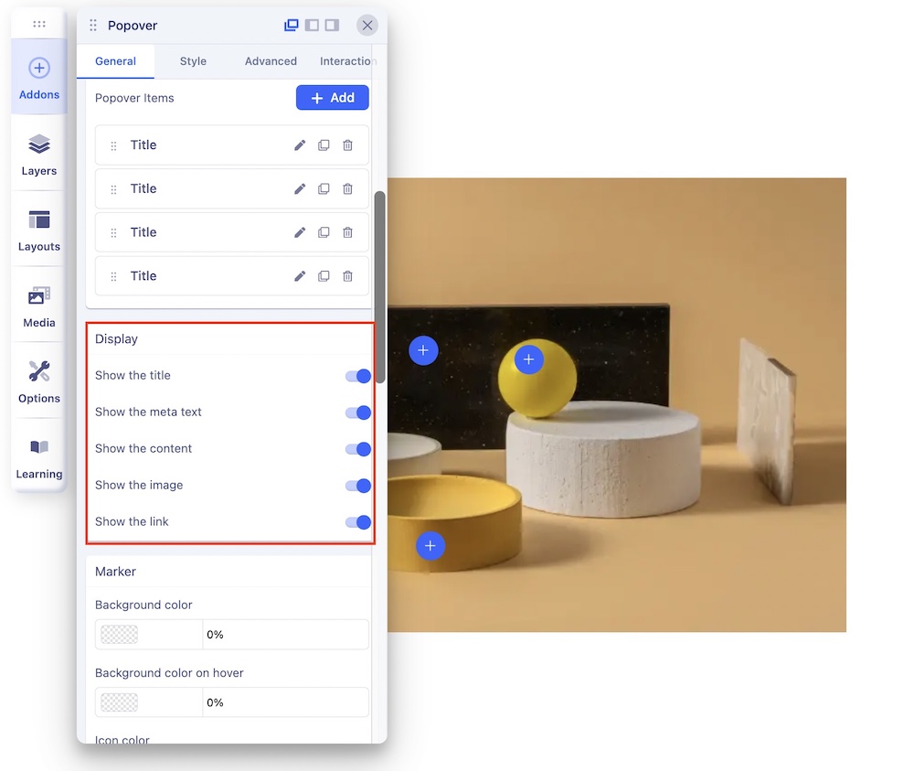
Choose what to display within the popover:
- Show the Title: Decide whether or not to display the title.
- Show Meta Text: Choose to display the meta text.
- Show Content: Opt to display the content.
- Show Image: Determine if the image should be displayed.
- Show Link: Select whether or not to display the link.
Marker Customization
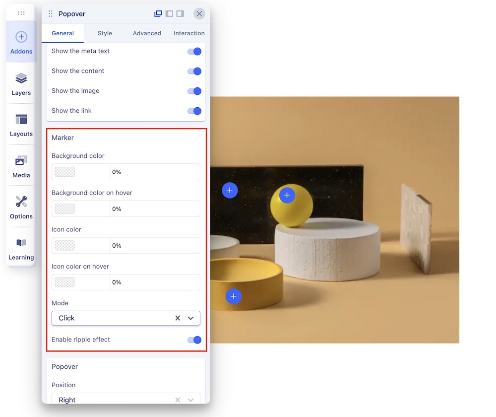
Customize the popover's marker (indicator):
- Background Color: Set the background color of the marker.
- Background Color on Hover: Specify the background color when the marker is hovered over.
- Icon Color: Define the color of the marker icon.
- Icon Color on Hover: Set the color of the marker icon when hovered over.
- Mode: Select the trigger mode for the popover, either "Click" or "Hover."
- Enable Ripple Effect: Add a visually appealing ripple effect for interaction feedback.
Popover Settings
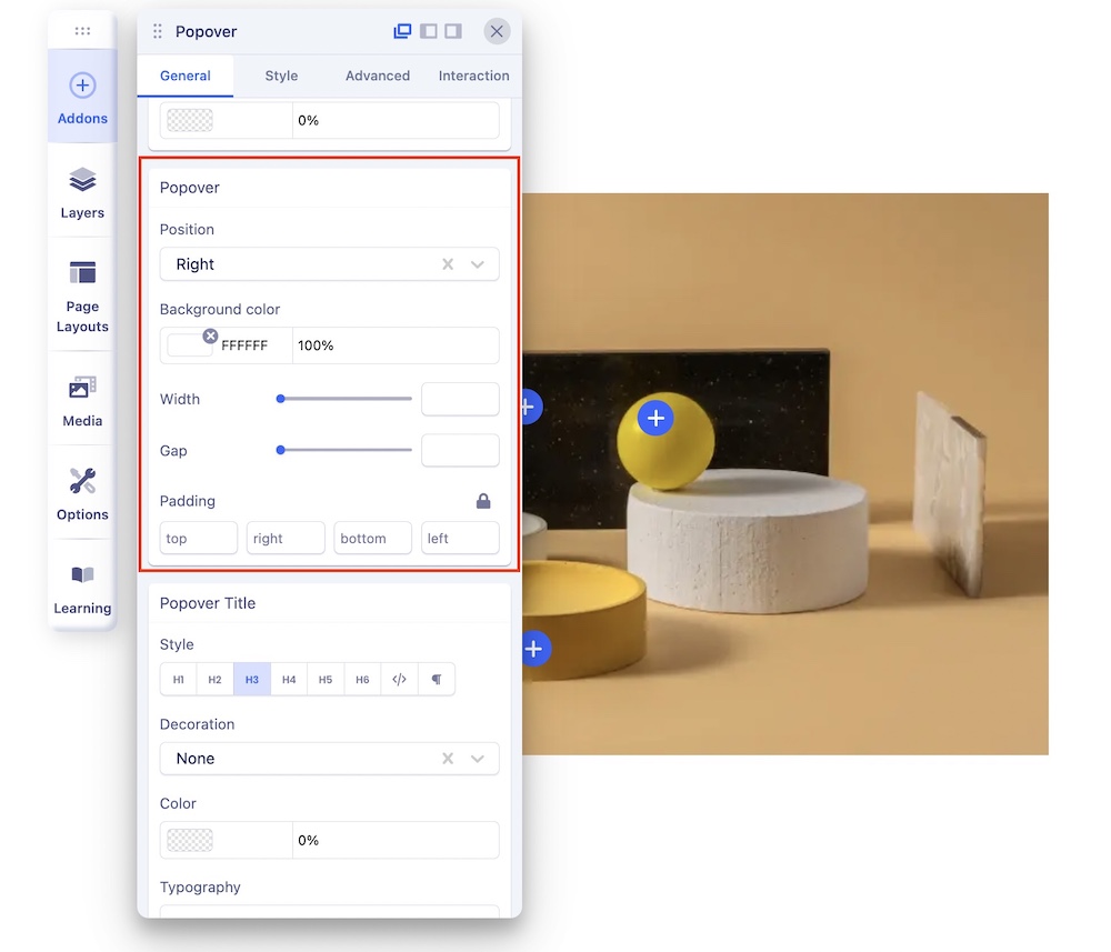
Popover Position: Set the position of the popover to ensure it appears where you want it.
You can choose from:
- Top: Position the popover above the triggering element.
- Bottom: Position the popover below the triggering element.
- Left: Position the popover to the left of the triggering element.
- Right: Position the popover to the right of the triggering element.
Background Color: Customize the background color of the popover to match the overall theme or to create visual distinctions.
Width: Adjust the width of the popover to control its size and accommodate varying content.
Gap: Define the gap or space between the popover and the trigger.
Styling
You can set the color, typography, padding, and margin for the Popover itself, Popover Title, Popover Meta, Text Content, and Popover Link,