- TemplatesTemplates
- Page BuilderPage Builder
- OverviewOverview
- FeaturesFeatures
- Dynamic ContentDynamic Content
- Popup BuilderPopup Builder
- InteractionsInteractions
- Layout BundlesLayout Bundles
- Pre-made BlocksPre-made Blocks
- DocumentationDocumentation
- EasyStoreEasyStore
- ResourcesResources
- DocumentationDocumentation
- ForumsForums
- Live ChatLive Chat
- Ask a QuestionAsk a QuestionGet fast & extensive assistance from our expert support engineers. Ask a question on our Forums, and we will get back to you.
- BlogBlog
- PricingPricing
Color Library
All settings and options for SP Page Builder’s colors can be found in the Color Library.
Color Variables and Modes
SP Page Builder’s Global Color settings introduce Variables, enabling users to define and manage colors centrally. These variables can be applied effortlessly across all SP Page Builder pages, ensuring consistent styling throughout the website. Any updates to a variable are automatically reflected everywhere it is used, making color management more efficient and streamlined.
Accessing Color Library
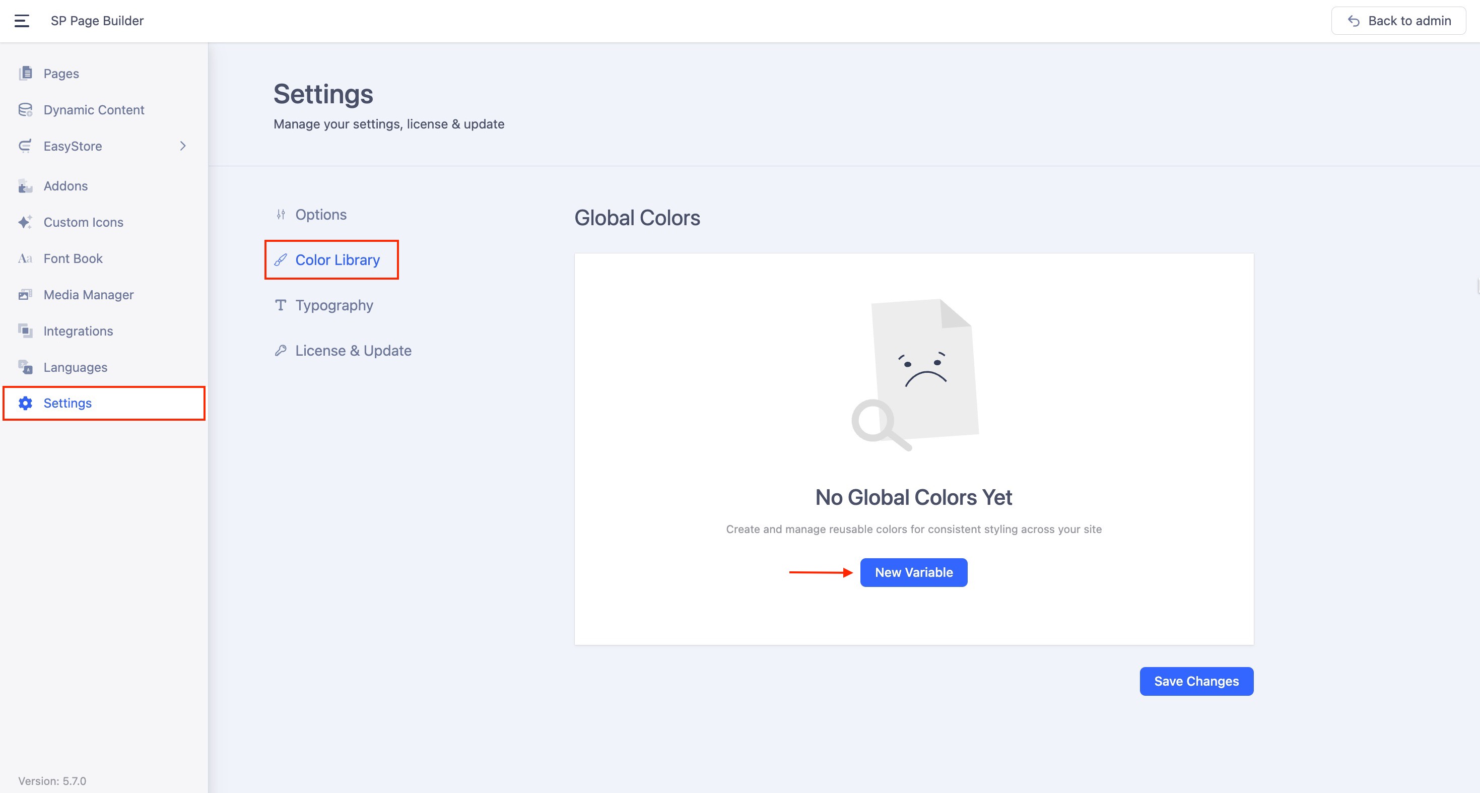
The Color Library option can be accessed from SP Page Builder’s Settings. From the side top bar, go to Settings > Color Library.
Creating a Variable
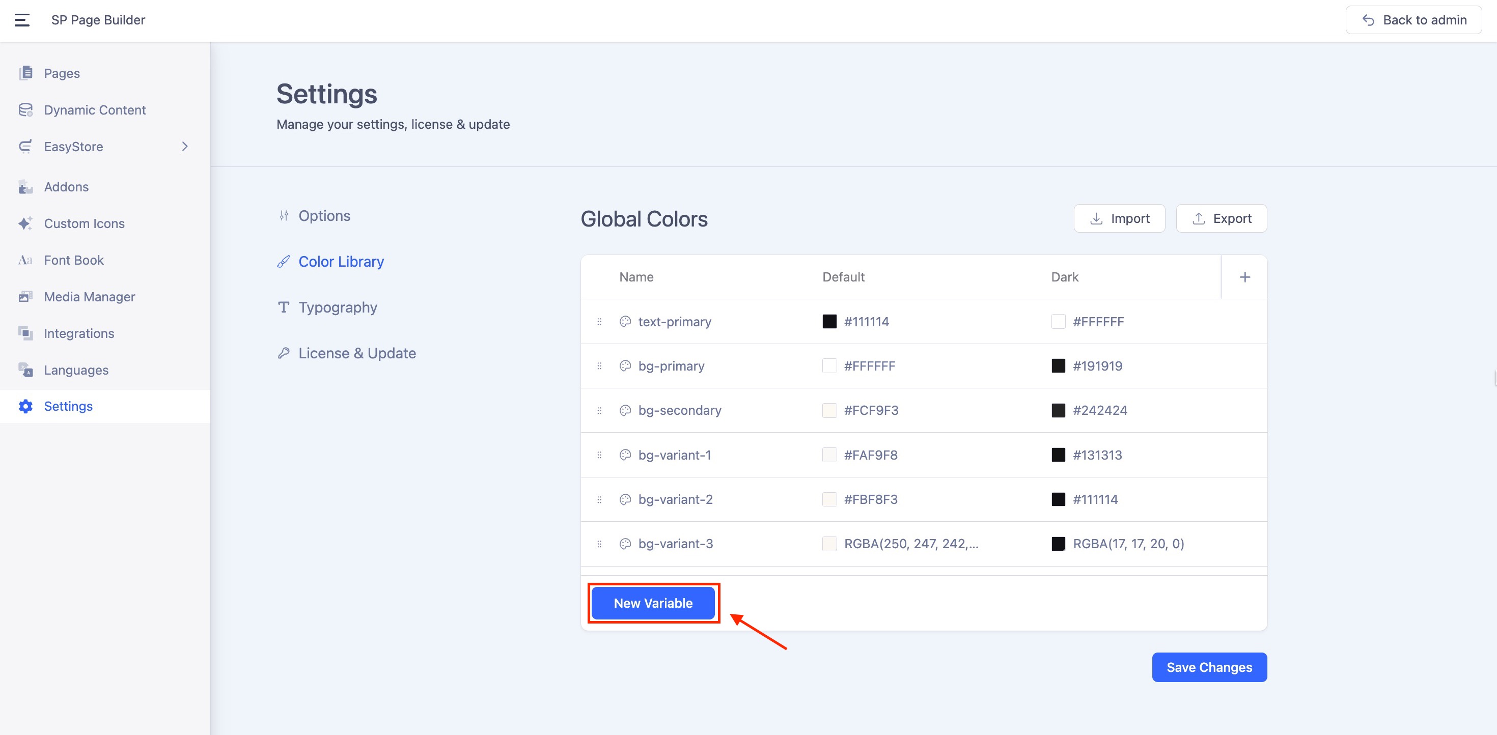
Once you have accessed the Color Library, click on the “New Variable” button to start adding your color variables. Assign a meaningful name to the variable and specify a default color value.
Adding Modes to the Variables
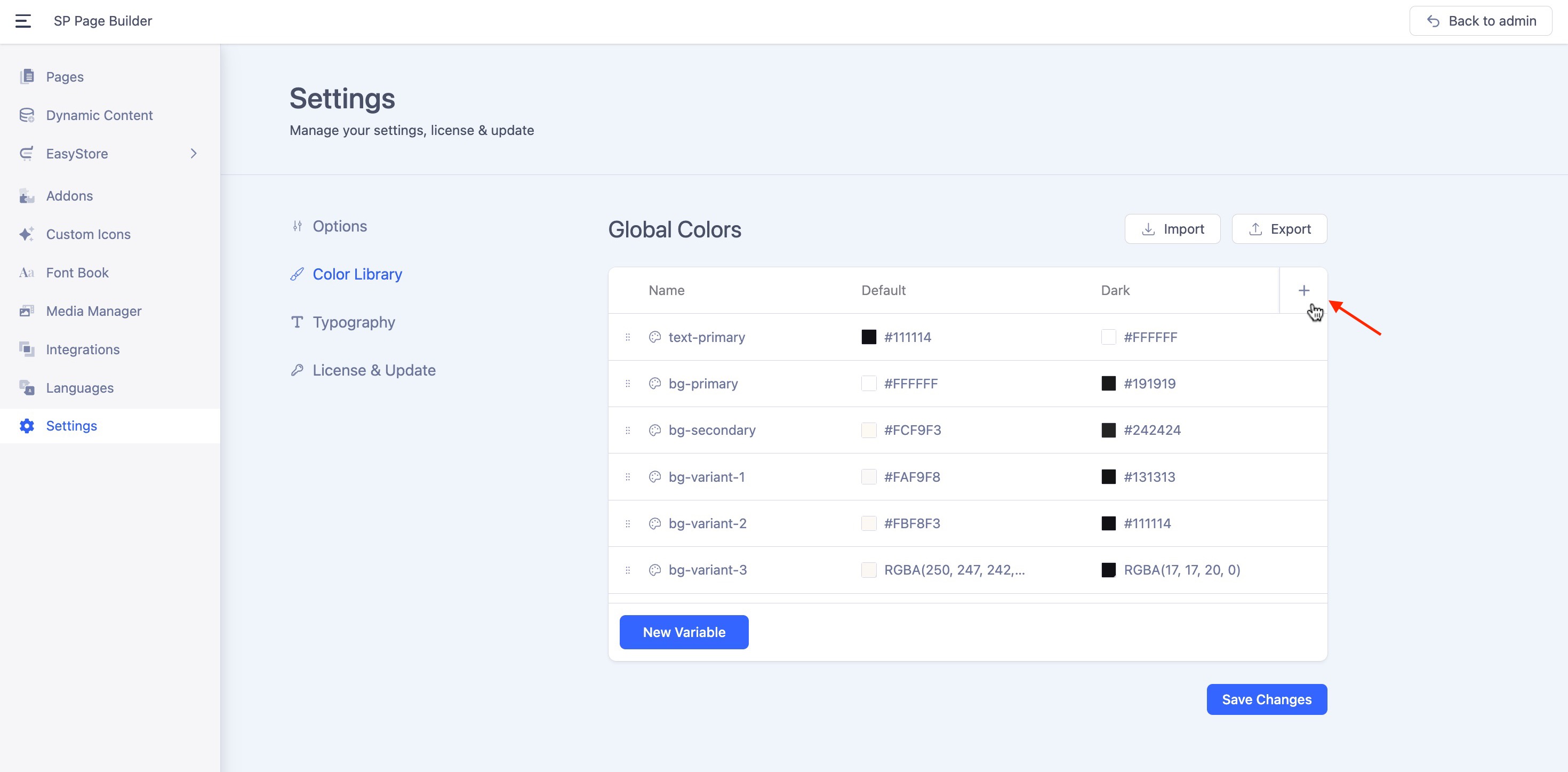
You can assign specific color values for different modes, such as light mode, dark mode, or custom theme variants. These modes are fully flexible, allowing you to tailor them precisely to your design needs.
- Click on the “+” button in the right corner in your mode panel. This will create a column for this new mode in the Variables panel.
- You can add as many modes as you need. Each Mode will appear in a separate column. For example, if you’ve named your modes “Dark Mode” and “Light Mode,” they will appear as separate columns.
- Define property values for each mode:
Example:
For Dark Mode, set the color to #2A4BEE.
For Light Mode, set the color to #F4F5FD.
Managing Variables
Renaming and Copying Variables
- Rename a Variable: Simply click on the variable name to edit and update it.
- Copy a Variable Name: Hover over the variable, and click the copy icon that appears next to it to copy the variable name.
Renaming Modes
You can rename variable modes to better organize and differentiate them, especially when working with multiple modes.
By default, the modes are named "Mode 1," "Mode 2," and so on. To customize these names, simply double-click on the mode name and enter your preferred label.
Duplicating Variables and Columns
You can duplicate variables along with their modes either row-wise or column-wise:
- To Duplicate or Delete a Column:
Click the three-dot menu next to the column name, then select “Duplicate” to create a copy of the column or choose “Delete” to remove the entire column. - To Duplicate or Delete a Row:
Hover over any row to reveal a three-dot menu. Click on it to choose “Duplicate” for duplicating the row or “Delete” to remove the entire row.
Importing/Exporting Global Colors
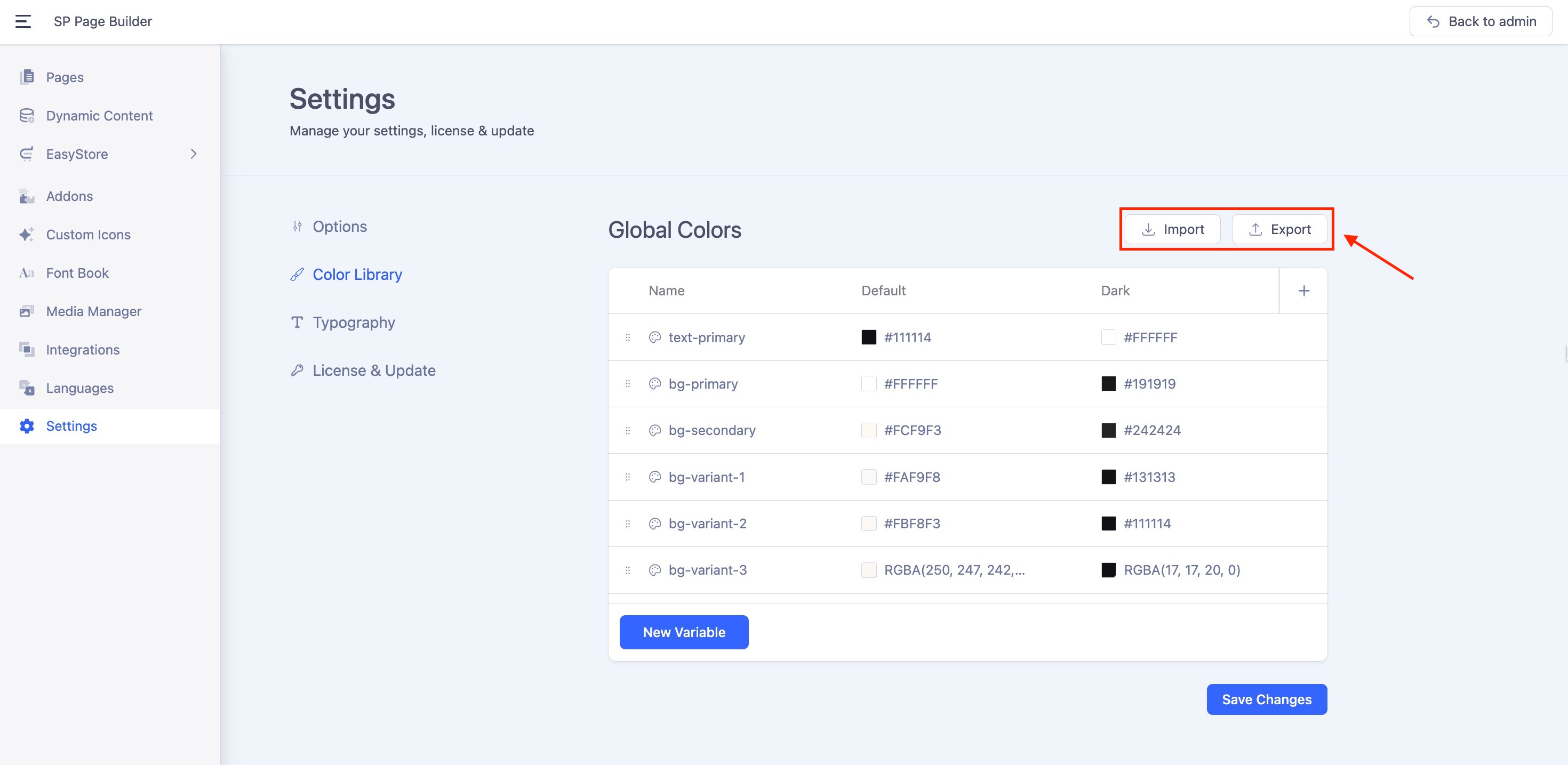
SP Page Builder v6.2.0 introduces an Import/Export option for Global Colors, to make color management across your websites faster and more consistent.
Exporting Global Colors
-
Click on the Export button.
-
Choose a location on your computer to save the exported color file (JSON format).
-
Your color palette is now ready to be imported into another site.
Importing Global Colors
-
Go to the Global Colors section on the target website.
-
Click on the Import button.
-
A popup will appear asking if you want to overwrite the existing colors. Tick the box to override, or leave it unchecked to keep your current colors.
-
Select the previously exported JSON color file.
-
Confirm the import.
Enabling the Color Switcher
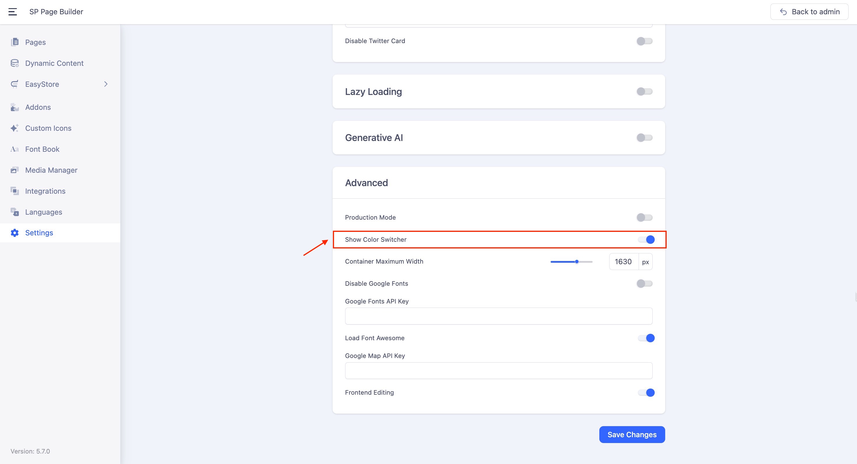
To display the color switcher on your site, navigate to SP Page Builder Settings > Options > Advanced and enable the Show Color Switcher option.
The modes you created with each of your variables will be displayed to switch between light, dark, or any custom theme.
Note: Once the Show Color Switcher is enabled, add a minimum of two modes for the switcher functionality to become active. Also, the switcher style displays two colors, which are taken from the first two variables defined in the Library.

