- TemplatesTemplates
- Page BuilderPage Builder
- OverviewOverview
- FeaturesFeatures
- Dynamic ContentDynamic Content
- Popup BuilderPopup Builder
- InteractionsInteractions
- Layout BundlesLayout Bundles
- Pre-made BlocksPre-made Blocks
- DocumentationDocumentation
- EasyStoreEasyStore
- ResourcesResources
- DocumentationDocumentation
- ForumsForums
- Live ChatLive Chat
- Ask a QuestionAsk a QuestionGet fast & extensive assistance from our expert support engineers. Ask a question on our Forums, and we will get back to you.
- BlogBlog
- PricingPricing
Collection Filter
The Dynamic Filter addon allows users to filter and display a collection of items in real time based on predefined criteria like categories, tags, dates, or any other custom fields. As users adjust filter options, the displayed content updates instantly to ensure a seamless and interactive experience.
For example, in a real estate site, users can filter properties by price range, property types, property titles, and more. This information is retrieved from the predefined fields you set up when creating your dynamic collections.
How to Use a Dynamic Filter Addon
The Dynamic Filter addon is available for any SP Page Builder page, including Dynamic Index and Dynamic Details pages.
Step 1: Add the Dynamic Filter Addon
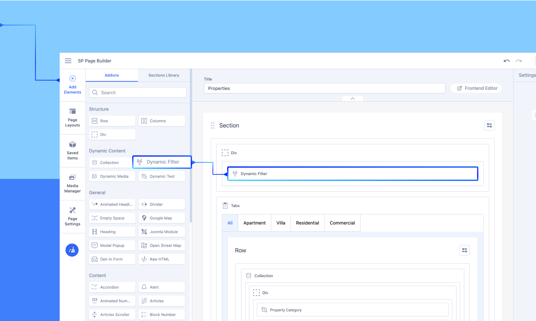
-
Open the SP Page Builder page where you want to use the filter.
-
Navigate to Add Elements > Addons tab > Dynamic Content section.
-
Drag and drop the Dynamic Filter addon onto your page at the desired location.
Step 2: Select the Collection Source
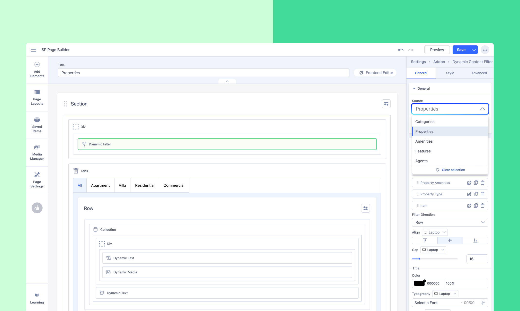
Click on the dropped addon to open the General Settings. In the Source dropdown, select the collection you want to use for the search.
Step 3: Choose Your Filter Layout
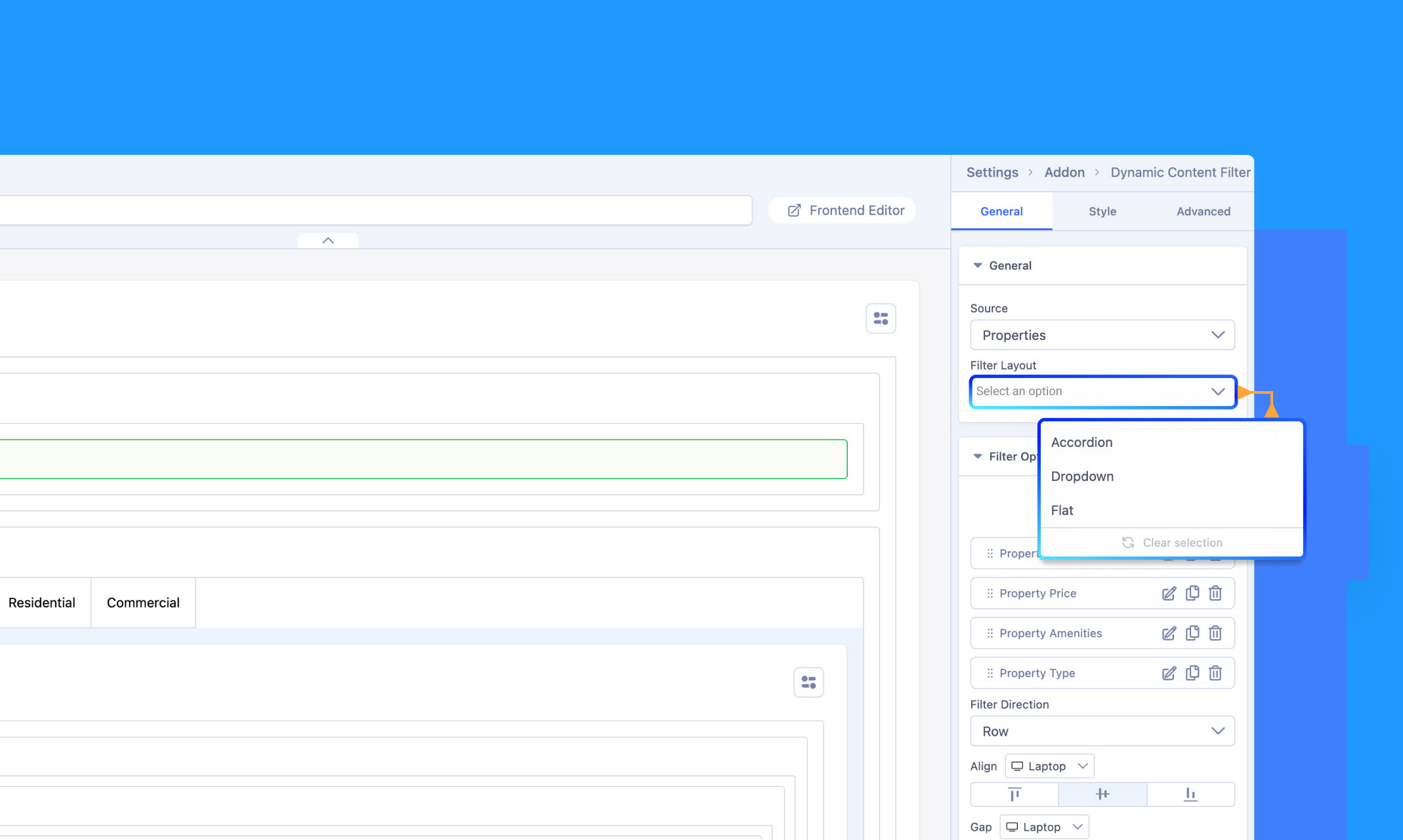
Next, pick your preferred Filter Layout from the following options:
- Accordion
- Dropdown
- Flat
Step 3: Add Your Filter Items
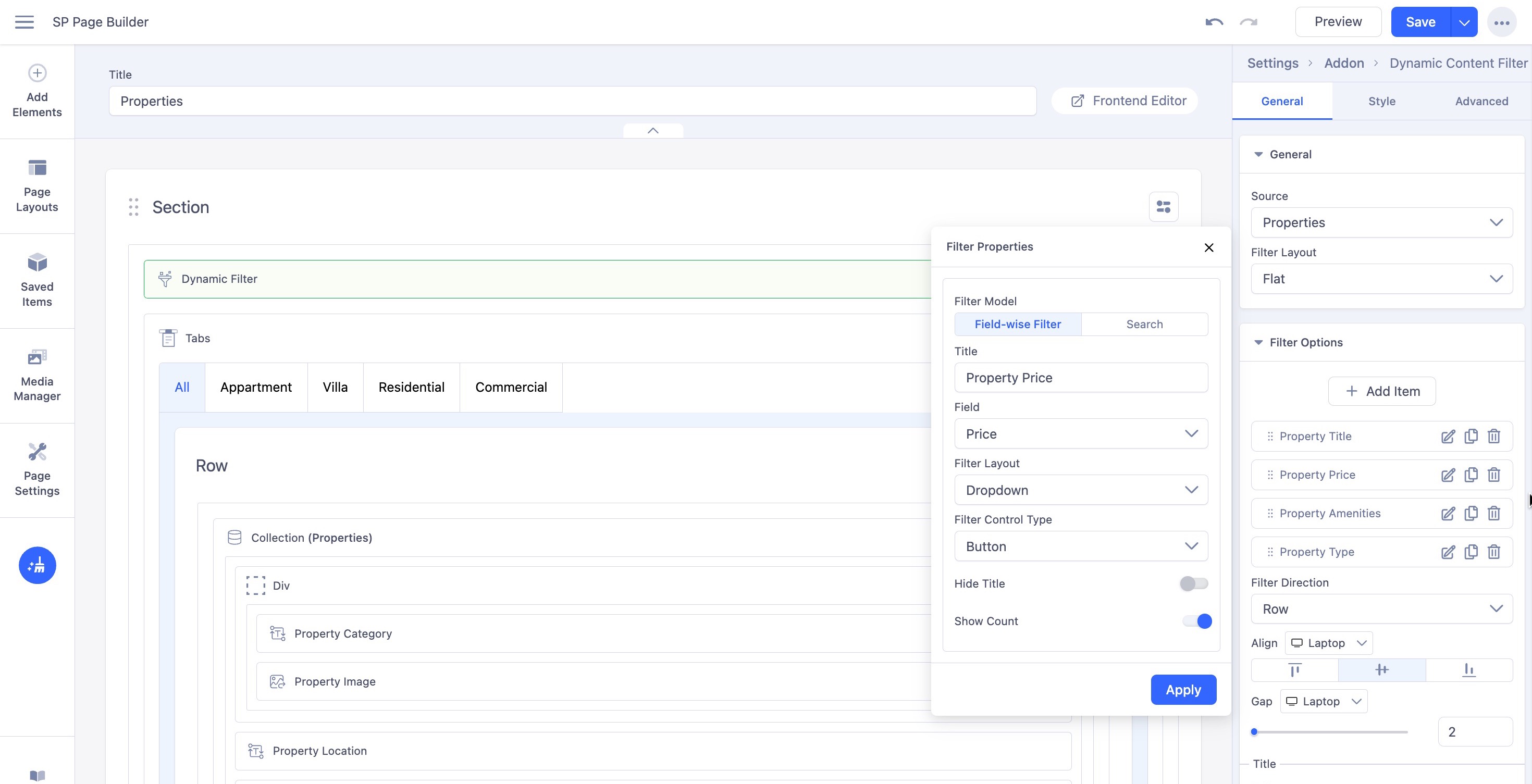
Once you’ve selected the collection source, proceed to add filter items. You can define the filter model in one of two ways:
- Field-wise Filter: Allows users to filter results based on specific fields like category, tags, or price range.
- Search: Enables a broader search across all fields within the selected collection.
1. Field-wise Search
Set up dynamic filters based on your collection fields. The search results are displayed based on the specific field values such as categories, tags, and more.
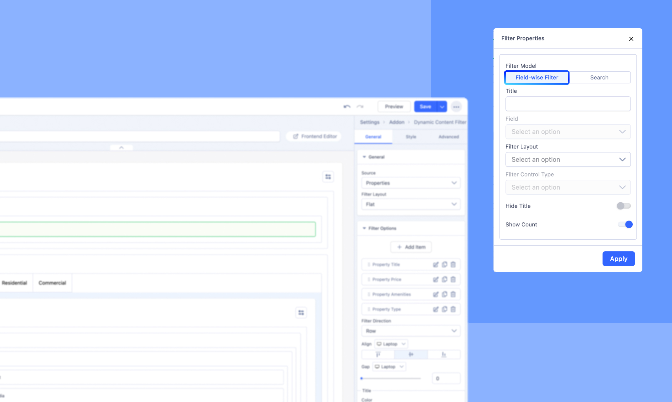
Title: Assign a name to your filter item, ideally related to the field type you’re configuring.
Field: Choose the desired field from the dropdown menu.
Filter layout: Choose your filter layout from the 3 given options: Accordion, Dropdown, and Flat.
Filter Control Type: Select the control type for your filter from the four available options: Input, Button, Checkbox, or Radio. This setting will be enabled only if your selected field offers multiple values.
Additional Filter Control Types for specific field types:
- For a field type set to Date, you can choose between "Date" and "Date Range" as the filter control type.
- For a field type set to Switch, the filter control type will default to Switch.
- For a field type set to Number, you can select from "Slider", "Checkbox", "Radio", or "Input" as the filter control type.
Hide Title: Enable this option to hide your Filter title.
Show Count: Enable this option to display the number of items available for each filter choice.
2. Search
Set up a keyword-based search filter to locate specific items within your chosen collection source.
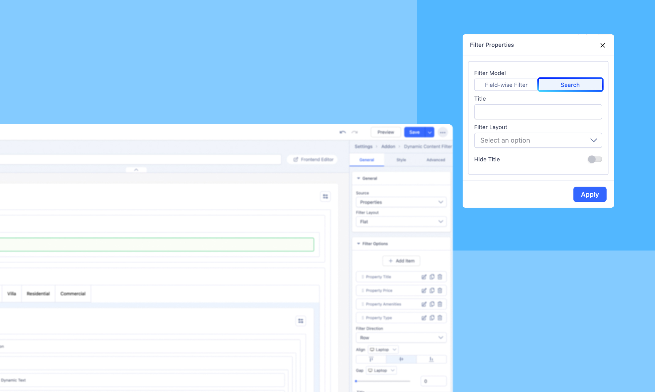
Title: Assign a name to your filter item.
Filter Layout: Choose your filter layout from the 3 given options: Accordion, Dropdown, and Flat.
Hide Title: Enable this option to hide your Filter title.
Other Dynamic Filter Options
Filter List Item
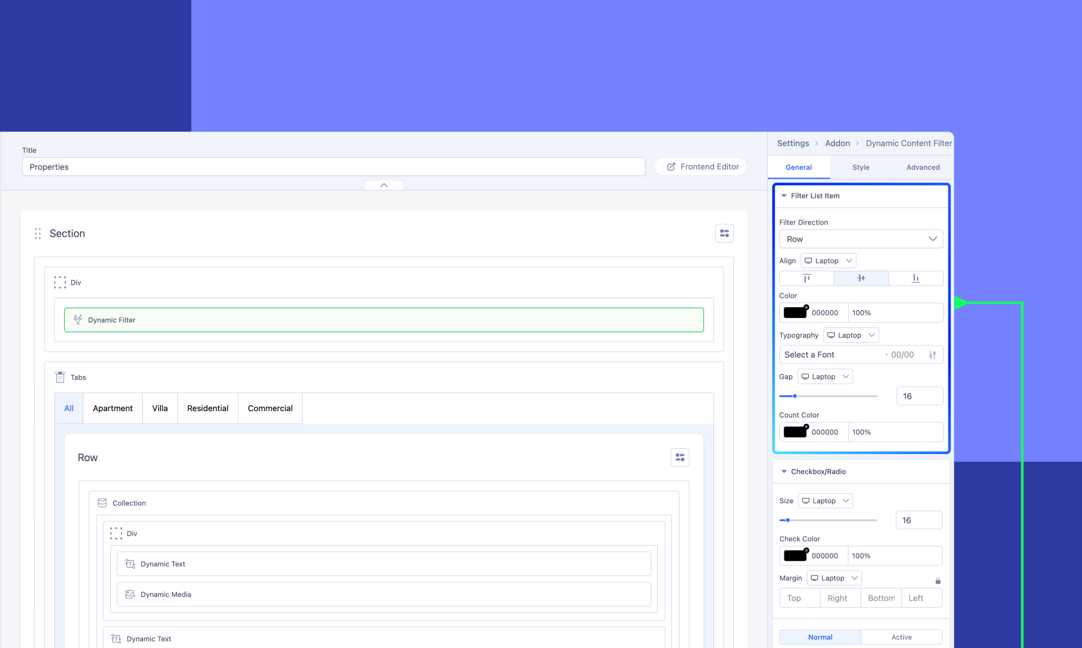
Customize the appearance and layout of your filter items’ values to match your design and functionality needs. You can set the direction (horizontal or vertical), choose the alignment (left, center, or right), adjust text color and typography, control the spacing between items, and customize the color of the item counts displayed next to each filter option.
Checkbox/Radio
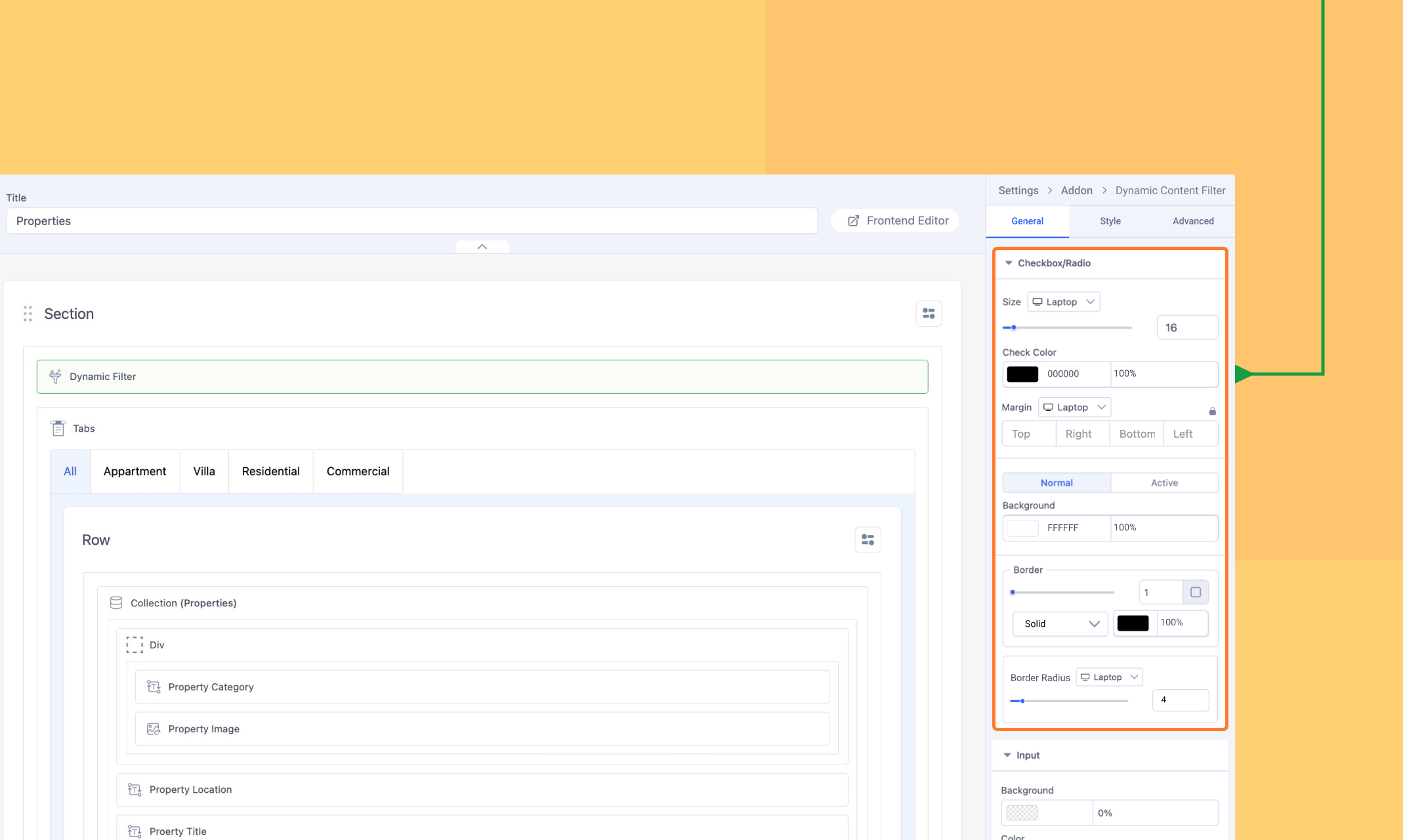
Customize the appearance and layout of the Checkbox/Radio options defined in your filter items.
Adjust the size, check color, and margin for optimal spacing and clarity. Modify the normal and active states by configuring the background, border style, and color. Additionally, use the border radius setting to refine the shape, making the corners either square or rounded to suit your design.
Input
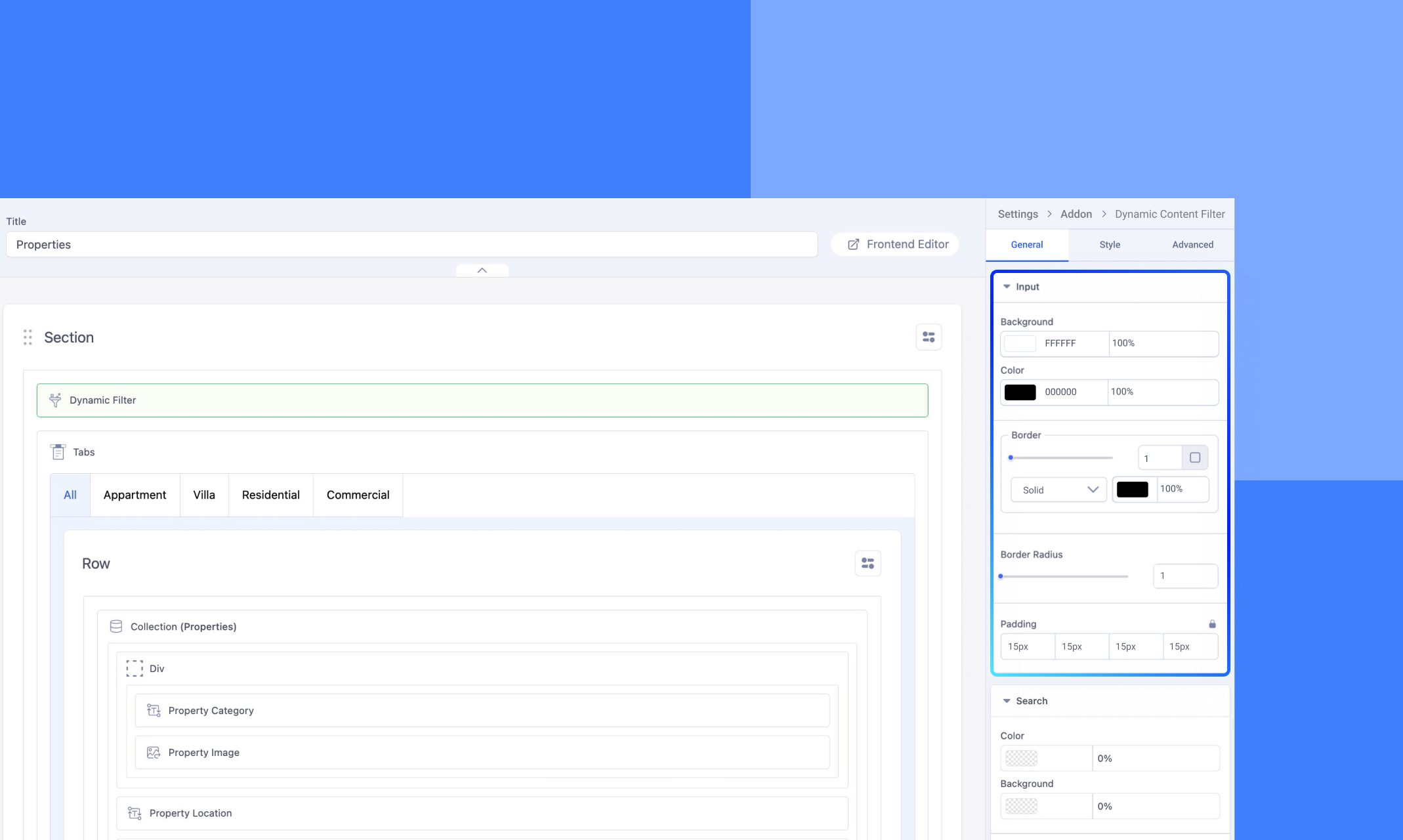
Customize the appearance of the Input field that you set while creating your filter items.
Set the background color for the field, and choose the text color to ensure readability. Configure the border style with a continuous, solid line and adjust the border radius to achieve either sharp or rounded corners. Use the padding setting to control the spacing between the text and the field's border for a balanced layout.
Search
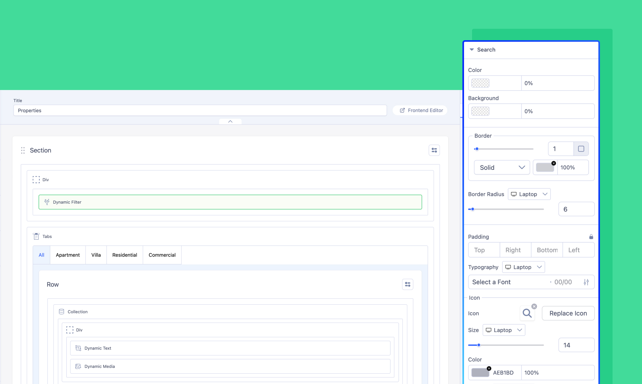
Customize the appearance of the Search filter model.
Adjust the text color, background, border style, and border radius for a polished appearance. Control padding for balanced spacing and configure typography to style the text. Enhance user experience by customizing the search icon, including its size, color, and spacing, and personalize the placeholder text with clear instructions and consistent styling.
Range Slider
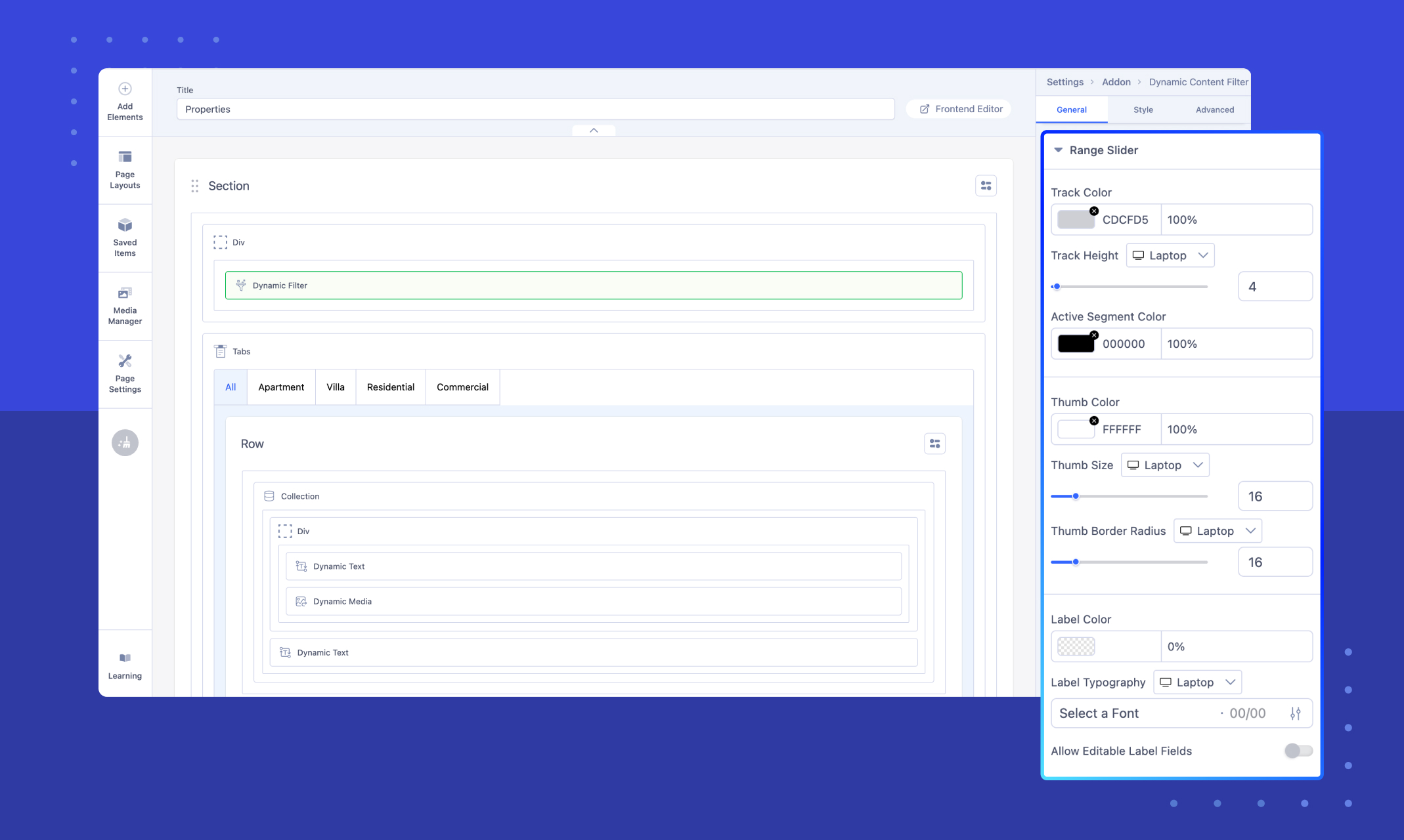
Customize the appearance of the Slider used as the Filter Control Type for the Number field in the field-wise filter model.
Adjust the Track Color and Track Height to define the slider's appearance, and set the Active Segment Color to highlight the selected range. Personalize the Thumb Color, Thumb Size, and Thumb Border Radius for the slider handles. Style the labels by configuring the Label Color and Label Typography, and enable or disable Editable Label Fields for user input flexibility.
Please note that these customizations will only apply if “Slider” has been previously selected as the Filter Control Type in your field-wise filter configuration.
Switch
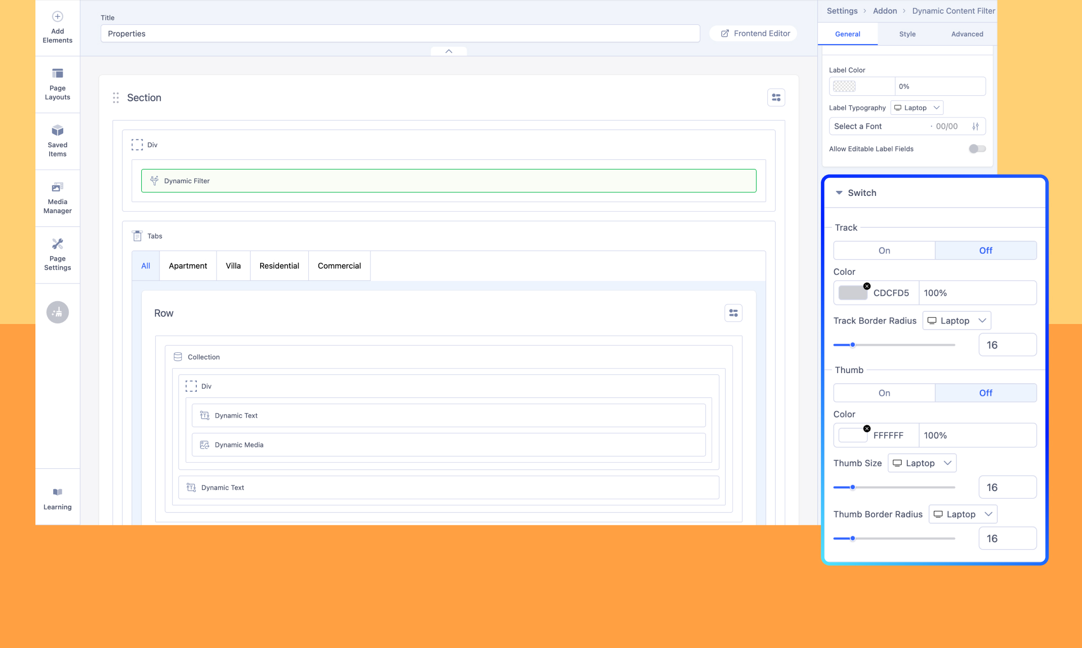
Customize the appearance of the Switch used as the Filter Control Type for the Switch field in the field-wise filter model.
Define the On and Off states with distinct colors, and adjust the Track Border Radius to achieve the desired level of roundness for the switch track. Personalize the Thumb by setting its color, size, and border radius to align with your design preferences.
Please note that these customizations will only apply if “Switch” has been previously selected as the Filter Control Type in your field-wise filter configuration.
Date
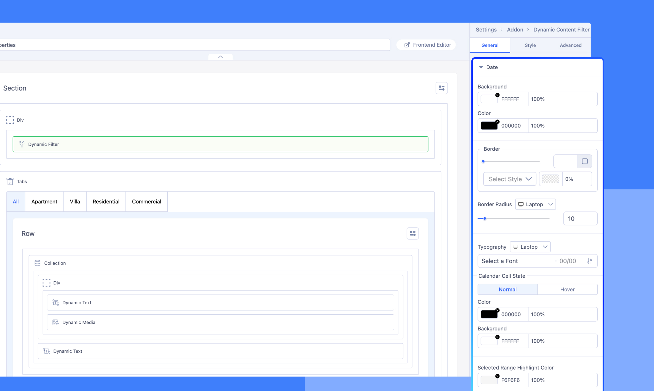
Customize the appearance of the Date used as the Filter Control Type for the Switch field in the field-wise filter model
In the Date field of the filter, you can customize multiple design elements to improve both appearance and usability. This includes selecting calendar cell states for Normal and Hover modes. Furthermore, you can configure the background color, text color, border style, and border radius of the date input field to align with your design requirements.
Please note that these customizations will only apply if “Date” or “Date Range” has been previously selected as the Filter Control Type in your field-wise filter configuration.

