

Create Buttons With Dynamic Links
Dynamic buttons can be created to show various links in different posts (collection items) and are displayed as buttons.
You can easily create dynamic buttons using the Dynamic Content feature in SP Page Builder.
Follow the steps below to dynamically display links as buttons from your collections.
Step 1: Add a Link Field to Your Collection
1. Navigate to Dynamic Content > Collections.
2. Select or create the collection where you want to add dynamic links.
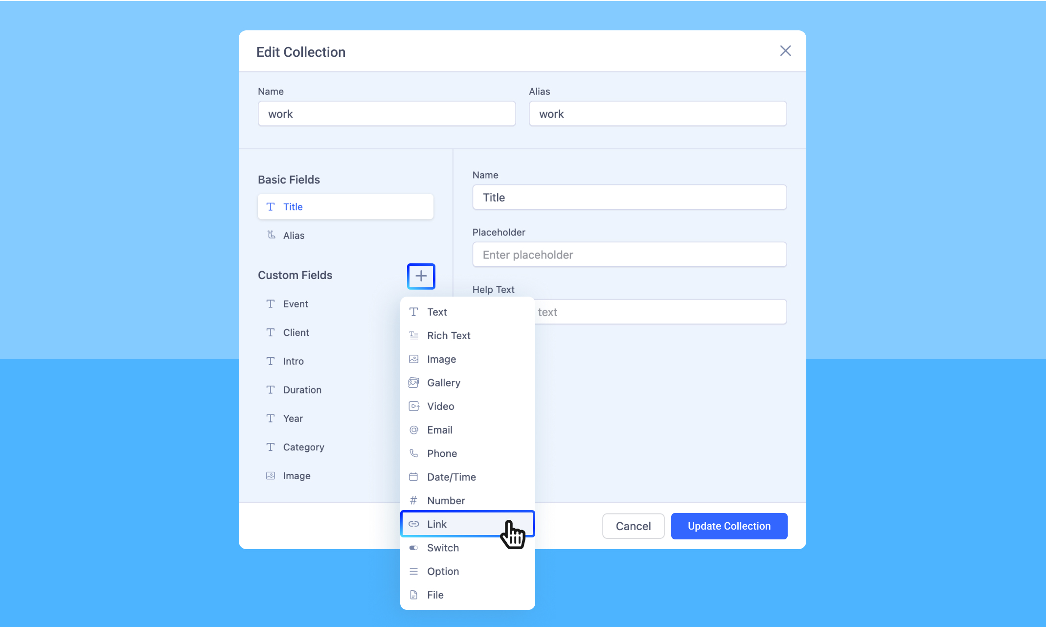
3. Click on the “Custom Fields” and add a new Link field.
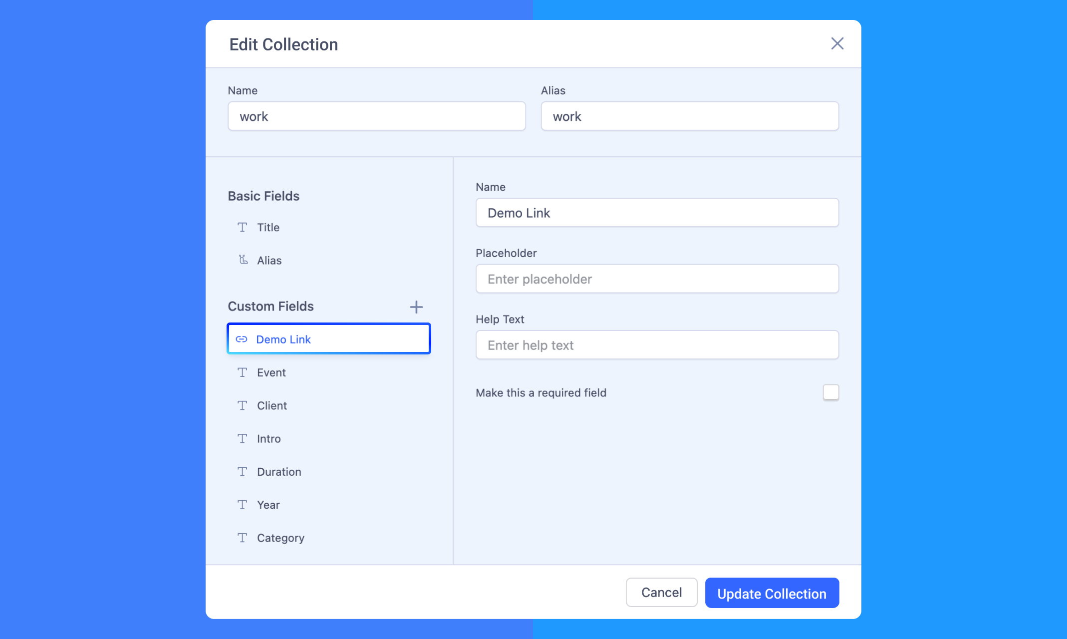
4. Give the field a meaningful name (e.g., "Demo Link").
5. Click Update Collection to save the changes.
Step 2: Populate the Link Field in Collection Items
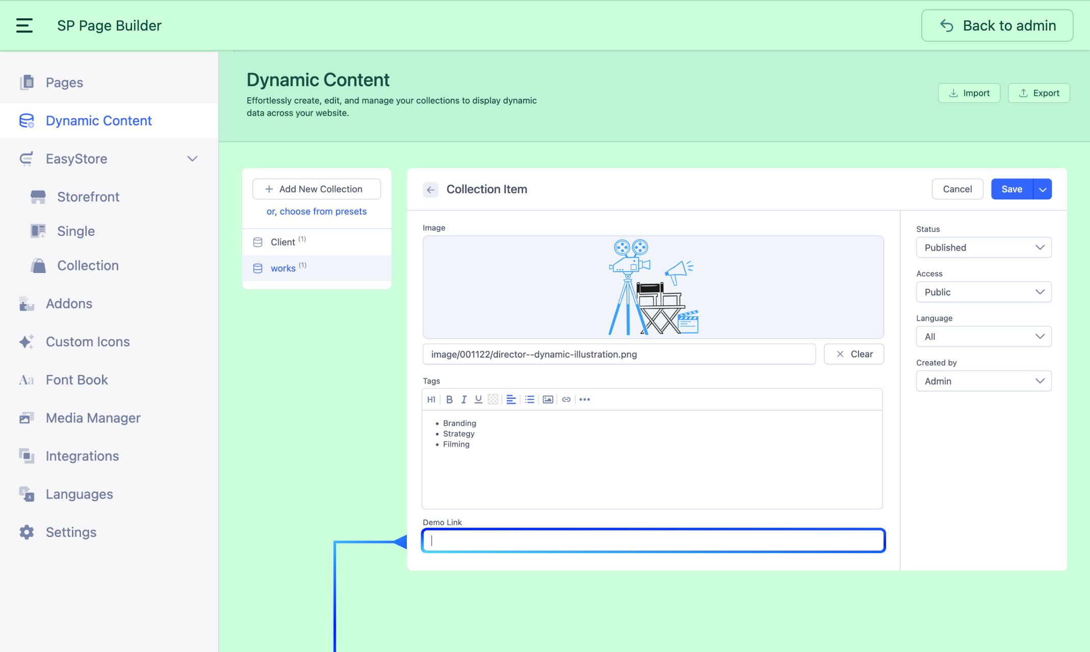
1. Go to the Collection Item.
2. For each item, populate the newly added Link field with the appropriate URL.
3. Repeat this process for all items in the collection.
Step 3: Display Dynamic Buttons on Your Page
1. Navigate to SP Page Builder > Pages.
2. Open the page where you want to display the buttons.
3. Drag and drop the Dynamic Collection addon onto your layout.
- Note: If you're using a Dynamic Content page, you can simply add a Dynamic Text addon without using the Dynamic Collection addon. In that case, it will display the source fields linked to that specific dynamic page.
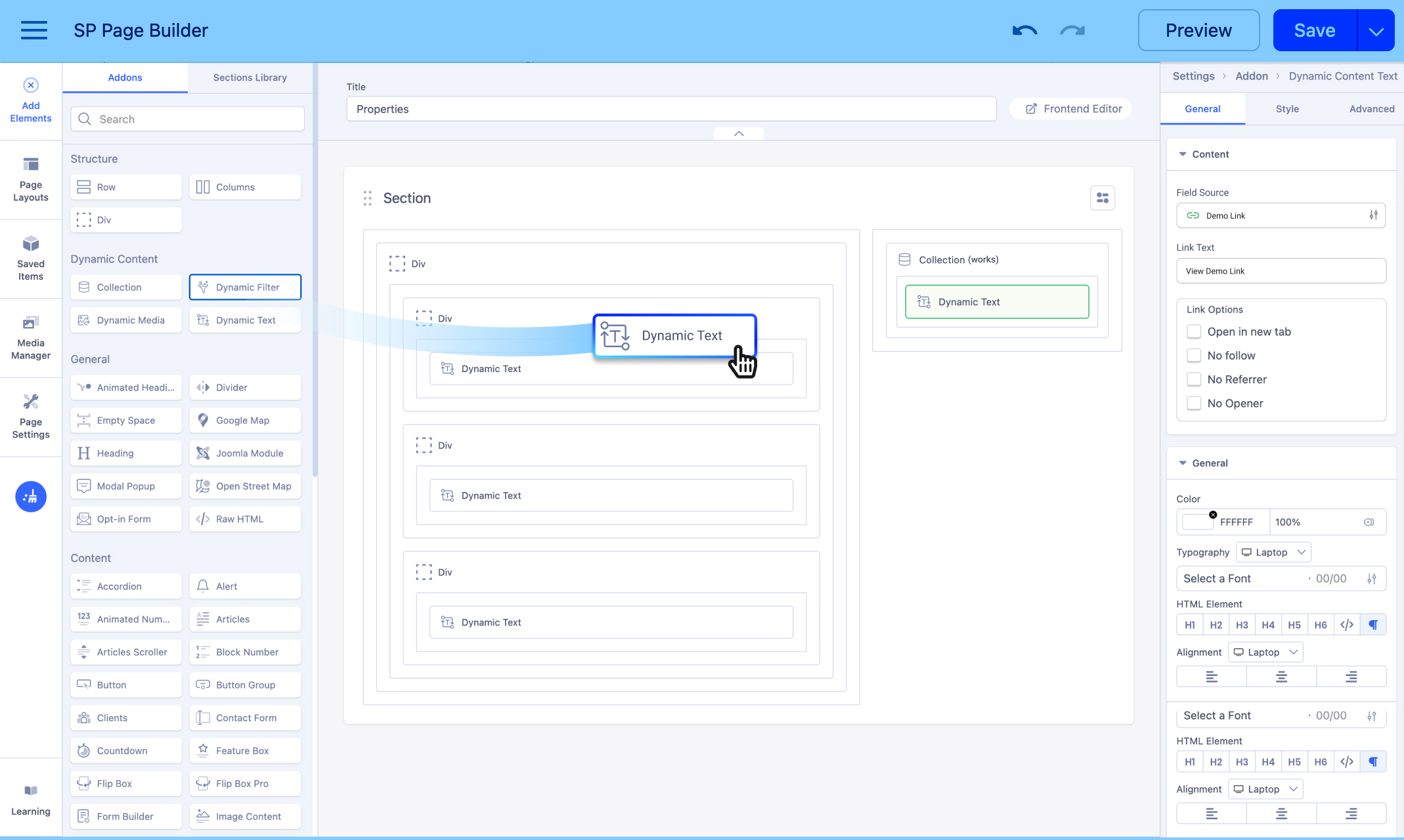
4. Set the Collection Source to the one that includes your Link field. For example, we'll set the source to "Works", since the Link fields are included within the Works collection.
5. Inside the Dynamic Collection addon, drag and drop a Dynamic Text addon.
- Set a Limit for the number of buttons/links you want to show (e.g., 1 to display one button).
6. In the Dynamic Text settings:
- Set the Source Field to “Link.”
- Enter a Link Text that will appear on your button (e.g., View Demo Link).
7. Style and customize the text addon as desired to make it appear as a button.
How to Implement the Dynamic Text Addon as a Button

Dynamic content links can be displayed as buttons. Follow the instructions below:
From the Dynamic Text addon’s General Settings, enable the Button option. You will get the following customization settings:
Button Style: You can choose a desired button style from the given list. The available styles include:
- Default
- Primary
- Secondary
- Success
- Info
- Warning
- Danger
- Dark
- Link
- Custom
By selecting Link or Custom, a Style section will appear where you can adjust the color and background color for Normal and Hover states.
Appearance: You can choose a suitable button appearance from the list. Available options include:
- Flat
- Gradient
- Outline
Shape: Choose your button shape from the list using this option. Shapes include:
- Rounded
- Square
- Round
Size: You can choose from numerous options to define your button size. Available options:
- Standard
- Large
- Extra Large
- Small
- Extra Small
- Custom
By selecting the Custom option, you will get the option to manually adjust padding.
Full-Width: Set this option to ‘Yes’ if you want a full-width button. Leave that to ‘No’ if you don't.