- TemplatesTemplates
- Page BuilderPage Builder
- OverviewOverview
- FeaturesFeatures
- Dynamic ContentDynamic Content
- Popup BuilderPopup Builder
- InteractionsInteractions
- Layout BundlesLayout Bundles
- Pre-made BlocksPre-made Blocks
- DocumentationDocumentation
- EasyStoreEasyStore
- ResourcesResources
- DocumentationDocumentation
- ForumsForums
- Live ChatLive Chat
- Ask a QuestionAsk a QuestionGet fast & extensive assistance from our expert support engineers. Ask a question on our Forums, and we will get back to you.
- BlogBlog
- PricingPricing
Flip Box Pro
SP Page Builder gets the Flip Box Pro addon, similar to the Flip Box addon, that lets you place interactive box-shaped elements on web pages. These boxes animate with several flipping effects on mouse hover. The addon is perfect for those who want some modern and lively content on their websites.
How to Add a Flip Box Pro Addon
You can add a Flip Box Pro addon to your page from the SP Page Builder sidebar. Simply drag the addon from the Addons panel and drop it on the section of the page where you want to add a Flip Box Pro addon.
Flip Box Pro Settings
When you click on the Flip Box Pro addon, the addon settings panel will open up. You can access the addon settings and customize the addon to fit your needs. The Flip Box Pro addon settings come with four different tabs:
- General
- Front
- Back
- Options
General
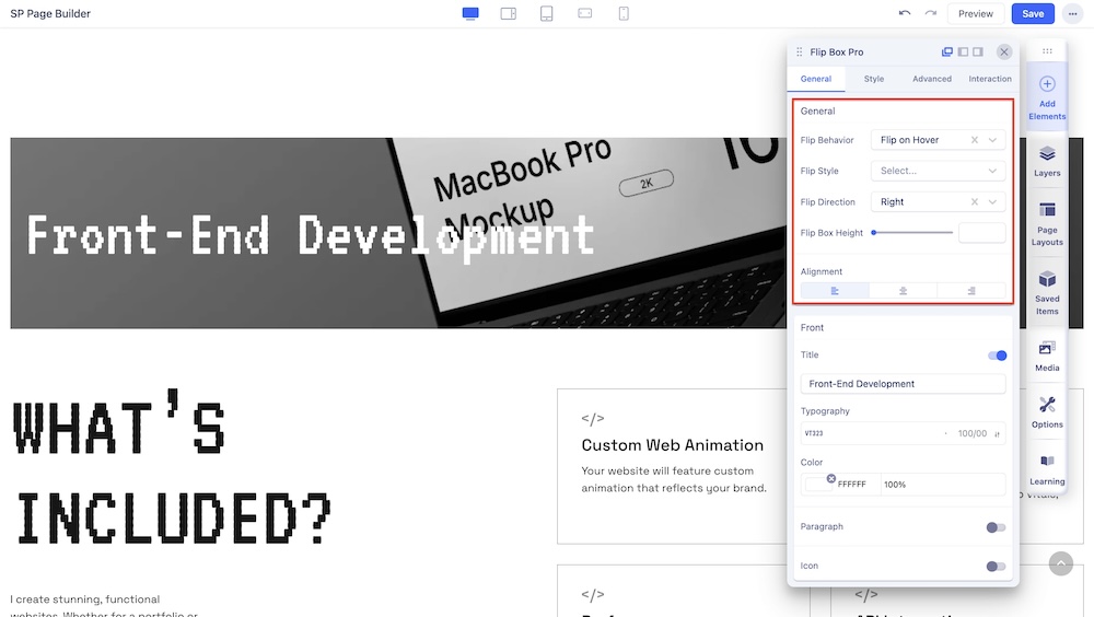
The General settings give you access to the functionality settings of your Flip Box Pro addon.
- Flip Behavior: Choose how you want your box to flip. You choose between the option of Flip on Hover (the box flips when hovered over) or Flip on Click (the box flips when clicked).
- Flip Style: Choose from a range of built-in flipping styles consisting of Rotate, Slide, Fade, and 3D styles.
- Flip Direction: You can also choose the flip direction to fit your need. Choose from the 4 available options on from Y-axis, Bottom, From X-axis, and Right.
- Flip Box Height: This option basically lets you set the vertical height of your Flip Box addon.
- Alignment: Choose how you want to align your flip box’s text from the available option of Right, Middle, and Left.
Front
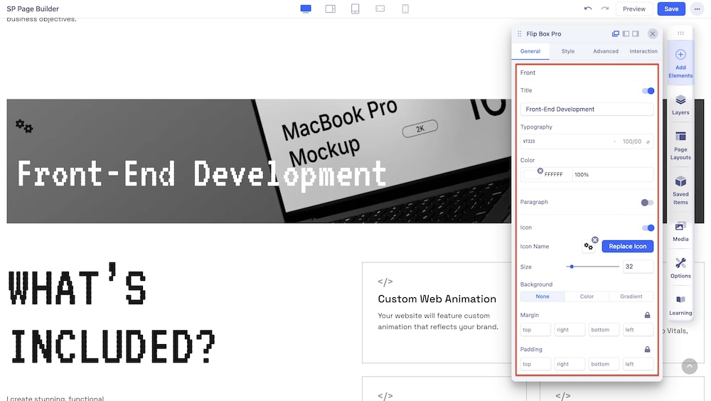
The Front settings panel comes with the settings for your flip box’s front customization option. You can display a title to your flip box, add a text body, and an icon on the front part of your flip box.
- Title: Enable this option in case you want to give a title to your flip box. You can also edit your title’s color and typography to fit your preference from the same editing panel.
- Paragraph: Enable this option in case you want to add a text body to your flip box just below your title. Easily customize your paragraph’s text color and gain access to the basic typography settings from the same editing panel.
- Icon: Enable this option to add, replace and adjust your preferred icon’s size that you want to display on your flip box’s front part. Choose from a range of available icons in the icon library or you can also upload your customized icon. Also, customize your icon’s color and adjust the spacing (Padding and Margin) to fit your needs from the same editing panel.
Back
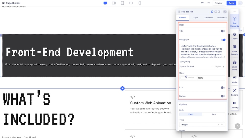
The Back settings are almost similar to the Front settings. This settings panel comes with the settings for your flip box’s front part’s customization option. You can display a title to your flip box, add a text body, and an icon on the front part of your flip box.
- Title: Enable this option in case you want to give a title to your flip box. You can also edit your title’s color and typography to fit your preference from the same editing panel.
- Paragraph: Enable this option in case you want to add a text body to your flip box just below your title. Easily customize your paragraph’s text color and gain access to the basic typography settings from the same editing panel.
- Icon: Enable this option to add, replace, and adjust your preferred icon’s size that you want to display on your flip box’s front part. Choose from a range of available icons in the icon library or you can also upload your customized icon. Also, customize your icon’s color and adjust the spacing (Padding and Margin) to fit your needs from the same editing panel.
Button
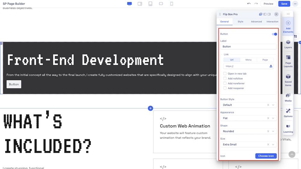
An additional setting for the Back of your Flip Box is Button. This option comes with the basic styling options for your button.
The Style tab comes with the following customization fields:
Label: Add a label for the button.
Link: Add a link to your added button using the Link tab options.
- For URL, simply paste the web address you want to link to into the first field.
- For Menu, select the option you want to link to from the dropdown list. Note that the options on this list are all Menu Items that exist on your website.
- For Pages, select the option you want from the dropdown list. Like Menu, these options are all existing Pages available on this website.
Lastly, you can enable options such as Open in New Tab to open this link in a new tab, as well as No Follow, No Referrer, and No Opener to tell search engines to ignore this link.
Button Style: You can choose a desired button style from the given list.
Appearance: You can choose a suitable button appearance from the list.
Shape: Choose your button shape from the list using this option.
Full Width: Set this option to ‘Yes’ if you want a full-width button. Leave that to ‘No’ if you don’t.
Size: There are numerous options you can choose from to define your button size.
Icon: Choose your desired icon from a list of available icons in the Icon Library.
Position: Choose whether you want to set the icon position to the left or right of your button text.
Full Width: Set the width of your button.
Margin: Set an optimum distance around your button.
Style: Use this setting to edit the color of your added button. The Color tab comes with the following two tabs:
- Normal: This tab lets you change the color of your button’s background and the color of the text inside your button.
- Hover: This tab lets you change the color of your button’s background and the color of the text inside your button upon hovering.
Options
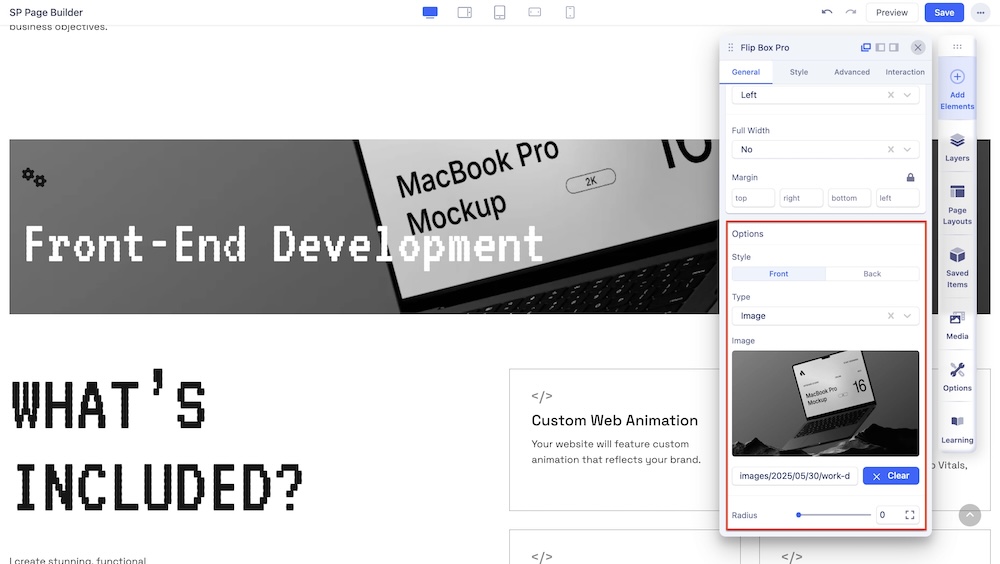
The Options Settings let you change the color and look of your flip box easily. Both the Front and Back color settings come with the following options:
- Style: Select between Front and Back.
- Type: Change your flip box’s background. You can select between Image and Color. Simply upload your preferred image from the SP Page Builder’s Media Manager. If the Color type is selected, you will be provided with the further option of choosing between a solid color or gradient.
- Radius: Change the radius of the flip box.

