- TemplatesTemplates
- Page BuilderPage Builder
- OverviewOverview
- FeaturesFeatures
- Dynamic ContentDynamic Content
- Popup BuilderPopup Builder
- InteractionsInteractions
- Layout BundlesLayout Bundles
- Pre-made BlocksPre-made Blocks
- DocumentationDocumentation
- EasyStoreEasyStore
- ResourcesResources
- DocumentationDocumentation
- ForumsForums
- Live ChatLive Chat
- Ask a QuestionAsk a QuestionGet fast & extensive assistance from our expert support engineers. Ask a question on our Forums, and we will get back to you.
- BlogBlog
- PricingPricing
Popup Settings
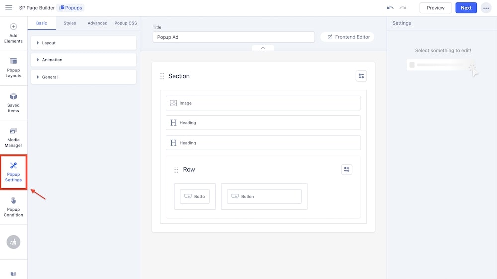
The Popup settings include general options for your popup, such as editing the layout, applying animations, changing the style, accessing advanced settings specific to the popup, applying your custom CSS, and more.
Basic
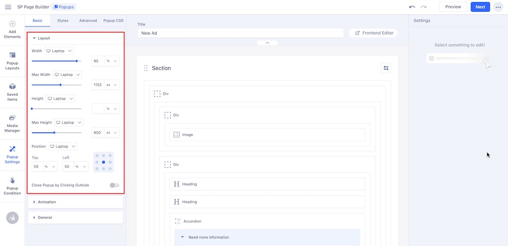
Layout: This setting allows you to control the overall structure and dimensions of the popup. You can customize the layout (based on several screens like Laptop, Tablet Landscape, Tablet Portrait, Mobile Landscape, and Mobile Portrait) by adjusting the following properties:
- Width: Set a fixed width of the popup, determining how wide it will be displayed.
- Max Width: Set the maximum width that the popup can reach. Make sure it doesn’t exceed a certain size regardless of screen size or content.
- Height: Specify a fixed height of the popup to determine how tall it will appear.
- Max Height: Set the maximum height of the popup to prevent it from growing too large even if the content expands.
- Position: Set the position of the popup on the screen. Adjust the top and left percentages by entering the value manually or clicking on a position in the square.
- Close Popup by Clicking Outside: Toggle this option to determine whether the popup will close when the user clicks on the area outside it.
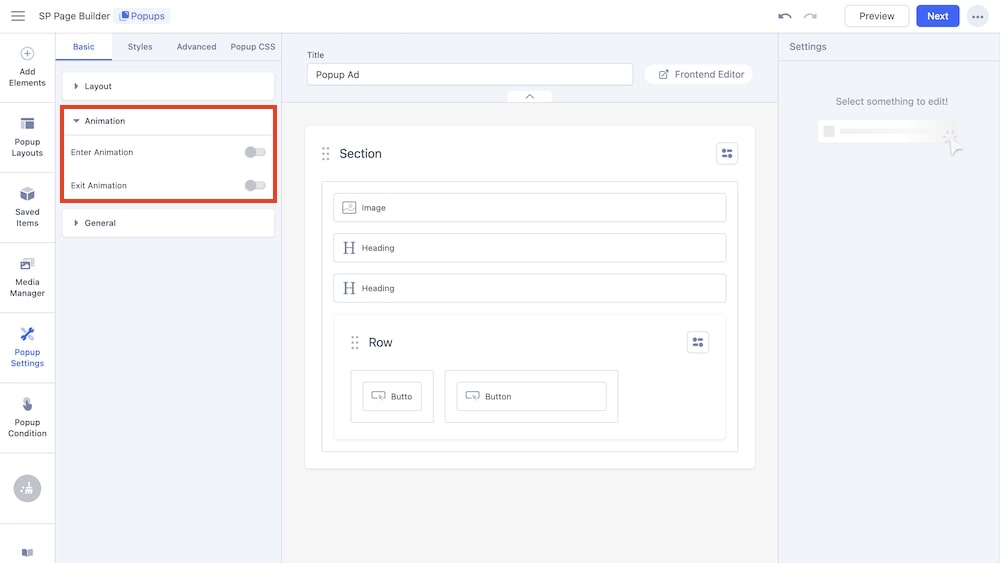
Animation: This setting allows you to control the animations of the popup.
- Enter Animation: This option allows you to select an animation effect that will be applied when the popup first appears on the screen. It controls how the popup enters the view, adding visual interest. Available options include Fade, Rotate, Flip, Bounce, Zoom, and Special. You can further adjust the direction, duration, and delay period of these animations.
- Exit Animation: Similar to Enter Animation, this setting lets you choose an animation effect for when the popup closes or disappears from the screen, making the exit smoother and more engaging. Available animation options are the same as that of Enter Animation.
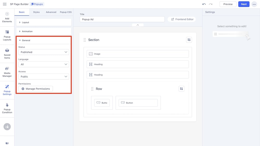
General: This setting allows you to control the general settings of the popup.
- Status: The Status setting determines whether the popup is active or inactive. An active status means the popup will be displayed according to its triggers, while an inactive status prevents it from appearing on the site.
- Language: This setting allows you to assign a specific language to the popup, making it part of a multilingual site. The popup will only appear when the selected language is in use.
- Access: The Access setting defines which user groups can view the popup. You can restrict the popup to certain users, such as registered members, administrators, or all visitors.
- Permissions: This setting controls who can manage or modify the popup. It allows you to specify which user roles have permission to edit, delete, or access the popup’s settings.
Styles
The Style settings tab allows you to edit and customize the appearance of your popup, including options like adjusting button positions and styles, selecting background colors or images, setting padding and margins, and more. The primary options are Popup, Overlay, and Close Button.
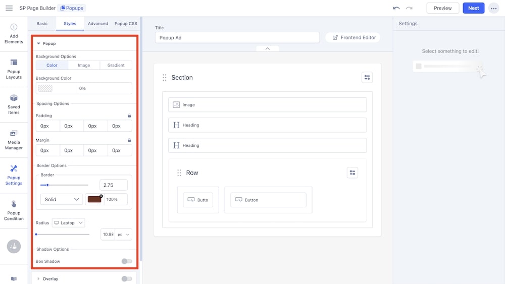
Popup: This setting allows you to control the popup style.
- Background Options: Select whether the background will be a color, image, or gradient. Based on the selection, additional customization options will appear such as background color for Color, background-repeat, size and overlay options for Image, gradient type and angle for Gradient, and so on.
- Spacing Options: Set the padding and margins for the popup.
- Border Options: Set the border type, color, and radius (based on screen size) for the popup.
- Shadow Options: The final option allows for setting a box shadow for the popup.
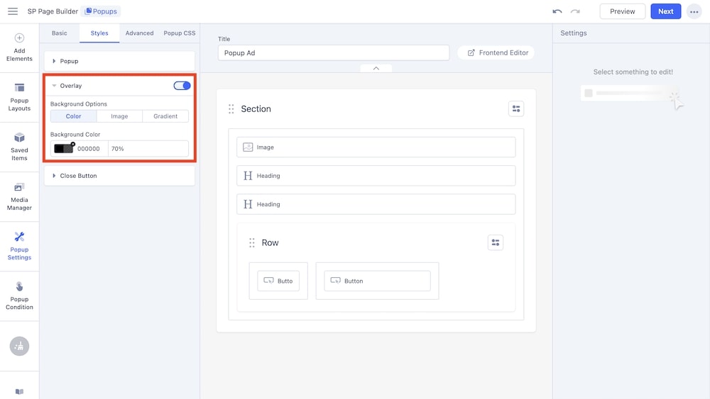
Overlay: This setting allows you to adjust an overlay for the popup.
- Background Options: Select whether the background will be a color, image, or gradient. Based on the selection, additional customization options will appear such as background color for Color, background-repeat, size and overlay options for Image, gradient type and angle for Gradient, and so on.
- Background Color: Adjust the background color of the overlay.
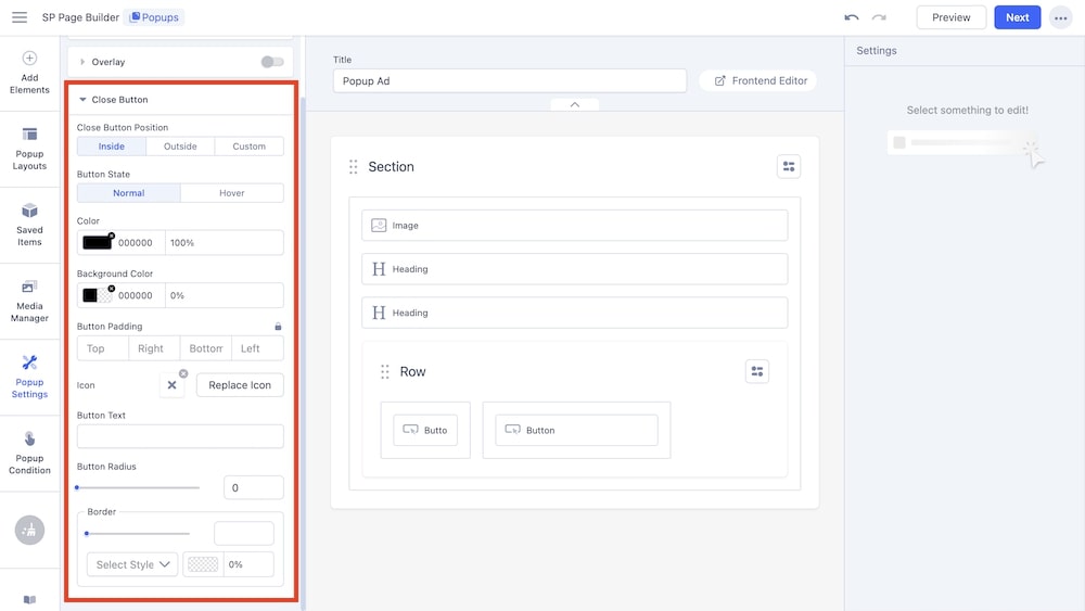
Close Button: This setting allows you to customize the close button of the popup.
- Close Button Position: Adjust the position of the close button between inside, outside, or a custom position.
- Button State: Select the state of the button, whether it will be normal or static or whether it will animate on hover.
- Color: Adjust the color of the button.
- Background Color: Adjust the background color of the button.
- Button Padding: Adjust the padding of the button.
- Icon: Select an icon for the button with this option.
- Button Text: Type text for the button.
- Border Radius: Adjust the border radius for the button.
- Border: Adjust the button’s border style.
Advanced
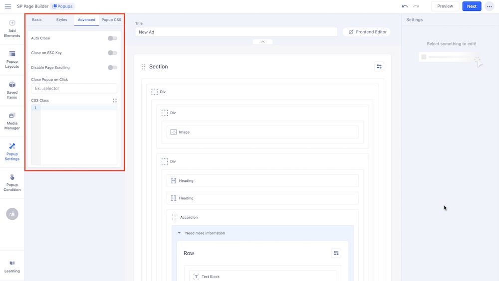
- Auto Close: Enable this option to automatically close the popup after a specified amount of time. After enabling this option you can define the exact number of seconds after which the popup will automatically close.
- Close on ESC Key: Enable this option to allow users to close the popup by pressing the ESC key on their keyboard.
- Disable Page Scrolling: When this setting is enabled, the page will be prevented from scrolling while the popup is open, keeping the user focused on the popup content.
- Close Popup on Click: This setting allows the popup to close when a specific element inside the popup is clicked. You can define the selector inside the given field.
- CSS Class: This field lets you add a custom CSS class to the popup that will enable you to apply additional styling or behavior through custom CSS rules.
Popup CSS
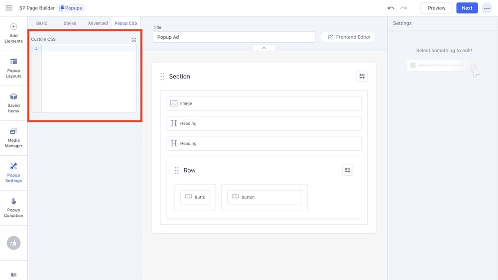
The Custom CSS field in the popup settings allows you to add your own CSS code to style the popup. By entering CSS directly into this field, you can tailor the appearance and behavior of the popup to better fit your design requirements.
Popups in the Frontend Editor
You can complete the entire setup using SP Page Builder’s frontend editor as well. All your edits will be visible in real-time.

