- TemplatesTemplates
- Page BuilderPage Builder
- OverviewOverview
- FeaturesFeatures
- Dynamic ContentDynamic Content
- Popup BuilderPopup Builder
- InteractionsInteractions
- Layout BundlesLayout Bundles
- Pre-made BlocksPre-made Blocks
- DocumentationDocumentation
- EasyStoreEasyStore
- ResourcesResources
- DocumentationDocumentation
- ForumsForums
- Live ChatLive Chat
- Ask a QuestionAsk a QuestionGet fast & extensive assistance from our expert support engineers. Ask a question on our Forums, and we will get back to you.
- BlogBlog
- PricingPricing
Native Comments for Articles
You can now integrate a full commenting system into your site with the Comments addon, giving you complete control to approve, edit, and manage comments effortlessly. This means there are no third-party dependencies that require additional downloads, extra costs.
Creating a Commenting Section in Joomla Articles
Make sure you have created your Dynamic Article details page first.
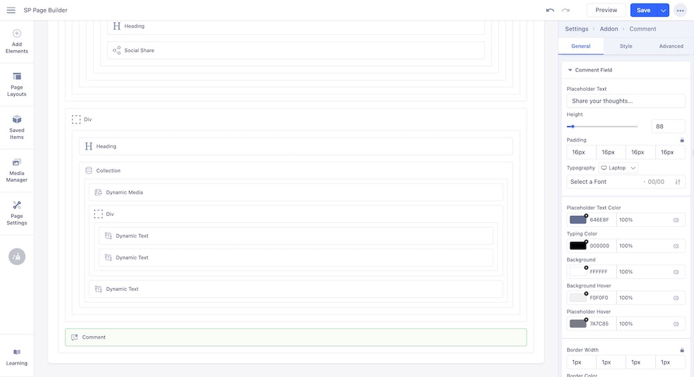
Go to your article details page and drag and drop a Comment addon where you wish to add the comment section. Upon clicking on it, you can customize the comments section, just like any other SP Page Builder addon.
The Comment addon comes with the following General Settings:
Title Settings
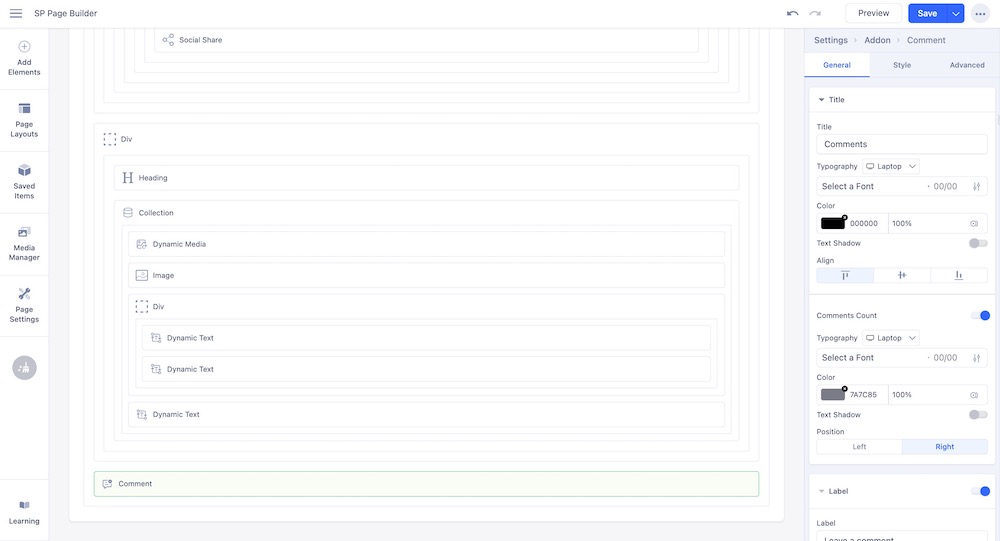
The Title settings control how the heading or title of the comments section looks.
- Title: Specifies the heading text for the comments section.
- Typography: Controls the font style, size, weight, and spacing for the comment text.
- Color: Defines the text color for the comments and titles.
- Text Shadow: Adds a shadow effect behind the text to enhance visibility or style.
- Align: Sets the horizontal alignment of the text, such as left, center, or right.
- Comments Count: Displays the total number of comments for the post or page.
- Typography: Adjusts the font style, size, weight, and spacing of the comments count text.
- Color: Sets the text color for the comments count.
- Text Shadow: Adds a shadow effect to the comments count text for better readability or style.
Label Settings
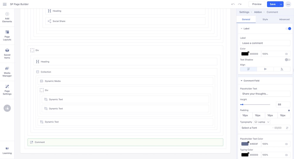
Enable the Label option to add a label for your comment section.
- Label: Specifies the text or caption displayed for the comment element.
- Color: Sets the text color for the label.
- Text Shadow: Adds a shadow effect to the label text for style or emphasis.
- Align: Determines the horizontal alignment of the label text, such as left, center, or right.
Comment Field Settings
- Placeholder Text: Defines the text shown inside the comment box before the user types anything.
- Height: Sets the vertical size of the comment box.
- Padding: Controls the inner spacing between the text and the edges of the comment box.
- Typography: Adjusts the font style, size, weight, and spacing of the comment text.
- Placeholder Text Color: Sets the color of the placeholder text inside the comment field.
- Typing Color: Defines the color of the text while the user is typing in the comment field.
- Background: Sets the background color or image for the comment field.
- Background Hover: Defines the background color or image when the mouse hovers over the comment field.
- Placeholder Hover: Changes the placeholder text color when the mouse hovers over the comment field.
Post Button Settings
The Post Button settings control the appearance and behavior of the button used to submit a comment.
- Text: Specifies the text displayed on the post button.
- Aria Label: Provides an accessible label for screen readers to describe the button's purpose.
- Typography: Adjusts the font style, size, weight, and spacing of the button text.
- Enable Anonymous Comment: Allows users to post comments without signing in.
- Button Style: Sets the design style of the button, such as solid, outline, or link.
- Appearance: Controls the button’s color scheme and visual theme.
- Shape: Defines the button's corner style, such as rounded or square.
- Size: Sets the button's overall dimensions, like small, medium, or large.
- Full Width: Stretches the button to take up the entire width of its container.
- Alignment: Positions the button horizontally within its container, such as left, center, or right.
- Button Icon: Adds an icon to the button for visual emphasis.
- Icon Position: Determines whether the icon appears before or after the button text.
Edit Comment Settings
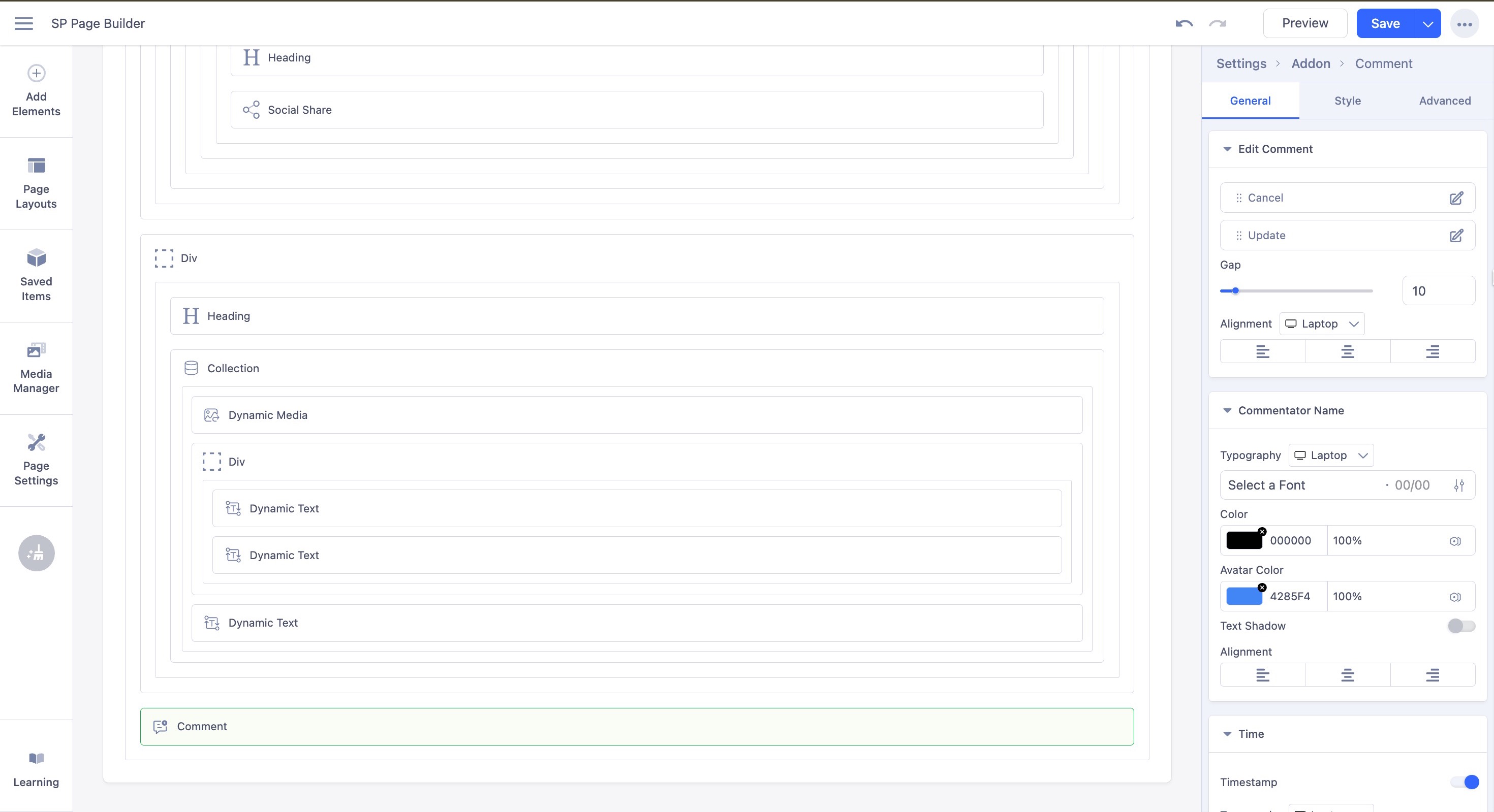
The Edit Comment Settings control how the comment editing interface looks and behaves.
- Cancel: The button that discards changes and closes the edit mode.
- Update: The button that saves the edited comment.
- Gap: Sets the spacing between the Cancel and Update buttons.
- Alignment: Determines the horizontal position of the buttons, such as left, center, or right.
Commentor Name Settings
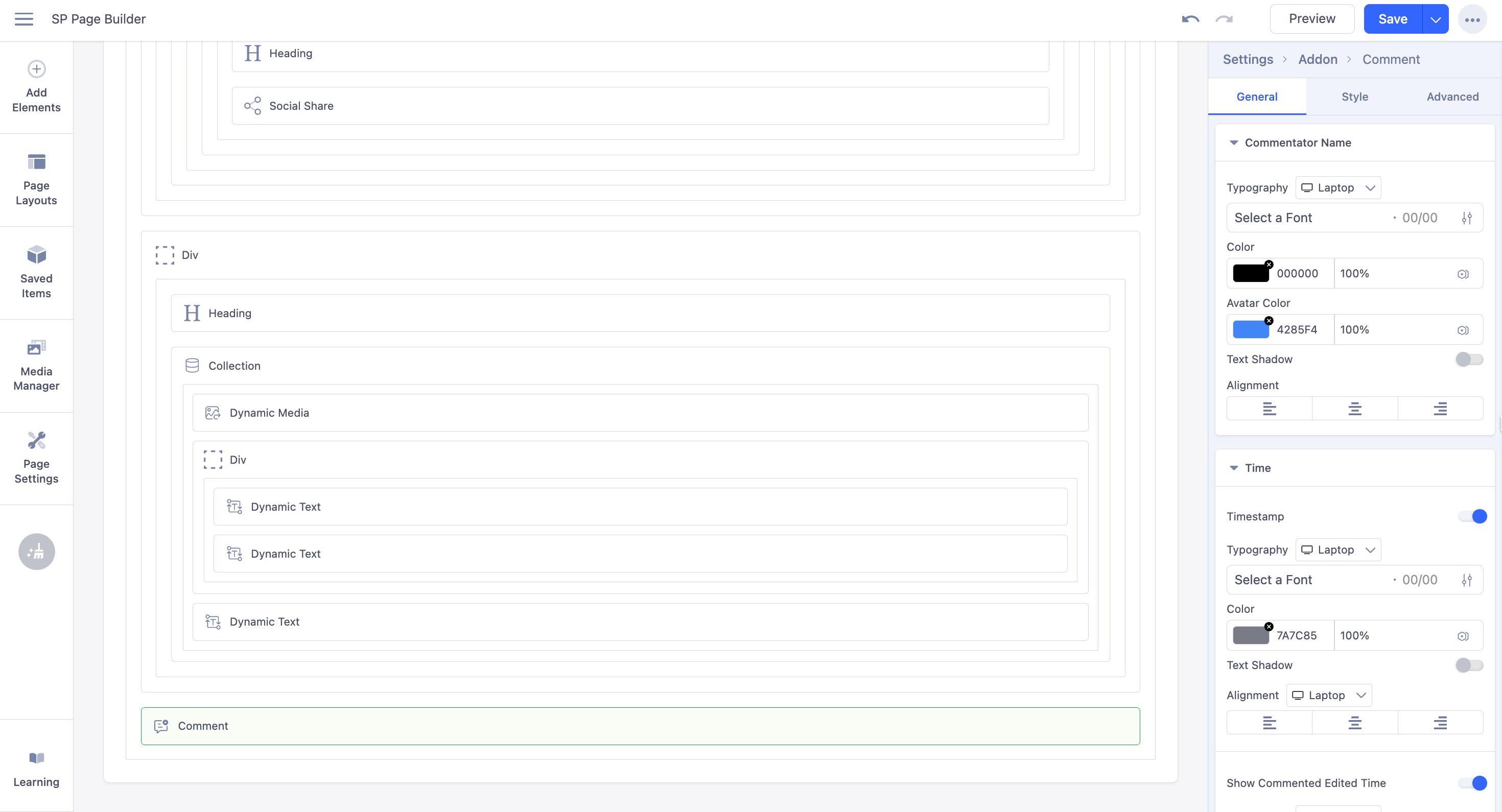
The Commentor Name settings control the appearance of the name displayed for each commentor.
- Typography: Controls the font style, size, weight, and spacing of the commentor's name.
- Color: Sets the text color of the commentor's name.
- Avatar Color: Defines the background color of the commentor’s avatar.
- Text Shadow: Adds a shadow effect behind the commenter's name for style or emphasis.
- Alignment: Determines the horizontal placement of the commentor's name, such as left, center, or right.
Time Settings
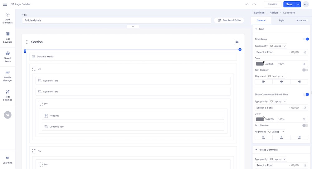
The Time Settings control how the timestamp of each comment is displayed.
- Timestamp: Displays the date and time when the comment was posted.
- Typography: Controls the font style, size, weight, and spacing of the timestamp.
- Color: Sets the text color of the timestamp.
- Text Shadow: Adds a shadow effect to the timestamp text for style or readability.
- Alignment: Determines the horizontal placement of the timestamp, such as left, center, or right.
- Show Comment: Toggles whether the timestamp is visible alongside the comment.
Posted Comment Settings
The Posted Comment settings control the appearance of the text for submitted comments.
- Typography: Controls the font style, size, weight, and spacing of the posted comment text.
- Color: Sets the text color of the posted comments.
- Text Shadow: Adds a shadow effect to the posted comment text for style or readability.
Ellipsis (three-dot) Action Settings
In the Comments addon, Ellipsis Action Settings control the appearance and behavior of the ellipsis (three-dot) menu for each comment.
- Button Style: Sets the design style of the ellipsis action button, such as solid, outline, or link.
- Appearance: Controls the button’s color scheme and visual theme.
- Shape: Defines the button’s corner style, such as rounded or square.
- Size: Sets the overall dimensions of the ellipsis button.
- Margin: Adjusts the spacing around the ellipsis button.
- Alignment: Determines the horizontal placement of the ellipsis button within its container.
- Icon Color: Sets the color of the ellipsis icon.
- Icon Background Color: Sets the background color behind the ellipsis icon.
- Edit: Configures the behavior or visibility of the edit action in the ellipsis menu. Click on the edit icon to access the in-depth settings of this button.
- Delete: Configures the behavior or visibility of the delete action in the ellipsis menu. Click on the edit icon to access the in-depth settings of this button.
Likes Settings
The Likes Settings control the appearance and behavior of the like feature for comments. Enable the option to implement likes in the comments.
- Typography: Controls the font style, size, weight, and spacing of any text associated with likes.
- Text Shadow: Adds a shadow effect to the text for style or readability.
- Color: Sets the default color of the like text or icon.
- Hover Color: Changes the color of the like text or icon when the mouse hovers over it.
- Icon Focused Color: Defines the color of the like icon when it is active or selected.
- Icon: Specifies the visual icon used to represent the like action.
- Icon Position: Determines whether the icon appears before or after the text.
Reply Settings
The Reply Settings control the appearance and behavior of the reply feature for comments.
- Typography: Controls the font style, size, weight, and spacing of the reply text.
- Text Shadow: Adds a shadow effect to the reply text for style or readability.
- Color: Sets the default color of the reply text or icon.
- Hover Color: Changes the color of the reply text or icon when the mouse hovers over it.
- Icon: Specifies the visual icon used to represent the reply action.
- Icon Position: Determines whether the icon appears before or after the reply text.
Managing the Comments
Once a comments section is added to your articles, the admin has full control over its behavior, including approving, unpublishing, or deleting comments.
Approving Comments
From your SP Page Builder dashboard, scroll down to find the Comments section. Here you will get the necessary settings related to approving the comments.
- Comments must be manually approved: When enabled, all new comments require approval by the admin before appearing on the site.
- Comment author must have a previously approved comment: When enabled, comments from authors with at least one approved comment are automatically approved.
- Enable Gravatar: When enabled, user avatars are fetched from Gravatar based on their email address.
Edit, Publish, Unpublish, or Delete Comments
As an admin, you have full control to edit, publish, unpublish, or delete comments within your comment section.
From your Joomla dashboard, go to Articles > Comments to view all approved and unapproved comments.

