

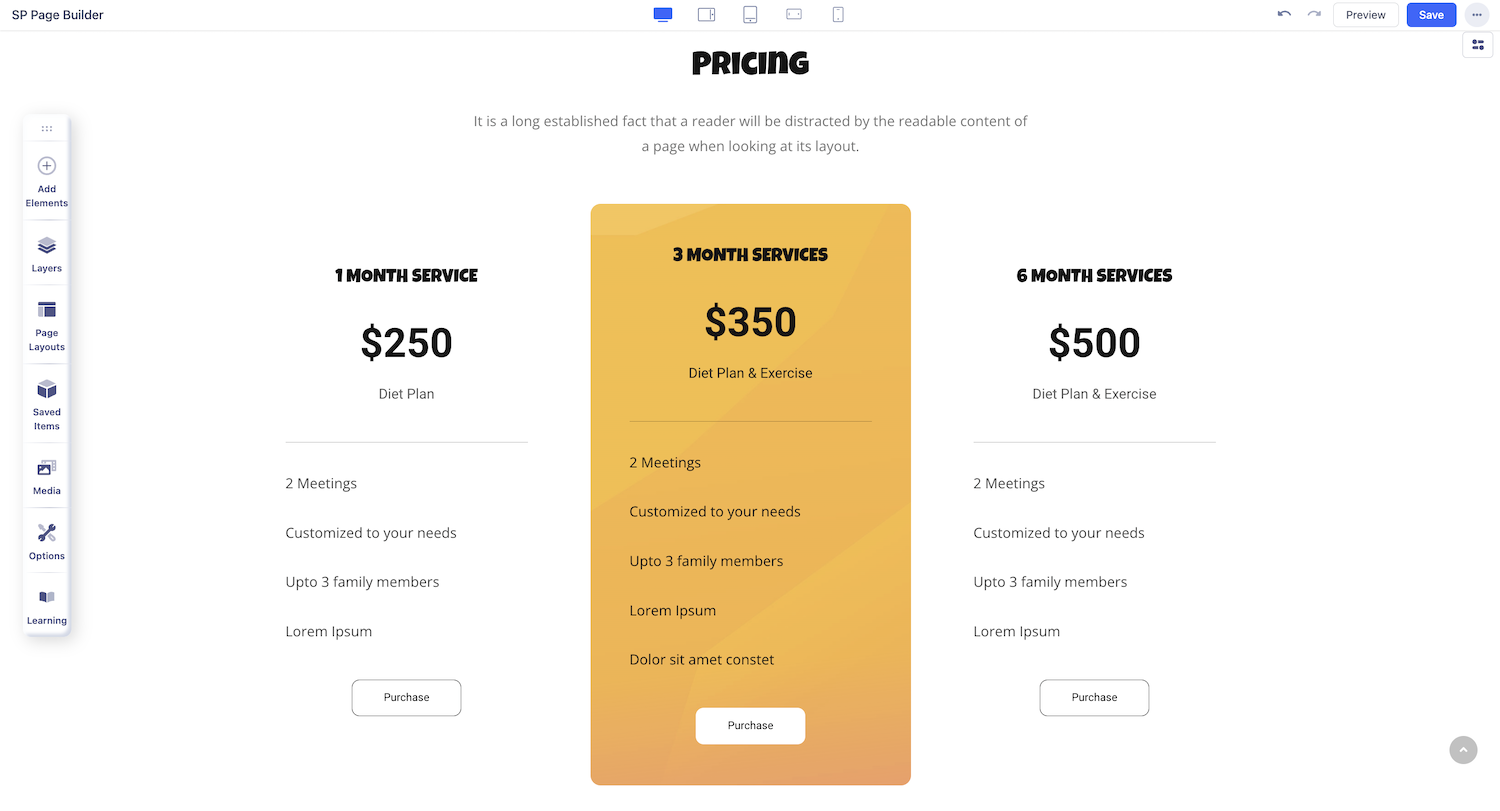
Pricing Table
The Pricing Table addon is a block that can be used to showcase any service or product’s Pricing Plans. Normally, creating such a thing can be time-consuming but with this pre-made addon, you can design your pricing page in no time!
How to add a Pricing Table
To add a Pricing Table, open the Addons Panel and find this addon under the Content section. Drag & drop it to your webpage onto the area where you want it placed.
Pricing Table Settings
Now that you’ve added the Pricing Table addon, replace the default text with your content and customize it to fit your needs. Click on the Pricing Table to open the addon settings panel and start making adjustments.
Title
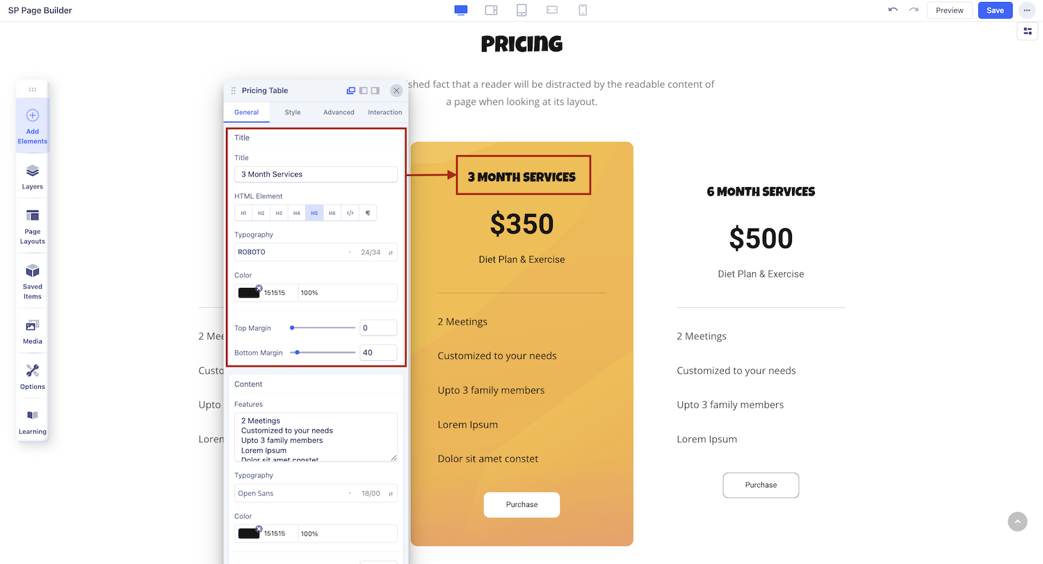
First up is the Title tab from where you can give your Pricing Table an appropriate Title.
Title: Enter the text for the Title
HTML Element: Set the HTML element hierarchy as H1, H2, H3, etc.
Top Margin: Set the top margin of your Title.
Bottom Margin: Set the bottom margin of your Title.
Color: Click to customize the color of your Pricing Table title to match your design.
Content
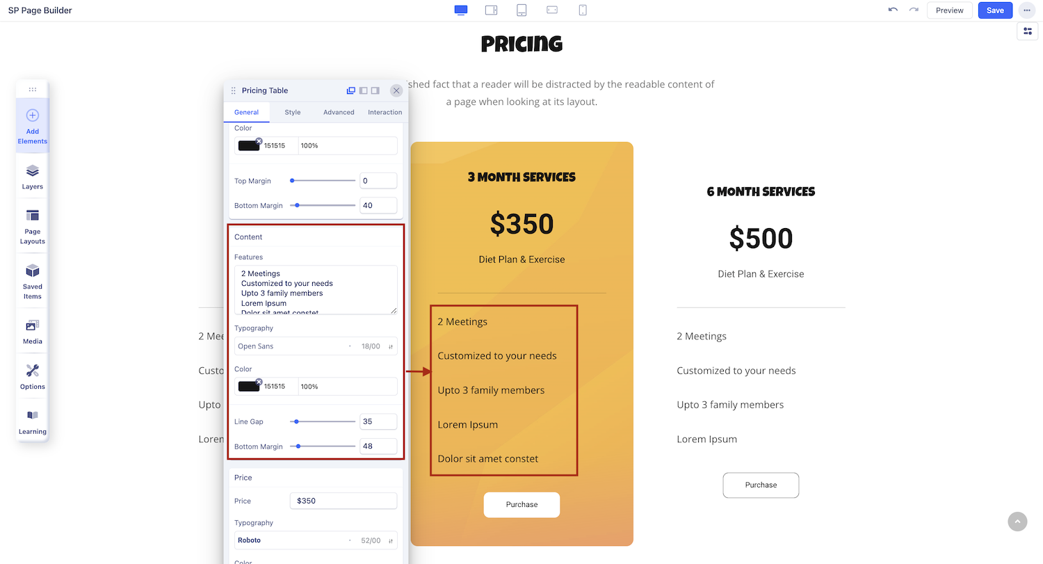
In the Content section of the Pricing Table, you can provide additional details about your pricing plan.
Features: List the key offerings and benefits included in the pricing plan.
Typography: Customize the font style and size for the content.
Color: Choose a text color that aligns with your design.
Bottom Margin: Adjust the spacing below the content for better layout control.
Line Gap: Set the spacing between lines for improved readability.
Price
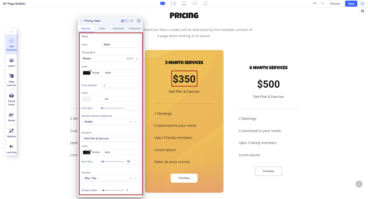
Modify the displayed price and adjust related settings, including font and alignment from this section
Typography: Customize the font style and size for the price text.
Color: Choose and set the color for the price text.
Price Symbol: Adjust the currency symbol, after title or before the button.
Position: Select the alignment and position of the price on your page.
Divider Width: Define the width of the divider line separating different sections.
Divider Color: Set the color of the divider line to match your design.
Bottom Margin: Adjust the space beneath the price to control the layout's spacing.
Bottom Padding: Set the padding below the price to manage the space within the pricing box.
Hover
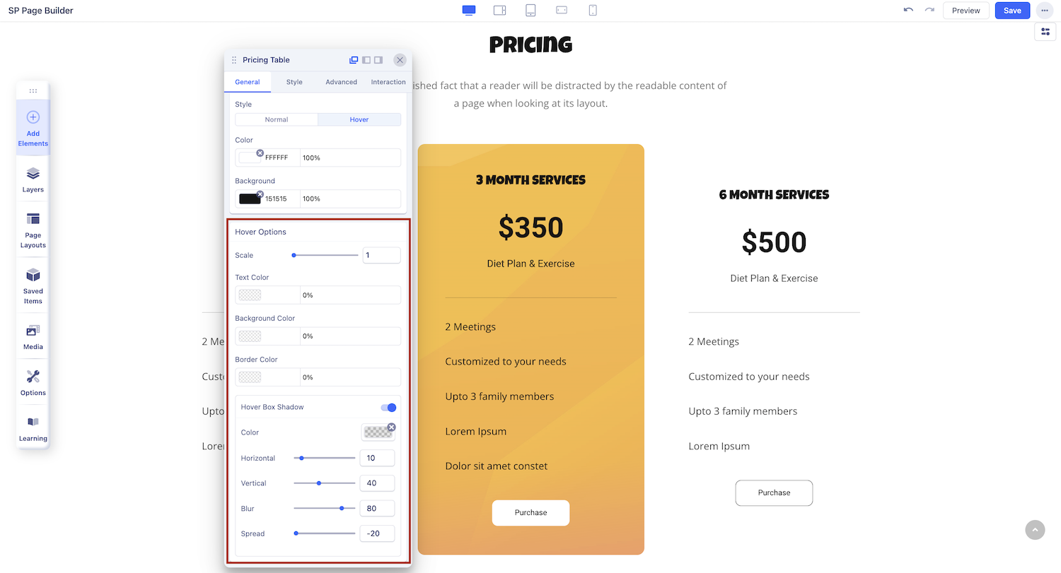
Scale: Set how large the Pricing Table will scale to in hover mode.
Text Color: Set the color of the Pricing Table’s text in hover mode.
Background Color: Set the color of the Pricing Table’s background in hover mode.
Border Color: Set the color of the Pricing Table’s border in hover mode.
Hover Box Shadow: Enable a box shadow effect when in hover mode. When enabled, you will get to access more options to customize the Box Shadow Effect.
Button
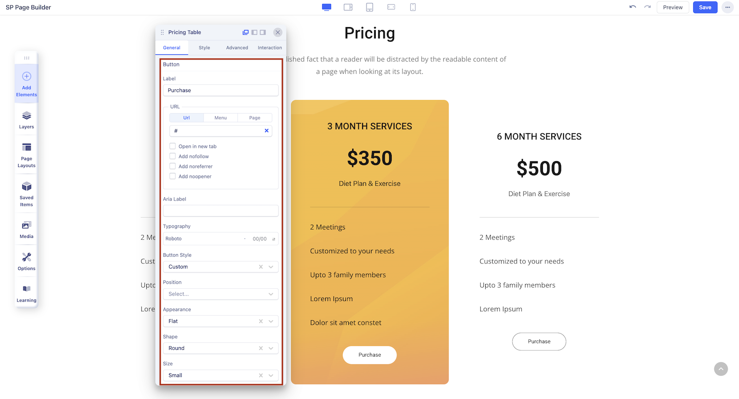
Label: Set the text displayed on the button.
URL: Add a link to direct users when they click the button.
Aria Label: Provide an accessible name for screen readers.
Typography: Adjust the font style and size of the button text.
Button Style: Choose a predefined style for the button's appearance.
Position: Align the button within the layout.
Appearance: Customize the button's visual presentation.
Shape: Select the button's shape, such as rounded or square.
Size: Adjust the button’s dimensions.
Full Width: Enable this option to make the button span the full width of its container.
Button Icon: Add an icon to the button for better visual appeal.
Icon Position: Choose whether the icon appears on the left or right of the text.
Top Margin: Set the spacing above the button.
Bottom Margin: Adjust the spacing below the button.
Style: Define the button style. Choose between normal and hover states.