- TemplatesTemplates
- Page BuilderPage Builder
- OverviewOverview
- FeaturesFeatures
- Dynamic ContentDynamic Content
- Popup BuilderPopup Builder
- InteractionsInteractions
- Layout BundlesLayout Bundles
- Pre-made BlocksPre-made Blocks
- DocumentationDocumentation
- EasyStoreEasyStore
- ResourcesResources
- DocumentationDocumentation
- ForumsForums
- Live ChatLive Chat
- Ask a QuestionAsk a QuestionGet fast & extensive assistance from our expert support engineers. Ask a question on our Forums, and we will get back to you.
- BlogBlog
- PricingPricing
Row Editing Tools
Row editing tools give you the freedom to customize your rows and style them. You can access the row editing tool on the right side of each section as shown in the image below.
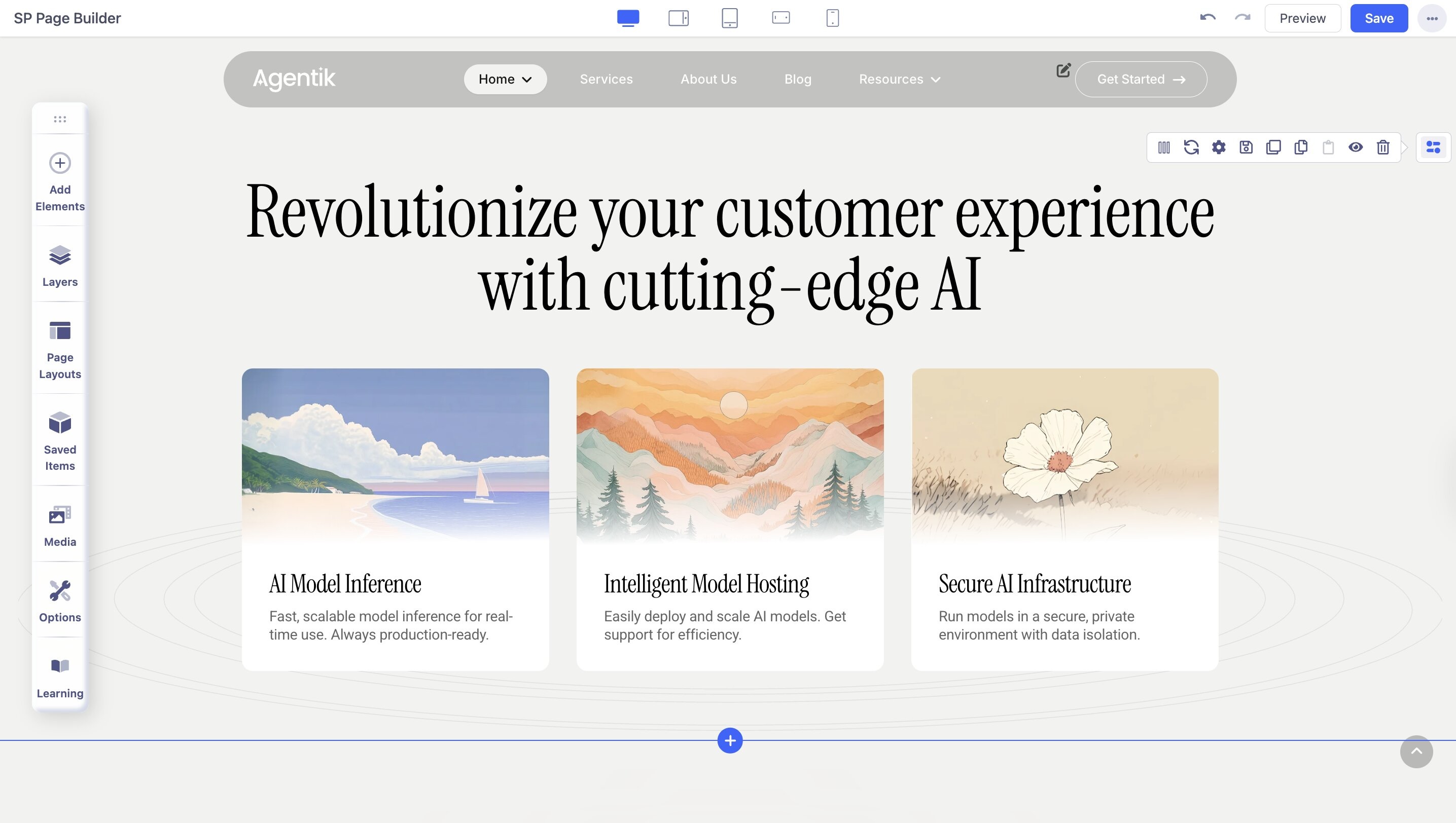
Edit Row: This will open up the column generator, using which you can change the column structure of the row.
Row Options: This will open the row customization settings.
Save Row: Click on this to save the section to reuse in the future. Set a name for the section, and you’re good to go.
Duplicate Row: Click on this to create a duplicate of the row immediately below the selected row.
Copy Row: Click on this to create a copy of the row and paste it onto any section of the page you want.
Disable Row: If you want to disable any row that you don't want to show for the time being, you can hide it by clicking the Disable Row option. You can still enable it by clicking the Enable button.
Delete Row: Click on this to delete the entire row.
Row Options
The Row Options consist of the Style, Title, Responsive, and Animation tab.
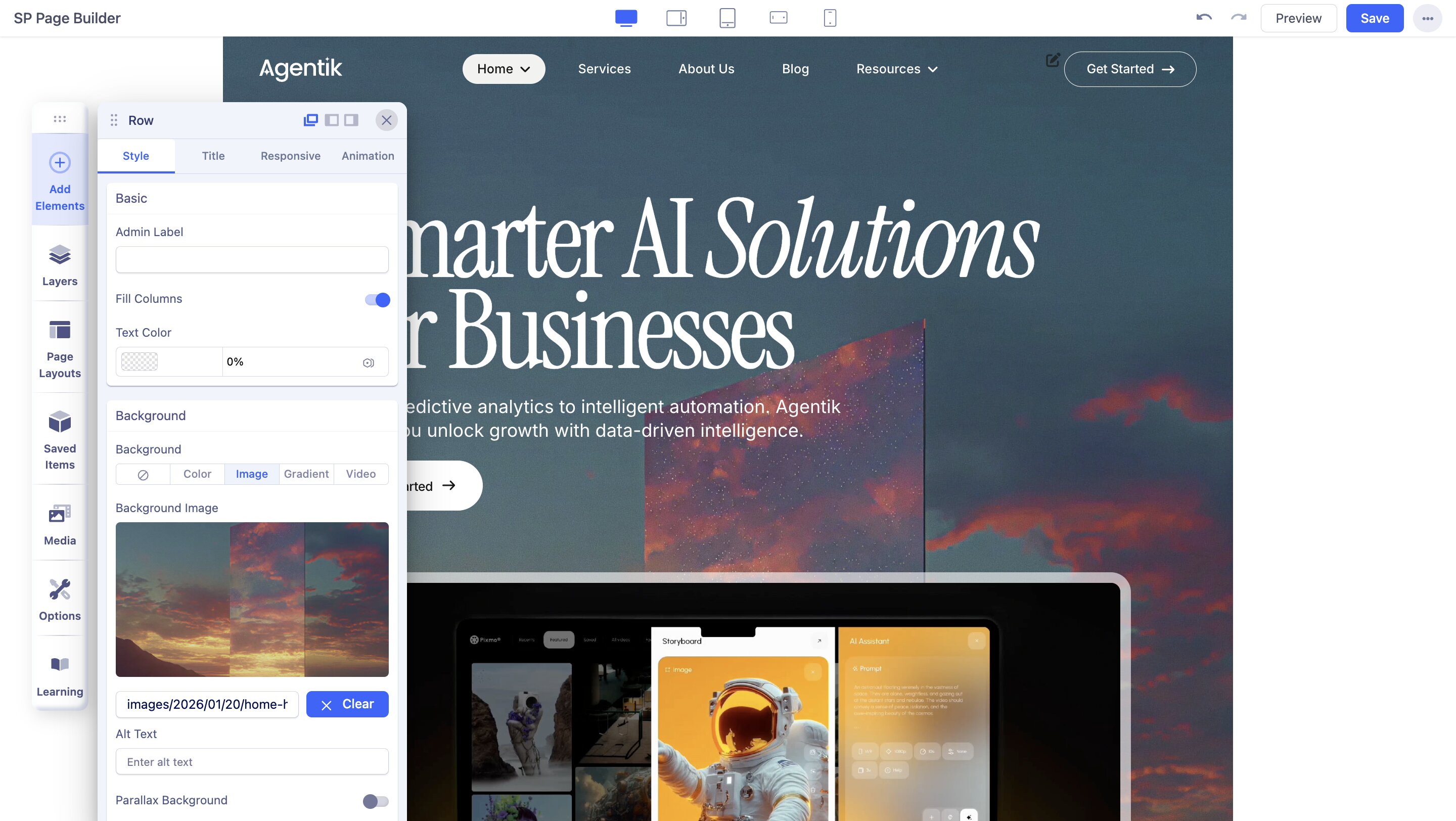
Style
Fill Columns: If you enable it, the width of the next column is adjusted to fill the available space within the row without breaking the layout.
Text Color: Use this option to set a color for all the text inside the row.
Background: You can set the background of the row to the following options:
- None
- Color Image
- Gradient
- Video
Vertical Align: Use the vertical alignment to vertically align the content of a section. You can set the alignment to either top, bottom, or center.
Fluid Row: Enable the Fluid Row option to make the row fluid by clicking on the row editing option.
Container Width: Use the slider or the input field to change the width of the container.
Remove Column Gap: Enable to remove the gap between columns in a row.
Gap Between Columns: Use the slider or the input field to set the gap between the columns in a row. You can also select your preferred unit from the drop-down.
Height Options
Set the minimum and maximum height (top & bottom) of the row using the height options.
Width Options
Set the minimum and maximum width (left & right) of the row using the width options.
Spacing
Use the margin and padding to create responsive content with consistent spacing. You can add space outside (margin) or inside (padding) a section boundary. Add spacing to one side, complementary sides, or all four sides at once.
Border
Enable Border: Enable this option to add a border across the entire row or section.
Border Style: Choose your border style from the drop-down list.
Border Color: Choose a color for the row border.
Border Radius: Border radius is for the corner of the border to be rounded or straight. Use the slider to up and down the number to set the Border Radius.
Box Shadow
Color: Choose a shadow color to add a shadow effect to the row.
Horizontal: Use the slider to change the shadow radius horizontally.
Vertical: Use the slider to change the shadow radius vertically.
Blur: Use the slider to change the blur level of the shadow.
Spread: Use the slider to change the size of the shadow spread.
Overflow
Overflow x: The overflow-x property specifies what should happen if content overflows at the left and right edges.
Overflow y: The overflow-y property specifies what should happen if content overflows at the top and bottom edges.
- Auto: If overflow is clipped, a scroll bar should be added to see the rest of the content.
- Hidden: The overflow is clipped, and the rest of the content will be invisible.
- Scroll: The overflow is clipped, but a scroll bar is added to see the rest of the content.
- Visible: The overflow is not clipped. It renders outside the section.
Section ID
Use this field to add a section ID to the selected row for unique identification.
CSS Class
If you wish to style a particular content element differently, then use this field to add a class name and also refer to it in your CSS file.
Enable Shape
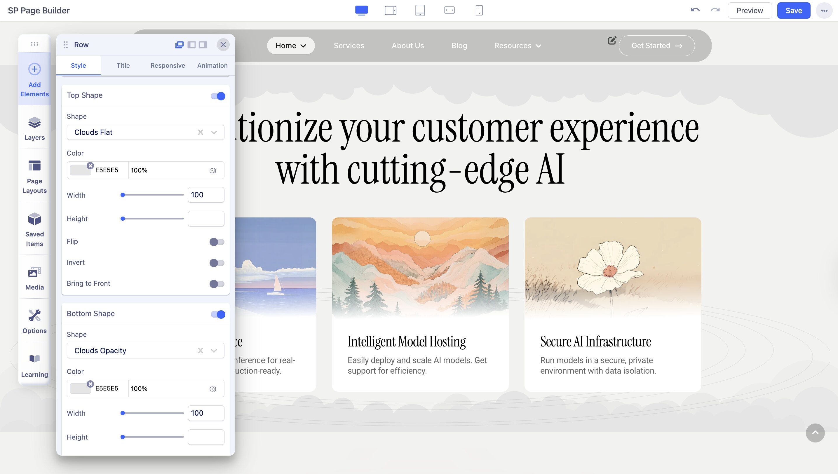
Enable Top and Bottom Shape to add vector shapes to the row. If you want to add shapes only to the Top or Bottom, enable only the relevant option.
Enabling Top or Botton Shape will provide the following settings:
- Shape: There are 10+ shapes to add. Add your desired one.
- Color: Set the color of the shape using this option.
- Width: Set the width of the shape. Use the wheel to adjust.
- Height: Set the width of the shape. Use the wheel to adjust.
- Bring to Front: This will face the design of the shape to the front.
Title
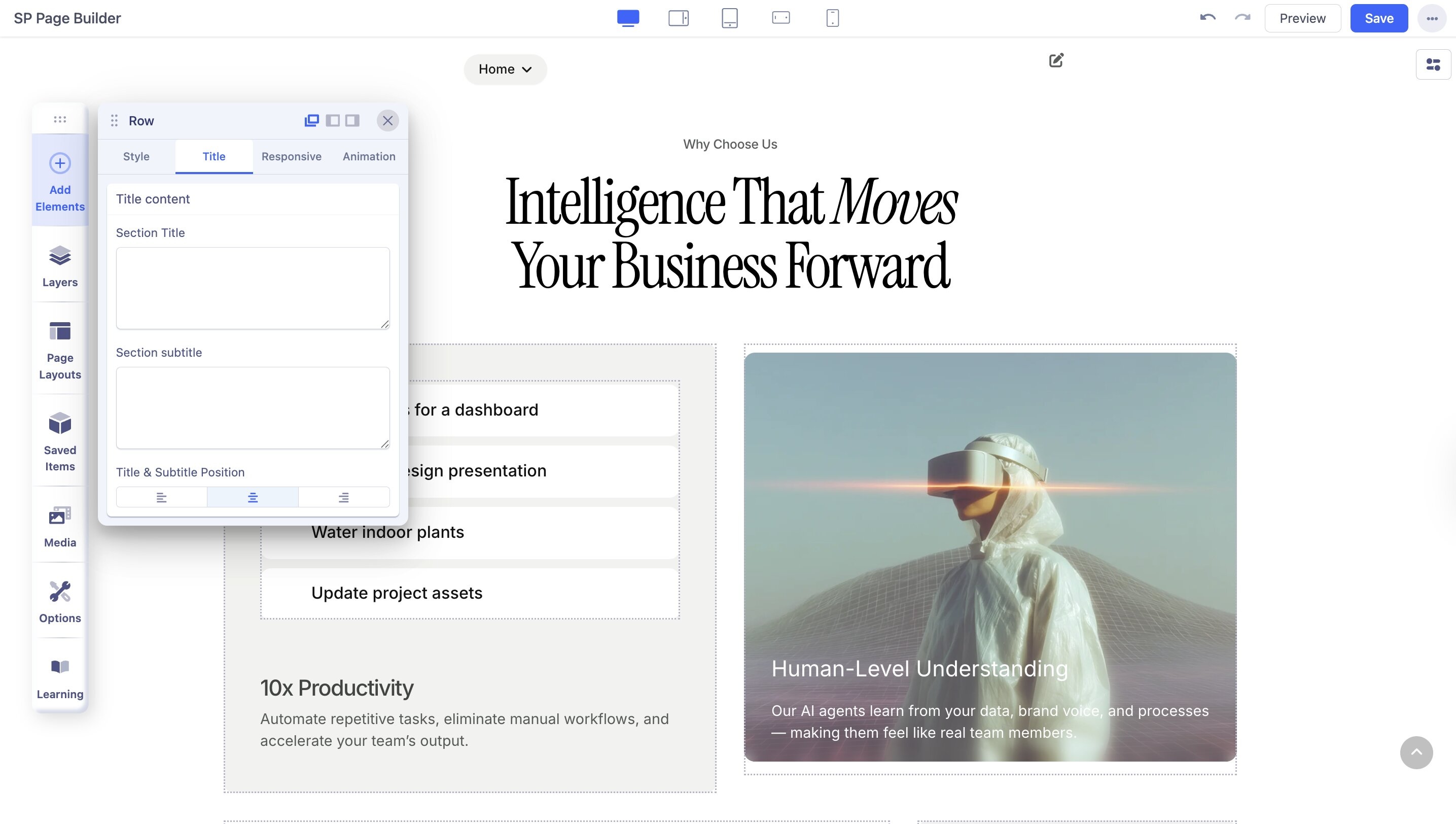
Section Title: Use the text box to add a title to the section.
Section Subtitle: Use the text box to add a subtitle to the section.
Title & Subtitle Position: Set the position of the section title and section subtitle to either right, left, or center.
Admin Label: Define an admin label for easy identification.
Responsive
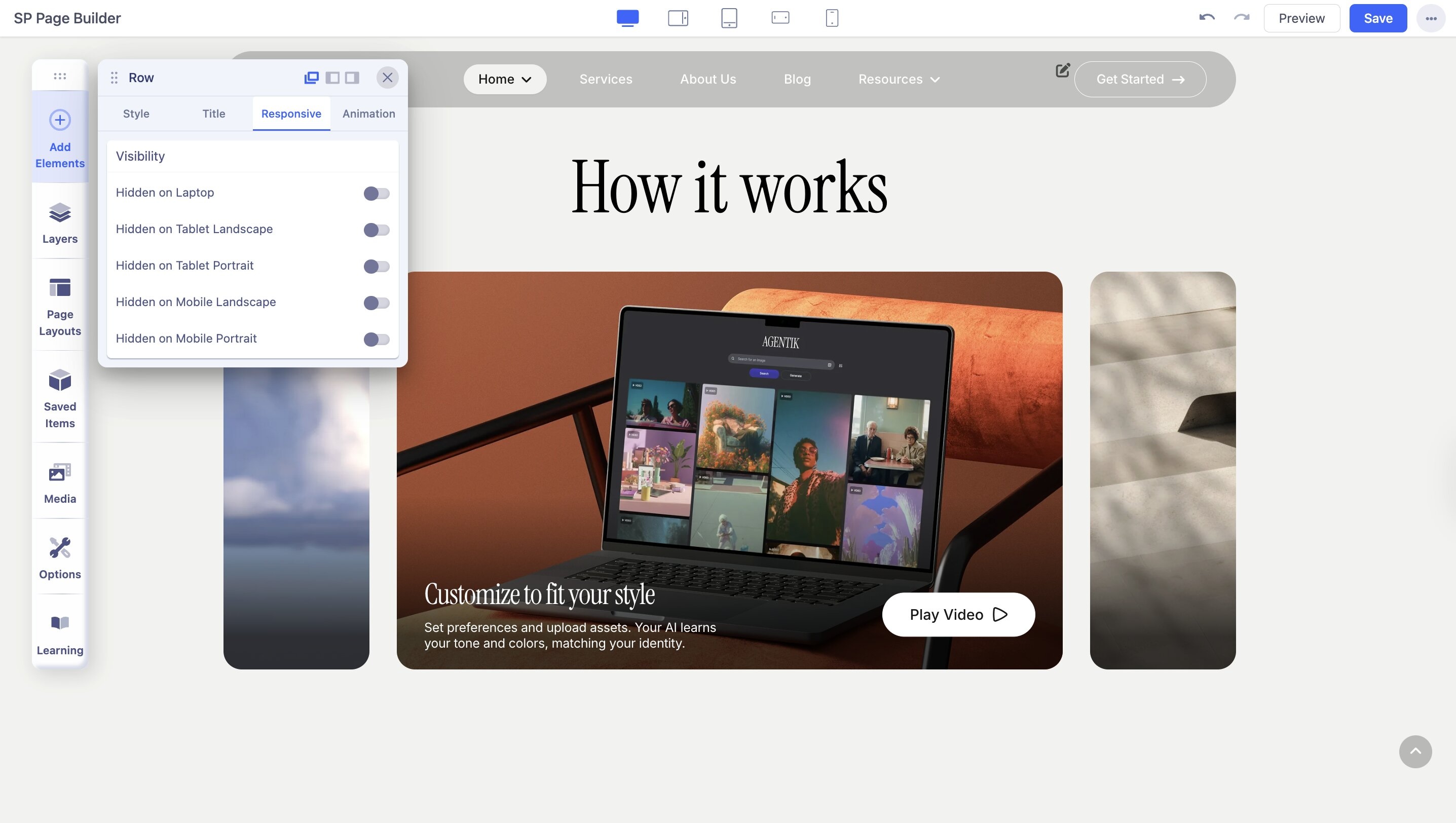
Hidden on Desktop: Enable to hide the section on Desktop orientation.
Hidden on Laptop: Enable to hide the section on Laptop.
Hidden on Tablet Landscape: Enable to hide the section on Tablet Landscape.
Hidden on Tablet Portrait: Enable to hide the section on Tablet Portrait.
Hidden on Mobile Landscape: Enable to hide the section on Mobile Landscape.
Hidden on Mobile Portrait: Enable to hide the section on Mobile Portrait.
Animation
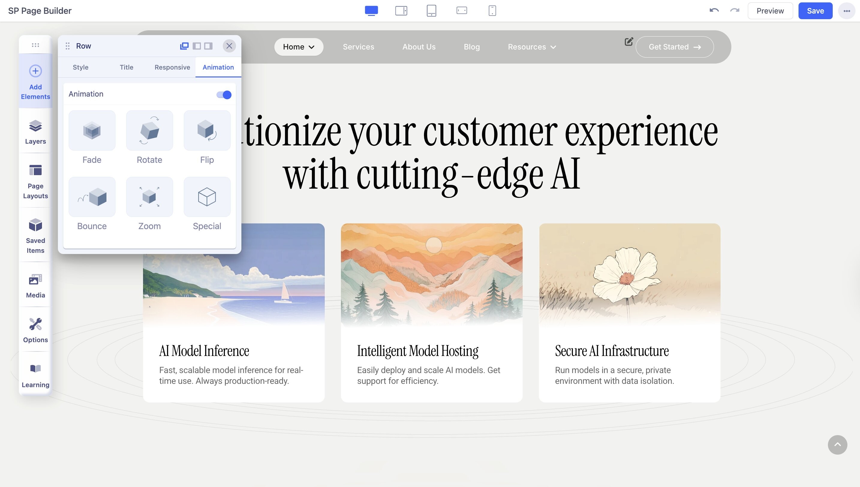
From this tab, you can select the animation for the row. It has the following options:
- Fade
- Rotate
- Flip
- Bounce
- Zoom
- Special
Direction: Select from the drop-down list the direction of the animation.
Duration: Use the slider or input field to set the duration of the animation in milliseconds.
Delay: Use the slider or input field to set the delay for the start of the animation in milliseconds.
Read our detailed documentation on Animation and Interaction in SP Page Builder to learn more.

